
Tuesday, 12:00pm
5 August 2025
This sporting myth
Otl Aicher
Gerhard Joksch
Mark Holt
SEA
Design history
Graphic design
Information design
SEA x Mark Holt. The myth of Otl Aicher’s pictogram grid
Thursday 31 July 2025. SEA, 54 Old Street, London EC1V 9AJWho would dare update the Munich pictograms made by Otl Aicher and Gerhard Joksch?
Mark Holt, that’s who. Quentin Newark reports
The sports event symbols for the 1972 Olympics are rightly regarded as one of graphic design’s undoubted high points, writes Quentin Newark. The ultimate pictograms. Up there in the pantheon alongside Rand’s logos and Neue Grafik magazine.
A booklet explaining Mark Holt’s investigation into ‘The myth of Otl Aicher’s pictogram grid’ begins: ’Between 1967–72, in the pre-digital age, Otl Aicher and Gerhard Joksch utilised a simplistic grid to help them conceive a harmonious set of sports event symbols for the 1972 Munich Olympic Games.’
They are perfect. Who would dare to examine them in any detail, let alone ask questions?
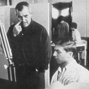
Above. Spreads from the booklet SEA x Mark Holt: The myth of Otl Aicher’s pictogram grid. Right. Aicher and Joksch at the team’s Garching-Hockbrück studio, Munich 1967.
Mark Holt, one of the founders of the hugely influential Octavo magazine and 8vo design group, that’s who.
He describes the problem: ‘Simply put, any arm or leg constructed from two components – one orthogonal, the other at 45º – cannot be of uniform thickness [given the thicknesses shown by the grid].’
(Yes I blanked at the word ‘orthogonal’, too. I spent the whole evening of the private view uncertain of what the problem was, or whether there even was one.)
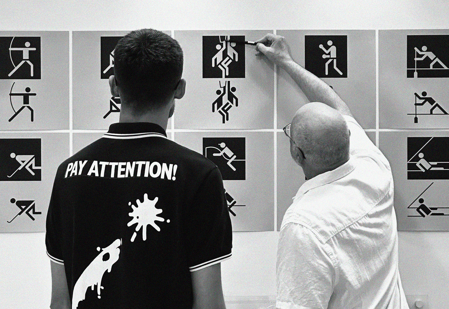
Mark Holt (right) at SEA’s one-night-only private view, 31 July 2025.
In compiling and writing his thorough book Munich ’72: The Visual Output of Otl Aicher’s Dept XI (see article in Eye 101), it troubled Holt to find that such an admired design scheme contained flaws – a disparity between the generative grid and finished icons he calls the project’s ‘Aichilles heel’.
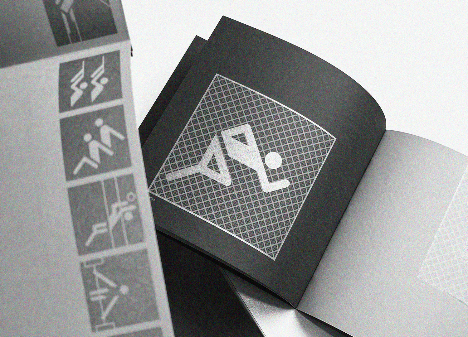
Rather than just flag this issue, Holt set about rectifying the ‘problem’. He has drawn a revised grid, a much finer grid at 45º that underlies Aicher’s original. This finer grid allows for 45º limbs to match orthogonal limbs, ensures all the gaps are uniform, makes all the heads snap into consistent positions.
Spread from SEA x Mark Holt: The myth of Otl Aicher’s pictogram grid showing Holt’s revised grid on the right.

In a Print article about Octavo and its making, Holt talks of digital typography being superior to the past, in that it enables us to engineer typography … ‘to levels of accuracy that were way beyond the tolerances of hand skills.’ I think this project is exactly that.
The modern moment, in which Holt can scale and shift elements to unprecedented degrees of fineness, and copy-paste ad infinitum, the technology removes all constraints. He can examine and remake the pictograms with no physical, time or budget constraints.
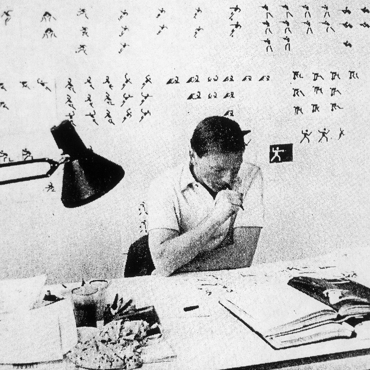
Compare this to the moment in which the pictograms were made: under commercial pressure, limited hours, Joksch sketching the pictograms for each sport quite loosely on tracing paper to be drawn crisply by artworkers, no-one having the time or inclination to subject each one to a grid-test – the appearance and ‘semantics’ of the finished pictograph being their sole concern.
Joksch at work – press clipping from Münchner Merkur, 23 April 1968.
Bryan Edmondson of SEA, who mounted last week’s one-night-only private view and published the booklet of Holt’s project, has a neat phrase to describe the point of it all – it’s a ‘dialogue with the past,’ he says.
By looking at Aicher and Joksch’s project in such exacting and reverent detail, and adding to their grid, Holt refreshes it, throws light on to the original creative and executional decisions and shows how such a project would be made today with different technology – without detracting from the impact and primacy of the Munich scheme at all.
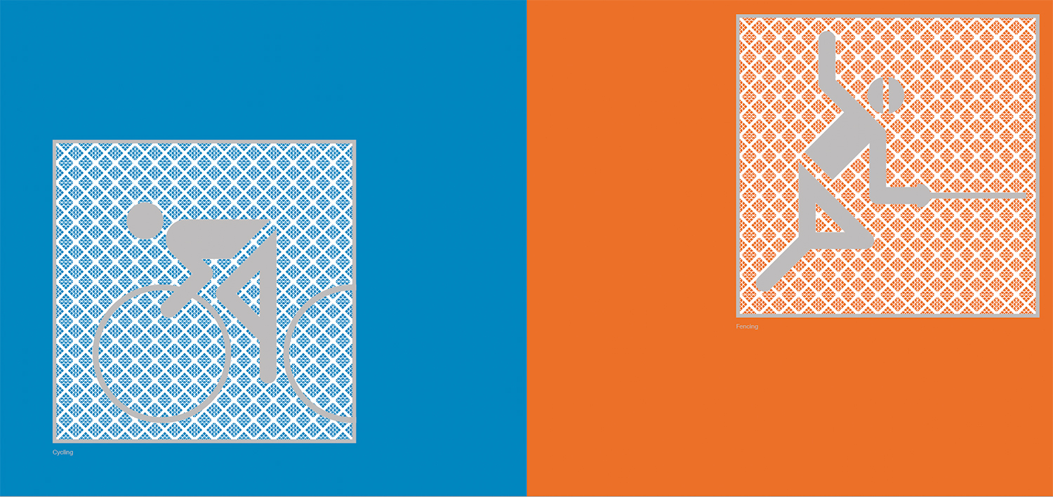
A spread from the booklet showing the revised pictograms for cycling and fencing.
Design: SEA / Mark Holt. Print: Made By Team. Paper: GF Smith.
To conduct such a dialogue to is to pay respect, to question, to understand … and to honour. Without a tradition, the transmission of values from one generation to another, graphic design will never advance.
We think of the Germans as thorough. What the Germans themselves call Gründlichkeit. They don’t have Mark Holt, though. He out-Germans the Germans.
But ultimately there is only one question. Is there a greater set of pictograms than Aicher’s? Nie im Leben.
Quentin Newark, designer, writer, co-founder of Atelier Works, London
Eye is the world’s most beautiful and collectable graphic design journal, published for professional designers, students and anyone interested in critical, informed writing about graphic design and visual culture. It is available from all good design bookshops and online at the Eye shop, where you can buy subscriptions and single issues.