
Monday, 11:48pm
23 April 2012
Type Tuesday. Look this way
‘Beauty in the making’ mixes paper, printing and a famous typeface

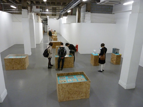
‘Beauty in the Making’ is a five-day show (ending Friday 27 April 2012), held in a cavernous basement near Holborn tube, organised and sponsored by paper merchant GF Smith.
And there’s plenty of paper to see and touch. The sign system, designed by MadeThought, is constructed from pallets of coloured paper: each top sheet is cut with stencil letters that reveal the sheet below.
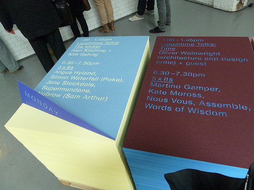
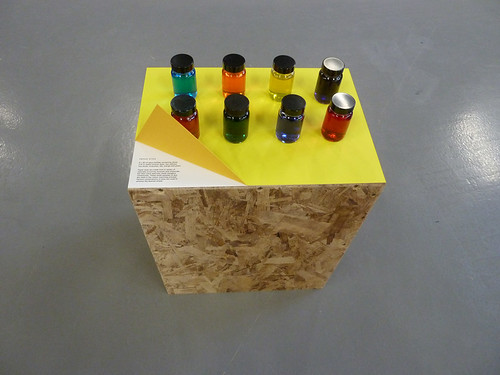
Some sheets have a corner folded up to reveal more information: there’s a ‘folded corner’ aesthetic that’s also employed in the display unit captions. Various demonstrations and workshops show visitors the physical objects and processes that lie behind design on paper: trees, paper manufacture, dyes (below), envelope-making, small-scale letterpress printing, and so on.
The highlight (for Type Tuesday regulars), however, is a space (almost a secular nave) that houses glass-covered display cabinets that permit a glimpse into Monotype’s archive of type and type design.
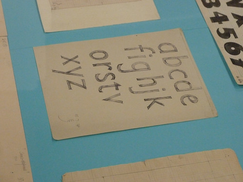
There are a number of Eric Gill’s original drawings for Gill Sans, along with letters and notes, plus some fascinating glimpses into life at the company that once dominated the Surrey village of Salfords.
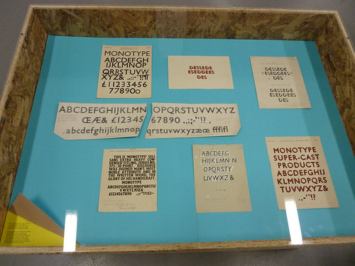
These include books, box files and archive photographs, including a picture of ‘the first machine gun made at the Monotype Works’, and correspondence about details in the design of Gill’s most famous type family (on which work continues at Monotype, whose UK operation is still based in Salfords).
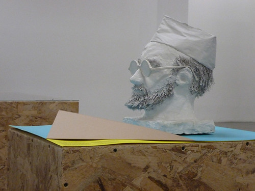
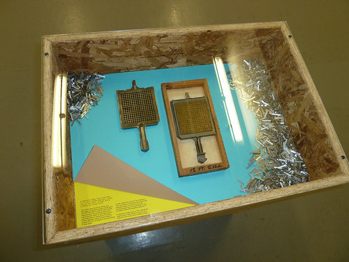
There’s a slightly alarming papier mâché bust of Eric Gill (above), made by Ann Pillar, plus a few other 3D objects such as a matrix case for casting 12pt Gill Sans and Gill Sans italic in lead (below).
In contrast to recent London exhibitions that pack a huge amount into a small room (see Richard Hollis at Gallery Libby Sellers), ‘Beauty in the Making’ is a modest display in a very large (22,000 sq.ft.) space. However anyone interested in British type design will enjoy the chance to peer at the historic Monotype / Gill archive before the show closes on Friday.

23 > 27 April 2012
Beauty in the making
A five-day exhibition / event curated by paper merchant GF Smith, in collaboration with Monotype, It’s Nice That and the British Council’s Architecture, Design and Fashion department (who have also contributed examples of touring work from British designers).
Victoria House Basement, Unit 6, 37-63 Southampton Row, London WC1B 4DA
Admission is free (and they throw in some free paper samples). Reserve tickets through Eventbrite.
See more images on Eye’s Flickr stream.
Paper merchant GF Smith has an interesting history of working with graphic designers to make promotional material. See ‘Sampling the modern’ in Eye 72 and ‘10,000 one offs’ featured on the cover of Eye 80.
Eye is the world’s most beautiful and collectable graphic design journal, published quarterly for professional designers, students and anyone interested in critical, informed writing about graphic design and visual culture. It’s available from all good design bookshops and online at the Eye shop, where you can buy subscriptions and single issues. Eye 82 is out now – you can browse a visual sampler at Eye before you buy on Issuu.