Friday, 12:00pm
3 October 2025
Type Tuesday: My favourite logo
Hugh Miller
Pentagram
Here Design
Michael Johnson
Rejane Dal Bello
Dines
Studio Blup
Bryan Edmondson
SEA
Alan Fletcher
Muriel Cooper
Grapus
Jean Widmer
Landor Associates
F. H. K. Henrion
Design history
Type Tuesday
Events and exhibitions
Eight designers gathered together at St Bride Library to share their knowledge and opinions about logo design

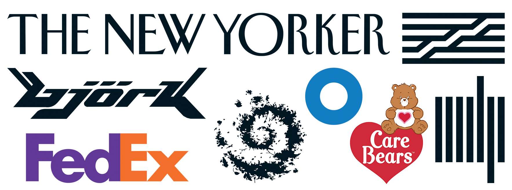
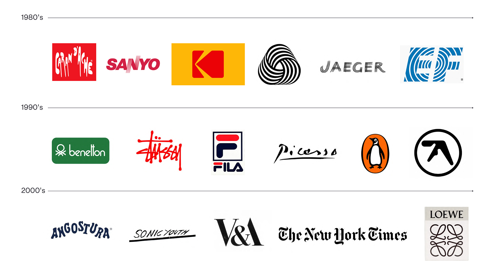
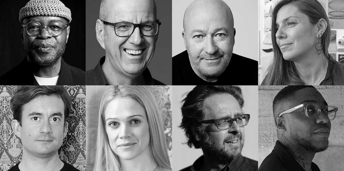
Last week audiences packed into St Bride Library for our sold-out Type Tuesday, ‘My favourite logo’, which featured eight logos (above) selected by an outstanding panel of speakers: Andy Cowles, Hugh Miller, Sebastian White, Kate Marlow, Michael Johnson, Rejane Dal Bello, Dines and Bryan Edmondson. Huge thanks to them for their fascinating and informative talks about type, symbol, form, meaning … and clients.
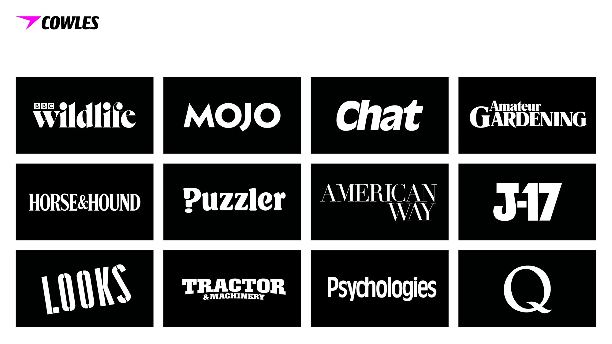
After an introduction from Eye editor John L. Walters, the first half began with magazine creative director and consultant Andy Cowles, who began, like most of the speakers, with a quick summary of his design career, which includes designing mastheads for many big newsstand magazines (see below).
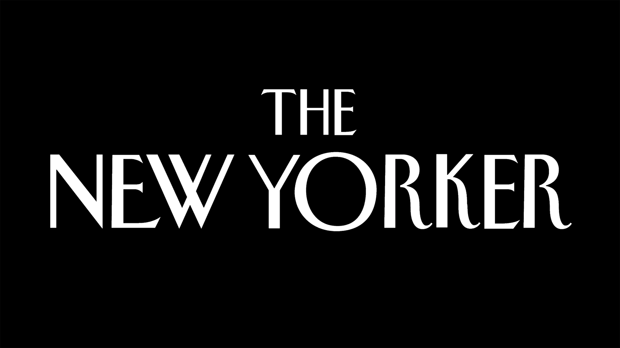
Cowles’s choice for his ‘favourite logo’ was The New Yorker masthead (below). He talked about the concept of a ‘logo smash’, when a titlepiece or symbol is recognisable even when cropped or chopped to bits. The New Yorker’s popular tote bag provides a vivid example of this. ‘The interesting thing about The New Yorker,’ said Cowles, ‘is that while it does talk about New York City, it's not about New York City. It’s about the audience.’
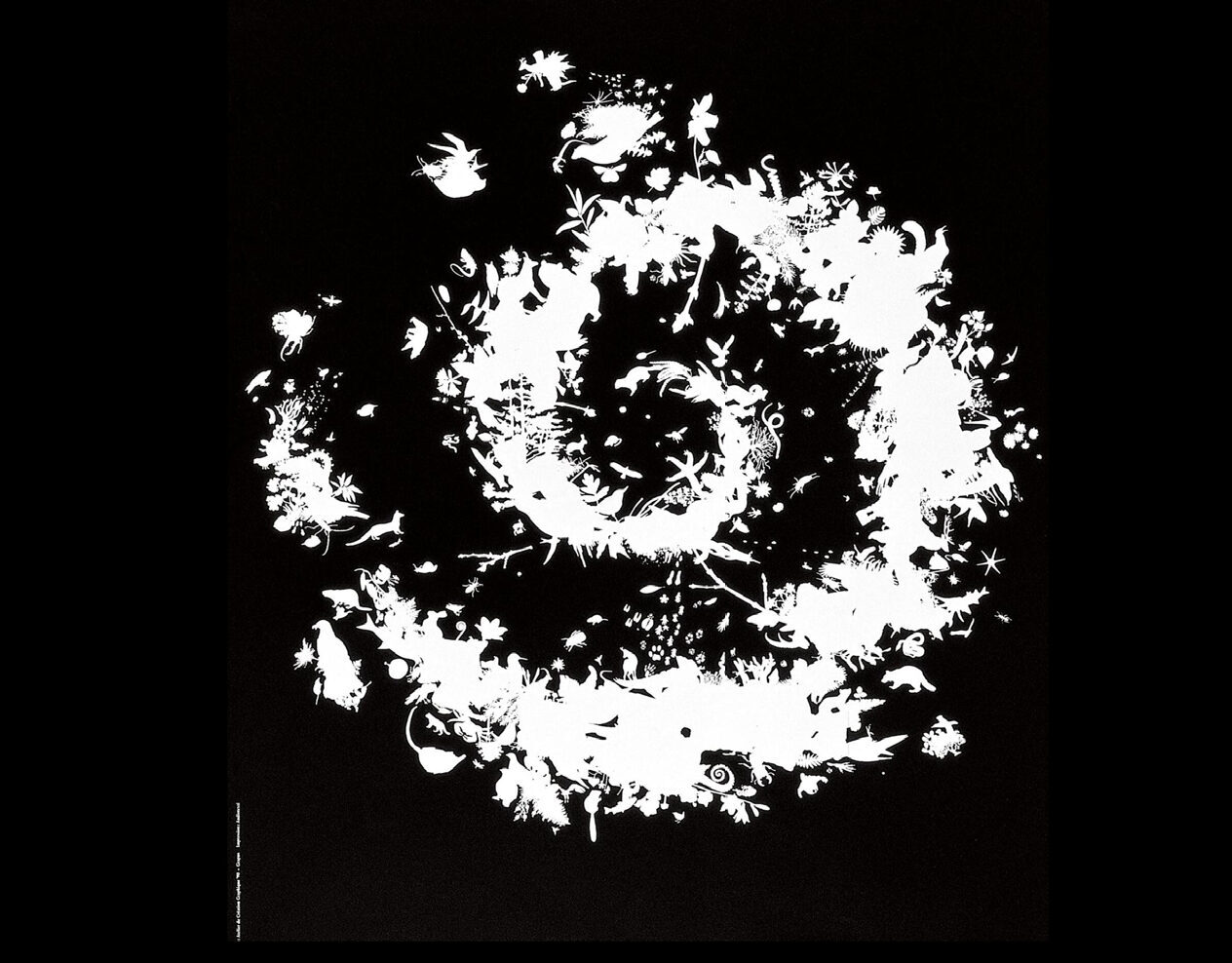
Pentagram partner Hugh Miller came next, talking about Grapus’s design of the logo for the French National Parks.
Miller recalled visiting the studio while he was a student at Kingston: ‘To my amazement, there were actual creepy crawlies on the table. Ants and spiders, beetles crawling on the table … I was transfixed and it’s stuck with me ever since. The spiral shows biodiversity, it’s based around the spiral of life.’
Logo for Les parcs nationaux de France by Grapus.
Staying with French subject matter, Kellenberger White’s Sebastian White spoke about Jean Widmer’s comprehensive identity (late 1970s) for the Centre Pompidou in Paris, and the logo based on its architecture.
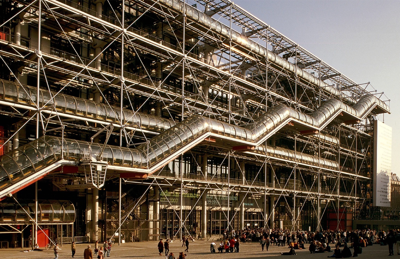
The logo has been through many iterations (we showed a six-bar version in our Reputations interview with Widmer in Eye 34), and White delighted the audience by informing us that the French Government ’listed’ the logo, by popular demand, as if it were a building. It can’t be rebranded.
Jen Widmer’s sketches for the Centre Pompidou logo.
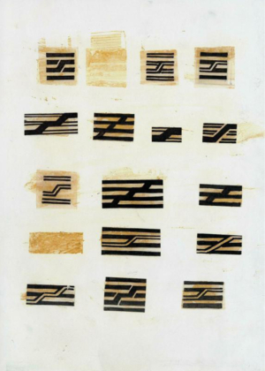
White described Widmer drawing the centre while the building was still under construction: ‘Through that slow looking, he saw something about the power of that escalator, traversing the different floors of knowledge and creativity.’
Kate Marlow with Here Studio’s logo for Hide, a Michelin Star restaurant based in London.
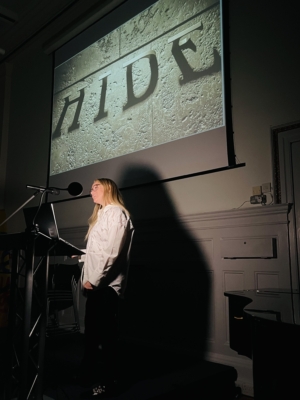
Kate Marlow (Here Studio) took us rapidly through many different logos from her early life to the present, referencing the Care Bears logotype as something that stuck in her childhood memory.
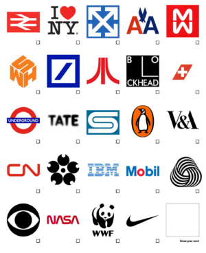
After Marlow’s psychogeography (or psychologography?) it was time for a break. At the start of the evening we had placed A4 voting sheets on every chair, inviting attendees to choose a favourite logo from a selection of 24, or to draw their own favourite in the 25th box: we asked everyone to return these to find the most popular (see below).
The ‘favourite logo’ voting sheet, which asked attendees to select a favourite from a shortlist of 24, or draw their own choice in the final box.
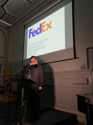
Starting off the second half of the evening, Michael Johnson listed his four ‘runners-up’ before getting on to the FedEx logo, and his conversations with Lindon Leader, who Landor Associates, who designed it in 1994.
Arabic version of the FedEx logo included in the presentation by Michael Johnson.
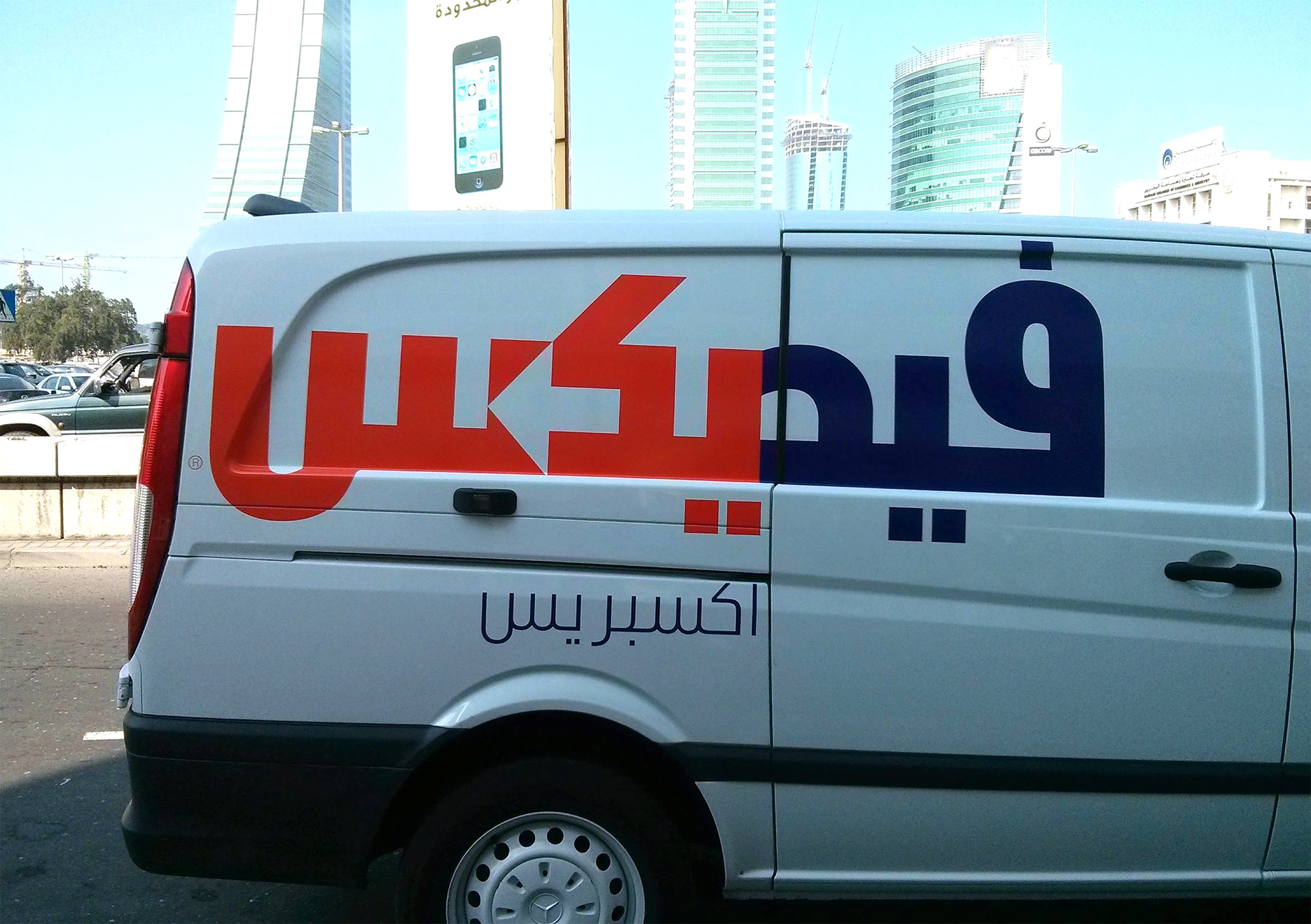
Johnson gave us a short history of the client, and also showed several examples, including its starring role in the Tom Hanks movie Cast Away, and an Arabic version (above), which has the famous ‘hidden arrow appropriately pointing right to left’.
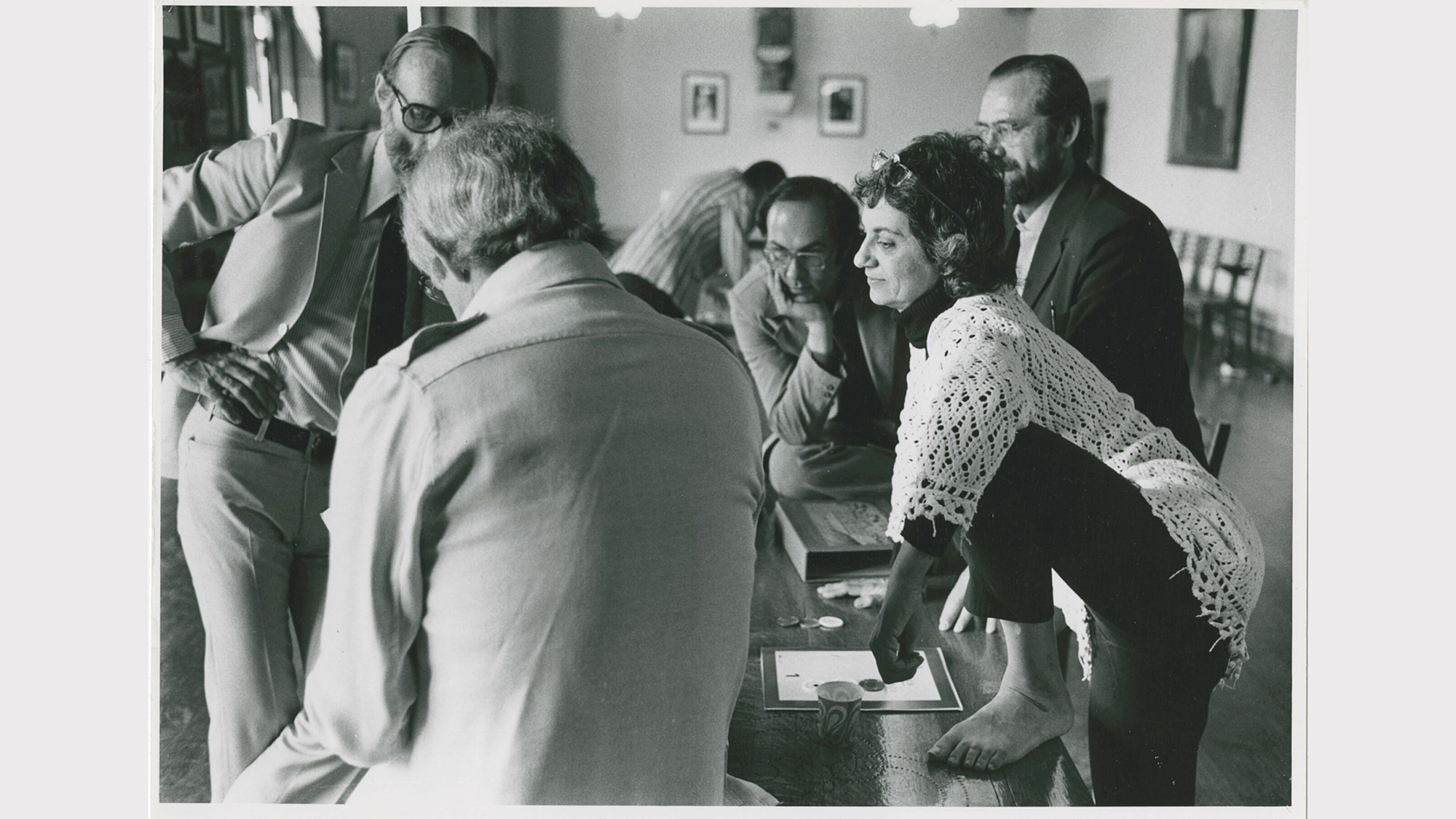
Muriel Cooper with colleagues while working at MIT (Massachusetts Institute of Technology).
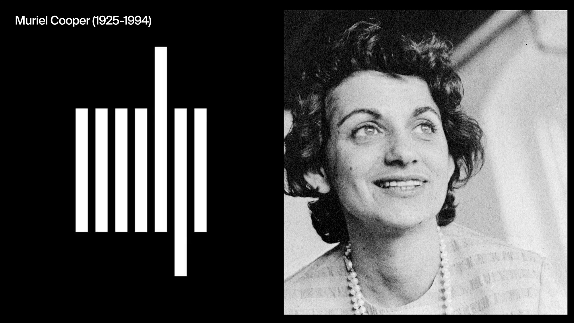
Rejane Dal Bello also ran through several favourites before regaling us with the story of Muriel Cooper’s logo for the MIT press, devised while she was working in-house at MIT.
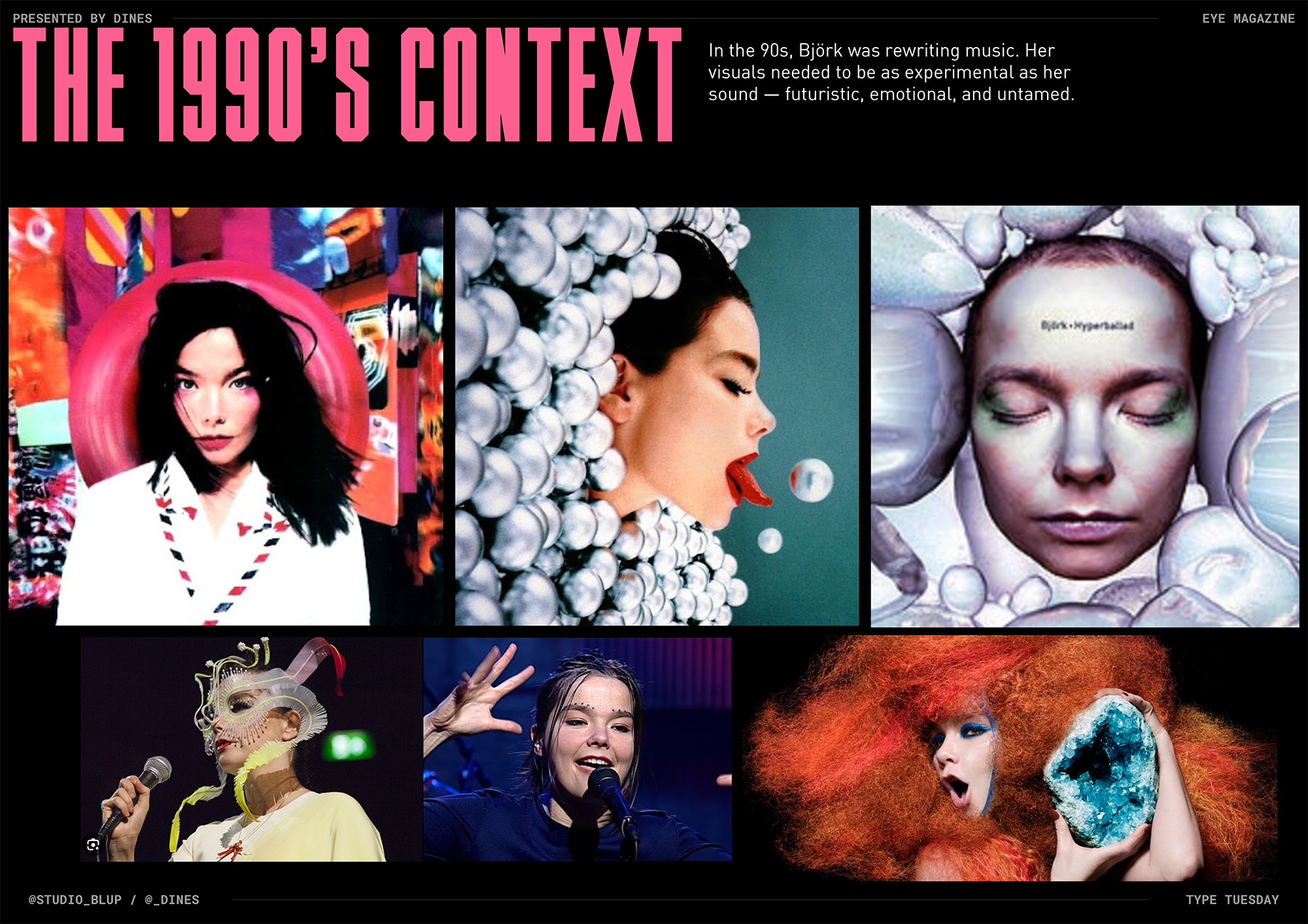
Penultimate speaker Dines bounded on stage, and gave a quick run-down of his studio’s approach before taking us back to 1990s music culture.
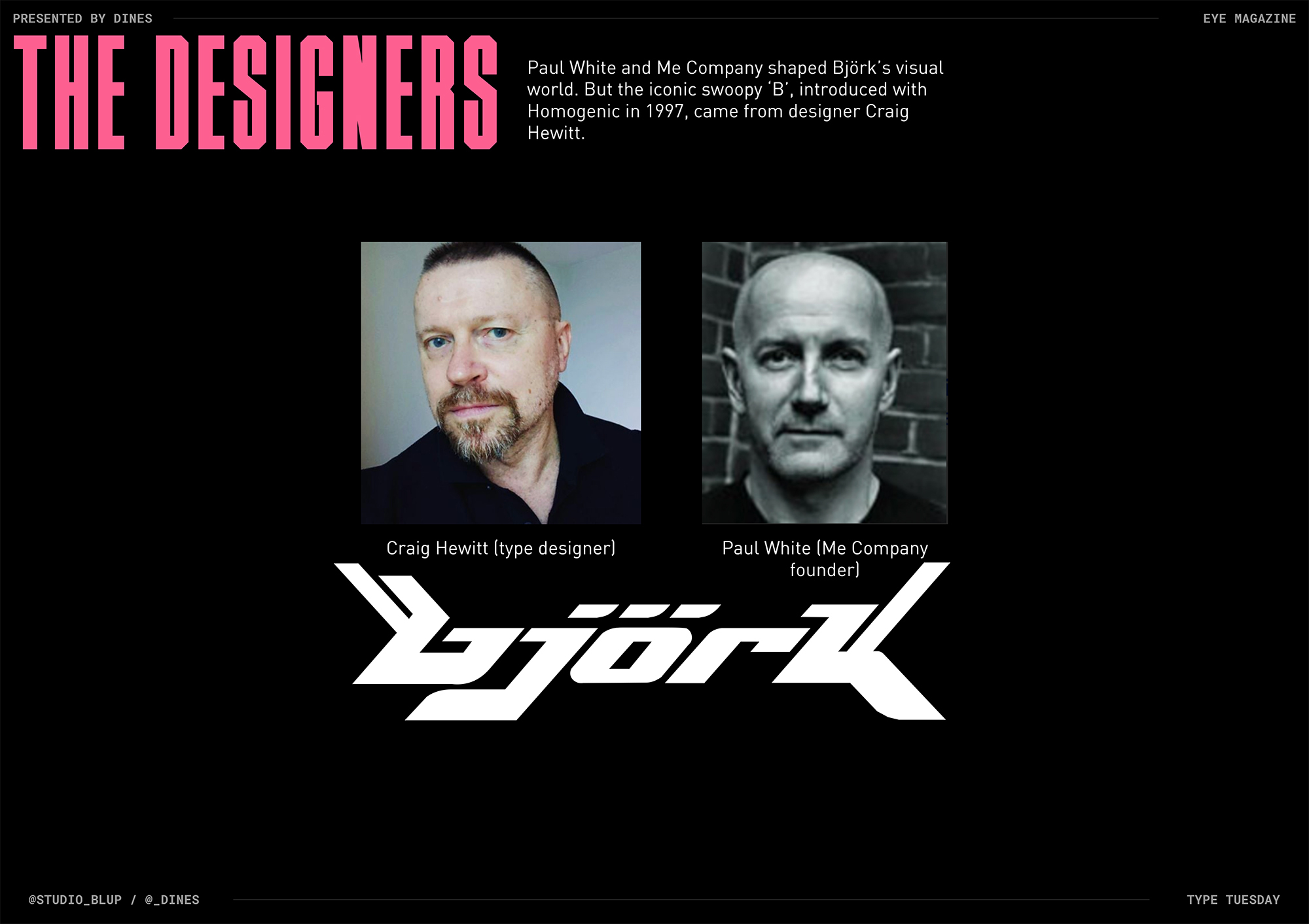
Dines chose the Björk logo (designed by Craig Hewitt while at Paul White’s Me Company – see ‘Hi-res hedonist’ in Eye 21).
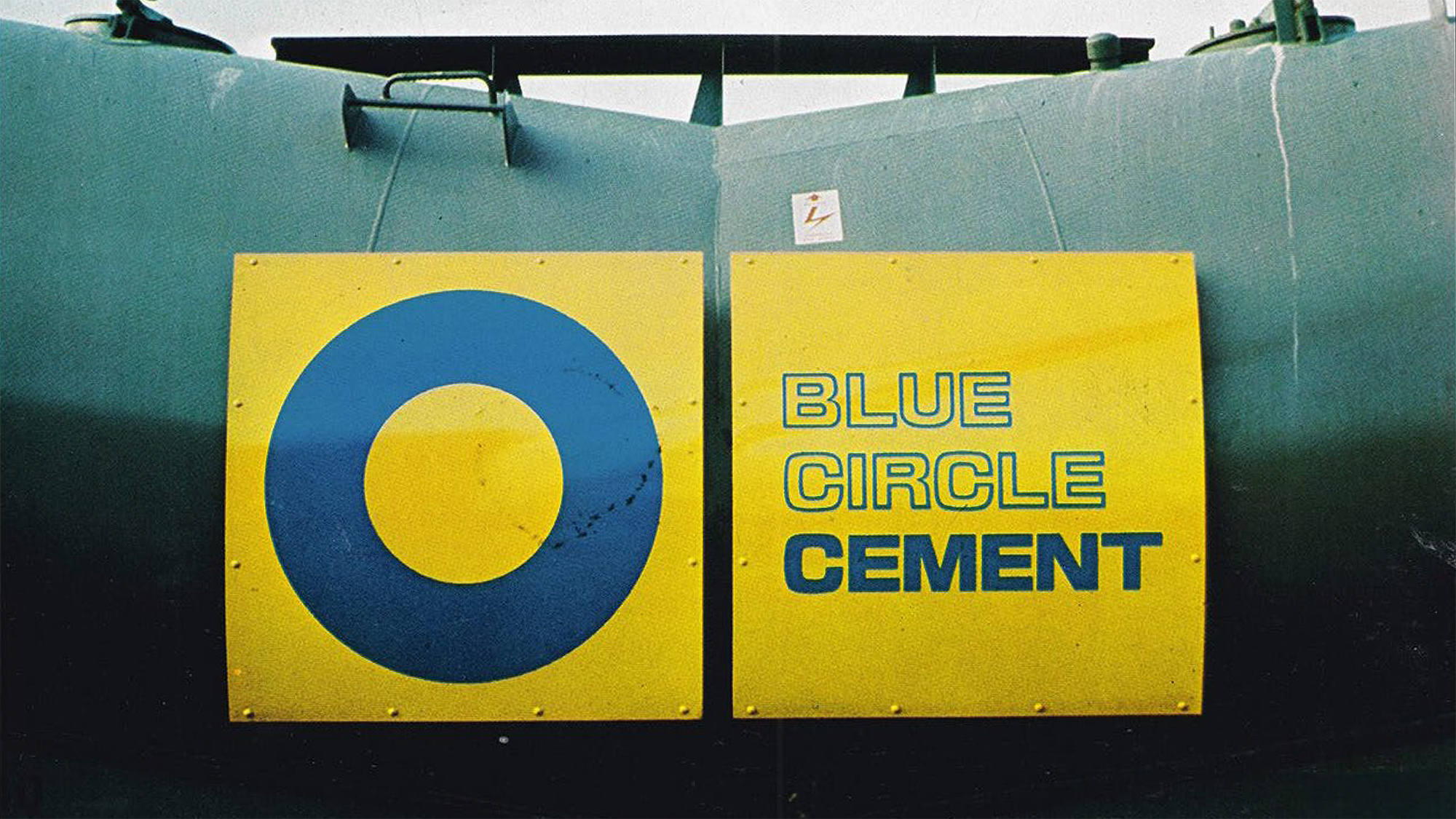
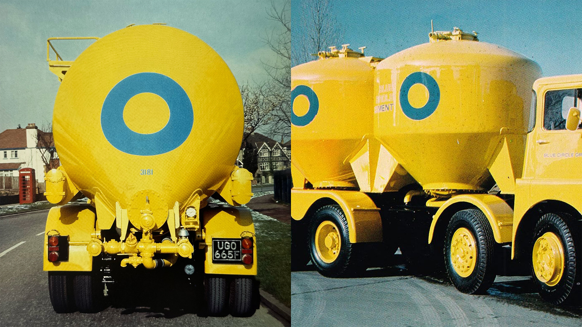
The eighth and final speaker was SEA Design founder Bryan Edmondson, who selected the timeless logo for Blue Circle Cement, a bold blue circle designed by F. H. K. Henrion.
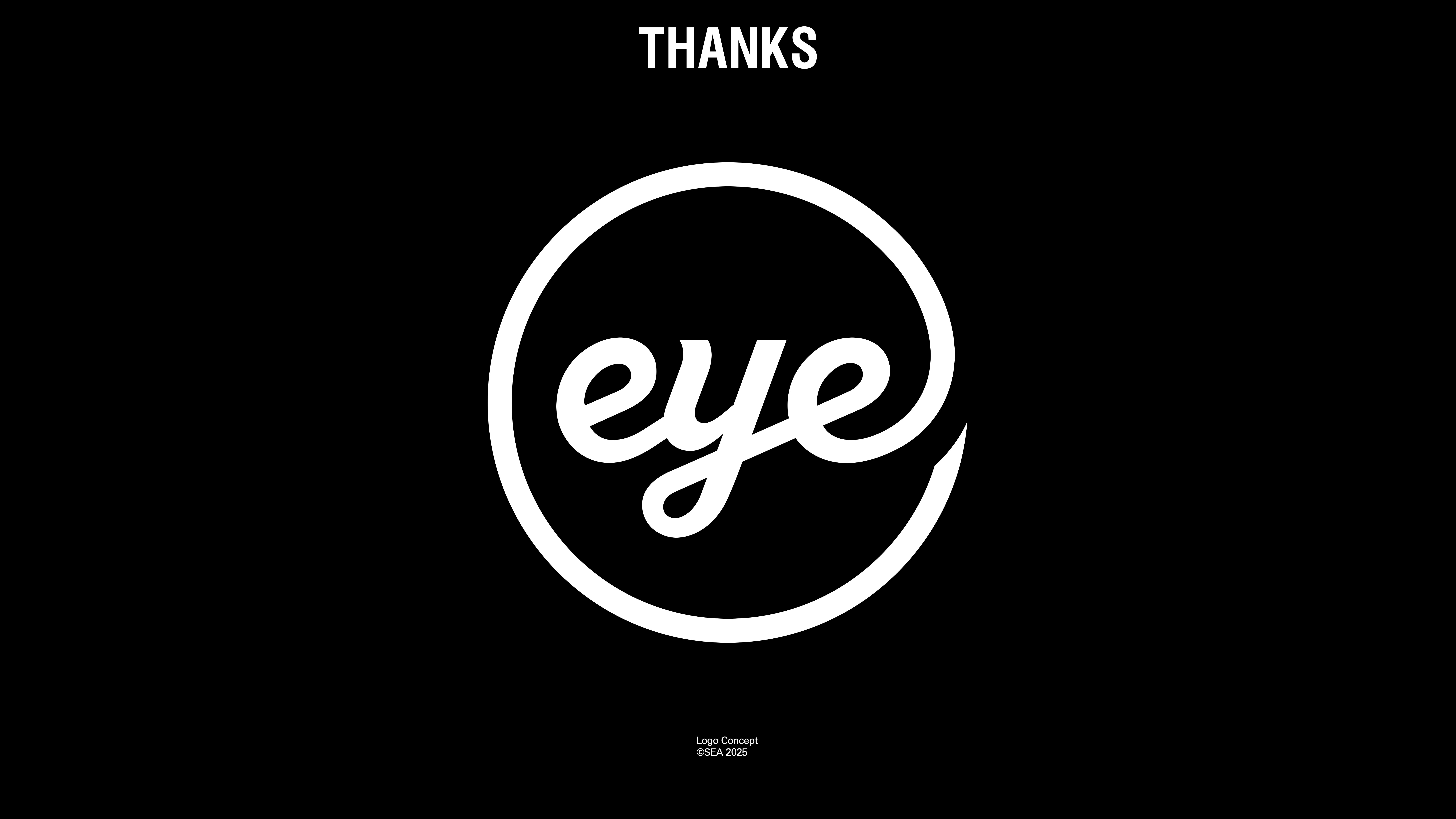
Edmondson cheekily ended his presentation with a circular version of Magnus Rakeng’s Eye logo, commissioned by Nick Bell, which we have been using since Eye 41 in 2001.
L TO R: Rejane Dal Bello, Michael Johnson, Andy Cowles, Hugh Miller, Bryan Edmondson, Dines, Kate Marlow, Sebastian White.
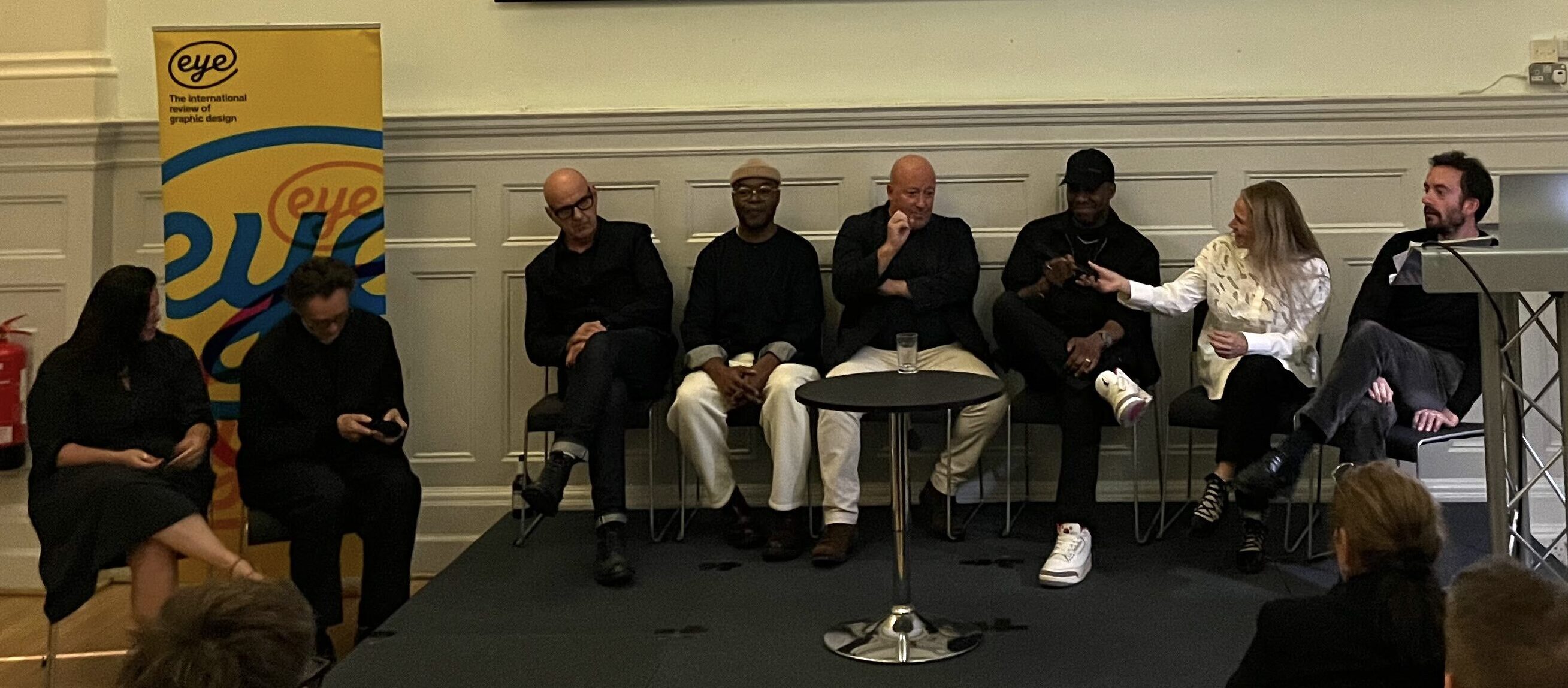
For the final part of Type Tuesday all eight panellists crowded on to the stage to chat about each other’s choices and to field some interesting questions about the eight logos selected from our highly engaged audience.
Issues covered included longevity, ownership and type design, and Eye editor Walters concluded the evening by thanking all the St Bride staff, the Eye team and our eight terrific speakers.
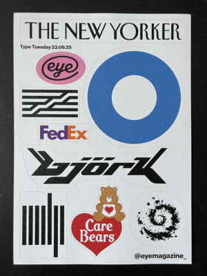
The ‘winner’ of the ‘favourite logo’ voting sheet was the V&A logo, designed in 1989 by Alan Fletcher at Pentagram. Everyone in attendance received a specially designed limited-edition sticker sheet. The last few remaining will be available at our next Type Tuesday on 25 November 2025, along with our popular Eye logo tote bags.
The limited-edition sticker sheet with the eight featured logos, plus a bonus Eye logo sticker.
Eye is the world’s most beautiful and collectable graphic design journal, published for professional designers, students and anyone interested in critical, informed writing about graphic design and visual culture. It is available from all good design bookshops and online at the Eye shop, where you can buy subscriptions and single issues.
