
Monday, 5:29pm
4 July 2011
Type Tuesday
Lust and likeability #3: Guardian Sans – by Schwartz and Barnes

Another extract from ‘Lust and likeability’, first published in Eye 67, in which our informal jury of Jan Middendorp, John Belknap, Petra Černe Oven, Deborah Littlejohn and Mark Thomson talk about typefaces.
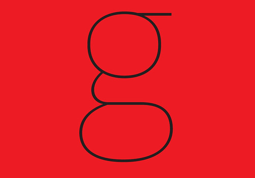
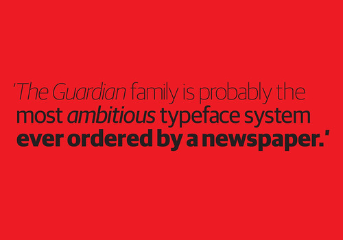
When Mark Porter, art director of The Guardian, commissioned a new sans serif, Paul Barnes drew a nineteenth-century-style Egyptian, hoping to arrive at a novel kind of sans after removing its serifs. The ‘throw-away’ slab serif was liked by all involved, and the by-product became the star of the family. At 200-plus fonts, the Guardian type family is probably the most ambitious typeface system ever ordered by a newspaper. The examples shown here are from Guardian Sans.
Mark Thomson
At first this face reminded me a lot of Fedra by Peter Bil’ak, which I’d been using in the design of dictionaries, because of its large x-height and sense of openness. From day one it looked as though it had always been in The Guardian. It has a straight, factual quality (in common with Fedra), objective rather than coloured. The light weights are more elegant, with a more delicate feel, which is perfect for the non-news sections’ headings. The slope of the italic is a bit too much, but you’d have to be more than fussy to complain about that.
John Belknap
A lot has been said about the Guardian fonts by Schwartz & Barnes. They are basically perfect: unique, distinctive, both traditional and fresh. And one of the many variations is the ultimate publication designers’ wet dream: a set of drop caps that fit exactly without any fussing. Nirvana.
Petra Černe Oven
You might ask why I would pay for an out-of-date newspaper in Slovenia when we have plenty of good newspapers there? Well, for me it is a combination of ‘second-home-sickness’, the cleverness of its contents, and last but not least because of the design. And what makes the design of The Guardian important is its typeface. I admire the art direction, but if you haven’t got the building elements, it doesn’t leave you with much.
Deborah Littlejohn
In my small, (unrepresentative) sample, Guardian is the second highest-rated typeface among all male respondents. Perhaps men like it more because of its physicality and the typographers’ design methodology of hacking off the serifs. And hey – if female designers pick the swirly-curly fonts, surely this is a Freudian-inspired male counterpart!
One respondent called it ‘perfect’ and two praised its ‘comprehensiveness’. The complexity and drama of the redesign project makes for a rare typographic tale. The bold italic is my favourite feature of the super family. Designing a typeface for a major newspaper must be one of the most difficult challenges for a typographer: it is such a highly public venture.
Jan Middendorp
Apparently it is difficult for newspaper designers to steer clear of international habits and received ideas. The typefaces chosen, even when commissioned, often remain safely within the realm of vaguely ‘transitional’ (eighteenth-century) letterforms, and turn to late nineteenth-century grotesque models when a heavy sans is required. Gerard Unger’s news faces are an exception, and in moving away from nostalgic habits, the Guardian typeface seems to have been moving closer to Unger. Nonetheless, it is original, crisp, recognisable and kind of cheeky. As a family, it works admirably.
Type Tuesday is our weekly column on typography and type design, featuring a mixture of brand new articles and material from the extensive Eye archive. For more Type Tuesday articles, click here.
Lust and likeability was originally published in Eye 67, Spring 2008.
Eye is the world’s most beautiful and collectable graphic design journal, published quarterly for professional designers, students and anyone interested in critical, informed writing about graphic design and visual culture. It’s available from all good design bookshops and online at the Eye shop, where you can buy subscriptions, back issues and single copies of the latest issue. The latest issue is Eye 79, a type special.