
Monday, 9:54pm
18 July 2011
Type Tuesday
Gothic horror: the Nazi party’s obsession with cultural dominance

During their period of rule over Germany (1933-45), the Nazis politicised art and nationalised aesthetics in an attempted to control all aspects of life. And they succeeded.
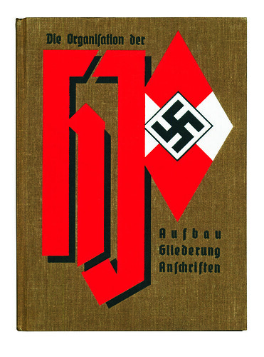
Above: Die Organisation der Hitler Jugend, 1937. Boldly designed cover shows the Hitler Youth's diamond-shaped logo and gothic lettering.
No detail was too minute, all art forms were strictly scrutinised and rules established to insure conformity within the bounds of ideological purity wrote Steven Heller in Eye 62.

Above: Das Programm der NSDAP, 1931. Before coming to state power, the Nazis codified their programme in annual manifestoes.
Early in the rise to power of the National Socialist German Workers Party (NSDAP, commonly known as the Nazi party), infighting triggered fierce debates between proponents of Modernism (i.e. those who accepted Expressionism and, to a certain extent, Bauhaus ideas) and Völkism (i.e. those who revered Teutonic folk traditions). Ultimately a rigid, retrograde Nazi style developed that inveigled its way into society through the concept of Gleichschaltung, the integration and consolidation of National Socialist cultural dominance over everything from architecture to typeface design.
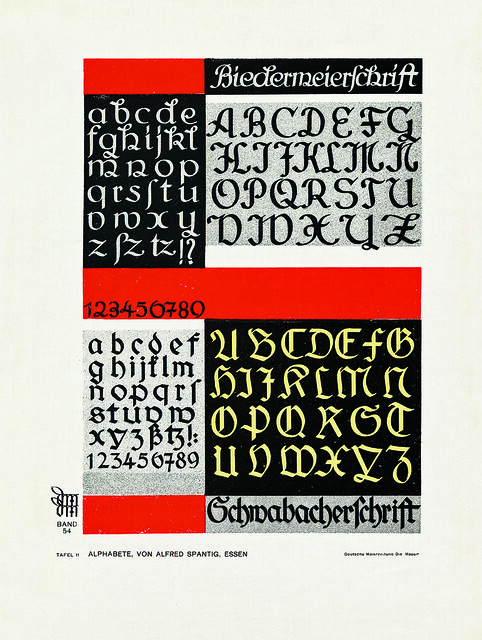
Above: Specimen sheet published by Die Mappe: Illustrierte Zeitscrift fur Farbige Raugestaltung, 1934-35. This arts and crafts journal provided a wide range of models of approved German wares.
Propagating the rightness of commonplace letterforms became part of the Nazi party’s culture-creating mission as a direct consequence of its belief that stringent doctrines were the way to German hearts and minds. The cumbersome title of Alfred Rosenberg’s Office for the Supervision of the Entire Cultural and Ideological Education and Training of the National Socialist German Workers Party, speaks volumes about the weight Hitler placed on artistic matters, and graphic design was included.
In order to be allowed to work, graphic designers, calligraphers and typographers were compelled to join the Reichskulturkammern (the ‘state chambers of culture’ that had replaced outlawed trade and crafts unions) and adhere to their dubious regulations. The Labour Front (DAF), directed by Hitler’s close ally Robert Ley (who also administered the pseudo-Modernist Strength Through Joy movement), was given jurisdiction over many culture chambers, including those overseeing graphic design and typographic style.
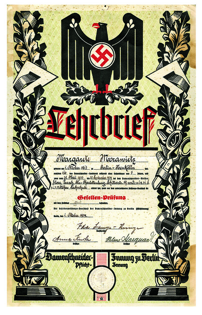
Above: Lehrbrief, 1934. Official documents bearing the Nazi aesthetic, like this certificate for being an upright German seamstress, were given on every occassion.
Ley’s departments were responsible for developing teaching materials and issuing organisational handbooks that included design guides, they also produced annual type specimen books featuring a limited number of favoured typefaces, most of which were in the blackletter and Fraktur families. The idea was not new to the Nazis. Gothic style in calligraphy and printing was appropriated as a nationalistic symbol and perpetuated as Teutonic virtue by German chauvinists during the late nineteenth century.
Above: Specimen sheet published by Die Mappe: Illustrierte Zeitscrift fur Farbige Raugestaltung, 1934-35.
Nonetheless, many were shocked in 1935 when Hitler warned against both ‘degenerate’ Modern art and the Teutonic art of ‘petrified backward-lookers’ as ‘dangers to National Socialism’. In a 1936 edition of Ley’s daf type book, Typographisches Skizzieren und Drucksachenentwerfen, were added Antiqua, Medieval, Grotesk (which looked suspiciously like Futura), Egyptienne and other crypto-Modern faces. And in style guides such as Moderne Reklame-Schriften, which taught students and neophytes how to letter, various anomalies reared their grotesque faces.
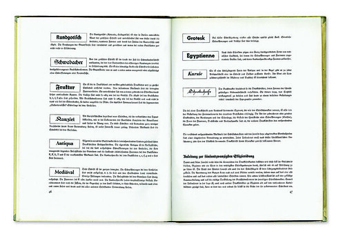
Top and above: Cover and spread from Typographisches Skizzieren und Drucksachenentwerfen, Teil 1: Typoskizze, c. 1936. Published by the office of Robert Ley.
Nazi Germany was not an extreme example of nationalising aesthetics, though it was especially cognisant of its typography. Iron-fisted regimes from Fascist Italy to Communist China have licensed their designers and artists in order to control and direct their expression in the service of the state. The branding of totalitarian nations – on the right or the left – has demanded that strict guidelines circumscribe the manners and styles used to define them. In Germany, a country with a long tradition of exceptional graphics, it was not surprising that these techniques were adopted to the business of politics.
This is an extract from Steven Heller’s article ‘Gothic Horror’, first published in Eye 62, Winter 2006.
Eye is the world’s most beautiful and collectable graphic design journal, published quarterly for professional designers, students and anyone interested in critical, informed writing about graphic design and visual culture. It’s available from all good design bookshops and online at the Eye shop, where you can buy subscriptions, back issues and single copies of the latest issue. The latest issue, Eye 80, is on its way to subscribers and newstands.