
Tuesday, 8:00am
26 July 2011
Type Tuesday
Scripts and hand-lettering are at the centre of music design

A lot of attention is paid to the design and typography of vintage record sleeves, and with artwork by illustrator-designers such as the late Alex Steinweiss (see Reputations in Eye 76 and NYT obituary) and David Stone Martin it is easy to see why.
But there is often just as much going on beneath the cover. The script logotypes on old record centre labels show that they, too, were fertile ground for music design, writes Alexander Ecob.
Here are some examples, courtesy of Simon Foster’s Center of Attention photoblog.
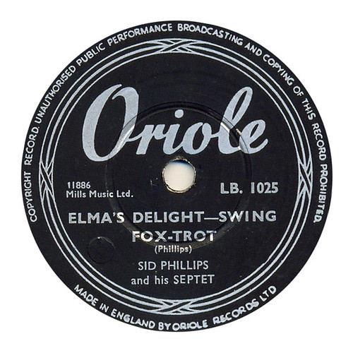
Above: ‘Elma’s delight’ by Sid Phillips and his Septet. Oriole Records (ca. 1953).
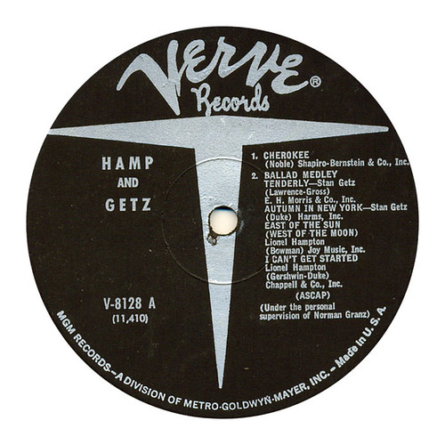
Above: Hamp and Getz, Verve Records (1961).

Above: ‘Come and see me baby’ / ‘Man makes a woman’, Barbara Acklin, Brunswick Records (1968).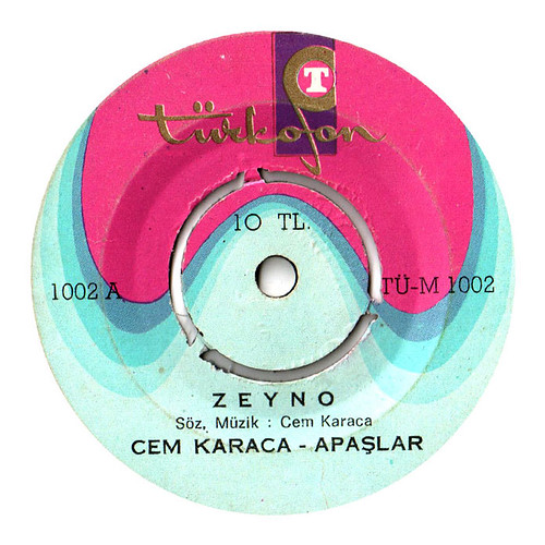
Above: ‘Zeyno’, Cem Karaca & Apaşlar, Turkofon (1969).

Above: Le grands succes de Jacques Dutrone Jacques Dutrone (1970).
To see more label-graphics visit the Centre of Attention photoblog by Simon Foster, who kindly supplied the images for this post.
Eye is the world’s most beautiful and collectable graphic design journal, published quarterly for professional designers, students and anyone interested in critical, informed writing about graphic design and visual culture. It’s available from all good design bookshops and online at the Eye shop. For a taste of the new issue, see Eye before you buy on Issuu. Eye 80, Summer 2011, is on its way to subscribers and bookshops worldwide.