
Tuesday, 8:27am
23 August 2011
Type Tuesday
Lust and likeability #4: Underware’s Bello, a versatile brush script

Our informal jury – Jan Middendorp, John Belknap, Petra Černe Oven, Deborah Littlejohn and Mark Thomson – takes a look at Bello by Dutch foundry Underware.
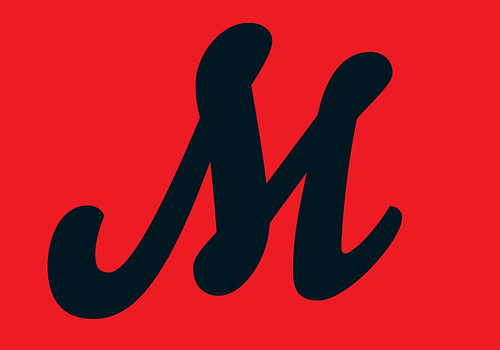
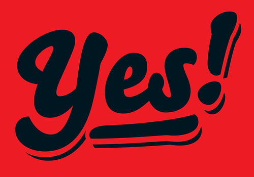
Bello was designed to mimic the work of the sign painter. It is a brush script typeface in just one bold weight, but with many extras to personalise the design of headlines and single words. The use of the many ligatures, swash characters and word logotypes is facilitated by OpenType functionality which, of course, only works with the professional layout software that supports it.
Mark Thomson
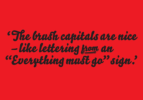
The snap-on swashes are really interesting, a little like Andreu Balius’s Súper-Veloz in that respect. Overall it looks as if it belongs in a different time; the brush capitals are nice but they look like lettering from an ‘Everything must go’ poster. That’s probably the point. The script version looks curiously static, in the way that Monotype Script does.
Petra Černe Oven
When Bello was introduced back in 2004 with the billing ‘big and beautiful’ I found the PR strategy a bit misleading. I honestly can’t find any similarities between Bello and the larger-size ladies clothing section of Tesco’s. To me Bello is a time capsule which takes you back to a time when in socialist countries like mine a toothpaste called Sarg’s Kalodont claimed to make tartar disappear in seconds, and the letters on the ads were as friendly and rich in flourishes as Bello’s ligatures are.
John Belknap
Usually when someone says brush script, it gives you an involuntary shudder and brings back memories of badly designed supermarket flyers. But this brush script is jaunty, stylish and beautifully constructed. The small caps are all that and solid. On top of that they have prepared a ton of extra ligature options and on top of that they offer a set of prefab words designed into shapes that can be thrown into copy to spice it up. The website shows these options in clever, rolling animations.
Deborah Littlejohn
Bello is beautifully crafted and exhibits personality galore. It makes me laugh out loud. One female respondent to my ‘poll’ calls it a ‘prettier Cooper Black’ – I say it’s a gregarious yang to Verlag’s staid yin. Four of the male respondents said: ‘If I was going to use this font, I would just draw it myself’ Bello also prompted some extreme reactions, such as that of blogster ‘Zara’, who said she desires a declaration of love tattooed on her butt in Bello. She adds: ‘Don’t forget the swashes!’
Jan Middendorp
Digital technology is changing the way we think about typesetting and unsurprisingly, the larger foundries are lagging behind. It is now largely up to younger and more flexible foundries to experiment with the new format. One such foundry is Underware, and Bello makes the most of OpenType technology. When used cleverly, the likeness to hand-lettering is uncanny.
Visit Underware for samples of Bello in action; you can buy Bello here.
Type Tuesday is our new weekly column on typography and type design, featuring a mixture of brand new articles and material from the extensive Eye archive. For more Type Tuesday articles, click here.
Lust and likeability was originally published in Eye 67, Spring 2008.
Eye is the world’s most beautiful and collectable graphic design journal, published quarterly for professional designers, students and anyone interested in critical, informed writing about graphic design and visual culture. It’s available from all good design bookshops and online at the Eye shop, where you can buy subscriptions, back issues and single copies of the latest issue. The latest issue is Eye 80.