
Tuesday, 8:22am
13 September 2011
Type Tuesday
Back with a flourish #4. Christian Schwartz on swash love.

Interest in swash characters has been rekindled by a growing acceptance from type designers and graphic designers of the OpenType font format. Here, Christian Schwartz takes a look at typographic embellishment.
Top: Ed Benguiat, Benguiat Caslon Swash, (ca. 1974); Top: Digital reconstruction of lettering by Photo-Lettering.
While Bookman Swash (see Back with a flourish part 3) epitomises unsophisticated typography, Benguiat Caslon still manages to give off an impression of cool urbanity – probably because of its association with movies such as Foxy Brown (1974). When House Industries invited me to be part of their project to bring Photo-Lettering, Inc back to life, this face was at the top of my list.
Above: lettering by Christian Schwartz for music video ‘Go’ (2005) by Common, directed by Kanye West, Matthew Tragesser / Convert and mk12.
Our new digital version came in handy when broadcast designer Matthew Tragesser hired me to turn hip-hop artist Common’s lyrics into type treatments evocative of 1970s-influenced magazine design for a music video. One of the co-directors sent over the scanned cover of a book called Kama Sutra ’71 (see top) for inspiration, which used this face.
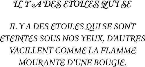
Above: Christian Schwartz, Farnham Display Regular Italic Swash (2004), published by Font Bureau, text from Rolling Stone issue no. 1000.
My first attempt at swash caps was released in 2004 as part of the Farnham family. A reinterpretation and expansion of punch-cutter Johann Fleischman’s eighteenth-century swashes, they worked well as initial caps, but when magazine designers used them in all caps they looked ridiculous. When drawing Luxury Text a couple of years later, I aimed to figure out a way to make swash all caps look reasonably good.
Above: Christian Schwartz, Luxury Text Italic (2006), published by House Industries; feature programming by Tal Leming; text from Anatole France, Le Jardin D’Epicure, 1895.
Antique maps gave a good starting point (incidentally, on closer inspection it seems that many of the swashes grew out of the need to hide engraving mistakes), and so did nineteenth-century Moderns, with sharp forms substituted for their ball terminals. A complex series of algorithms automatically balances swash substitution and attempts to tone down the flamboyance, making it easier for its users to look as if they have sophisticated tastes.
Christian Schwartz is the founder (with Paul Barnes) of Commercial Type.
Type Tuesday is our new weekly column on typography and type design, featuring a mixture of brand new articles and material from the extensive Eye archive. For more Type Tuesday articles, click here.
Eye is the world’s most beautiful and collectable graphic design journal, published quarterly for professional designers, students and anyone interested in critical, informed writing about graphic design and visual culture. It’s available from all good design bookshops and online at the Eye shop, where you can buy subscriptions, back issues and single copies of the latest issue. The latest issue is Eye 80.