
Tuesday, 6:50am
4 October 2011
Type Tuesday
Lust and likeability #5: Elettriche, an exercise in modularity

The Berlin-based Italian designer Alessio Leonardi is known for his whimsical cartoons and hand-drawn typefaces, but Elettriche (‘the electric ones’) shows a different aspect of his personality.
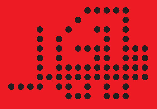
Built on the principle of modularity, the type is structured on a simple grid, using different kinds of modules, weights and styles to arrive at a staggering 648 fonts – not counting 272 pictogram fonts. With weight variations and options for different letters, the package contains 162,000 glyphs. Below, Eye’s informal jury have their say.
Mark Thomson
A great example of the super-family tendency, but this is not just straight interpolation – Elettriche is about different flavours as well as different forms. This is a full exploration of the capacity of small-grid modular types to express different feelings. Look at the emotional difference between the ‘decorative’ Quadro F, Shape F and the ‘formalist’ Base A, Shape A versions – all done with a few dots. Incredible – someone had to do it.
Petra Černe Oven
I would like to hear more about Leonardi’s explorations into the world of modularity in his daily life. The person who designs sets of 648 typefaces is bound to have more than 24 hours in their day. How is that possible? Elettriche has something of a cross-stitching mentality – you never know where the freedom of modularity will lead you, and although we’ve seen so many pixellated typefaces in the past twenty years, this one is as promising and satisfying as finding an awkward alphabet stitched to an old tablecloth at the flea market on Strasse des 17 Juni in Berlin.
John Belknap
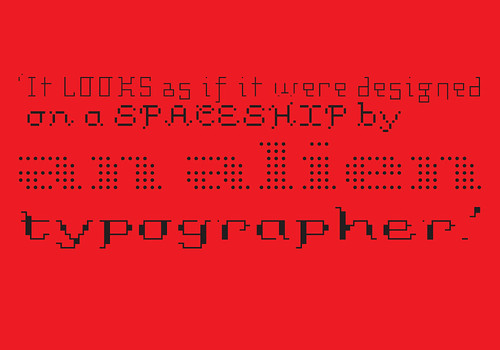
This is a labour of love by mad geek typographer Leonardi. Elettriche looks as if it were designed on a spaceship by an alien typographer who had been out there too long. Inspired by Licko’s Empire and the Bauhaus Shablonierschrift, he was driven to create the ultimate modular fonts series, where all the letters are set to a dot matrix grid. I can’t get my head around his complicated explanation of the options, but even to non-geeks it is obvious that this is a wonderfully creative system, where the designer has given you a ‘Lego set’ to build the fonts with. He’s so adept at modular drawing he could do the Mona Lisa with a few six point dots.
Deborah Littlejohn
Elettriche cannot be discussed without also considering the design experiments by Emigre’s Zuzana Licko, as confirmed by the majority of comments. One respondent said ‘Done ten times as good twenty years ago’. An overwhelming number of respondents rated Elettriche at the bottom of the likeability scale. The only four respondents to rate Elettriche in their top 50 per cent were students and part-time faculty. Though it is a nice idea to have a modular bitmap system with an interchangeable ‘kit of parts’, the proportions of it are just wrong. The icons are fun – more interesting than the typeface.
Jan Middendorp
Alessio Leonardi is a jester or, in Shakespearean terms, a fool: a comedian and a philosopher who likes to point out that the difference between so-called reality and so-called madness is often merely a question of perspective. So I’m not sure whether to take his Elettriche as a joke on the type community (the ultimate, semi-automated, ‘superfamily’), an obsessive tour-de-force or a serious attempt to create a useful design tool. A bit of all, I guess.
Type Tuesday is our weekly column on typography and type design, featuring a mixture of brand new articles and material from the extensive Eye archive. For more Type Tuesday articles, click here.
Lust and likeability was originally published in Eye 67, Spring 2008.
Eye is the world’s most beautiful and collectable graphic design journal, published quarterly for professional designers, students and anyone interested in critical, informed writing about graphic design and visual culture. It’s available from all good design bookshops and online at the Eye shop. For a taste of the new issue, see Eye before you buy on Issuu. Eye 80, Summer 2011, is out now. Eye 81 will be on press soon.