
Winter 1999
A design (to sign roads by)

As an exemplary rational design programme, the road signs of Jock Kinneir and Margaret Calvert demand careful study. Despite poor application, inconsistent additions and muddle over the past four decades, their robust, flexible system – with its humane typeface and quirky pictograms – still functions throughout the length and breadth of Britain
Some time in 1965 The New Traffic Signs, a Department of Transport leaflet, arrived at our house. Learning this new language of symbols, shapes and colours was exciting for a six-year-old. Trips by car henceforward became I-Spy journeys of trainspotting intensity. Twenty years or so later, I would learn that the signs were the work of Jock Kinneir and Margaret Calvert, whose graphic design amounted to a house style for Britain, characterised by the use of sans serif alphabets with careful and sparing use of colour and a great attention to detail.
The sign system for the national road network had its origins in the motorway signs tested on Britain’s first motorway, the Preston by-pass. Realising that these new high-speed roads would need something quite different from any British precedent, the government set up an advisory committee in 1957, chaired by Sir Colin Anderson, which took as reference signs for similar roads in the US and elsewhere in Europe. Practical research was carried out at the Road Research Laboratory in Slough and Jock Kinneir was asked to detail the committee’s broad recommendations. Margaret Calvert, an illustration student of Kinneir’s at Chelsea School of Art, joined as his assistant on the project.
The Preston by-pass, which opened the following year, was used to see what regulations this new class of road should have, and some provisional signs were erected there for testing. The system was essentially alphabetic, offering directional and distance information.
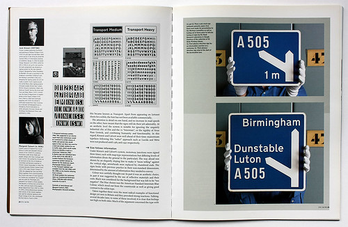
Following European and American practice, the committee wished to use upper and lower case type rather than the capitals used on Britain’s roads since 1933. [1] The German Din lettering was suggested but Kinneir rejected this on aesthetic grounds. Wanting a letterform with open counters and clear shapes he wrote his own specification. When he found that such a face did not exist, he and Calvert set about designing one themselves. When revised for the British road system this became known as Transport. Apart from appearing on Letraset sheets for a while, the font has not been available commercially.
The attention to detail on one hand, and no increase in road speeds on the other, have meant that the signs still do their job admirably. At an aesthetic level the system is notable for ignoring the ungainly industrial chic of Din and the US ‘Interstate’, or the rigidity of Neue Haas Grotesk, and combining humanity and functionality. In this regard, Kinneir and Calvert were well ahead of their time: mainstream typefaces following this ‘softer’ approach such as Lucida and Meta were not produced until 1985 and 1991 respectively.
First advance direction sign for an intermediate junction on a motorway. Courtesy of the collection of St Bride Printing Library.
Top: Spread from Eye 34 showing a road sign scale mock-up, 1963; pictogram drawings, 1963, of car and ‘flying motorbike’ by John Jamieson and children by Margaret Calvert; a photograph of the old system dated from an Act of 1944 in use on Essex Road; the prototype Preston by-pass signs in use, Design no. 129, published by The Design Council, September 1959; and the front cover of the first publication introducing the new signs prescribed by the Traffic Signs Regulations 1964 prepared by the Ministry of Transport and the Central Office of Information, 1965.
Size follows information
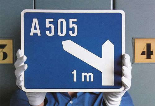
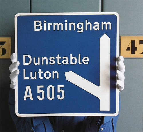
Under Kinneir and Calvert’s system, motorway junctions were signed three times, each with map-type representations but differing levels of information (from the general to the particular). The way ahead was shown by an elegantly sloping line to make it ‘more telling’ against the vertical edge, arrowheads were replaced by chamfered ends. The signs broke with previous practice in their non-standard dimensions, determined by the amount of information they needed to convey.
Colour was carefully thought out. In part it was an aesthetic choice, in part it was suggested by the use of reflective materials and their costs. Black was considered for the background but was felt to be ‘too negative’. The blue chosen was the American Standard Interstate Blue Colour, which stood out from the countryside as well as giving good contrast to the white type.
Taken together these were the most radical examples of functional design yet seen in Britain and they provoked strong reactions. Talking, several decades later, to some of those involved, it is clear that feelings ran high on both sides. Much of the argument concerned the type with its upper and lowercase setting. Sans serif offended people in a way that is difficult to comprehend 40 years later. A rash of letters appeared in The Times, and a discussion meeting organised by Design magazine explored the issues in detail. [2] David Kindersley, the calligrapher and carver, represented the ‘traditionalists’, and presented his own, all-capitals alphabet. Later this was tested against Transport but found to be far less of an improvement than he had claimed. [3] Even to the liberal eyes of 1999 his type still looks homespun and ugly.
The size of the signs was another cause for complaint. They were nearly three times larger than previous signs, in part due to the use of upper and lowercase instead of all capitals, and in part because of the requirements of reading 600 ft away.
Such criticisms do not feature in the Anderson report, which sets out clearly its goals and findings. It was a working party, with a constant cycle of test and evaluation. The signs were revised a year later for use on the new London-Yorkshire motorway, the M1. By the time the committee’s report was finished in December 1960, there had been eighteen months of practical experience at Preston and twelve months on the M1. That the signs were deemed a success can be seen by the fact that one year later parliament had appointed another committee, chaired by Sir Walter Worboys, to recommend signs for all Britain’s roads.
The road system
Creating signage for all classes of road in the country was a more complex task than the motorways, but many of the principles established could be applied, and a consistent system emerged. The signs were of two kinds: ‘regulatory’, which included mandatory, prohibitive and warning signs, and ‘informatory’ –principally directional signs.
For the former, British practice had always been at variance with continental Europe where the development of symbolic rather than literal signs had been carried since the 1931 Geneva Convention Concerning the Unification of Road Signals. In the early 1960s, Britain was applying for entry to the European Community (now the European Union) and the need for acceptance of an international standard figured in the decisions of the Worboys committee to base many of their designs on the later Geneva protocol of 1949. This described signs in their form – circular, triangular, etc. – and in their content, but not in the details of their drawing. The protocol was ignored only in a few cases.
The road signs, like the protocol, comprise a hybrid set: part iconic, part alphabetic and part symbolic. What ties them together and makes them distinctive is the quality of their drawing. Diagrammatic road layouts are ruthlessly concise, while the pictograms give both people and vehicles a personality that in no way detracts from their efficiency.
For directional signs, the protocol had no comprehensive instructions, so Kinneir devised a system based on the motorway signs. Green backgrounds with white type and yellow road numbers were used on primary routes. The green was a compromise between the bright green Kinneir had proposed and the dark green suggested by Sir Hugh Casson – ‘like the colour of old dinner jackets,’ Casson was quoted as saying. [4] White backgrounds with black type were used for other routes, with a heavy blue border for local destinations – a distinction dropped in 1994. The junction map presentation was made more explicit, with lines of differing thickness used to denote each road’s particular status. The elegant angles of the prototype Preston signs disappeared. The actual layout of these signs was not dictated: what was provided was a kit of parts and the instructions for use. The signs designed themselves according to these rules.
The typeface drawn up for the motorways was modified slightly and drawn in two weights: medium (for white and yellow type on the green and blue signs) and heavy (for black type on white). It was produced on tiles rather like the bodies of metal type. These butted up to each other and ensured correct spacing by the many different contractors who were then responsible for the signs’ production. The stroke widths of the cap ‘I’ in the size of type used were the determining factors governing the size of elements and the distance between them.
The report still impresses with its thoroughness and the scale of its implications. The twelve-strong committee met for a mere twenty days, discussing and assessing Kinneir’s designs, the test results from the Road Research Laboratory and the findings of the working party. Practical matters such as illumination, construction, maintenance, siting and clutter were all touched upon. They recommended implementation of the report within five years (three for primary route signage) at a cost of £22 million. It was approved by the minister of transport, Sir Ernest Marples, in December 1964.
Third advance direction sign sited at the start of the deceleration lane. This scale mock-up (artboard, gouache, paper, Cow Gum) was made for presentation to the Worboys committee as well as testing out of doors prior to full-size testing of signs by the Road Research Laboratory in Slough. Courtesy of the collection of St Bride Printing Library.
People
As with many innovative designs, part of the sign system’s success lay in the combination of people involved. A key figure was the chairman of the working party for the Worboys Committee, T. G. Usborne, head of the Traffic Signs Division at the ministry (and also a member of the Anderson committee in its final months). As an administrator, his influence was an important factor in carrying the whole process. The personality of Jock Kinneir was crucial, too. Designer David Jones, a junior in the studio at that time recalls: ‘Jock seemed very much the right person for the job. As an ex-Army officer, he got on with people at the ministry in a way which wouldn’t have been possible for, say, Fletcher Forbes Gill’.
Kinneir’s own recollections in the 1980s were slightly different: ‘… I was a consultant to the committee and not a member. Frequently I had to battle to get my views heard, and had running skirmishes with one chairman who had a habit of taking design decisions at home over supper with an architect friend and then telling me what to do.’ [5] In the studio, Margaret Calvert’s eye for detail was crucial in the drawing of the alphabets and the pictorial signs. Kinneir employed more staff as the pace of work increased. Apart from the rigours of testing the Transport alphabets and their spacing (‘a lot of squinting’), there was fun, too. Calvert remembers the individual designers responsible for certain signs: John Jamieson drew the car, ‘flying motorbike’ and train; Clare Theobald drew the sheep and falling rocks. Calvert herself drew the children and pedestrians.
Critique
The association of Kinneir and his studio with the Department of Transport lasted no longer than the report. (Even there, the smaller explanatory text plates were not designed by them). By the time The New Traffic Signs was issued in 1965, several signs had been altered. Such tinkering, not to mention much poor application of the designers’ system, has been part of the history of British road signs ever since.
Design tinkering can be seen in the Department of Transport’s subsequent attempts to be ‘helpful’. Two specific examples: the dramatic increase in the use of pictograms and the depiction of primary and non-primary routes on directional signs are noted in the illustrations. The design work has been done in-house and is characterised by poor detailing and muddled thinking. Too-often, the guidelines are simply ignored: a large proportion of signs do not meet the regulations.
The role of the road signage system within society has changed. In 1965, it could afford to inform. Today’s situation – faster cars, slower average speeds, too much car use – demands an increasingly large measure of control. British motorists have seen the emergence of special routes for pedestrians or cyclists, restrictions for different classes of vehicle, the increase of parking restrictions and the use of signs to direct cars where planners want them to go. These examples are a response to either a lack of infrastructure for the car, or successive governments’ refusal to restrict vehicle use.
Editing or limiting the information provided for road users does not appear to be an option at present. In any case, such ‘authorial’ control is impossible: responsibility for signing the different classes of roads is fragmented and shared between the Highways Agency, the local authorities, and the county and metropolitan councils.
The Department of the Environment, Transport & the Regions (as it is now known) is constantly reviewing the system. It has also digitised the Transport alphabets and all the symbols (a process made difficult by a lack of original artwork). Signs are being constantly evaluated so that significant improvements can be considered for inclusion in regulation revisions. New signs are also considered: some pictogram-type and some variations of existing models in response to new traffic management techniques. The next regulations (with dozens of new signs) are due to be issued in 2000.
At a purely visual level, it is clear that the department still believes in the Kinneir Calvert principles of layout, and that the system is robust and flexible enough to cater for most of the needs of today’s traffic. Yet the simplicity of that original system has been eroded by inconsistent additions and a plethora of pictograms of little or no use.
What the department has lost sight of is the philosophy at the heart of the design, that signs ‘should contain only essential information and their significance should be clear at a glance so that the driver’s attention is not distracted from the task of driving’. (Worboys, para 26 (c))
Yet as an example of a rational design programme applied without visual preconceptions, the Kinneir Calvert system should be required study material for the skin-deep Modernists of today: it is Modernist in broad terms but does not adhere to any dogma. There may be many inconsistencies and quirks, but it works.
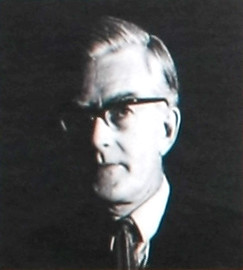
Jock Kinneir (1917-94)
Kinneir studied engraving, illustration and painting at Chelsea College of Art, 1935-39, and later lectured there. After active service in the Army, he joined the Central Office of Information working on exhibition design. In 1950 he joined Design Research Unit (DRU), which he left in 1956 to set up his own practice. An early assignment was designing a signing system for the new Gatwick Airport (designed by Yorke, Rosenberg & Mardall). He was a consultant to the Anderson committee (1958-62) and the Worboys committee (1961-63), designing the signing system for all UK roads, a system much copied around the world. Many other signing projects followed, notably British Rail (1964), British Airports Authority (1965), the National Health Service, the Army and Tyne and Wear Metro (1977). Kinneir was the head of department of graphic design at the Royal College of Art from 1964 to 1969 and continued teaching until 1974. He retired in 1979 and moved from Ham Common to a (second) self-designed house in Winderton, North Oxfordshire to write and paint. His book Words and Buildings (Architectural Press) was published in 1980.
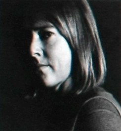
Margaret Calvert (b. 1936)
Calvert came to England from South Africa in 1950 and attended Chelsea School of Art (1954-57), studying illustration under Brian Robb and graphic design with Hans Schleger and Jock Kinneir. She worked for Kinneir as an assistant at the time of Anderson committee and became a partner in Kinneir Calvert Associates in 1964. The company became Kinneir Calvert Tuhill Ltd in 1970, later Kinneir Calvert. In 1980 she adapted her Tyne and Wear Metro typeface (first commissioned by the French new town of Saint Quentin- en-Yveline, but considered “too English” and not used) for Monotype, who released it as Calvert in three weights. She became a visiting tutor at the RCA in 1961, and was head of the graphic design department from 1987 to 1990. In 1992, a three-dimensional, stainless steel version of the Calvert typeface was used for external signing at the Royal College of Art. She contributed the font A26 to Fuse in 1994.
Spread from Eye 34 showing proposed motorway symbol, 1960; Gantry sign over individual lanes at the start of the A40 redrawn by Kinneir for the Anderson report; the Transport alphabet, available from the mid 1960s until the 1980s, as dry transfer lettering from Letraset; road numbers for motorway signs in Commercial Grotesque; and scale mock-ups for presentation to the Worboys committee.
With thanks to Margaret Calvert, Central Lettering Record, Richard Hollis and Christopher Wilson, David Jones, Eric Kindel, Robin Kinross, Conor Mangat, James Mosley and Nigel Roche of the St Bride Printing Library, Bride Lane, Fleet St, London EC4Y 8EE.
Footnotes
1. According to Design no. 152, August 1961, these were based on a design by Edward Johnston.
2. Design no. 129, 1959, pp. 28-32. Participants included, Kinneir; Kindersley; Sylvia Crowe, landscape architect; Noel Carrington, typographer and designer; E.C. Poulton of the Applied Psychology Research Unit, Cambridge; G. Grime of the Road Research Labroatory; G. S. Campbell of Franco Traffic Signs; Rolls Royces’ deputy chairman Whitney Straight; Brooke Crutchley, a Cambridge printer; and C.H. Wykes from the Ministry of Transport.
3. Design 152, pp.56-61.
4. Design no. 178, 1963, pp. 28-32.
5. From a lecture transcript (early 1980s) supplied by Margaret Calvert to the author. Original publication unknown.
Phil Baines, designer, tutor: typography, Central Saint Martins, London
First published in Eye no. 34 vol. 9 1999

Eye is the world’s most beautiful and collectable graphic design journal, published for professional designers, students and anyone interested in critical, informed writing about graphic design and visual culture. It is available from all good design bookshops and online at the Eye shop, where you can buy subscriptions and single issues.