
Spring 2025
Dafi Kühne comes to town
A grey London February was enlivened by a visit from the Swiss letterpress innovator. Report: Richard Ardagh [EXTRACT]
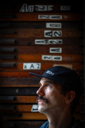
Dafi Kühne is a Swiss designer whose radical use of letterpress techniques to produce large typographic posters inspires a cult-like following. He is someone who sets his own standards, resolutely working towards his own measure of perfection, even if an edition of hundreds of posters requires as many as 25 passes through his enormous Grafix GX4N printing press. Working from a well equipped studio outside Zürich, all of the physical (and often experimental) components that make the production of a poster design possible are fabricated in-house – no PDF ever leaves his studio as a final product. But although he is determined to make use of traditional methods, there is nothing sentimental about the appearance of his work, which is all the more arresting when seen in person.
Portrait by Philip Sayer. Top.
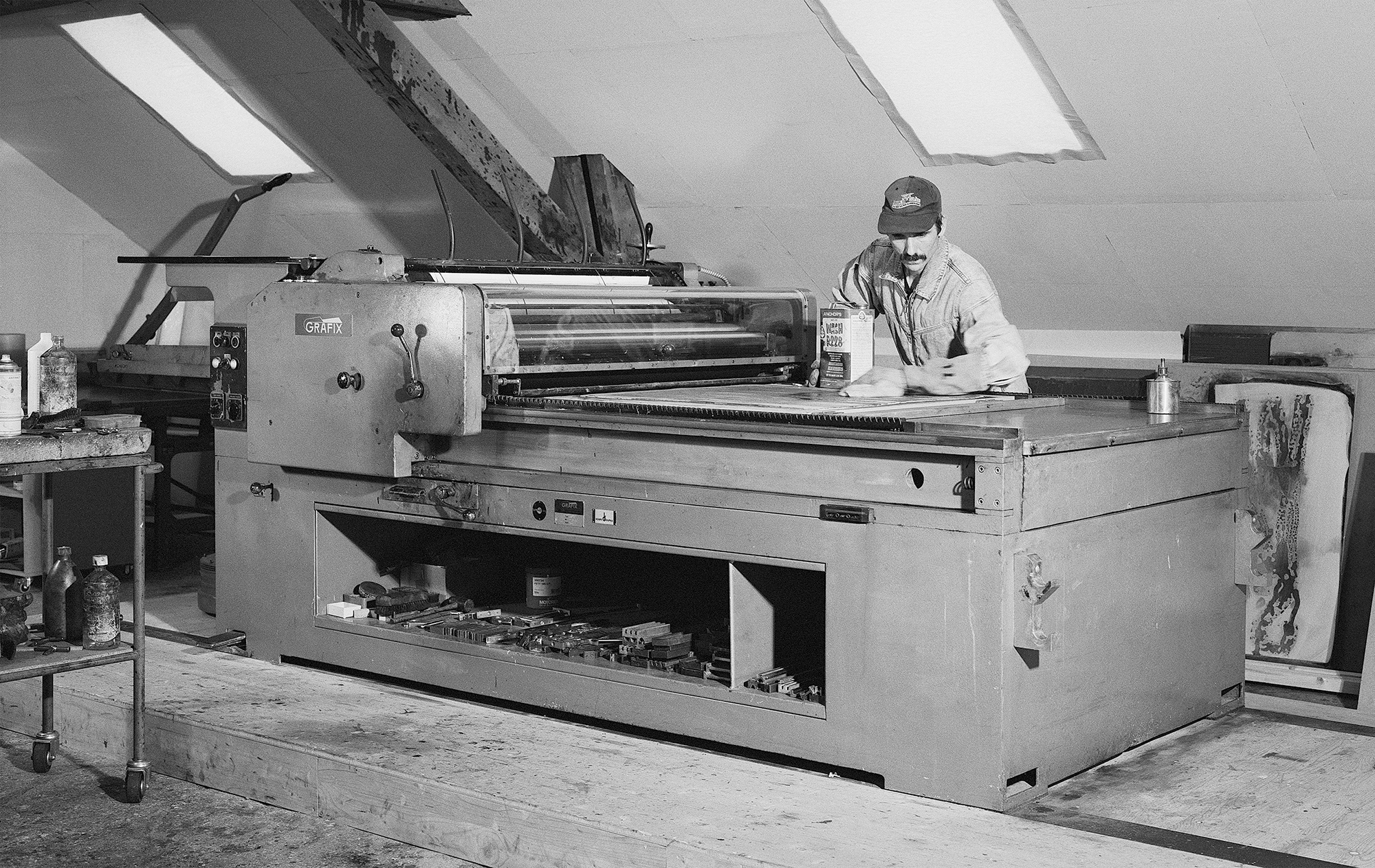
Dafi
Kühne pictured in his studio in Näfels, Switzerland. The 1960s
cylinder proofing press is a Grafix GX4N, manufactured by Haas &
Kellhofer Maschinenfabrik in Singen, Germany. Photograph by Peter
Hauser, 2024.
As those who have watched episodes of The Dafi Kühne Printing Show will know, Kühne is also an entertaining presenter. ‘There are no short-cuts in analogue life,’ he tells the sold-out audience of his Type Tuesday talk at St Bride Foundation …
Richard Ardagh, designer, London
Read the full version in Eye no. 108 vol. 27, 2025
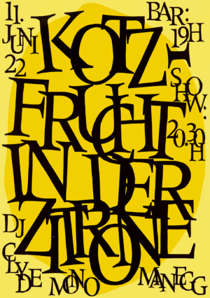
Kotzfrucht in der Zitrone, 2022. Printed in three passes in an edition of 100 70×100cm posters, using hand-cut linoleum, photopolymer plate and a tiny metal type signature, barely visible (running vertically along the ‘E’ of ‘ZITRONE’). The band’s name means ‘vomit fruit’ while the venue’s name means ‘lemon’, hence the colour choice. Paper: Forever Color, gelb, 200g/m2.
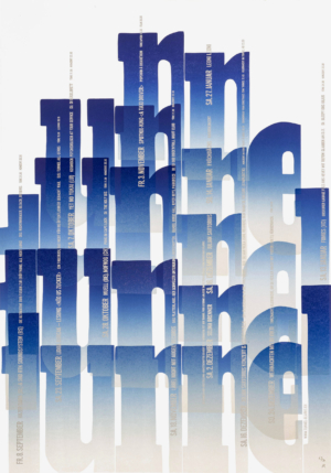
Tunnel
III,
2023, large version. Printed in six passes in an edition of 90
70×100cm posters, using movable hand-cut linoleum letters and Ludlow
slugs. This is one of a series promoting the Tunnel-Glarus club in east central Switzerland. Kühne used the same
linocut blocks to print both the large posters and a bigger run
of two small (35×50cm) posters.
Paper:
Fedrigoni Materica Gesso, 250g/m2
and 120g/m2
for the smaller posters.
Eye is the world’s most beautiful and collectable graphic design journal, published for professional designers, students and anyone interested in critical, informed writing about graphic design and visual culture. It is available from all good design bookshops and online at the Eye shop, where you can buy subscriptions and single issues.