Spring 2011
In the thick of it
Morag Myerscough puts an eclectic graphic sensibility into public spaces, with colour, pattern and big type

Walk into the bright, airy atrium of the Kentish Town Health Centre in north London and you are likely to feel better, whatever the reason for your visit. Behind the reception desk, KTHC’s metre-high initials, repeated and overlapped, seem to urge you to ‘KICK’ whatever it is that ails you – the habit, the health problem, the hypochondria.
The health centre’s identity, by Morag Myerscough, bears little resemblance to the dinky illustrations or tentative typography of the average health service branding. It is, however, in complete harmony with the building, by architects Allford Hall Monaghan Morris [AHMM], which has been festooned with awards nominations since it was completed in 2008. (It won Building magazine’s ‘Public Building Project of the Year’ and an RIBA [Royal Institute of British Architects] Award for Architecture.) The centre may have the functional gleam of a Modernist box, but it is one in which designers and architects have collaborated to splash its white surfaces with colour and light.
Morag Myerscough’s Studio Myerscough is one of the UK’s more prolific studios, with a consistent stream of work for exhibitions, schools, installations, wayfinding projects and advertising, largely but not exclusively 3D and with a strong graphic signature driven by a feeling for type and lettering. Yet the studio is neither a big team nor a partnership, but the initiative of one woman, Morag Myerscough, with two assistants and a loose alliance of collaborators. ‘Some people don’t even know that Morag is a woman’s name,’ she says.
‘Urban Africa’ exhibition, Design Museum, 2010. Exhibition design by David Adjaye and Morag Myerscough / Studio Myerscough. Curator: Gemma Curtin. Photograph: Luke Hayes.
Top: Morag Myerscough and Lemmy, her West Highland terrier, in her East London studio with a few of her collection of 105 chairs, March 2011. ‘Each one of my chairs tells a story,’ says Myerscough. Portrait by Maria Spann.
Her work is characterised by strong colour, big type, stripes, spots and puzzle-like arrangements of geometrical elements, often hand-painted, assembled with an affinity for scale and drama. ‘I like interpreting spaces, really,’ she says, ‘putting narrative into spaces that don’t exist. I like stories and things.
‘And I don’t like just making pictures … or people just looking at things. There was no outlet for me to do any of those things in the past. That’s what makes now an exciting moment for me: you don’t have to be an artist to express yourself.’
Over the past two decades she has forged relationships with architects that enable her to grasp the issues and problems associated with spatial commissions in the early stages. Her aim is to have a bigger impact on the result and transcend the limitations of what she exasperatedly calls the ‘graphic opportunity’ typically doled out to designers.
Though Myerscough has never been short of work or acclaim (KTCH was just one of two recent collaborations nominated for the RIBA Stirling Prize), she identifies certain years as turning points: 1993, when she founded the studio; 2002, when she started ‘Her House’, an exhibition of products; and 2004, when she designed the Archigram exhibition at the Design Museum and decided to buy her present work-live space in East London, to which she moved in 2005. ‘Sometimes you have to have these awakenings,’ she says. ‘Every year I re-evaluate what I do.’ 2011, with several big exhibitions and public space installations under way, plus her first big commission (still under wraps) for a client in the United States, looks like being a bumper year. ‘Every time the phone rings, it’s a new job,’ she says.
Inspired by the stage
Myerscough was born in Holloway, North London, in 1963, the middle child of three sisters in what she calls a ‘bohemian’ household. Her mother, Betty, is a textiles designer who also taught at Chelsea; and her late father Henry (whose own father was a self-taught violinist and circus performer) was a classical musician who played viola with the Fidelio Quartet, as well as recording on movie soundtracks and pop music sessions such as ‘Martha My Dear’ on the Beatles’ ‘White Album’.
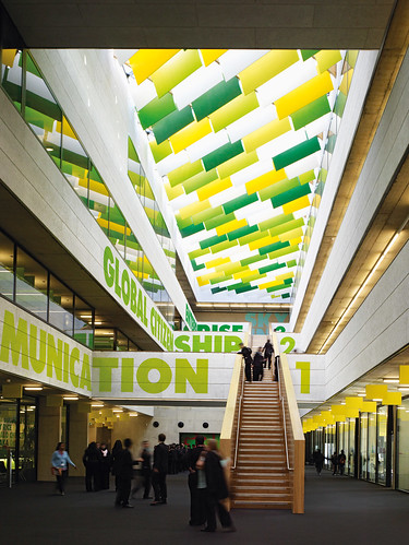
Westminster Academy, Harrow Road, London. The words ‘Communication, Global Citizenship, Enterprise’ denote year groups covered within The Academy’s specialisms: ‘Global Business and Enterprise’. Architects: Allford Hall Monaghan Morris [AHMM]. Environmental graphics and wayfinding: Morag Myerscough / Studio Myerscough. Photographs: Matt Chisnall and Timothy Soar.
At Highbury school she did well at art, designing the school’s badge. She did a foundation year and then a graphic design degree at St Martin’s (now Central Saint Martins), where she found inspiration in teachers such as Geoff Fowle and the late Robin Bagihole. ‘A lot of people didn’t “get” Geoff, but he was the best person St Martin’s ever had,’ says Myerscough. ‘He just made me think.’ Bagihole, she says, was the first tutor to see potential in her work.
Then followed two years at the RCA (Royal College of Art), joining while Gert Dumbar was head of graphic design. It wasn’t always an easy time: ‘I often hid when the tutors did their rounds as I was very engrossed in my own thing and my own opinions.’
Inspired by an exhibition of David Hockney’s stage design – and recoiling from the idea that a career in graphic design might mean a life making ‘hankie boxes’ – Myerscough based her final RCA project on Benjamin Britten’s opera The Turn of the Screw, with a typographical and illustrative interpretation of the libretto and designs for the stage set.
The project was a reaction to what she saw as a limited, 1980s perception of the graphic designer’s role. ‘I didn’t want to be the person who just did the cover of the programme … I wanted to be involved in the whole thing.’
She still emphasises the importance of making physical models for three-dimensional projects. ‘What’s so brilliant is that they have these little model people in there and the clients spend the whole of the meeting looking inside it. So before it’s completed they know exactly what it’s going to be like.’
Her bright, white-painted London studio has several scale models of work in progress: the entrance hall for The Grove, a postmodern building in London’s Marylebone Road, due for completion in 2012; and the ‘Home of Metal’ show due to open at Birmingham Museum this summer (18 June-25 September, 2011), which is about the region’s industrial legacy and its role in the birth and growth of the heavy metal music genre.
After graduating from the RCA in 1988, Myerscough quickly developed a double life, working for major agencies during the day and doing freelance illustration by night.
During two years’ employment at Lamb & Shirley, she worked on the Next Directory, which then had a print run of two million. This proved to be a valuable experience. ‘They just had folders and everything was organised … I watched and learned how to run a studio.’
Tim Lamb gave her lots of responsibility, sending her out to Italy to pass pages. When Myerscough left Lamb & Shirley in 1990, she went to Milan for six months, working at Studio De Lucchi and mixing with the fashion crowd, including the late Alexander McQueen. ‘I went to Italy because I was obsessed by Memphis when I was in college,’ she says. ‘What I loved about Memphis was that they implied you could make furniture, you could do textiles, you could do anything.’
A taste for interpretation
The following year, with savings in the bank from the freelance work, she founded Myerscough Chipchase with Jane Chipchase. This was a time when several RCA graduates – GTF, Why Not Associates, Fuel – had started their own businesses. ‘I thought, well, there’s all the boys together having a great time and drinking beers, you know, so I’m going to set up my own studio.’ The new shop was soon involved in work with architects, including Paul Monaghan of AHMM and the ‘Under 40K’ exhibition at the RIBA. ‘We sort of infiltrated the architecture scene.’
When Chipchase left for Pentagram (and then a family), Myerscough set up her own studio in the spring of 1993. The ‘Familiarity’ hoarding commission from Design Week, in collaboration with the late photographer Trevor Key, demonstrated her ability to create a colourful splash while collaborating across disciplines. Also that year, her temporary installation for London’s Science Museum, 230 metres of colourful banners, gave her a taste for exhibition work and interpretation. The seeds for her current practice and ambitions were sown early on.
In the subsequent eighteen years, Studio Myerscough has intermittently expanded to six or eight staff, including a senior designer, or contracted to just Myerscough herself, according to the scale of projects in train, yet she has hardly paused for breath.
Currently she and her two assistants, Holly May Mahoney and Vilma Jaruševic, are based in a 4000 sq ft East London gallery and studio space she owns. When she first saw the property it was empty, boarded up and covered in graffiti, but she decided to buy it within minutes: ‘I walked into this L-shaped room and said “I’m going to get it.” ’ Her living quarters are upstairs, so there are days when she hardly leaves the building, except to take Lemmy, her West Highland terrier, for a walk. She grows tomatoes on her roof terrace.
The minimal personnel does not appear to limit her scale of operations, however. She often works in collaboration with Supergroup, a loose network of divergent practitioners founded in 2010.
‘I always said I was going to have a studio that mixed lots of different people together, and it’s taken me years, but Supergroup is finally what I imagined I was going to have when I started,’ Myerscough explains, ‘But it’s more of a virtual group.’ [See supergrouplondon.co.uk].
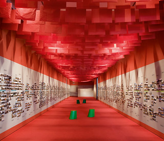
The other members are ex-Architects’ Journal editor Isabel Allen (‘storyteller’), Claire Catterall (‘matchmaker’), publicist Martyn Evans and artist Luke Morgan. The sixth member, until his death last year (aged 47) was architect Gerrard O’Carroll, who worked with Myerscough and Catterall on the RCA ‘Show’ of 2007 – technically a Supergroup project ahead of its formation.Morgan (also her partner) is her most regular collaborator. It was he who designed and built the much-loved ‘Elvis Shoe Super Loo’ as part of her 2008 Deptford Project café / gallery, and it is a matter of jokey irritation to Myerscough that his loo has outlasted her carriage conversion and garden.
Another project at the planning stage, for the Graphic Design Museum in Breda, Holland, is a collaboration with Catterall.
Pick up a pair of scissors
Myerscough cites the ‘Her House’ exhibition [herhousegallery.com], held initially at her former house in Clerkenwell, as a moment of liberation, an occasion that prompted an outpouring of personal design objects: a lamp made of surgical tubing, dinner plates decorated with high-heeled shoes, and so on. ‘Why didn’t I express myself earlier?’ she asks rhetorically, gesturing at a sequence of increasingly outrageous items (including a wooden bird box advertised with the strapline: ‘Great tits, nice box’). The idea of making things and selling them was there when she was nine, she says: ‘I belonged to the “young embroiders”, and I had a piece of work in the Commonwealth Institute and put a price on it: I always wanted to sell things.’
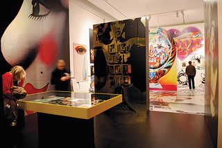
‘Alan Aldridge, The Man With Kaleiscope Eyes’, Design Museum, London, 2008. Exhibition design: Morag Myerscough / Studio Myerscough. Curator: Nina Due. Photographs: Luke Hayes and Adam Laycock.
After nearly a decade as a successful graphic design practice, she had begun to feel ‘restricted being in a two-dimensional environment’. The 2002 ‘Her House’ experience soon informed other projects, perhaps the most significant of which was the Design Museum’s Archigram show in 2004. Working with the survivors of that highly influential architectural team was, she says, a bit like working with the Rolling Stones.
Some of them were initially suspicious of entrusting their influential legacy to Myerscough. Yet her eclectic methods made perfect sense of this potentially confusing collection of plans, models, manifestos and broadsheets. Many of Archigram’s projects were unbuilt, so the raw materials were closer to graphic design than more typical architectural exhibitions. Myerscough’s exhibition design included tear-off sheets, stencils and captions stapled on to the walls. ‘Sometimes you forget you can get off your arse, pick up a pair of scissors and make something,’ she says.
Soon afterwards, Archigram’s Peter Cook invited Myerscough to ‘dress the old lady’, and design the British Pavilion for the 2004 Venice Biennale. She has also worked closely with architects such as Crab Studio, Foreign Office Architects, OMA architects and Herzog De Meuron architects, striking up a particularly fruitful partnership with AHMM for projects such as the aforementioned KTHC and Westminster Academy, a 1175-pupil school on an awkward site in London’s Harrow Road.
Myerscough’s brief was to add narrative to the building, emphasising the academy’s ambitions – ‘Global business and enterprise’ for its pupils. Myerscough used colour extensively on the elevations as ‘a reaction to the drab quality of the area (nowhere near the central, tourist-friendly area of Westminster).
Another AHMM project, Kirk Balk School in Hoyland, Barnsley, is nearing completion: Myerscough’s identity and decorative panels use pattern-based lettering.
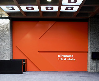
Since then, there have been wayfinding graphics – with big type and even bigger numerals – for the Barbican Centre (with Cartlidge Levene), the Tea Building studio complex and the LCC (London College of Communication), all in London.
Wayfinding system for Barbican Centre, London, completed in 2007. Architects: Allford Hall Monaghan Morris [AHMM]. Design: Studio Myerscough & Cartlidge Levene.
Her exhibition design has ranged from cultural projects such as the Design Museum’s ‘Urban Africa’ and Alan Aldridge shows (see Eye 69 and 70), to shows such as ‘Formula 1’ (about the celebrated car race) and ‘Matthew Boulton: Selling what all the World Desires’, a historical profile of the Birmingham entrepreneur. She erected Boulton’s initials as a ‘blingy’ pair of Baskerville characters (Boulton was a friend of John Baskerville).
Art, architecture, product design, experience design – Myerscough sails happily through all these disciplines while resolutely remaining a graphic designer. But is this still the best term for what she does? She considers the question: ‘What’s been interesting about graphics is that although all the typesetters went, the book-binders went, and the printers are going, graphic designers have always managed to keep themselves in a very strong position. Now that is changing. It’s a bit like a dustman becoming a cleansing artist, or libraries becoming learning centres, but if you reinvent the concept of “library”, what is wrong with the name still being library?’
She notes that what used to define a graphic designer was often a flat, typographic item: ‘If you did a poster that’s who you were. But it’s not the object or the thing, it’s the understanding, knowing the nuances of the different shapes and letters and how they read or don’t read. The type is the thing and that’s a big part of being a graphic designer. That will go on forever.’
Reflecting on her career, she says: ‘I’ve always felt I was a slow starter and so I only feel now I can see what I’m doing. I never wanted to be a musician like my Dad because I didn’t like practising. But I actually do like setting a bit of type or even justifying type because for me that’s sort of practising.’
First published in Eye no. 79 vol. 20, 2011
Eye is the world’s most beautiful and collectable graphic design journal, published quarterly for professional designers, students and anyone interested in critical, informed writing about graphic design and visual culture. It is available from all good design bookshops and online at the Eye shop, where you can buy subscriptions and single issues.