
Spring 2023
John Randle and his 26 soldiers of lead

As Matrix comes to a full stop, its doughty founder talks to Eye. Photographs by Philip Sayer
John Randle, publisher and printer of Matrix, photographed at the Whittington Press with the 1848 Columbian hand press on which they printed Whittington’s first book, Richard Kennedy’s A Boy at the Hogarth Press in 1971.
First published in 1981, Matrix is unique, writes Simon Esterson. The product of John Randle’s publishing enthusiasms and printing skills, 36 issues have emerged from his and Rosalind Randle’s Whittington Press print shop just outside Cheltenham in the Cotswolds area of England. But now Matrix has run its natural course and there will be no issue 37.
Typeset in metal on the Whittington’s Monotype keyboards and casters and printed letterpress on its Wharfedale and Heidelberg presses, Matrix combines John Randle’s passions for form and content in a physical object. Book-like in its single column layout, but with specially printed sections bound in, pictures tipped (stuck) in and folded-down posters exploding out of the restrained format, Matrix has a look and binding scheme like no other publication.
Edited and designed by Randle and mostly set in his favourite Caslon font, its articles and images reflect his love of the old analogue worlds of book publishing, illustration and letterpress printing and the people that inhabited them. The names listed on the front covers echo with his interest in art (Edward Bawden, Lee Miller, Henri Matisse), design, papermaking and the early twentieth-century renaissance of fine printing: Curwen Press, Rudolf Koch and Jan Tschichold. Contemporary letterpress isn’t ignored, with Nick Loaring’s letterpress experiments and Catherine Dixon writing about Gráfica Fidalgo in São Paulo. A reviews section keeps up an opinionated commentary on the kind of books Matrix readers pore over.
Yet,
if Matrix
is a niche publication, it is one that is international in its reach
and, with editions nearly sold out before publication to subscribers
at £100 a copy, a publishing success story. It sits alongside the
Press’s output of limited-edition illustrated hardbacks, titles
like Venice,
John Craig’s book of wood engravings.
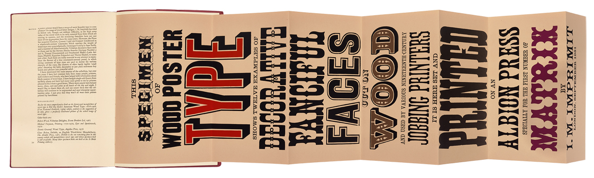
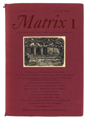
Matrix 1. Autumn 1981. Bound vertically into the first issue and folded down to fit inside, this specimen of wood poster type was printed letterpress by Ian Mortimer. It folds out to 950mm tall.
Eye: Do you like Matrix to be called a magazine or a book? How do you think of it?
John Randle: I think we call it a review. Ever since number one we have printed under the title ‘a review for printers and bibliophiles’. That seems to describe it pretty accurately over a 40-year period. We’ve never deviated very much from that.
Front cover of Matrix 1. Autumn 1981. Print run: 350 copies. The cover is printed letterpress on tinted paper, while the wood engraving of the Whittington Press buildings by Miriam Macgregor is printed on cream paper and tipped on. Page size: 200 × 290mm. Inside Matrix, the letterpress text and images are printed on Heritage Laid and Zerkall Halbmatt papers.
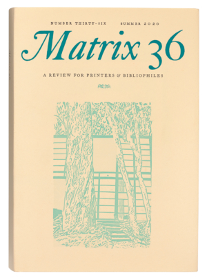
Here’s number 1 and 40 years later here’s 36. The only revolutionary change was this horizontal rule … I thought it wasn’t quite right so I increased that from a 3pt rule to a 6pt rule. The ‘and’ in the subtitle has changed to an ampersand, but that’s about it. Things have hardly changed.
Dust
jacket of Matrix
36, Summer 2020, the final issue of the much loved ‘review for
printers & bibliophiles’. Print run: 720 copies. Linocut of
the Eames House, California by Hannah Cousins. Monotype text types
used include Caslon, Bembo, Scotch Roman, Walbaum and Univers Light.
But success has changed it: the number of pages, the number of copies you’re printing have completely changed. Issue 1 has 72 pages and you printed 350 copies. Issue 36 is 200 pages and you printed 720 copies. And in production terms, you have multiple tip-ins and extras like this huge poster folded in. I’m not aware of another publication that has this quantity of special elements. And there are also parts printed litho and digitally.
The format provided a grid on which we could hang everything. It’s like a stage set. The measure has never changed. The margins are the same. You’ve got the basic stage set with the bits at the side and the back, and then you have fun with it.
I
love all this stuff. You see this poster: it’s been pinned to the
wall, behind the Heidelberg, since about 1990. So we facsimiled it.
An insect ate a hole through it. I got them to print the back. And
then we made the insect hole. I quite enjoy all this stupidity!
Randle’s Whittington Press is based in a much-extended former gardener’s cottage. Matrix is printed here on the Press’s Wharfedale and Heidelberg letterpress machines and typeset in metal on its Monotype system.
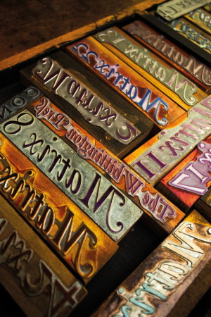
Inside the single-storey Press building, a cottage in the grounds of Whittington Court, metal type is in cases ready for handsetting.
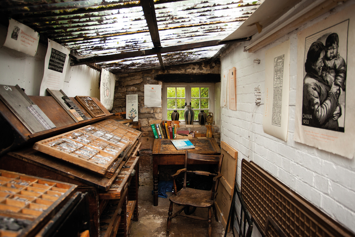
Letterpress line blocks for Matrix mastheads at the Whittington Press. Set in Caslon, John Randle’s favourite font.
How much of your year did Matrix take up?
You never stop thinking about it. All the pages are Monotype set. It takes a few months just to keyboard it, cast it, proof it, correct it. Then we send it out to the contributors. More corrections. The worst offenders for corrections were the printers who knew the work involved. To change a comma in a line of metal type can take ten or fifteen minutes.
Who are your subscribers?
I
worked it out at around the time of issue 10. A third of the
subscribers were in the US, a third in the UK and a third in the rest
of the world, largely the old Commonwealth like Australia and New
Zealand. A few in Europe, but only one in France, which always
disappointed me bitterly because Matisse is our god. The French
printers are technically pretty dreadful, but there’s something
magical about the way they use typefaces like Cochin, it’s so
inspirational.
I’ve always thought the French graphic design tradition was very separate from the rest of Europe or America.
Do you know that French magazine Arts et Métiers Graphiques? That to me is worth a thousand Fleurons or Signatures. I always found things like Signature slightly dull. They took themselves and Stanley Morison pretty seriously. But they were pioneers: Morison left behind this incredible legacy of Monotype faces that we have been enjoying ever since. In fact, in our Monotype department I think we have the biggest selection of Monotype matrices certainly in this country and possibly in the world. I started collecting in the early 1980s when all the little type foundries were going out of business. I thought, if we’re going to carry on printing from type, we need to start making the type ourselves. In those days you could buy a Monotype caster for £30. If the pot was full of lead it was £50. I dashed around and got the hardware: the keyboards and the casters. The software is the matrices and, because I was using them when I worked in publishing, I knew the printers who had the most interesting matrices. All the Oxford University Press Monotype matrices came down here when they stopped typesetting in metal.
When did the printing thing start for you?
I
started printing when I was fourteen. I was at boarding school and
bored out of my mind. It was raining and I saw on the noticeboard:
‘press recruiting, come up and have a look’. There was a man
called Edward Walters who I think had learned from Eric Gill at
Ditchling. He ran the school press in the late 1930s and through the
40s. It was just left to the boys to get on with. I knew in an
instant that was all I ever wanted to do, so instead of going off to
university, I wrote to the London School of Printing and said, ‘Would
you have me?’. So in 1964 I started a three-year course in printing
administration. It was really designed for the sons of master
printers. It gave me a good grounding in how machines worked, but I
soon knew the last thing I wanted to do was go near the British
printing industry. Printers just got their arses kicked by the
publishers. I knew which side of the kicking I wanted to be.
So you got a job in publishing?
I got a job with a little firm called Ernest Benn. Benn Brothers were one of the biggest publishers of trade magazines, based in Fleet Street. All the most boring things on earth like The Chemical Age and Timber Trades Journal. I worked initially on Printing Trades Journal. It gave me a huge taste for journalism. Writing something and seeing it on the magazine stalls the following Wednesday gets you. Ernest Benn, who published books, was the respectable bit. We were on the same floor as the chairman: we had wood-panelled offices and carpets. It taught me that if you are going to keep alive financially you need a journal.
My first love was letterpress. Then this taste for journalism at Benn’s. Every month I put £10 into my escape fund. I had a great yen to go to India. Both my parents were born in India. I read A Short Walk in the Hindu Kush. I bought a Land Rover and we drove; it took about six months. That was a hiatus: I’d made this break from Benn’s and all the time I was driving I was planning the press – ‘I’m going to have Caslon … 12pt? 18pt?’
I came back and remembered this disused gardener’s cottage here at Whittington Court where I had stayed as a boy. I wrote to Stephanie Lawrence, the owner and she said ‘OK’.
I
saw myself as a publisher rather than a printer. I was always full of
ideas for books. Rose [Rosalind Randle] has been a key element of the
Whittington Press since it began. She helped print our first book A
Boy at the Hogarth Press on
the Columbian hand press in the winter of 1971. This put her off
printing for life, but she loved the publishing side of the business,
which she could do from home, especially when there were children
around. This left me free to concentrate on the ems and ens at
Whittington, a mile down the road. Fifty years later, our son Patrick
is still here working as Nomad Letterpress and printing on the
Columbian, and on the speedier Heidelberg and Wharfedale cylinder
presses.
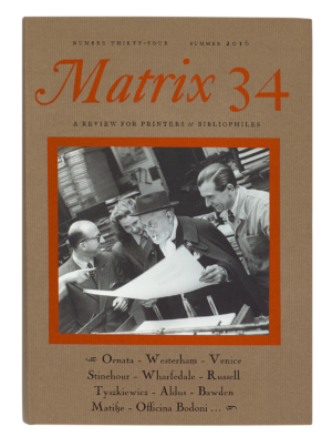
Cover
of Matrix
34. Summer 2016. Tipped-on photograph by Ina Bandy of Henri Matisse
‘admiring a sheet’ at the printers. Articles include Eva Svensson
on the Westerham Press.
How did Matrix start?
It started because I had some typescripts, none of which would quite make a book, but all of which I really wanted to see in print. Paul Morgan on the diary of a press man at the Shakespeare Head Press; Brocard Sewell’s reminiscences of St Dominic’s Press and my great hero Hilary Pepler. By putting them together and asking a few friends to write this, that and tuther it made up Matrix no. 1. All my enthusiasms and skills came together. We could do the printing here. We had just bought the Monotype so we could set the type ourselves. I found a retired caster operator called George Wiggle sitting on a park bench in Cheltenham bored out of his mind, and then his friend Basil came and did the keyboarding in the morning and George cast it in the afternoon. We were our own bosses.
The
only way of preserving this stuff is to use it. We now have Neil
Winter running the Monotype (see ‘Machine and man’ in Eye
84). We are so lucky we’ve never had to move. Printing machinery
doesn’t like being moved, it’s very heavy but it’s also very
delicate.
Did you make careful financial calculations before starting Matrix?
It’s gut instinct. But we were so lucky. Thanks to Stephanie I had this shed where I could dream out my dreams and fiddle around. There was always this excitement commuting down on a Friday to see how the building work was going. During the week in London I designed and produced Heinemann’s science list. Everybody was throwing their letterpress machinery out so I could get presses. I love the pretty bits, the pull-outs and tip-ins, but my top priority with Matrix is recording things while people are still around, like the work of the printer Bernard Roberts. Academic printing history bores me, but I love getting people who knew people when they were still around. Somebody who knew Eric Gill or Edward Johnston. To get all that recorded before they pop off. Printers are often more interesting than the stuff they print. I wanted to get this stuff down: it’s a resource for the future. I have a low boredom threshold so I try to make it entertaining: you’ve got to engage the reader. Not have 50 footnotes. I only ever ask people I have an empathy with to contribute. The ideas for the articles always come from me. I’m in a fortunate position of knowing all the main letterpress printers worldwide. We travelled a lot in America. I admire the US private press movement … Vance Gerry and The Weather Bird Press in California. In New York, Barbara Henry. Then there’s a gang of them in the Midwest. We used to go once or twice a year. There’s a tremendous amount of letterpress activity in America: they’ve got the funds.
The way to get the flavour of a printer is get them to print a four-page insert for Matrix. The tactility of their paper choice, the typefaces, the smell of ink. We always get them to print it. I don’t care whether it’s well or badly printed: it’s got their personal flavour.
We
have used the same binders right through: The Fine Bindery in
Wellingborough. It’s a bit of a challenge to put Matrix
together. I wanted Matrix
printed letterpress on a rough paper so any illustrations would have
to be tipped or folded in.
But you’re not a letterpress Luddite?
I
think digital printing is one of the best things that happened to the
private press. Short runs, no problem. Quality is of a level
collotype used to be.
Behind the restrained format it’s a very successful venture.
It’s kept us afloat financially. We were charging nearly £100 a copy. They are all out of print now. It costs a lot to produce and we need to shift the whole printing. Matrix has accounted for half our annual turnover. The Press is always on a bit of a knife-edge, but the great thing is to ignore that and carry on and things have a way of sorting themselves out. But I’ve been doing it for 50 years and I feel it’s time for a change. Two hundred books published. Thirty-six issues of Matrix. I will admit I haven’t got the physical and mental energy I had five years ago. It’s called growing old.
Simon Esterson, art director of Eye, London
First published in Eye no. 104 vol. 26, 2023
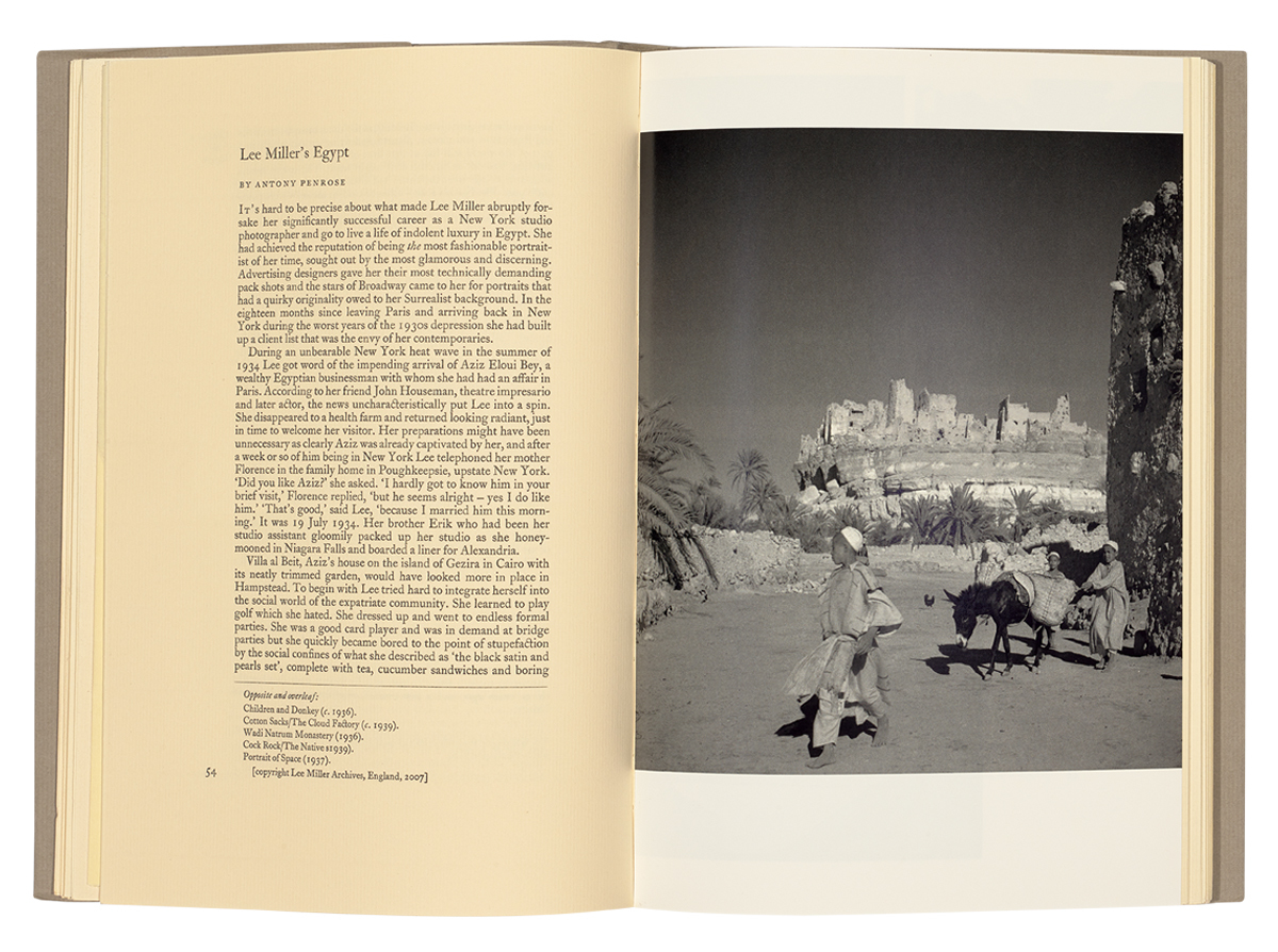
Matrix
27. Photograph of Egypt by Lee Miller. Photographs are printed with
tritone offset lithography by (among others) CTD Printers on whiter
matt art paper and bound in.
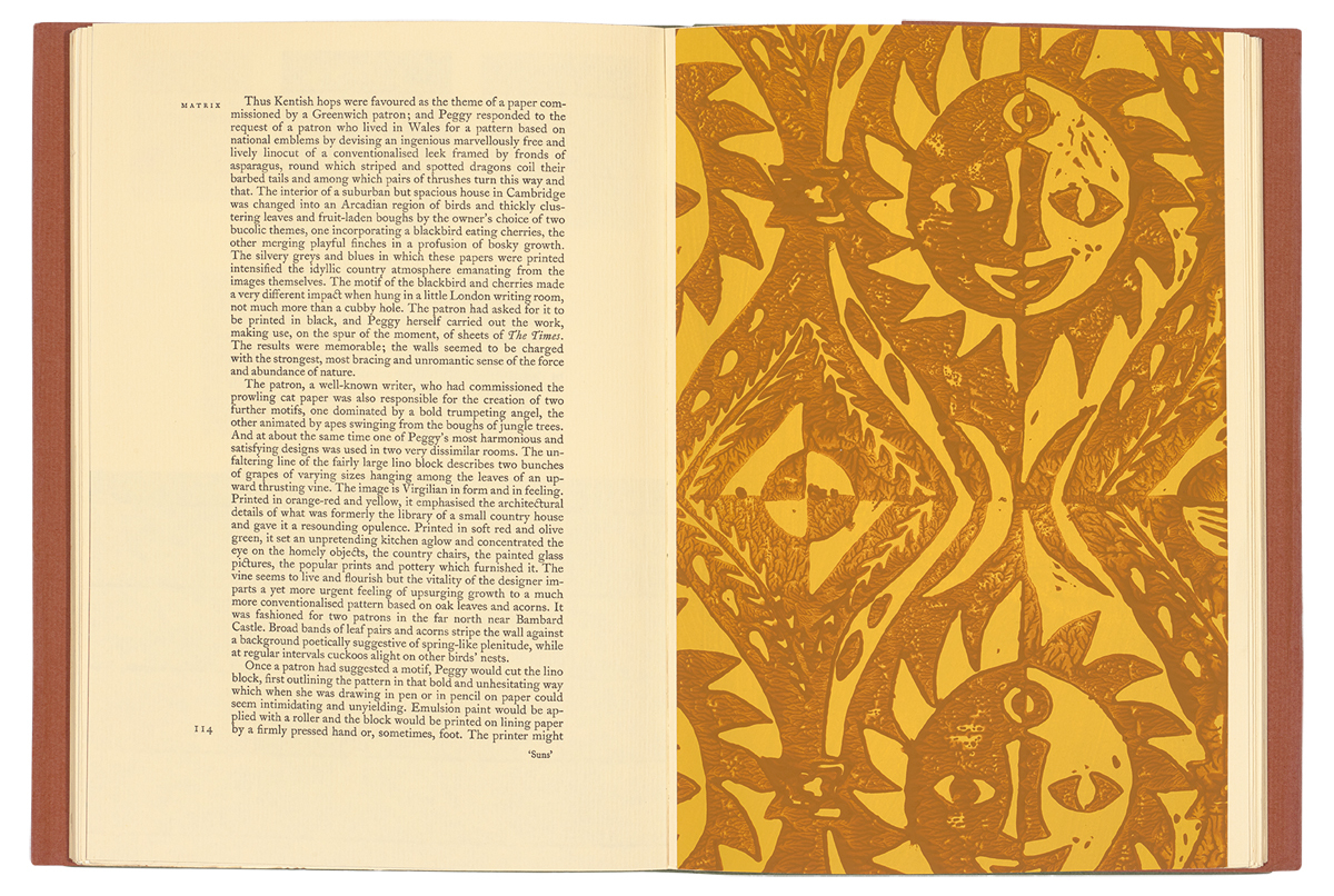
Winter
1996. Peggy Angus and her Wallpapers by Olive Cook. Bound-in
wallpaper sample printed by Angus’s granddaughter Emma Gibson from
the original blocks.
Matrix
16. Winter 1996. Bound into the issue is this smaller sized four-page
flyer from the John Roberts Press, proud letterpress designer /
printers in Clerkenwell, London, run by Bernard Roberts.
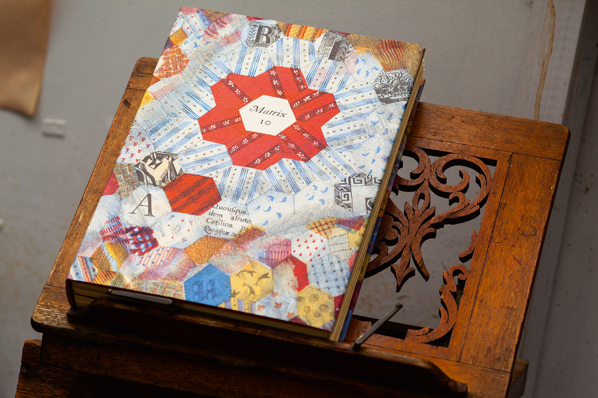
The
dust jacket cover of Matrix
10
is an autolithograph by writer and artist Alan Powers.
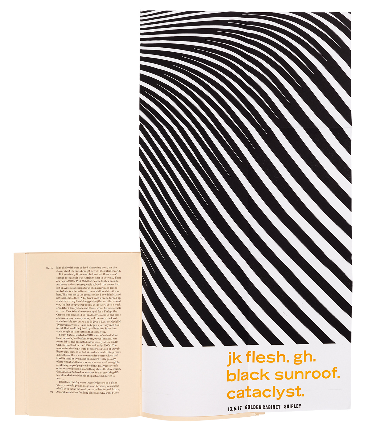
Matrix
36. Summer 2020. Fold out two-colour letterpress poster for the
Golden Cabinet music night in Shipley, Yorkshire, designed and
printed by Nick Loaring.

Eye is the world’s most beautiful and collectable graphic design journal, published for professional designers, students and anyone interested in critical, informed writing about graphic design and visual culture. It is available from all good design bookshops and online at the Eye shop, where you can buy subscriptions and single issues.