
Winter 2025
Learning from Coney Island: Michael Doret and American lettering
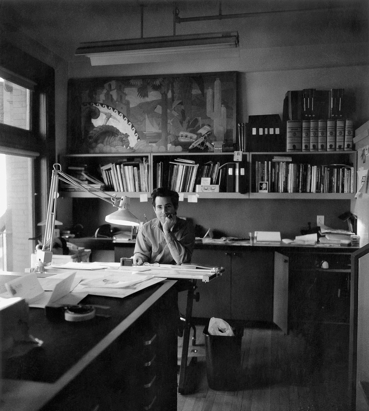
When Norman Hathaway was asked to edit and design Michael Doret’s monograph, it was a chance to fill in some gaps in the history of illustrative lettering [EXTRACT]
Michael Doret was the first person to introduce illustrative lettering work that stood free, without the need for photography or traditional illustration. Alphabet City, a new book that I designed and edited, celebrates his life’s work.
There were many designers cranking out ‘studio lettering’ before him. But Peter Dom, Tom Carnase, Tony Di Spigna and Ed Benguiat were primarily hired to provide elements of a design, not its entirety. Doret’s work rose to prominence in the 1970s, when I was a sapling working my first job in a sign shop. It had proved impossible to find a good education at the local institutions so instead I got mine by scouring the streets – reading bound back issues of Gebrauchsgraphik at the library during my lunch break, admiring the stunning work of local Victorian / hippie sign painters (such as Doug Fast) and magazines and record sleeves, which was where I first spotted Doret’s work.
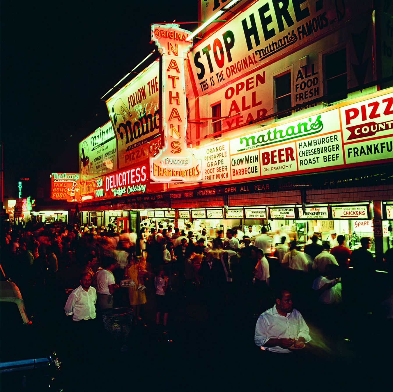
Doret was born in Brooklyn in 1946. Living near Brighton Beach and Coney Island, with its curt and stupefying fairground ride signage, staring in awe at the smoke ring-emitting Camel billboard on his way to have lunch with his dad, this emphatic imagery burned a hole into his heart. At Cooper Union, that bastion of art education for the working class, Doret was taught the ‘proper’ way to do things, but initially he had no facility for calligraphy and the graceful stroke. That came after landing a job working for Ed Benguiat, the colossus of New York lettering at the largest ‘display’ typesetting company in New York, Photo-Lettering.

Larger than life and perhaps Doret’s polar opposite, Benguiat taught him the hand skills required to clean up film negatives and create letterforms from scratch. Doret found his path.

This crucial period is rarely written about. Before the 1970s, most type and lettering work was living under the all-encompassing shadow of advertising work. But some younger dudes rejected this …

Norman Hathaway
Read the full version in Eye no. 107 vol. 27, 2025
Eye is the world’s most beautiful and collectable graphic design journal, published for professional designers, students and anyone interested in critical, informed writing about graphic design and visual culture. It is available from all good design bookshops and online at the Eye shop, where you can buy subscriptions and single issues.