
Winter 2025
Reputations: Margaret Calvert

‘If I look back at my beginning and everything, it’s learning on the job. You teach yourself and you pick up things and you look and you research – and it happens.’ Interview by John L. Walters and Simon Esterson. Portrait by Philip Sayer
Margaret Calvert is the doyenne of British graphic design, much admired for her contribution to the sign systems for the UK’s motorways and roads on which she worked with her boss and mentor Jock Kinneir in the late 1950s and 60s. She was born in 1936 to English parents in Malvern, near Durban, South Africa, and attended school in Pretoria. In 1950, aged thirteen, she emigrated with her older sister and widowed mother to England, studying at St Paul’s School and Chelsea School of Art, and joined Kinneir’s office after graduation. Calvert was the only woman whose work was included in the landmark book 17 Graphic Designers London (1963), which showed her designs for P&O, fishmonger Burkett and Schott. In 1966 she became a partner in Kinneir Calvert, and the practice continued working on signs and letters for NHS hospitals, British Rail, the Airports Authority and many more large-scale signing projects worldwide. She also began teaching part-time (one day a week) at the Royal College of Art (RCA).
Calvert’s final project for the practice (then named Kinneir Calvert Tuhill) was the signing system and supergraphics for the Tyne & Wear Metro (1980), for which she created the lettering that was later adapted for the Monotype typeface that bears her name, Calvert, the foundry’s first Lasercomp font.
Other projects over the years include a multiscript (English and Farsi) art catalogue (1978) for David Hockney, the typeface A26 (1994) for experimental type magazine FUSE and wayfinding signs based on Calvert for the RCA.
Her association with the Royal College lasted until 2001, and included a four-year stint as head of graphic design, from 1987-1991. Former students who attested to Calvert’s authority and kindness as a teacher include Andy Altmann, the late Phil Baines (who wrote about the road sign system in Eye 34), Frith Kerr, Amelia Noble, Marina Willer and Henrik Kubel.
Since 2001 Calvert has continued to produce work for galleries and clients that is often based on the signs that she and Kinneir created; a deconstructed collaboration with Marion Deuchars; a ‘Woman at Work’ sign for her retrospective at London’s Design Museum; meeting room signs for the Nomad agency; and a stylish wristwatch, the M1, for Mr Jones Watches.
Calvert has been a member of AGI since 1976, she is a Royal Designer for Industry (2011) and she has received countless honorary doctorates and awards over the years, the latest of which is the New York Type Directors Club medal (2024).
In 2006 she began collaborating with Henrik Kubel of A2-TYPE on digital versions of her public lettering: New Rail Alphabet (2010, see Eye 71) and Transport. She was engaged as a consultant by Ben Terrett of the Government Digital Service. Transport has been used for the UK Government’s gov.uk website since 2012. Calvert was also a consultant on A2’s sign system for the Moscow Metro (2015, see Eye 90). Her latest collaboration with Kubel is A2’s custom typeface Rail Alphabet 2 (which also won a TDC award in 2021) which is now being implemented across British Rail’s network of stations as part of a wayfinding scheme designed by Spaceagency. A crowdfunded book about her life and work, designed by Kubel and published by Unit Editions, now owned by Thames & Hudson, is due to be published in 2025. The following conversation, with John L. Walters and Simon Esterson of Eye magazine, took place over several sessions with tea and biscuits at Calvert’s sign-filled London home.
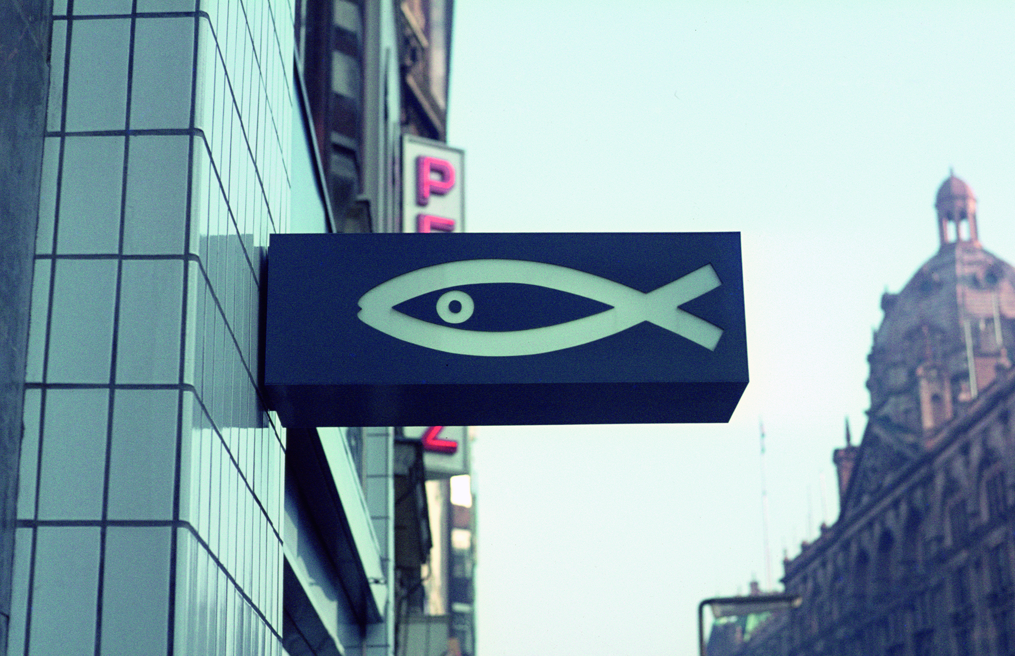
Burkett, 1962. Calvert remembers the Kinneir office’s identity design for fishmongers Burkett and Rudman as one of her favourite jobs.
Early years
Margaret Calvert was born in South Africa to English parents and emigrated to the UK in 1950 with her mother and older sister.
Eye magazine: Were you always keen on art?
Margaret Calvert: Yes. Always. In Standard Five, the last year before going on to boarding school, there was a Scottish teacher called Bill Craig, a proper artist. A lot of our lessons were to do with art, whether it was painting a jacaranda tree or drawing someone sitting on a chair. I made a point of sitting in the front in those old fashioned desks with ink-pots so that I’d really concentrate, so I got a lot of encouragement. He entered my work into various competitions, so I’ve got all these certificates. One thing Craig said was: ‘Just draw anything in front of you.’ So I did. I enjoyed drawing my hand. I went on to Pretoria High School for Girls, as a boarder, where there was a very good art mistress. Then my mother said: ‘We are going to England.’
How did you get here?
We set sail on the Athlone Castle in late 1949. We celebrated New Year on the boat and arrived on 5 January 1950. There were all our aunts in big fur coats at Southampton. England was wet and cold – we didn’t have the right clothes. I spent a whole year in the country with my aunt and uncle. Next door to them there was the farm, more relatives and cousins. So that was a rather idyllic year, learning to farm. That’s where I met Patience, the cow we based the road sign on.
It seems you were observant and good at drawing …
I was told so. It was something I had to do.
Did you notice letters and signs then?
No. Flowers and hands basically. And egg cups. And a lot of trees.
England
Calvert went to school at St Paul’s in London and then to Chelsea School of Art for four years in 1953.
The school they found for me was St Paul’s. My mother had been awarded a bursary to pay for my education because, very sadly,
my father was killed in a road accident, having joined up to serve in the Second World War. Many South African soldiers were sent up North, to fight in the deserts. My art teacher, Winnie Passmore, gave me a lot of encouragement. (She was at Chelsea when Jock was a student; they knew each other.) She suggested Chelsea – that’s how I ended up there, doing illustration and printmaking.
They invited Hans Schleger to come in one day a week to give us some idea of what design was actually about. He was really an advertising man. He did everything, but he was very keen on that. Jock was much more about design in a broader capacity with an emphasis on packaging. He’d used terms like ‘packs’. And I started going into Sainsbury’s and looking at the packs. Suddenly I was drawn to it – this is where I needed to be.
Did you know what you might do next?
No, you were expected to do an extra year for a teacher’s qualification to wrap it up. I went to the interview and they talked about puppets, and doing a trial in front of pupils. I thought, this is not me at all.
First job
After graduating from Chelsea in 1957, Calvert started working for designer Jock Kinneir as his assistant.
One day Jock wandered into Chelsea and asked if I would be interested in joining him as an assistant to help design the signs for the then new Gatwick Airport. I said, what does it actually involve? He said: ‘Nothing like you’ve been doing here.’ So I was very excited.
Next week he said it was all off. You can imagine my disappointment. But he used to do exhibitions for the Milk Marketing Board at Wembley. And by coincidence – I was on a platform at Ealing Broadway when Jock was coming back from Wembley – we met and it was all on again. He had probably got cold feet, thinking, what will I do with her? She’s not trained.
But he did employ you …
The reason he did employ me, he said in some article, was that I worked like a maniac. Well, I didn’t work like a maniac, but I made a point of coming in by ten o’clock, being at my desk and getting my head down. And I got really interested in lettering and book jackets. Painting lettering with a fine sable brush – I got hooked into all that. For Gatwick, Jock was drawing enormous letters, very Johnston-like, where the curves join the stem of the letter. We used to have debates about the letterform. Jock wrote a report (for 21 guineas) on possible typefaces for signing airports. Well, there weren’t any.
Jock was also working on the P&O labels when I joined him. I got involved in mixing the colours, and of course, doing the artwork – a very laborious job, as there were no computers then. Jock designed the main, tie-on destination labels, aimed at being understood by baggage handlers who didn’t speak English. I designed the adhesive cabin baggage ones. This was my first attempt at designing a very simple letterform.
Jock said, oh, you must brush up your typography. I didn’t know what the word meant. I had to look it up in the dictionary.
You did typography classes with Colin Forbes …
Colin had a big effect on my life because he was running evening classes at the Central School of Art. George Daulby (BDMW) was wonderful. He opened my eyes because he took me into the marvellous library, showed me a book with different typefaces. I only knew Gill.
Motorway sign scale maquettes, which Jock Kinneir donated to James Mosley, then librarian of St Bride Library (see Eye 34 and 90).
How big was the office?
Jock wanted to start on his own, so he found this office over a garage in Old Barrack Yard, a mews just off Hyde Park Corner in Knightsbridge. He let one room to the designer James Maine. Gerald Barney was his young assistant, who went on to design the ‘double arrow’ symbol for British Rail, after moving on to work for Design Research Unit (DRU). The other two offices were let to architects.
With more work coming in, we needed all the rooms, so James and the architects left – James to start a new practice with Michael Wolff, where Gerald Barney joined them, before moving on to DRU, where he got on really well because he had extraordinary skill in doing artwork. Artwork was a very laborious thing then. I picked up a few tips from him, but we were always comparing how much he got paid compared to me!
Jock later took on another assistant, Claire Theobald, also from Chelsea, and she’s my oldest friend. We had so much work coming in at that time: Gatwick had happened, the road signs followed, everything seemed to happen at the same time. I loved mixing designers’ gouache colours. The best lesson I had at Chelsea was from one of the tutors who said you only need nine colours to mix any colour in the world if you choose the right ones.
Because of the motorway signs, a fish company called Burkett and Rudman were so impressed by the actual signs that they wanted us to do their identity. I chose Akzidenz-Grotesk for the name, as Burkett made a good shape in lowercase letters. The white vans really did stand out.
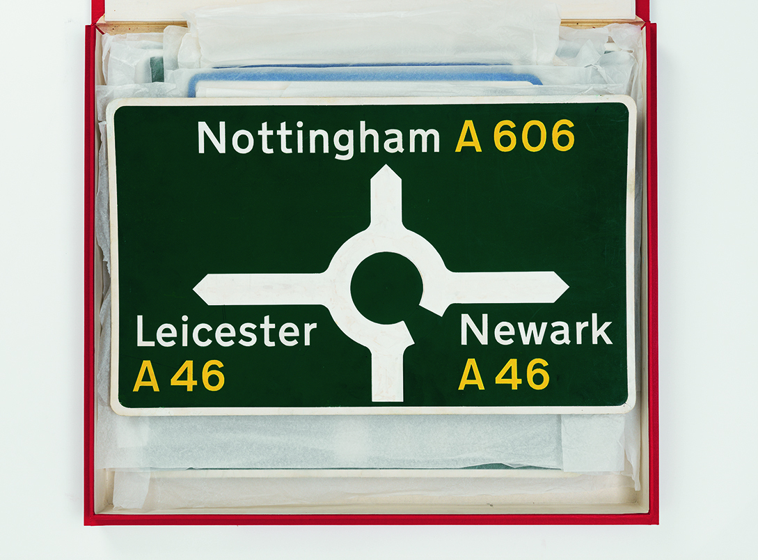
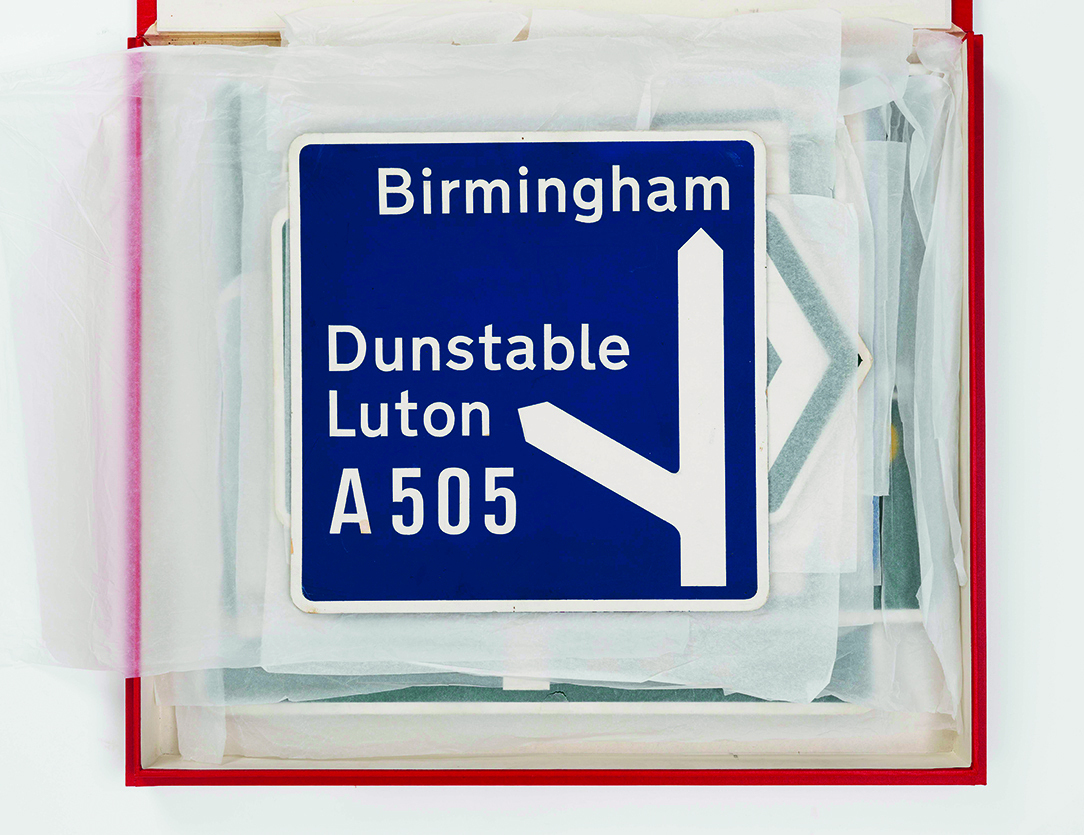
Road sign scale maquettes courtesy St Bride Printing Library.
Motorway and road signs
Kinneir had been appointed design consultant to the Anderson Committee for the motorway signs in 1957, followed by the Worboys Committee (1961-63) for Britain’s all purpose road signs. More assistants joined, including Claire Theobald (now Bates), John Jamieson and Marin Fairfax-Jones, who contributed to the design of several traffic signs.
How were the sign ‘maquettes’ made?
We got large film positives made of the Transport lettering. Then paper contact prints made by the Universal Drawing Office, cutting out the place names with a Swann-Morton knife. It was then a simple process of pasting the letters down on board with Cow Gum and removing everything that had to be painted with the knife, then rolling on gouache paint. The fun part was pulling off the paper dyelines to reveal the white letters, direction element and borders out of the colour. Satisfying but time-consuming. The maquettes are now in the care of St Bride Library (see Eye 34).
Jock then made presentations to the Committees at a Government office in London. Except for the Worboys Committee, when we moved on to the pictograms, which were mostly my work. Jock had flu and couldn’t attend, so it was up to me to make the presentation. You can imagine how nerve-wracking that was. I spent all my money on a suit.
How old were you?
Well, still early twenties.
And how many people in the meeting?
Oh, at least a dozen. They came from the police and from racing drivers and a whole lot. They were very rude about my road works pictogram, saying it looked like a round-headed deep sea diver. Anyway, I just went and did it again and eventually I got it right.
With the pictogram signs, were there a lot of iterations before you settled on a final one?
No, not a lot. These were based on a Protocol established by the United Nations World Conference on Road and Motor Transport, held in Geneva in 1949. Britain followed Europe, but with our own versions. I wanted to make it like a unified family. So the schoolchildren sign was important, and they did that badly to begin with.
Recently, I had a chance of doing it again, and this is where Simon Morgan [see pp.26-27], who belongs to various committees, got it approved, so I’m happy with that. I wanted them to be a family.
I enjoyed doing the animals, though the horse was difficult. The deer, the wild animals sign, was based on Muybridge.
Photos of animals in motion …
Yes, and the children crossing sign was made to look like an action had happened. There was movement. If I look back on what I’ve done, if it’s helped save a few lives, that’s a good thing, isn’t it?
Another detail we recall you discussing was the simplification of numbers, like the distance of half a mile.
That absolutely was Jock. It was his idea to remove the division line between numbers, it’s really ‘less is more’, the old cliché. Jock designed the system: the spatial arrangement of information on direction signs was all based on the width of the capital ‘I’.
My contribution was basically towards the Transport lettering and the pictograms and the simple signs. We did have an issue with the no right turn one on the traffic lights. It was a bit competitive as well, really. But if Jock had made a point, I would give it thought and come round to his view, and he would do exactly the same. He’d come in the next morning and be a completely different person. We were a team, so we agreed to share the credit.
If I look back at my whole beginning and everything, it’s learning on the job. You teach yourself and you pick up things and you look and you research and it happens. Style was never a consideration.
Clients
I have to say that the clients that we’ve worked with, they’ve all been good. Bob Gill said: ‘There are no bad clients. There are just bad designers.’
Partnership and expansion
In 1966 Calvert became a partner in Kinneir’s practice and started teaching one day a week at the RCA.
I think I might have approached Jock about the partnership because I was so much part of the work. He was happy to go along with all of that. The final person to join us was David Tuhill from the Royal College of Art. We had a few students joining us from the RCA. Mason Edwards was brilliant. They were younger than me by a few years, but we got on very well.
What did David Tuhill bring to the practice?
He was doing work for the Serpentine Gallery: posters and promotional things and books. He fitted in. I found it difficult being the woman in between, but it seemed to work out. David asked if he could join us. I was surprised that Jock agreed, but Jock let it be known to me eventually that he would be retiring soon, and then David and I would continue the company. Then personal things changed with David and he ended up teaching.
After you and Jock had done the road signs, you must have been the go-to studio for every sign system. Did the studio just become full …
… of signing projects? It did. And some of our assistants wanted more variety.
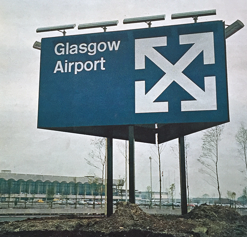
Sign from Kinneir Calvert’s identity for Glasgow Airport (designed by architects Spence Glover & Ferguson), which was opened by Queen Elizabeth II in 1966. Calvert’s logo is made of four white arrows that intersect against a blue background to create a Scottish flag – also known as the St Andrew’s Cross or Saltire. The letters are in Rail Alphabet.
More signs
Over the next decade and a half, Kinneir Calvert continued to consult on all manner of sign design projects.
The hospitals were another learning curve, and by then we were working for British Rail. I was into drawing letterforms, so I started drawing something and said, ‘Jock, let’s do this for the railways.’ He said, no, we’ve got Transport, one typeface is enough. Well, Transport was designed to be read at speed. If you look at the letters individually, you’ll notice little quirks, including the ‘l’ that was borrowed from Johnston. I said, you see railways are pedestrian, they can be taken at a slower pace. In the British Rail manual, all the pages with signs were designed by me, as was the typeface. I say this because I had a discussion with Jock and he didn’t want to do it, so I’m going to take the credit!
And that was the typeface used by DRU, who were designing the BR identity?
Absolutely. But we never called it a typeface. Anything I designed, including the face I did for the Tyne and Wear Metro, it was never a font or a typeface. I called it lettering. Each of the enormous signs for Tyne and Wear was hand-drawn.
The letters were inspired by Tyne and Wear because so many metros and stations and signs and all that, they’re all in sans serif faces. Newcastle especially was a rich architectural Georgian city. And, I thought, yes, a slab serif, which has got an interesting history as well.
There aren’t many metro systems that use supergraphics, that use the type really huge. Was that your original proposal?
Absolutely. It had to be in vitreous enamel. And the panels were a certain width. So you’ll get a large letter going across a join. But with the letters really large it works.
Drawing
To me drawing letters relates very much to life drawing. It’s about observing and how you see and the whole feel of head, your hand, the physical thing, what you put into it. And it takes a long time.
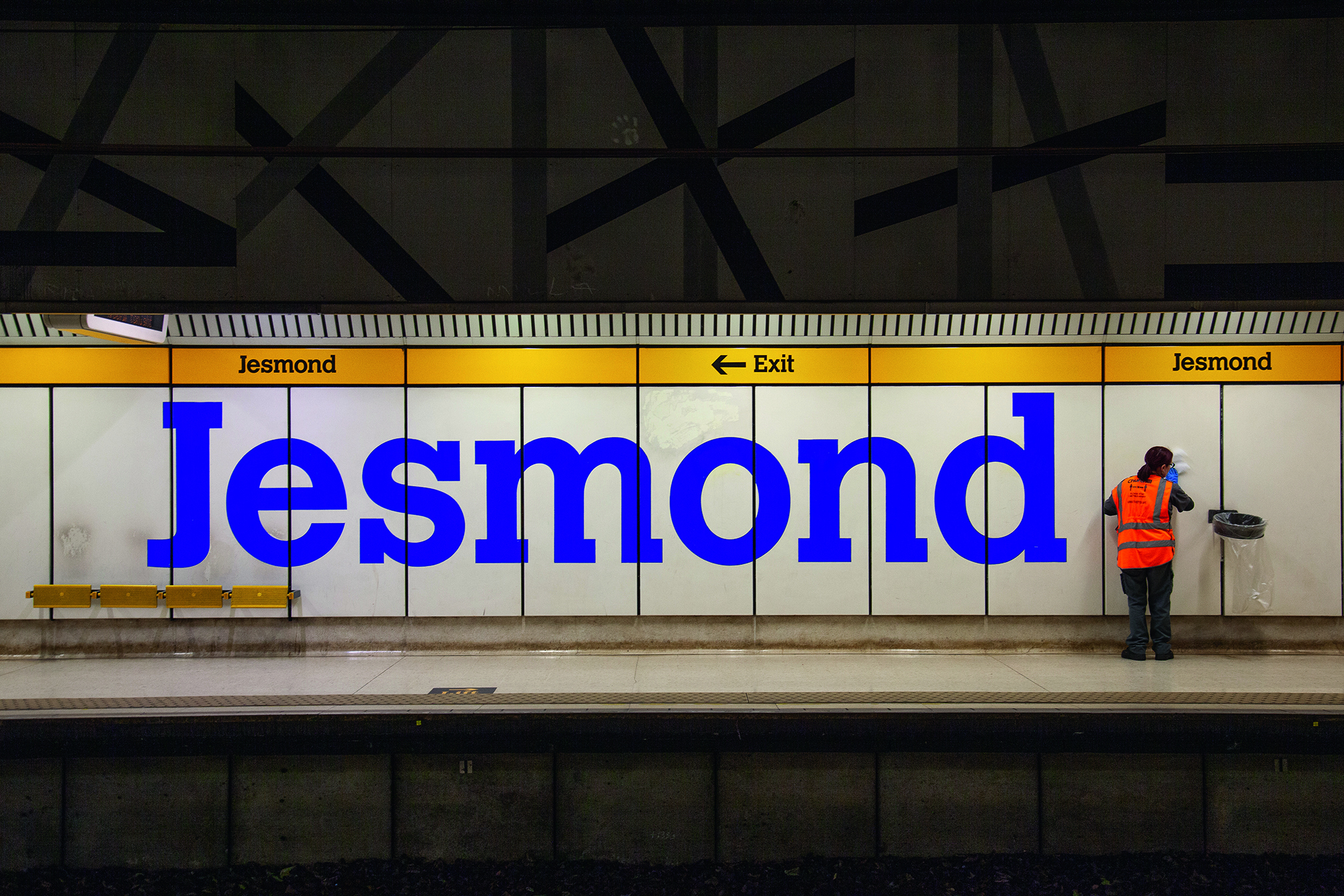
Tyne and Wear Metro identity using Calvert lettering (1980). Sign for the Jesmond station, north of Newcastle city centre. Each of the enormous signs was originally hand-drawn.
Monotype and Calvert
In the late 1970s, Calvert worked with Monotype to make her first typeface.
When I designed our stationery, for when we became Kinneir Calvert Tuhill Ltd., I used Calvert for the title. This was shown to John Dreyfus, a very nice man who was Monotype’s typographical advisor at that time, and he was impressed by it. I drew all the key characters and they turned it into a font, not hot metal – it was a time of change. It was their first ‘Lasercomp’ typeface.
Did you expect it to be hot metal?
I did. To me that would have been like climbing Everest.
How many weights did Monotype make?
Only three. But I planned more. When I did the initial sketch I was into mapping pens, different coloured inks. I drew a sketch of the lowercase ‘n’ to show the various weights. All the key characters were drawn in ink.
It’s a beautiful drawing.
People seem to like it because it’s so naive, but it’s got a quality about it. I drew those different weights and different coloured inks and the actual faces. I must have drawn in ink, because I extended the serif and made that red.
Were you doing this while you were still in the Kinneir Calvert Tuhill office?
Yes, that was all in the office. But by then, I think we knew we were going to wind up the company because the big jobs weren’t coming in. Dick Guyatt and Nick Jenkins started a design company and they attracted all our staff (apart from Mason Edwards). They employed them, paid them more money, so off they went.
So you were left on your own.
Right. That was quite convenient.
We never had to sack people.
So maybe it was for the best.
Absolutely. If you look back, some things are for the best.
After Kinneir Calvert
By the time the typeface was released, Calvert had moved her studio back to her home in Islington.
I remember meeting the two Monotype guys in the Senior Common Room at the Royal College. Eventually the Calvert typeface got produced, with an article in The Monotype Recorder in 1980. I thought it worked well as a text face. I suppose it was quite innovative.
Learning and teaching
Calvert has taught for most of her career and has had a long relationship with London’s Royal College of Art.
What was Jock Kinneir like as a teacher?
Jock wouldn’t repeat anything. He’d just say it with all the words in order, all the sentences in order, and then that was that.
My approach to teaching was quite different. You’ve got to take it stage by stage and understand that the person you’re teaching isn’t coming from the same point of experience as you are.
At the RCA, did you have an idea of what the ideal art college should be like? How would you run one if you were in charge?
At the school I went to they said you’re not being taught subjects, you’re being taught how to learn. There’s a big difference. I don’t think there is an ideal school, but what I do think important is a foundation course, when you haven’t settled on whether you’re going to be a graphic designer or whatever. That opens lots of doors for you.
When it was a three-year course, students could mess about, play, have fun, be outrageous. And then in the last three weeks they would get their show together, and it would be brilliant.
I used to set a project for fun called ‘Design Without Labels’, which opened them up to other disciplines.
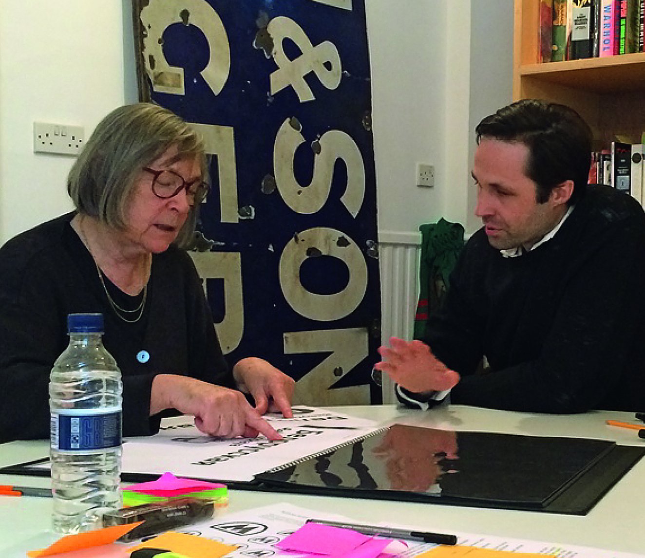
Margaret Calvert and type designer Henrik Kubel discuss the latter’s Moscow Metro commission (see Eye 90, 2015) at the A2-TYPE studio in East London.
GDS and Henrik Kubel
In 2012, Ben Terrett engaged Calvert as a consultant to talk to everyone at GDS [Government Digital Service], the department tasked with updating the UK Government’s labyrinthine website.
Ben asked Amelia Noble, who had been one of my students, whether she knew a typographer that could give him some advice on what they’re doing. So she recommended me. It’s interesting how you are connected with ex-students.
So along came Ben and he showed me all their original ideas. And I thought they were over-ambitious. It was too ‘designy’. I said, you need to go back to basics, because the important thing is the actual language, that it’s written in simple terms, the answers and the questions. So they actually employed someone specifically to do that. But nothing happened for quite a long time. Then he came back again and he’d done what I’d suggested. And because I had been working with Henrik on New Transport, it was my suggestion that he looked at it, because by then we’d made it as a digital face.They were using several different typefaces. I said: ‘You only need one.’ So it just got simplified: the type, the writing, the questions, all the organisation of the stuff.
Looking back
Was there a sense that you were part of a New Wave, the Modernists who were changing the way?
Well, I never thought that, but I do remember thinking that the Festival of Britain – all this Victoriana and decorative stuff – that wasn’t me at all. So naturally I rejected all that. I never thought I was new wave – young people don’t, do they? It was just a wonderful time. Fashion-wise, there was that little shop Bazaar [Mary Quant] in the King’s Road, and then there were the Beatles. So fashion changed and design and D&AD was happening. Small groups were starting. Fletcher Forbes and Gill were very different from Design Research Unit. Of course, in the 1960s, there weren’t many designers. Then that book appeared designed by Derek Birdsall, 17 Graphic Designers …
The term graphic designer was new.
Absolutely. Graphic design didn’t exist before, it was called commercial art, which is quite a respectable title, instead of ‘branding’. I hate the word ‘branding’. I can only think of poor animals.
John L. Walters, editor of Eye, London
Simon Esterson, art director of Eye, London
First published in Eye no. 107 vol. 27, 2025
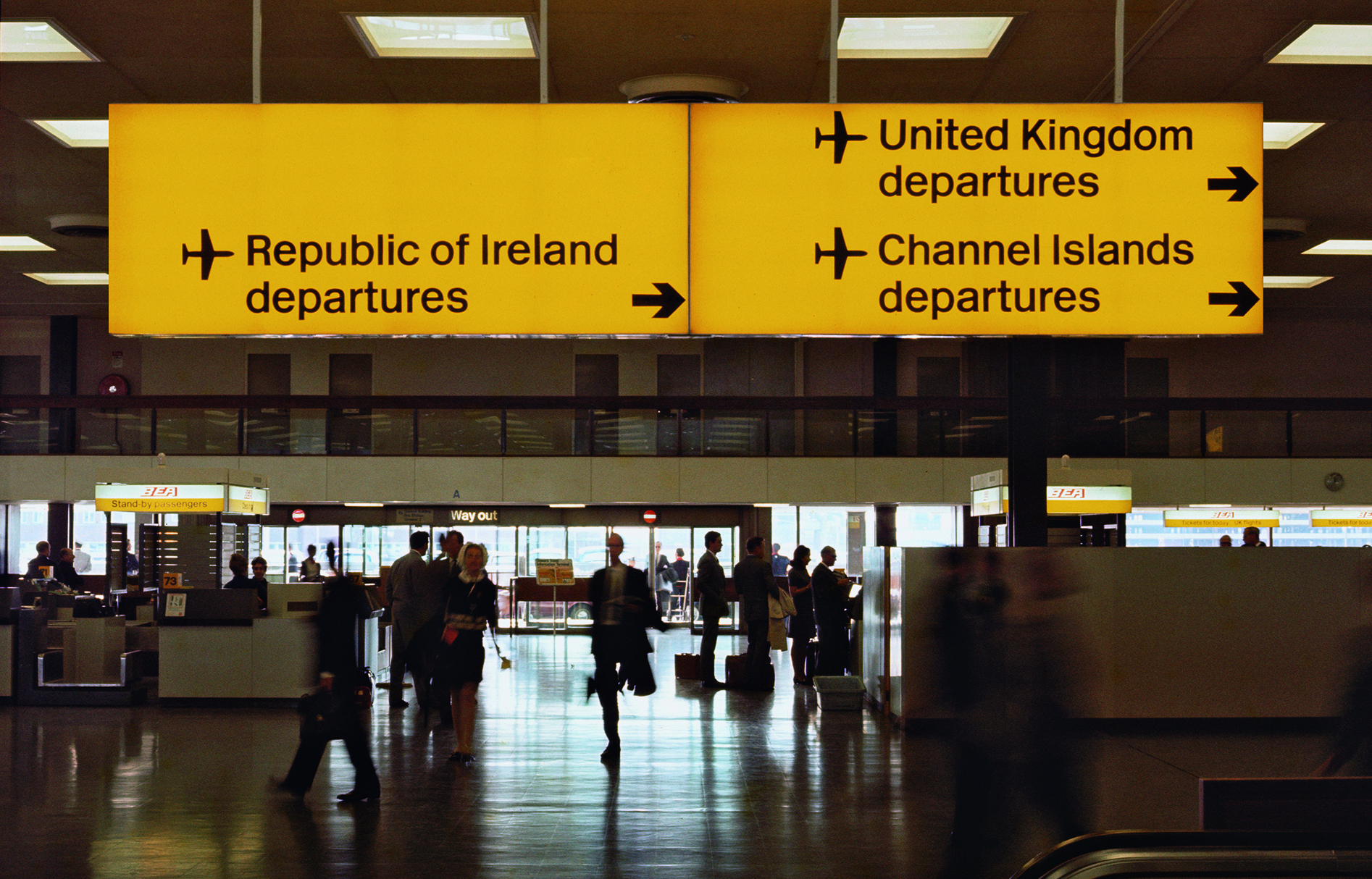
Internally illuminated black-on-yellow direction sign at Heathrow airport Terminal 4, mid-1960s.
Eye is the world’s most beautiful and collectable graphic design journal, published for professional designers, students and anyone interested in critical, informed writing about graphic design and visual culture. It is available from all good design bookshops and online at the Eye shop, where you can buy subscriptions and single issues.