
Spring 2025
Reputations: Rob Saunders

various designers
anonymous designers
Piet Zwart
Rudy VanderLans
Zuzana Licko
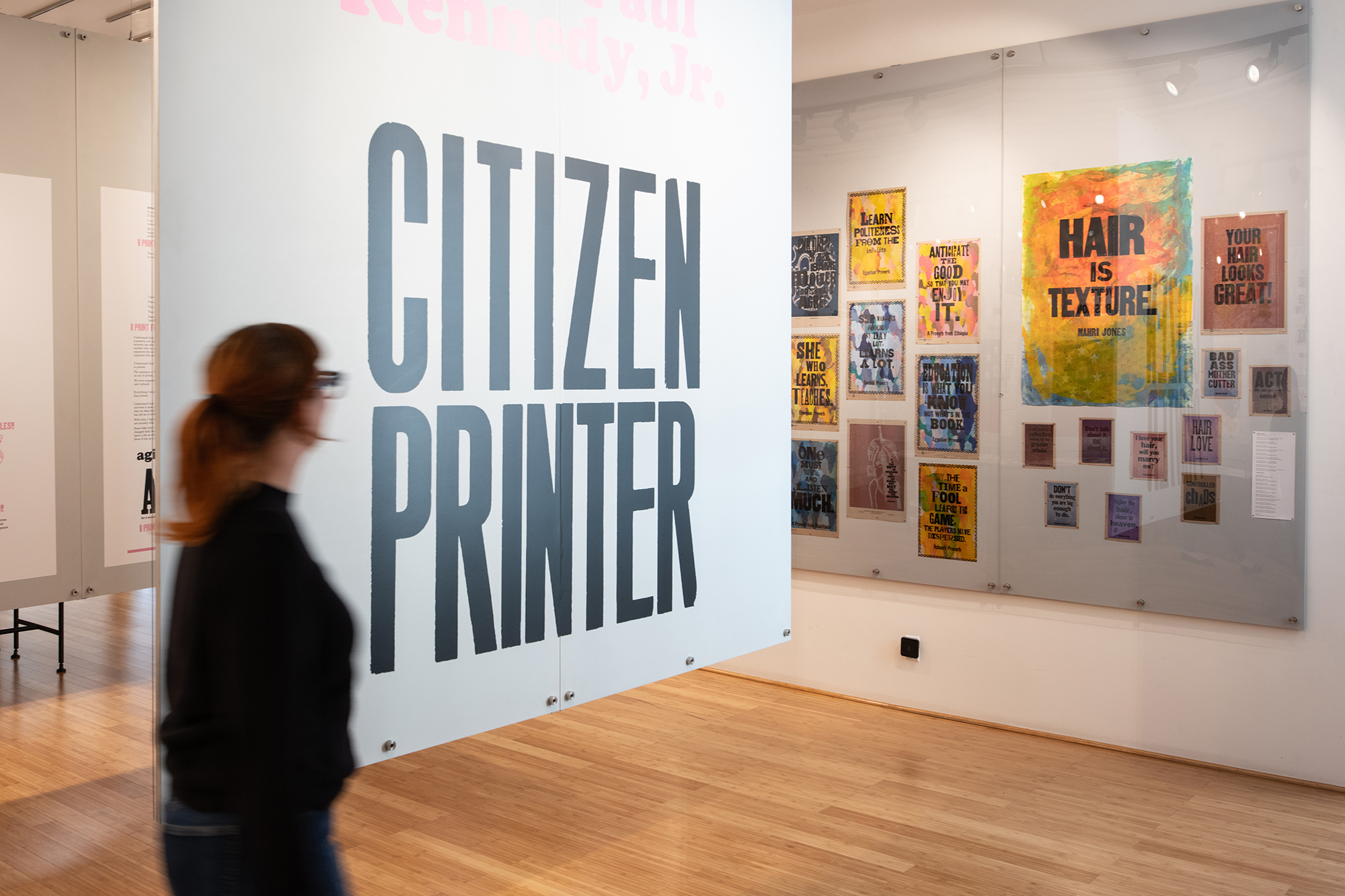
Amos Paul Kennedy, Jr.
E. M. Ginger
Jacob Jongert
Paul Rand
W. A. Dwiggins
Alice Chau
Marisa Kwek
Bruce Kennett
Julien Priez
Karen Polder
Lucian Bernhard
Roger Excoffon
Aldo Novarese
Stephen Coles
‘We are in a moment of fascination with everything analogue, especially for designers who spend all day working on screens for screens. For them, it’s refreshing and mind-opening and inspiring in some magical way I can’t fully explain.’
Interview: Eric Heiman [EXTRACT]
About a decade ago, I heard about a strange new place. Some guy had a loft in the Dogpatch / Potrero Hill area of San Francisco and it was filled with a formidable collection of graphic design ephemera. And you could visit it! Soon after, I was invited to a colleague’s birthday lunch at that loft, now called the Letterform Archive. The honoree has Dutch in his bloodline and upon entering the double-height space, we were presented with a table of design from the Netherlands. Works by Piet Zwart, Irma Boom and every designer of importance in between. Pieces I’d only seen in history books and design annuals. Gobsmacked, like a starstruck teen, I was so immersed in these legendary artefacts that I never managed to talk to their owner, Rob Saunders.
Since I’ve known Saunders, I’ve never managed to mention a design artefact in my own collection he does not already have. The Letterform Archive has expanded beyond that first location to multiple floors in a nearby industrial building that includes two galleries, lecture space, offices, a photo studio, plus endless shelves of design ephemera dating back to the Renaissance.
A self-proclaimed unruly teen, who cycled through three high schools before finally graduating, Saunders ended up studying at the progressive Hampshire College in Amherst, Massachusetts, where he discovered design. He claims that calligraphy ‘saved’ him. Mentored by British calligraphers Donald Jackson and Ann Hechle, Saunders later taught the artform at The School of the Museum of Fine Arts at Tufts University in Boston. Fascinated with the increasingly refined printing processes coming online, in 1981 he started his own publishing company, Alphabet Press, specialising in graphic design and children’s fare. However, Saunders soon shed the design arm, renamed the company Picture Book Studio (after one of its own imprints) to focus solely on children’s publishing and was soon commissioning celebrities such as Meryl Streep and Robin Williams to read the audio component of his books. When Simon & Schuster acquired his company in 1993, he started anew, relocating to the Bay Area with an unruly stash of graphic design ephemera he had been collecting. After detours promoting parties for San Francisco nightlife and design consulting, the Letterform Archive was officially born in 2015.
Portrait of Rob Saunders (above) and photos of the Letterform Archive (right and below) by Maria Spann.
Eric Heiman: You had a publishing business. You sold it. You collected all this design. When did you say: ‘Oh, this is not just the stuff on my shelves anymore. It’s an archive I want to share’?
Rob Saunders: I eventually found the place that you saw, which became the first home of the archive around 2001 or 2002, and lived there until 2015. There were bookshelves everywhere in that unit, and I did get almost all of my collection in there, but even the bedrooms became collection spaces and I still had off-site storage spaces filled with work. By the time I got it all unpacked it was a really different environment from when I started to collect, because the internet had changed everything. There was a major renewal of interest in this material.
I always assumed it would go to an institution. I started to talk to some and they were all interested. But one of the curators said, ‘Don’t give it to us because it’ll be in storage for twenty years.’
And you wanted the collection to be accessible …
‘Are you going to digitise? Will there be online resources?’ Nobody guarantees anything unless you donate a pile of dough. A lot of large collections go with endowments to academic libraries, and that’s the only way they ever have programmes built around them. So I decided to spend the money myself to preserve it.
Sabiha Basrai from Design Action Collective shows posters to a class from a Texas college in the multifunction ‘reading room’ adjacent to the main gallery. Photo: Maria Spann.
The key catalyst was in 2012, when a couple, who had graduated from type design programme of The Hague’s Royal Academy of Art [KABK], contacted me. Tânia Raposo’s husband had a job at Adobe, but she didn’t have a work visa. So she interned with me. They found me when they went to the San Francisco Public Library and asked for a specific book. Susie Taylor was there at the time and said, ‘We don’t have that, but I know somebody that does,’ and hooked them up with me.
They came to visit. They’re young. They’re looking at stuff, they know what they’re looking at, and they care. Tanya interned with me … then another KABK graduate took her place … and they were bringing their friends. They brought me to these Type ‘picnics’ organised by Stewf [Stephen Coles, now the Archive’s Associate Curator & Editorial Director]. They were always in a local park and drew 30 or 40 people: type nerds, type designers, people from Apple and Monotype. So I started to have afterparties at my house where they would see the collection and go ‘Oh my God, this is amazing.’
And they would tell their friends …
It reinforced my gut reaction to what the institutions were saying, that the collection would just go into a black hole and that would be a waste. For me it was always a collection for use. Not precious. We have crappy copies of our things because we can afford more that way …
Eric Heiman, principal at Volume Inc. and professor at California College of the Arts (CCA)
Read the full version in Eye no. 108 vol. 27, 2025
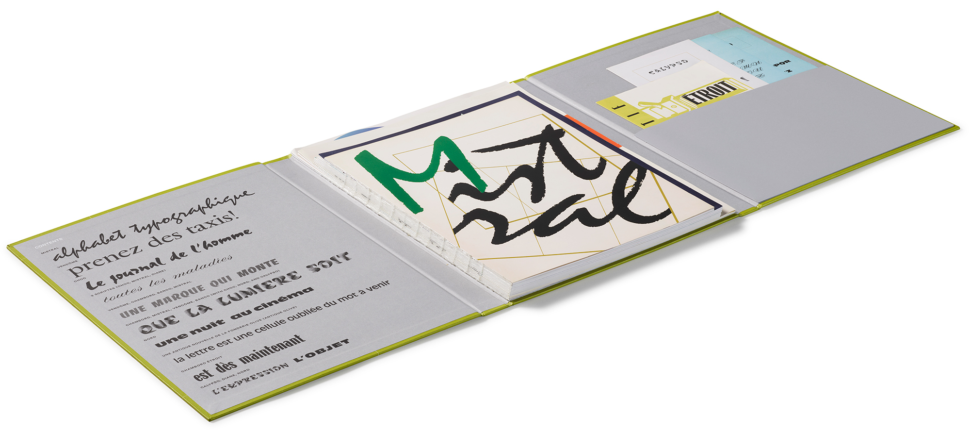
Folder with specimens of typefaces by German-American designer Roger Excoffon, which opens out to reveal specimen facsimiles bound together, loose facsimiles in the pocket on the right side and written information. Art director: Alice Chau.
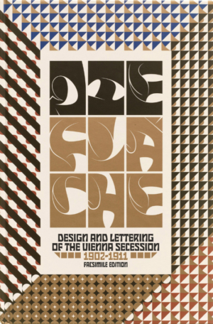
Die Fläche (Facsimile Edition): Design and Lettering of the Vienna Secession, 1902–1911. Art director: Alice Chau. Cover design by Julien Priez.
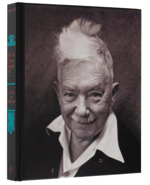
Cover of W. A. Dwiggins: A Life in Design, written and designed by Bruce Kennett, 2017.
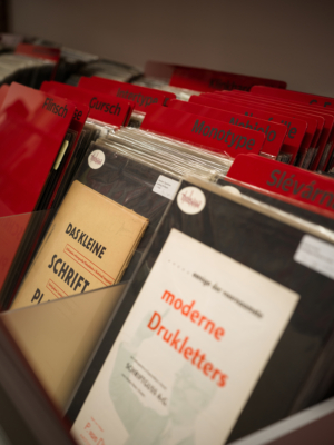
The Archive’s formidable type specimen collection dates back more than a century and has a global reach, representing type foundries large, small, famous and defunct, including Monotype, Darden Studio, Ludwig & Mayer, American Type Founders (ATF) and Nebiolo. Photo: Maria Spann.
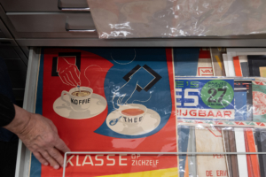
Plan chest up close, including a coffee and tea poster designed by Jacob Jongert (1883-1942) for Rotterdam based company Van Nelle, ca. 1930. Photo: Maria Spann.
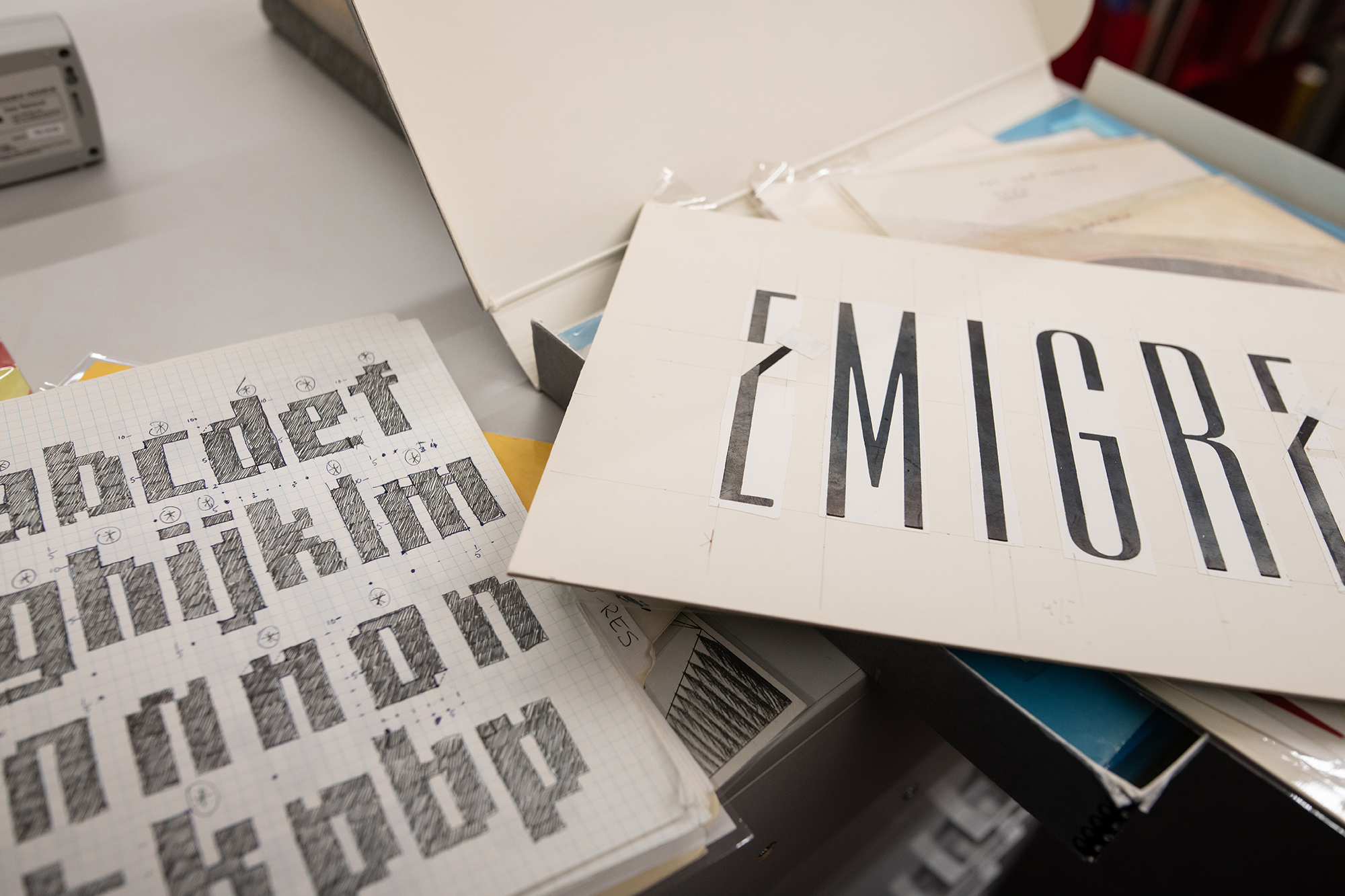
The Archive acquired the entire Emigre archive, including type design sketches and mechanical materials designed by Zuzana Licko (see Eye 43) for its eponymous, epochal publication and pioneering type foundry. Photo: Maria Spann.
Eye is the world’s most beautiful and collectable graphic design journal, published for professional designers, students and anyone interested in critical, informed writing about graphic design and visual culture. It is available from all good design bookshops and online at the Eye shop, where you can buy subscriptions and single issues.