
Spring 1991
The academy of deconstructed design
Students and graduates of Cranbrook Academy of Art are producing some of the world’s most challenging graphic design.
Cranbrook Academy of Art’s graphic design programme has been accused of hermeticism, formalism, theoretical obfuscation and other crimes against the values of both classic Modernism and the slicker professional mainstream. While these accusations have some basis in fact, the question remains whether such transgressions are truly objectionable, or whether instead they have broadened graphic design’s formal range and its capacity for intellectual self-examination.
The book Cranbrook Design: The New Discourse, which accompanies a travelling exhibition, surveys the Detroit school’s contribution to graphic, industrial and interior design over the last ten years. It brings home to anyone who doubted the fact that the school has significantly expanded the visual vocabulary of Modern graphic design since Katherine McCoy became co-chair of the design department in 1971, with Michael McCoy, who is in charge of industrial and interior design.
When the McCoys first came to Cranbrook, they were part of the Modernist design movement as it had crystallised in the United States. Modernism viewed itself as the critical arm of design, charged with resisting the allure of the marketplace in favour of building a better society. It conceived the graphic designer as a messenger charged with delivering clearly coded information to a public it hoped to liberate from the emotional manipulations of advertising and the mass media. The McCoys shared the view of other ‘hippy Modernists’ in the early 1970s that the formal problems of graphic design had been solved: what remained was the expansion of ‘problem solving’ across new territories. Yet by the mid-1970s it had become apparent to many Modernists – at Cranbrook and elsewhere – that the formal search was not, in fact, over.
The accompanying shift from rationalism to intuition reflected the avant-garde’s understanding of history as a process of continual revision, which compels each generation to reconfigure the achievements of the last. Katherine McCoy explains that while the experiments of the mid-to-late-1970s concentrated on syntax (the formal relation between signs in a system), the work of the 1980s is informed by semantics (the relation between signs and the concepts they present). In summarising the last twenty years at Cranbrook, the McCoys strike a self-consciously avant-gardist stance, describing a series of shifts, which began with the move from International Style Modernism to what Katherine McCoy has called ‘Mannerist Modernism’, and led to a fascination with ‘post structuralist’ theory in the 1980s.
‘Post-structuralism’ is an umbrella term commonly used to name a broad current in critical writing – primarily French in origin – which swept literary studies in the 1970s and 1980s and spread into art and architecture. Structuralism was founded at the turn of the century by the Swiss linguist Ferdinand de Saussure, who argued that a verbal sign has no inherent significance, but has meaning only in relation to the system or ‘structure’ of language: a sign has no positive, essential significance, but is only a difference defined in relation to other signs.
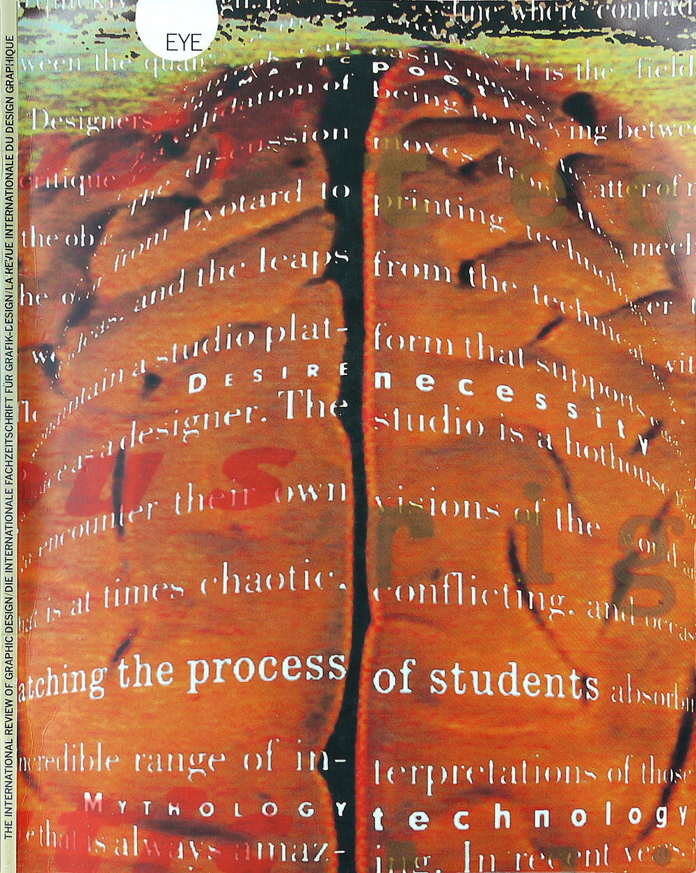
Post-structuralist theory first came to the attention of graphic designers at Cranbrook when the students designed an issue of the scholarly journal Visible Language (Vol. 7, No. 3, Summer 1978). The issue’s subject was post-structuralist literary aesthetics, and the students responded by progressively disintegrating the series of articles by inserting space between the lines and the words of the text. By the end of the book, the text had been fractured into a field of floating fragments. The extreme to which this well publicised project pushed the rules of syntax drew ridicule and rage from designers committed to an ideology of problem-solving.
It was not until the mid-1980s, however, that post-structuralist ideas fully took hold at Cranbrook. Jeffery Keedy, one of the students, is credited with introducing fellow course members to books by Barthes and to Hal Foster’s anthology, The Anti-Aesthetic, a primer on postmodern society, which flooded American art schools at the time. The response to these texts has been largely optimistic, side-stepping the profound pessimism and political critique permeating much post-structuralist writing. ‘It was the poetic aspect of Roland Barthes which attracted me, not the Marxist analysis,’ explains Keedy. ‘After all, we’re designers working in a consumer society, and while social criticism is interesting as an idea, I wouldn’t want to put it into practice.’
For Katherine McCoy, too, post-structuralism is a channel into personal expression. ‘Syntax is the hardware of graphic design, while semantics is the software. Syntax is grammar, system and structure while semantics is soft, referential meaning. It’s subjective and emotional.’ McCoy sees post-structuralism as a further reason for emphasising the subjective element of the design process that has always been a crucial component of classic Modernism.
Will post-structuralism become the tag for a new design style, replacing postmodernism as the label for the newest incarnation of a perpetual avant-garde? Already the term ‘deconstruction, borrowed from Derrida, has entered the mainstream of American design journalism, where it has been pinned to a huge range of typographic devices once called ‘post-Modern’: layering, spacing, distorting, interweaving, fragmenting, decentering, bitmapping and so on.
While Katherine McCoy carefully avoids calling post-structuralism a style (rather, she says, it is an ‘attitude’), her position is not entirely different from that of writers who are claiming the term ‘deconstruction’ as the banner of a new avant-garde movement. McCoy explains that the Cranbrook programme is not applying specific theories to design projects, but is loosely tapping the current of critical texts circulating through the art and architecture worlds.
Before the insurgence of post-structuralism in the mid-1980s, the chief source of theory at Cranbrook had come from architecture. Learning from Las Vegas, by Robert Venturi, Denise Scott Brown and Steven Izenour, presented the United States’ indigenous ‘commercial vernacular’ as a new model for academic Modernists, who had traditionally placed themselves outside – and above – this sprawling territory of vulgar capitalism. And it provided aesthetic validation for a landscape that most Americans see as an ugly but necessary feature of suburban life.
Venturi’s architectural polemic lent a theoretical basis to McCoy’s revision of the classic Modernist typography problem that submits a single verbal message to a series of formal arrangements. McCoy replaced the materially neutral verbal messages traditionally used in this problem with materially specific artefacts from the commercial vernacular, such as food labels and phone-book ads – graphic equivalents of Venturi’s suburban kitsch. Seamless Helvetica compositions thus gave way to impure pages riddled with unclassical fonts and symbols.
The commercial vernacular (a recurring strategy in Cranbrook graphics) sits uneasily with the hermetic, design-for-designers status of so many school projects. While Katherine McCoy claims that these elements are intended to make the work more accessible to the general public, the luscious graphics of Milton Glaser or Woody Pirtle are probably more enticing to consumers than bland icons lifted from the phone-book. The commercial vernacular is also regarded as a supplier of spontaneous graphic forms, which are free from the formal consistency, and professional self-consciousness of Modernism. Many such quotations from the ‘vernacular’ rest on a confusion between the visual form of an artefact and its social function.
In graphic design at Cranbrook, evidence of semantic research reveals itself less overtly than in the academy’s industrial design projects. The illustrative function of some of the project designs (toaster = suburban home) is rarely so direct in graphic design, much of which remains strongly influenced by the refined syntactical studies that brought the school notoriety in the 1970s and early 1980s. Allen Hori’s ‘Typography as Discourse’ poster consists of text, images and abstract elements delicately splintered across a vast field. Hori has literally applied contemporary theoretical writing to his poster by grafting provocative quotations onto its surface. Such work yields delight or frustration in proportion to the reader’s patience – the consumer of Cranbrook graphics is often another designer, who is more willing to make the effort.
A series of cruder, visually blunter posters offers more explicit evidence of ‘semantic’ research. Scott Zukowski’s ‘Loaf’ poster and other designs from the late 1980s suggest a new concern at the school for exploiting visual and verbal signs for their multiple meanings as well as for the visual patterns they generate. Yet there is something a little too tidy about Katherine McCoy’s assertion that semantics has replaced syntactics as the governing focus of Cranbrook graphic design. Perhaps the desire to represent the programme in terms of avant-gardist historical progression has encouraged McCoy to describe a rejection of the past and discover a new centre. In fact, both syntactics and semantics are the primary concerns of classic Modernist design: think, for example of Modernist corporate identity, which involves first creating a symbol expressing the personality of the organisation (semantics), and then deploying it according to a consistent programme detailing in a prescriptive manual, the grammar book of corporate image (syntactics). The difference between Cranbrook’s programme and high Modernism is not the regions of activity, but rather the intellectual commitments driving them; the search for universally legible sign systems has shifted to a scepticism about ‘meaning’ as a fixed, stable entity.
While Cranbrook has aggressively exploited syntax and semantics, the third element of semiology – pragmatics – remains unexamined. In the semiotic theory of the American writer Charles Morris, pragmatics is the study of signs in use in living situations, and what these signs reveal about the culture that uses them. The term might suggest practicality and a potentially dull ergonomics of legibility, but Morris’s use implies a richer territory, extending from rhetoric, phenomenology and psychoanalysis to the sociology of knowledge.
Although many Cranbrook projects represent deep contemplations on visual syntax and the range of semantic reference triggered by particular signs, few reflect on the institutional structures in which design functions. The flattening of the category of ‘commercial vernacular’ to encompass everything outside the professional, style-conscious discourse of design is one symptom of this indifference. When the institutional, social differences between vernacular codes are not acknowledged, the vernacular is reduced to pure style. Indifference to pragmatics is also indicated by the reliance on the poster (graphic design’s equivalent to the oil-painting) as Cranbrook’s dominant format. This ‘artistic’, self-contained genre allows design to detach itself from the world of use.
Yet, clearly, graphic design is part of numerous modern institutions that frame the production of knowledge, such as the mass media, the corporation, the modern art school, and the professionalisation of design itself. To uncover the social and aesthetic pragmatics of these modern enterprises would be a vital subject for advanced research in graphic design. What form might such research take? Perhaps Cranbrook students will consider this path of inquiry as they embark on their next phase of their internal micro-history of the avant-garde.
First published in Eye no. 3 vol. 1, 1991
Eye is the world’s most beautiful and collectable graphic design journal, published for professional designers, students and anyone interested in critical, informed writing about graphic design and visual culture. It is available from all good design bookshops and online at the Eye shop, where you can buy subscriptions and single issues.