
Winter 2014
We made this: Dorothy and Otis
In 2009, Norman Hathaway and Dan Nadel arrived at an archive in Arizona to rediscover a legacy of graphic design left by Dorothy and Otis Shepard.
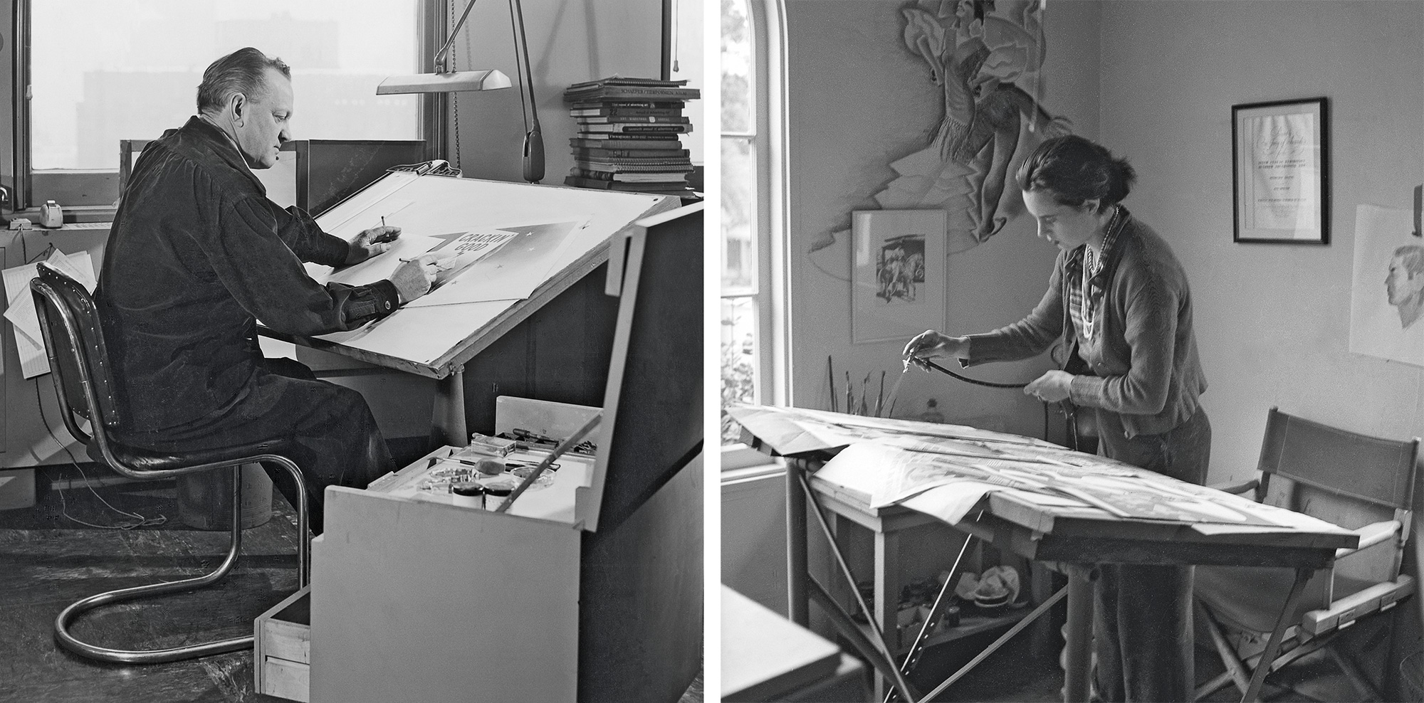
This book is the result of a lengthy period of research and rediscovery on the part of designer Norman Hathaway, later joined by co-author Dan Nadel. Hathaway first glimpsed Otis (Shep) Shepard’s work in the instruction booklet accompanying a Paasche airbrush he acquired as a teenager. Later, he saw Shep’s work for Wrigley’s in advertising annuals and in the exhibition catalogue Images of an Era: The American Poster 1945-1975. Hathaway says: ‘I just loved his ability to reduce shapes to their minimum, yet still convey depth … and the way he could portray simple subject matter so dynamically.’
Shortly after the publication of his book Overspray (2008, see Eye 71), Hathaway started putting screen grabs and images for potential book ideas on the photo sharing site Flickr. When someone commented that one of the pieces had been created by Dorothy Shepard, not Otis, Hathaway’s quest began. The Flickr commenter was the Shepards’ grand-daughter Erin, who put Hathaway in touch with her father, Kirk Shepard, in Arizona. By the following summer Hathaway had recruited writer Nadel as his co-author and the two men went to Arizona to see the archive.
‘We arrived, made our introductions, and in the front room on top of a dining table were piles of large scrapbooks, photos, letters and boxes of negatives – the best design archive I’ve ever run across,’ says Hathaway. ‘We started rifling through it and within two minutes Dan and I stared at each other with “holy shit” expressions on our faces.’
Hathaway and Nadel pieced together the history of the Shepards’ life and work using Dorothy’s scrapbooks as the ‘backbone’ of the book, while still leaving ‘lots of holes’ that the authors had to research themselves, such as ‘figuring out when they travelled to Europe to meet Joseph Binder.’
The question remains as to why the Shepards were forgotten, never to reappear in the graphic design canon established by Meggs, Remington and others in the 1980s and 90s. They were hardly recluses; Otis Shepard was sought after to lecture on advertising and design, and was one of the few Americans lauded by Europeans in the 1930s. Otis Shepard’s work was featured in Tom Purvis’s Poster Progress and in the German magazine Gebrauchsgraphik, and Dorothy won outdoor advertising and illustration awards. During the Depression years the Shepards were known as some of the most successful advertising designers of their generation.
Hathaway points out that by the 1970s the Shepards’ airbrush style was ‘squaresville’, although it was soon referenced by retro-style illustrators. And the Shepards had been stars of the billboard sector, considered a medium superior to magazines in the 1930s (for illustrators) because it reproduced work in colour at a giant scale, but which was eventually eclipsed by magazines.
‘Magazines were only printed in black and white,’ says Hathaway, ‘but once advertising moved from billboards to magazines much of the Shepards’ legacy disappeared.’ The couple’s geographical location – in California and then Chicago – far from the hothouse of New York’s younger, more visible mid-century design heroes, may be a factor, too.
Since completing the book, Hathaway and Nadel have found more examples of the couple’s work, including sketches for Wrigley’s transit cards, the ads displayed in buses, trolley cars and subways.
They have also found more billboard images, which Hathaway says ‘show the change-over from Shep’s traditional, representational style to symbolism,’ a sign that Dorothy made for a Catalina cocktail bar and Shep’s ‘killer’ logo for the Arlington Park horse track in Chicago.
John L. Walters, Eye editor, London.
First published in Eye no. 89 vol. 23 2014. This is a sidebar to the article ‘The first couple of American billboards’.
Eye is the world’s most beautiful and collectable graphic design journal, published quarterly for professional designers, students and anyone interested in critical, informed writing about graphic design and visual culture. It is available from all good design bookshops and online at the Eye shop, where you can buy subscriptions, back issues and single copies of the latest issue. You can see what Eye 89 looks like at Eye before You Buy on Vimeo.