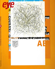
Autumn 2000
Editorial Eye 37

The editors of a magazine featured in ‘Visual journalism’ (Eye no. 36 vol. 9), though glad to be included, were displeased that their title was ‘lumped together’ with another journal whose editorial philosophy was the opposite of theirs. Such editorial juxtapositions happen all the time, whether perpetrated by editors, art directors (and the layout of the feature created several more unlikely bedfellows), publishers or the buying public. Graphic design book sales charts show David Carson, Ed Fella, Richard Hollis and Edward Tufte, for example, sitting quite happily alongside any amount of thought-free eye candy.
Phil Baines, writing about the public art of Brossa and Subirachs, notes that the two great men never saw eye to eye, and that their local supporters tend to be fiercely partisan (so we are bracing ourselves for a flood of letters from Barcelona). Rivalry and opposition provide an interesting context, but we don’t need to take sides: the work literally speaks for itself, in materials, letterforms and language. And these commissions have many processes and elements in common with the best graphic design: public art of this nature is determined by a social purpose and place; an understanding of materials; lettering as language and image; and a sympathetic client.
If there is something that unites the wide variety of examples that we show it must be creativity and originality. In music, there is a useful distinction between ‘creative’ and ‘repertoire’. Though in time, the former will evolve (or devolves) into the latter, there is more fun to be had with the originators, the ground-breakers, the people who bring different ways of thinking and new forms, images and ideas into the world. Such words could be applied to artists as varied in time, style and methods as Count Michael Maier (author of Atalanta Fugiens), the formerly anonymous 23 Envelope photographer Nigel Grierson, Shift! founder Anja Lutz, the original creators of Octavo and John Maeda, the exuberant artist-engineer-educator from mit. Maeda’s idiosyncratic approach to art and design using the computer as a raw, rough-edged tool is on the verge of becoming repertoire, as dozens of imitators, good, bad and indifferent, spring up in his path. His decision to ‘move on’ is significant and admirable.
An underlying theme of language is made explicit in the essays by Lucienne Roberts and Jonathan Burrows and in this issue’s Agenda by Ruedi Baur, whose work for cultural institutions has prompted him to question the unspoken rules of ‘corporate identity’ that designers have accepted for decades. Where Burrows examines the fascinating, impossible search for a graphic language of movement in time, Roberts points out the democratic, liberating role of simple literacy, raising questions, fears and hopes for a design education system that too often treats language as a poor relation.
First published in Eye no. 37 vol. 10, 2000
Eye is the world’s most beautiful and collectable graphic design journal, published quarterly for professional designers, students and anyone interested in critical, informed writing about graphic design and visual culture. It is available from all good design bookshops and online at the Eye shop, where you can buy subscriptions and single issues.
