Wednesday, 8:00am
23 August 2017
Graphic language of the wall
Brassaï’s photographs of graffiti with handwritten typographic treatments made striking, almost punkish paperback covers for Le Livre de Poche
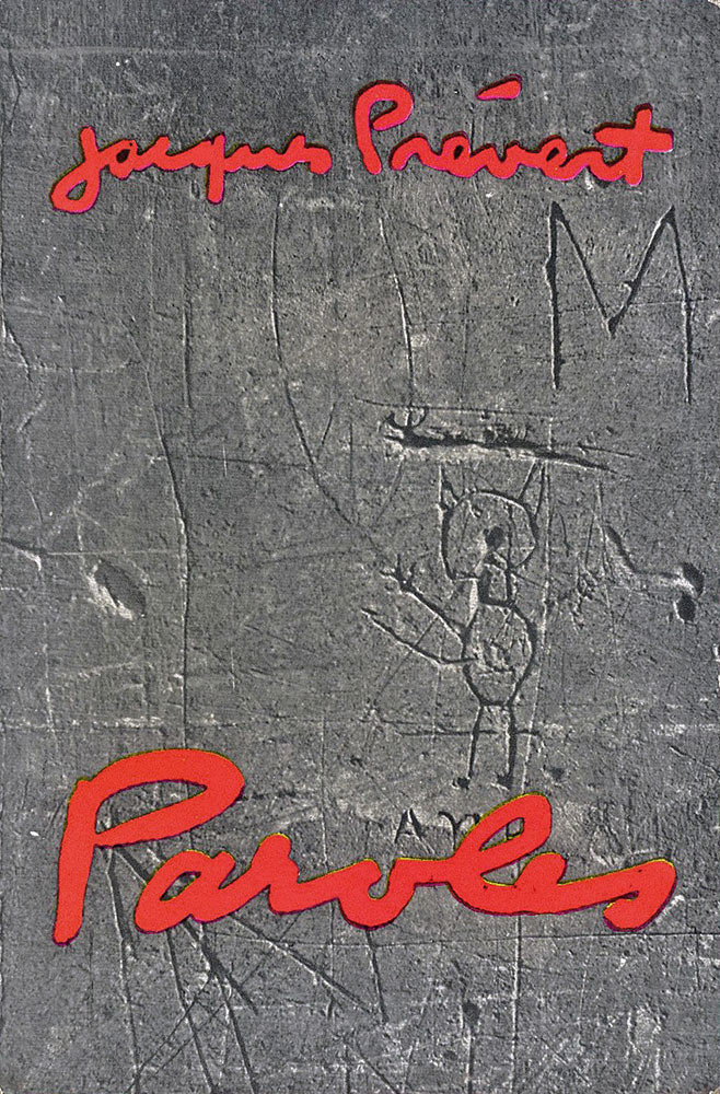
Photo Critique by Rick Poynor, written exclusively for Eyemagazine.com
The Livre de Poche paperbacks published by Gallimard in the postwar years are the French equivalent of Penguins. These inexpensive publications intended to make literature easily available to ordinary readers are now collectible items, thanks to the charm of their cover designs. While the endlessly inventive Pierre Faucheux and his studio designed many of the most engaging covers, the series featured plenty of curiosities, even before he took the reins in 1964.
A collaboration between the photographer Brassaï, a Hungarian long resident in Paris, and the French poet Jacques Prévert, on a series of four Livre de Poche covers is especially noteworthy. Prévert, whose work is still read in schools, was also the creator of fantastical collages with a debt to Surrealism. The two met in 1930 and, after the war, Prévert wrote a poem titled ‘Brassaï’ for a portfolio of his friend’s drawings. In 1945, Faucheux used a photograph by Brassaï of graffiti scratched into a wall on the cover of Prévert’s first collection of poetry, Paroles (Words), a limited edition published by Édition du Point du Jour. The title and author’s name were scrawled by hand on the image like an additional layer of graffiti.
Paroles, back cover, 1957 (this edition 1962).
Top: Paroles, 1957 (this edition 1962). All covers by Jacques Prévert and Brassaï.
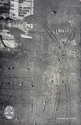
When Livre de Poche reprinted Paroles in 1957, the publisher reused the same picture and this time the title and Prévert’s name appeared in his own handwriting. There is a second graffiti photograph on the back and, in a nice embellishment, the Livre de Poche logo is creased and torn, as though it is part of the wall. The cover appeared at a time when Brassaï’s photographs of graffiti, which he started taking in the early 1930s, were the subject of growing attention. In Minotaure no. 3-4 (1933), he first showed some of these pictures in an article titled, ‘Du mur des cavernes au mur d’usine’ (‘From Cave Wall to Factory Wall’). ‘Beneath the crystalline transparency of spontaneity, what one observes here is a function of life, as insistent as breathing and sleeping,’ he writes.
In 1956, the Museum of Modern Art in New York mounted ‘Language of the Wall’, an exhibition of around 120 of Brassaï’s graffiti pictures, divided into six sections, according to his own system of classification – Birth of the Face, Faces, Birds and Beasts, Love, The Sign of Death, War, and Wizards and Phantoms. The graphic power of the images, shot from a consistently frontal position and printed by Brassaï for maximum contrast, is undiminished today. Children and young people made many of these etchings in stone and the figures have the primal and mythic force of prehistoric cave art or later tribal carvings. They seem to emerge unchecked and uncensored from the depths of the subconscious. ‘It is the graffiti,’ Brassaï asserts in U. S. Camera (1958), ‘which give the most truthful, most spontaneous testimony as to the character, the intimate life of an epoch.’
La Pluie et le Beau Temps, front and back, 1962 (this edition 1963).
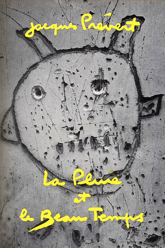
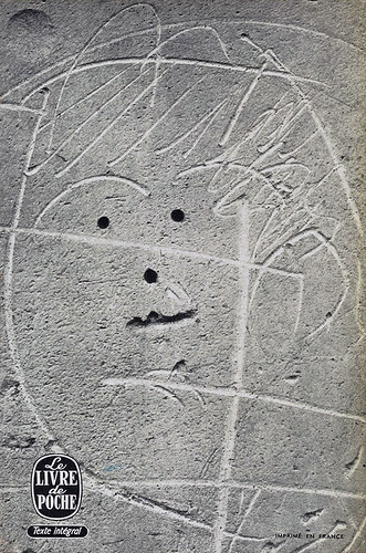
The third of the Prévert books, La Pluie et le Beau Temps (Rain and Good Weather), published in 1962, has well known shots of faces by Brassaï, one vigorously defined and slightly weird – a crop from a larger picture, which he classified as a ‘primitive image’ – and the other quicksilver and almost cartoonlike in its pleasant ordinariness. The plump yellow cursive lettering, again by Prévert’s hand, makes a startling contrast. Like all the designs in the series, the cover looks both considered and deliberate and yet entirely unconstrained by professional concerns about what is allowed or decorous. The designs are close in spirit to the dissonant and emotional graphic style that would later come to be known as ‘punk’.
Spectacle, front and back, 1959 (this edition 1965).
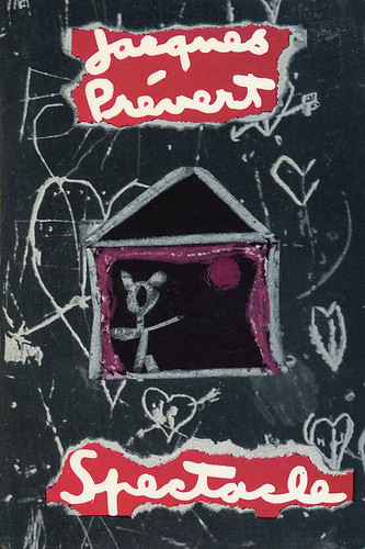
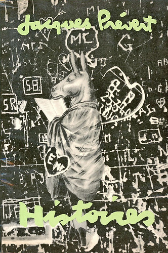
On the other covers, Spectacle (1959) and Histoires (1965), Prévert plays a more visible role – apart from Paroles, which has no visual credit, all are jointly attributed. Both employ Brassaï’s prints as a base (as Prévert did in other artworks) for additional elements that he collages on top. With Spectacle, he went so far as to tear ragged holes in the image through which the type shows. I was unable to identify the source pictures, though elements from both covers appear in a design constructed from multiple prints that Brassaï produced for a tapestry in 1968. Histoires reproduces most of a collage by Prévert, originally in colour, and here photographic motifs, notably the hearts, have been cut out and stuck down on top of other collage elements, an intrusive ‘remix’ of the source(s) that Brassaï must have been happy to sanction. Histoires was the first of the paperbacks I chanced upon and it hasn’t lost its sense of cabbalistic oddity even now it is so familiar.
Histoires, front and back, 1965 (this edition 1971).
Rick Poynor, writer, Eye founder, Professor of Design and Visual Culture, University of Reading
Eye is the world’s most beautiful and collectable graphic design journal, published quarterly for professional designers, students and anyone interested in critical, informed writing about graphic design and visual culture. It is available from all good design bookshops and online at the Eye shop, where you can buy subscriptions and single issues.