
Winter 2026
Groop dynamics
Stereolab’s reliably wayward approach to music graphics is back for the cover of the Anglo-French band’s latest album. Critique by Rick Poynor
The relationship between a band’s music and the cover designs created to express it has always fascinated visually aware listeners. Often there is no direct correlation – the designers may not even have heard the music before they present their proposals – and yet, in the listener / viewer’s mind, a firm link is established, and industry practice tends to treat the bond as fixed. While there is no limit to the number of times a novel’s cover can be reinterpreted, it is rare for an album to be reissued with a different cover.
From their earliest releases in the 1990s, the covers of Stereolab, the Anglo-French experimental ‘avant-pop’ band, have always struck a note of finely calibrated graphic eccentricity. Years ago, I celebrated Emperor Tomato Ketchup as an example of peculiar design (by the standards of its time) that worked in spite of the oddity of its incongruous components, which included a coiled, ribbon-like element, a little banner bearing the title, curious centrifugal lettering, and a cluster of parallel lines. The cover, like the history-conscious electronic pop it housed, suggested an amalgam of cleverly filtered influences from the past, although it also felt entirely of its time.
Stereolab’s latest studio album, Instant Holograms on Metal Film, arrived earlier this year after a fifteen-year hiatus during which the only releases by the band, led by Tim Gane and Laetitia Sadier, were compilations. Such a long-delayed comeback might have seemed superfluous, but the album was widely admired as equal to the earlier work of the self-styled ‘groop’. The songs are incisively political and even visionary, the music and production bright, propulsive, lyrical and unexpectedly uplifting. ‘Mystical Plosives’ and ‘Flashes from Everywhere’ are typical titles.
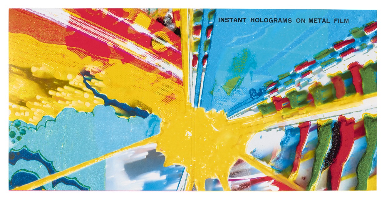
Interior of the LP’s gatefold, itself a retro reference.
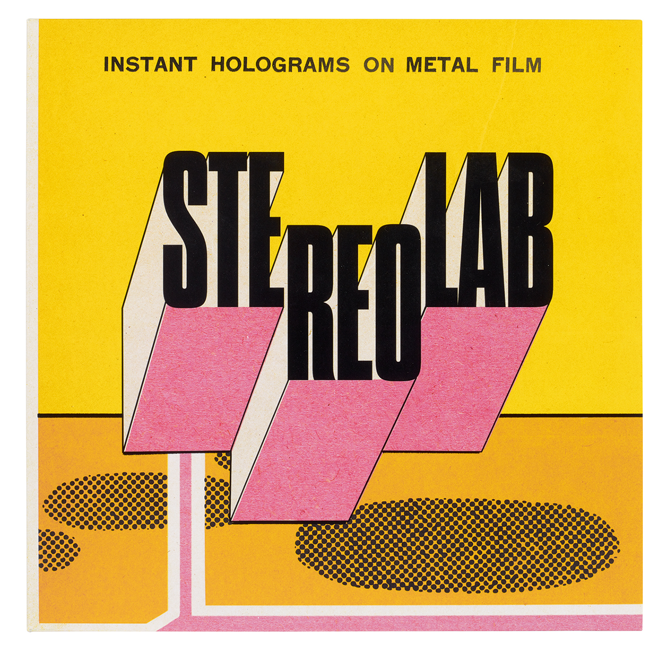
Top. Front cover of Stereolab’s Instant Holograms on Metal Film, Duophonic Ultra High Frequency Disks / Warp, 2025. Design: Vanina Schmitt.
The vinyl album cover, attributed to Vanina Schmitt, is equally knowing, effortlessly reprising Stereolab’s long-established but reliably wayward graphic manner. As with Emperor Tomato Ketchup, 29 years earlier, the cover is a kind of graphic picture, an image that implies a three-dimensional space, yet none of the elements is representational; graphic and typographic devices become materials for a playful abstract conundrum. The group’s name, broken into three staggered blocks, appears to float above the surface below and its rendering is deliberately crude. The black rules that define the blocks vary in thickness as if drawn without sufficient care using a Rotring pen – a minor flaw often seen on pre-digital artwork. The line that hits the lower curve of the ‘S’ makes no sense as a description of three-dimensional form and the pink underside of the blocks is slightly out of register and subtly mottled, once again suggesting cover artwork imperfectly printed somewhere in Eastern Europe 50 years ago.
The shadow-like shapes, seemingly composed of half-tone dots, are even more arbitrary, a deliberate mismatch with the lettering elements above. (They are slightly repositioned on the CD sleeve, which is otherwise a miniature facsimile.) Schmitt places the pink and white lines with great emphasis, as though they have some conceptual significance, but their only obvious purpose is visual, helping to tie the collection of parts together. The album’s title is stamped without ceremony across the top in plain capitals and the word-spaces are slightly too large, another calculated imperfection. This pointedly artless, single-weight typography continues on the back cover, which is styled to look like a heavy-duty envelope – perhaps containing the ‘metal film’ – and then onto the two inner sleeves.
The most unlikely flourish is the interior of the gatefold, a digitally manipulated psychedelic paint splatter that looks like it was meant for another album entirely. The sense of disjunction is presumably the point since that is the operating principle here, but the air of overstatement is much less pleasing than the front cover’s enigmatic signals.
I was curious to learn more about Schmitt. I could find no references to her online and only six other cover credits – two Stereolab compilations and four for Cavern of Anti-Matter, a Stereolab side-project, who have appeared on Julian House’s Ghost Box label (see Eye 63). Surely a designer this sophisticated and original would have done more work?
Suspicions aroused, I contacted House, who was Stereolab’s designer up to the album Chemical Chords (2008). Was he ‘Vanina Schmitt’? House said it wasn’t him so the identity of the ingeniously referential designer behind this totally contemporary sleeve remains a mystery. Whoever designed it, the cover is now, definitively, Instant Holograms on Metal Film.
Rick Poynor writer, Eye founder
First published in Eye no. 109 vol. 28, 2025
Back cover. Design: Schmitt.

Eye is the world’s most beautiful and collectable graphic design journal, published for professional designers, students and anyone interested in critical, informed writing about graphic design and visual culture. It is available from all good design bookshops and online at the Eye shop, where you can buy subscriptions and single issues.