
Autumn 2012
Alphabetical jazz soup
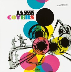
Jazz Covers
By Joaquim Paulo; edited by Julius Weidemann <br> Taschen, £34.99
The most ingenious editorial design element of Jazz Covers is its double spine: a trompe l’oeil rendering of slightly battered LP spines that includes John Coltrane’s A Love Supreme, Duke Ellington’s soundtrack for Anatomy of a Murder, The Individualism of Gil Evans and Miles Davis’s On the Corner.
The remainder of this hefty two-volume book shows no such discrimination. Packed in a sturdy slipcase, it includes many great covers but its emphasis on quantity over quality means that work by Robert Flynn (Impulse), Reid Miles (Blue Note) and Bob Ciano (CTI) is fighting for space with kitsch.
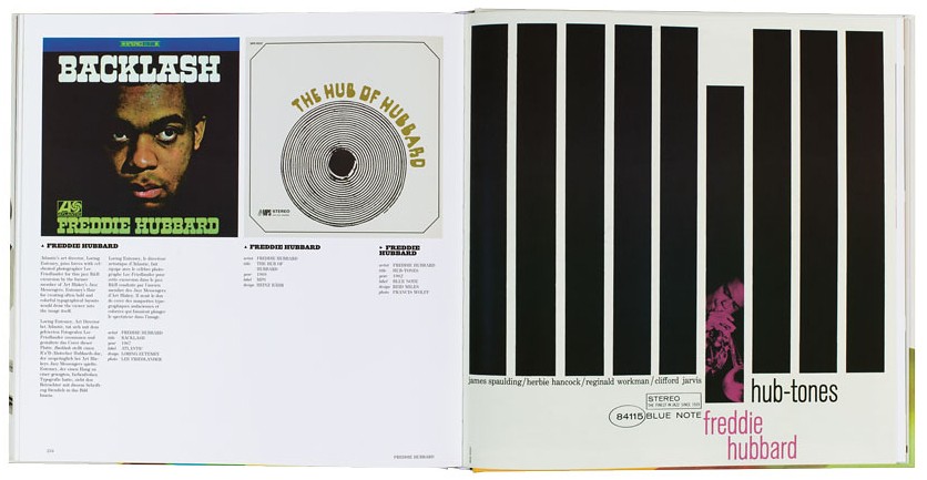
Of course it’s wonderful to see some remarkable covers in a book format. Some images may be familiar from graphic design Tumblrs, or as thumbnails in iTunes, but Jazz Covers shows powerful graphic statements such as Freddie Hubbard’s Hub-Tones (designed by Reid Miles) and Archie Shepp’s The Magic of Ju-Ju (designed by Robert and Barbara Flynn) full bleed, at full twelve-inch LP size.
However, many examples are not even jazz, but pop or ‘easy listening’, such as the uncredited design for Four Freshman and 5 Trombones used for the slipcase cover. As a dynamic example of mid-century overprinting this has some interest, but it’s an odd choice for a book that excludes jazz design heroes such as Alex Steinweiss (the subject of a Taschen monograph) and Mati Klarwein. There are far too many examples of the retro stinkers (such as Quincy Jones’s Around the World) regularly skewered in Selwyn Harris’s ‘Art Failure’ column for Jazzwise.
The lack of discrimination, in its contents and in its uncertain page layout, makes the heavy Jazz Covers feel oddly weightless. Some short Q&As – with designer Bob Ciano, Impulse! / CTI founder Creed Taylor and others – help to establish some context, but we get little sense of Paulo’s attitude to the contents of his book. All we know is that he’s got a collection and he wants to show it.
One odd element of Jazz Covers is the way it is organised: in alphabetical order by musical artist. This means that to see the work of designer Burt Goldblatt (from the Australian Jazz Quartet via Bud Freeman to Mel Tormé) or illustrator David Stone Martin (Basie to Lester Young), you have to skip around the volumes, like flipping covers in a second-hand record shop. Many of the captions offer incomplete information, and some are inaccurate: Lou Beach’s evocative collage for Weather Report’s Heavy Weather is credited to art director Nancy Donald.
The caption commentary is a somewhat random mix of anecdotes and gossip about music, or design, or a bit of both. All in all, reading Jazz Covers is a bit like browsing for old vinyl in a vintage record store, with a chatty, obsessive sales assistant grokking Wikipedia on their laptop. Given the demographic of vinyl collectors, maybe that’s deliberate.
Top: a spread featuring three Freddie Hubbard albums from the 1960s.
John L. Walters, editor Eye, London
First published in Eye no. 84 vol. 21 2012
Eye is the world’s most beautiful and collectable graphic design journal, published quarterly for professional designers, students and anyone interested in critical, informed writing about graphic design and visual culture. It is available from all good design bookshops and online at the Eye shop, where you can buy subscriptions, back issues and single copies of the latest issue. You can see what Eye 84 looks like at Eye before You Buy on Vimeo.