
Autumn 2021
Ambassador for reading
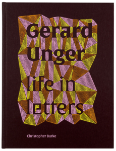
Gerard Unger, Life in Letters
By Christopher Burke. Designed by Hansje van Halem. De Buitenkant, £45, €45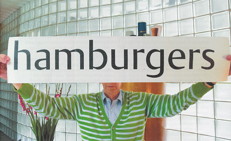
In his daughter Flora’s schoolyard, the late Dutch type designer Gerard Unger (1942-2018) was once approached by a mother who told him that her daughter was convinced Flora’s father must be stupid to be still drawing letters at home. Indeed, that is what he did – during the time when I assisted him – first on paper, later on his screen.
Born during the Second World War, Unger grew up in the city of Arnhem (of A Bridge Too Far fame), was educated in Amsterdam and London in the 1960s and lived in Bussum, a small town, with Marjan, his art historian wife, until the end of his life, drawing about 25 typefaces in the 50 years he lived there.
In his final years, Unger approached Christopher Burke to write about his type designs and asked Hansje van Halem to design the book, which was printed and published – also at his request – by Jan de Jong’s De Buitenkant.
The result is a 336-page full colour book, close in size to A4 that provides an ample surface to show clearly the details in the sketches, tests and final type designs. A beautiful set of fonts has been compiled from Unger’s oeuvre for the typography of this book.
Through Unger’s letters work we can read Burke’s words about them. Burke presents Unger’s letters for the most part in chronological order and includes a written commentary on each typeface revealing when, for whom, why and how they were made and also what Unger himself had to say about them. This latter knowledge comes from Burke’s conversations with Unger and from Unger’s own publications, many excerpts of which have been smoothly incorporated into the text.
The result is a well written history by an author who is known for his well respected books on Paul Renner and Jan Tschichold. The story benefits from his technical insights – Burke, a former lecturer at the University of Reading, also designs fonts himself.
Burke describes clearly how Unger gradually mastered the profession: first as a student by reading everything on the subject that could be found, then his first fragile attempts, followed by his initial font assignments. Soon, Unger no longer regarded letters as shapes that arise from pen movements, but as unique basic shapes stored as structures in our brains. He referred to these mental structures by accentuating parts of them through magnification. By paying close attention to the details of these letter parts Unger was able to evoke amplified letter signals. Subsequently, by consistently applying this approach to similar and repeated letter parts, he increased the legibility of his fonts.
How Unger dissected his letters to reassemble their parts into more and more efficiently collaborating members of his font families explains why his fonts became more and more similar over the years. It also explains why his letters in larger fonts lack some grace: they were primarily built to increase readability in small sizes.
Burke also clearly describes how Unger anticipated the technical developments that had a profound effect on letter production during his long career. After some 500 years of printing with lead letters, texts were set with photo negatives. This in turn was quickly replaced by building letters from thin, digitally drawn lines, after which the previously pixelated letters were replaced by vector drawings, making letter shapes scalable so they could be used easily on screens. Such rapid developments inspired Unger to draw specific font families for them, initially for customers, but later on he marketed his work himself directly.
In addition to form and technique, reading is the third theme in Unger’s life of letters; it is because of reading that there are letters and therefore it was a subject close to Unger’s heart and he wrote about it extensively during his career. For him, developing optimum readability was a quest in which he used his visual and technical knowledge and which – as mentioned – gave his fonts similarities.
However, the subject of readability is also too big a problem for a single type designer. On the one hand, it’s about how letterforms are processed in our brains – the neurological aspect of reading. On the other hand, it’s about how communities agree on which letterforms to use – the social conventional aspect of reading.
Unger was fascinated by what conditions were necessary for readability, the limitations of technique, and the way in which these aspects determined the shape of letters throughout their history. He spoke about them regularly and passionately as a teacher and in his many lectures, introducing a wide audience to these topics and lighting up their enthusiasm. It was therefore not surprising that his death made the Dutch national news.
Our former ambassador for reading is truly missed, and anyone wanting to learn more about the life, work and thinking of this gentle type giant can spend hours enjoying Burke’s impeccably researched, extensively documented and well written book.
Cover of Gerard Unger, life in letters designed by Hansje van Halem. Top. Spread with drawings by Unger of Swift italic, bold and bold condensed, 1984-85.
Chris Vermaas, designer, writer, educator, Amsterdam
First published in Eye no. 102 vol. 26, 2021
Eye is the world’s most beautiful and collectable graphic design journal, published for professional designers, students and anyone interested in critical, informed writing about graphic design and visual culture. It is available from all good design bookshops and online at the Eye shop, where you can buy subscriptions and single issues.