
Summer 2016
Making sense of a complex ideal
Simplicity: a matter of design
Written and designed by Per Mollerup. BIS Publishers, £34
Simplification is an ideal we think we aspire to, whether we are talking about the simple life, a clean uncluttered aesthetic, truth to materials, or just efficiency and economy. Per Mollerup uses these different motives – functionality, aesthetics and ethics – as an organising principle for the book, and introduces a wide range of sources and examples.
He identifies several paradoxes of simplicity: that simple processes are enabled by complex tools, that redundant information makes for more reliable understanding, and that to master some eventually simple actions requires learning. Mollerup gives the example of the BMW iDrive control. It offers drivers a single knob to control more than 700 functions, but this physical simplicity results in cognitive complexity.
Information designers have for years railed against the conflation of simplicity with brevity (such as the government minister who decreed that no tax form should be more than twelve pages – potentially leading to complex compound questions, inadequate response spaces and smaller type). Simplified explanations frequently grow in length, as you take time to explain things, or pace the user’s experience through white space and page breaks. Vijay Bhatia, who writes about simplification in legal documents, uses the term ‘easification’ to avoid this assumption.
Now, Mollerup comes up with brilliant terminology to describe this paradox: ‘quality-simple’ and ‘quantity-simple’. He gives an example from furniture design. Aesthetically simple modernist cupboard doors, with no visible hinges or handles, are quantity-simple. But we need to explore them and learn how to open the doors by sliding them, or pressing a particular part. That’s fine if we own the cupboard but disastrous if they contain emergency equipment. The quantity-simple doors have no perceivable affordance or readability. Doors with conventional handles are instantly readable, so are quality-simple.
Per Mollerup is a past master of the clear and concise. He has previously tackled Data Design and Wayshowing, among other topics, and he has taken the same approach here. Like the classic Danish furniture designers, he strips out superfluities and retains the essence. Well illustrated, and written with both quality and quantity simplicity, it makes essential reading for thoughtful designers.
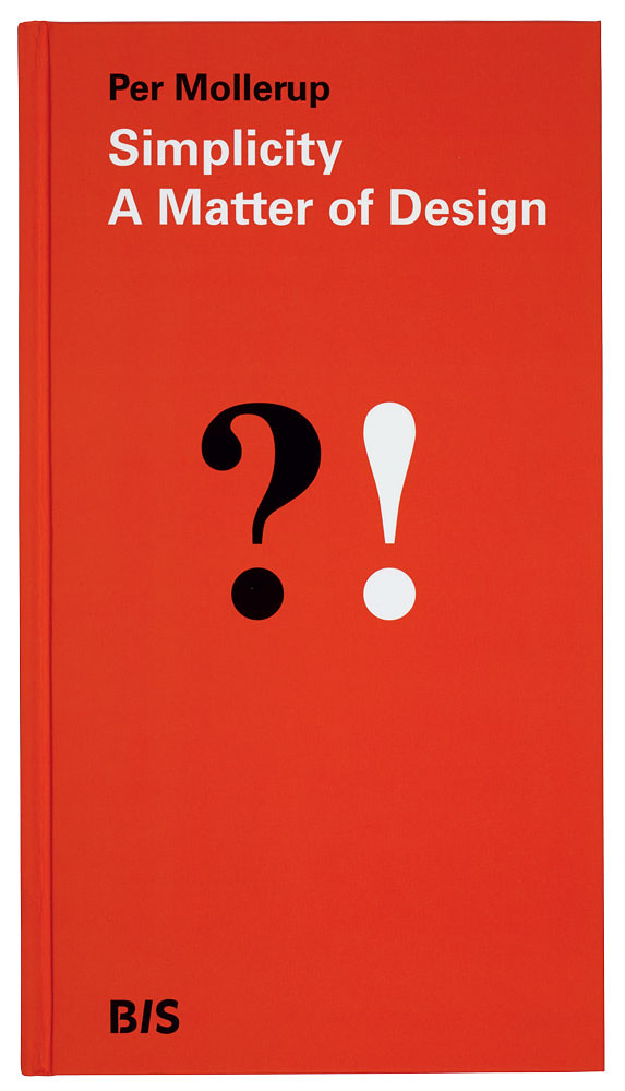
Top: Cover of Simplicity: A Matter of Design, written and designed by Per Mollerup. The cover graphic shows a question mark and exclamation mark, echoing a cable communication between French author Victor Hugo and his publisher about the fate of his novel Les Misérables.
Rob Waller, information designer, editor, educator, Reading
First published in Eye no. 92 vol. 23, 2016
Eye is the world’s most beautiful and collectable graphic design journal, published quarterly for professional designers, students and anyone interested in critical, informed writing about graphic design and visual culture. It is available from all good design bookshops and online at the Eye shop, where you can buy subscriptions and single issues. You can see what Eye 92 looks like at Eye before You Buy on Vimeo.