Autumn 2021
Poster man and boy
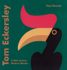
Tom Eckersley: A Mid-century Modern Master
By Paul Rennie. Batsford, £25
Paul Rennie’s Tom Eckersley: A Mid-century Modern Master is a fascinating account of Eckersley’s prolific output as a designer and educator, lavishly illustrated with more than 200 works spanning five decades.
‘Mid-century Modern Master’ must be the most bestowed title in historic design criticism, but it does feel fit in the case of graphic designer Tom Eckersley – though perhaps we could expel the ‘master’ soon?
Owing to his reserved but friendly nature, Eckersley is an enigmatic figure, and with little detail of his private life on record, Rennie focuses on the broader industry and socio-economic contexts for his work. Given Eckersley’s active years from the 1930s to the 1970s, a period of continual evolution of the status and role of design, Rennie’s book is as much a story about Eckersley as it is about the key developments and figures of modern British graphic design, taking in print technology, politics, commerce, commissioners, training and designer-led networks.
Eckersley was born in Lancashire in 1917 and grew up on a small-scale dairy farm, his father a Methodist lay preacher. Rennie describes the distinct environment of northwest England, with its basis in industrial innovation, Nonconformism and radical politics as a potential source of Eckersley’s later commitment to human-centred, progressive design.
Trained at Salford School of Art, Eckersley graduated in 1934 and moved immediately to London with classmate Eric Lombers. Inspired by the avant-garde European posters they had seen at Salford, the pair set up a design partnership and were soon creating posters for the most influential commissioners of the day: London Transport, Shell and the General Post Office. Modernist examples, including the cosmic still-life ‘Scientists Prefer Shell’ do feature, but there are also surprises: editorial illustrations for News Chronicle reveal the duo’s proficiency in evocative, figurative illustration.
During the Second World War the partnership dissolved, and Eckersley continued working for his prewar clients, though his posters for the Royal Society for the Prevention of Accidents (RoSPA) accounted for most of his design output during the period – see ‘Make Sure You Are Seen’, 1940s, below left. Rennie makes a compelling case for this body of work – which includes experimental photomontage, surrealist disembodied hands and dramatic plays of scale – as being a design contribution to the war effort second only to that of Abram Games.
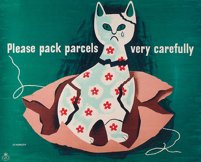
In the 1950s, economic austerity compressed industrial activity throughout the UK at the same time as practitioners were re-establishing their networks and presenting a coherent manifesto for graphic design and its role in redevelopment. Thoroughly engaged in these activities, Eckersley continued to design posters, combining his Modernist sensibilities with dark British wit, as in his now-iconic ‘Please Pack Parcels Very Carefully’ series for the General Post Office (GPO), see ‘China Cat’, 1958, left, reproduced alongside lesser-known work for Pakistan International Airways and the Foreign Office.
Later that decade, Eckersley took up the post as Head of Design at London College of Printing (LCP, now LCC UAL), working there until 1976. At LCP, Eckersley developed a mode of working quite different to that of the central and west London-based art schools. Understanding that students would need to design for scenarios that did not yet exist,
the school’s programme, taught by professionals with different backgrounds, considered problem-solving the fundamental task of the designer, who could find solutions through task-specific combinations of skills and tools.
Rennie sets Eckersley’s ‘studio as laboratory’ and informal learning environment as a radical alternative to the Beaux-Arts tradition that came before, and one that successfully prepared design students for the rapidly changing demands of the 1960s and 70s.
Eckersley’s work at LCP reduced the scale of his practice as a designer, but also influenced his posters by introducing him to screenprinting. Striking, block-colour posters for LCP include the unnerving ‘Long Hair is Dangerous’, while playful college invitations are charming experiments in three dimensions.
Rennie notes in his conclusion that Eckersley’s work was well celebrated in the UK in his lifetime and by designers of his generation, and that he was unusual in having an international profile. However, his work as a designer, with its commitment to economy in every sense and his expanded approach to graphic design education, still has much to teach us.

Olivia Ahmad, artistic director, House of Illustration, London
First published in Eye no. 102 vol. 26, 2021
Eye is the world’s most beautiful and collectable graphic design journal, published for professional designers, students and anyone interested in critical, informed writing about graphic design and visual culture. It is available from all good design bookshops and online at the Eye shop, where you can buy subscriptions and single issues.

