Spring 2018
Relics of a vanished world

Claudia Klat
Dave Farey
Colin Brignall
Mike Daines
David Quay
Design history
Graphic design
Reviews
Typography
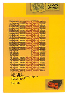
Letraset: The DIY Typography Revolution
By Adrian Shaughnessy. Edited by Tony Brook and Adrian Shaughnessy. Designed by Spin. Unit Editions, £55.

‘It’s all about nostalgia now,’ writes Malcolm Garrett in his introduction to Letraset: The DIY Typography Revolution (Unit Editions, £55), a fond and cheerful celebration of the rubdown lettering system that turned graphic design on its head in the 1960s, 70s and early 80s.
Letraset: The DIY Typography Revolution, designed by Claudia Klat at Spin, covers the historical bases. It has a foldout timeline and reminds us that, in its heyday, Letraset was seen everywhere, from advertising to church circulars, from Private Eye to punk. It was ubiquitous in teen magazines and on high streets (check out the swinging-1970s Davida fascia of Battersea barber Eddy Scissorhand on page 13). It even made an appearance in the paintings of Francis Bacon. The book also nods to Letraset’s afterlife as an experimental design tool, for example in the work of Erik Brandt, interviewed here alongside type designer Freda Sack (who began her career at Letraset), Andy Stevens, David Quay and others. Key Letraset players Colin Brignall, Mike Daines and Dave Farey contribute essays.
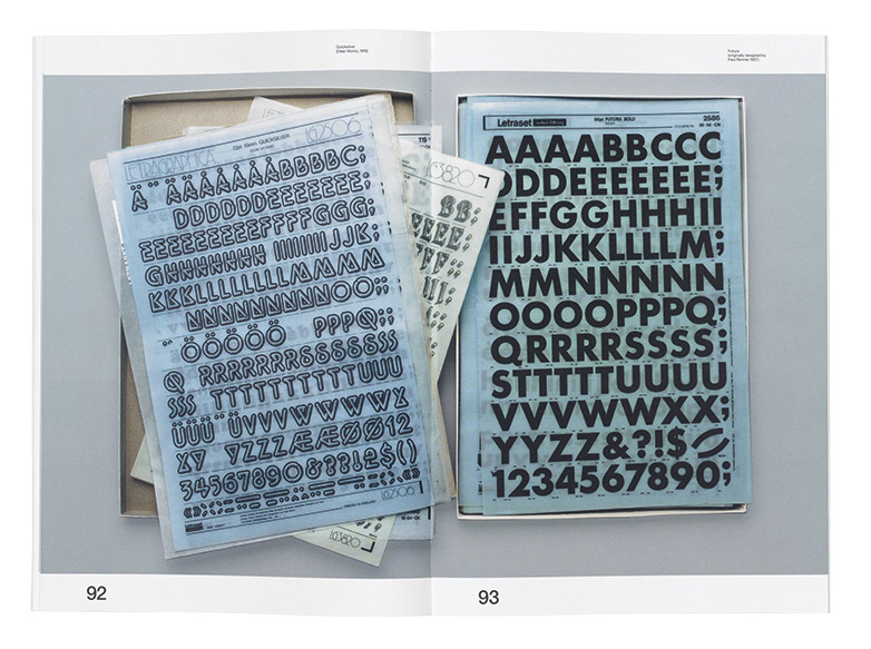
But at heart this book is ‘all about nostalgia’, and its real pleasures lie in the many full pages given over to images of the stuff itself: sheets and sheets of Letraset typefaces, often with gaps where the most popular letters used to be, or with corners rubbed away, hacked for last-minute repairs.
There are architectural symbols, textures and ‘art sheets’ featuring slacks-clad daddios and beehived women; there are press ads, mailers and spreads from the annual Letraset catalogues, whose arrival in art-supply shops were once eagerly awaited by the nation’s young designers.
Despite its irritatingly freeform approach to captioning, the book is a beguiling reminder of how we were – enough to make readers of a certain age feel wistful for a vanished world of pre-Mac, hands-on design and all-nighters spent setting type with nothing but Letraset and an old biro. Can’t imagine many of them would want to return to it, though.
Letraset: The DIY Typography Revolution, Unit Editions, £55.

Jane Lamacraft, writer and editor, London
First published in Eye no. 96 vol. 24, 2018
Eye is the world’s most beautiful and collectable graphic design journal, published quarterly for professional designers, students and anyone interested in critical, informed writing about graphic design and visual culture. It is available from all good design bookshops and online at the Eye shop, where you can buy subscriptions and single issues. You can see what Eye 96 looks like at Eye Before You Buy on Vimeo.

