Winter 2011
Typonauts, start your quest here
Type Navigator: The Independent Foundries Handbook
Edited by Jan Middendorp and TwoPoints.net <br>Designed by TwoPoints.net <br>Gestalten, €49.90, £45<br>
So Type Navigator, curated by Jan Middendorp and the Barcelona-based studio TwoPoints.Net (which, with Victionary, last year launched its gorgeous ‘I Love Type’ book series), comes at the right time. Its main purpose is to bring fresh and accurate information about where and how to purchase digital fonts to the ever-growing community of type users – ‘civilians’, as Middendorp puts it – as well as professional designers and typophiles.
In his inspired and inspiring introduction, Middendorp recounts the recent history of typography as a product, reminding us for instance how expensive it could be to buy pieces of text on film or paper from typesetting companies before our digital days. He describes the differences between majors (such as Monotype Imaging, which has recently bought out MyFonts, possibly the most popular online seller) and independents such as FontFont and its selling platform, FontShop.
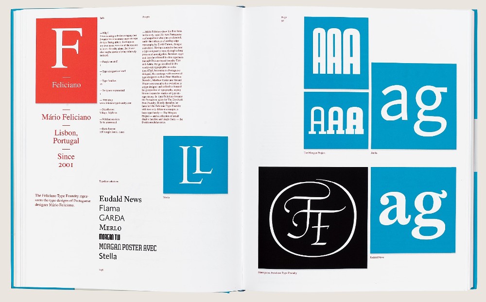
Type Navigator provides a snapshot of the current typescape, built upon a selection of 53 international foundries. Their output is presented through short but informative biographical notes, examples of types in use, and neatly designed specimens, many in colour, over varying numbers of pages. One can find online retail pioneers such as P22 or Fountain Type, or newcomers such as Just Another Foundry; confirmed designers such as Jonathan Barnbrook (VirusFonts), or rising stars such as Kris Sowersby (Klim).
This substantial volume is completed by a thorough index and a CD of free fonts offered by some of the featured foundries. This handbook will help any ‘typonaut’ begin the quest for the font suited to their needs. It will also help them detect the trends and design patterns that have spread in recent years: superfamilies, faithful revivals, rounded sans serifs, post-neo-modern faces, OpenType-fuelled scripts, stencil, ornamental and hyperfat one-shot faces …
One may, however, regret the absence of non-Latin fonts or foundries such as the recently launched Czech foundry Rosetta, Thailand’s Cadson Demak or the Indian Type Foundry – the growth in this part of the typosphere is rendering earlier impressions obsolete. Let us hope this book will become the first of a series documenting and updating the evolution of typography as a business, and of fonts as cultural artefacts and endless hybridisations. New territories – or the moving of obsolete frontiers – need new maps.
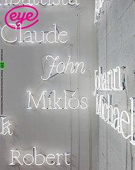
Cover of Type Navigator designed by TwoPoints.Net.
Top: Spread showing work from Mário Feliciano.

Sébastien Morlighem, researcher, writer, lecturer, Barcelona and Amiens
First published in Eye no. 82 vol. 21 2012
Eye is the world’s most beautiful and collectable graphic design journal, published quarterly for professional designers, students and anyone interested in critical, informed writing about graphic design and visual culture. It is available from all good design bookshops and online at the Eye shop, where you can buy subscriptions, back issues and single copies of the latest issue.