
Sunday, 9:41pm
20 March 2011
Fixed compass
John L. Walters
the history department
Design history
Graphic design
Typography
Visual culture
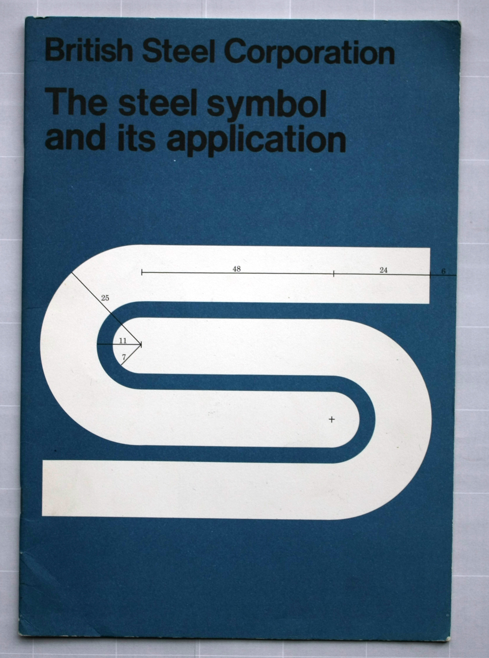
David Gentleman talks about his identity design for British Steel
The most recent issue of Eye includes a Reputations interview with David Gentleman, whose career spans nearly six decades, and whose work includes illustration, wood engraving, protest graphics, posters, books, stamps and identity design.
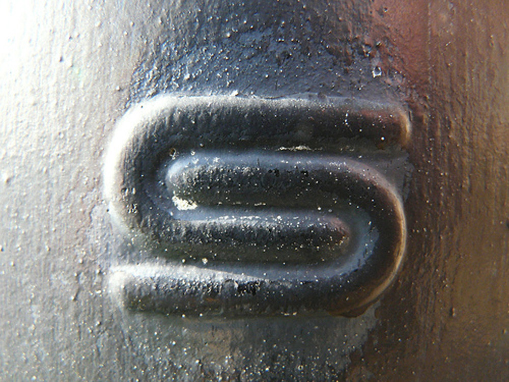
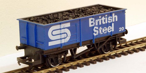
One of his best known identities is the logo for British Steel, which he designed in a hurry after another design practice’s work was rejected by the client.
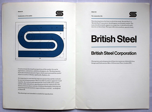
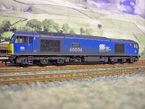
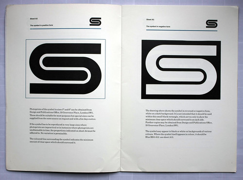
Gentleman’s A size proportioned logotype, which can be replicated on site using a ruler and a set of compasses (see diagrams and measurements above and below, from the sixteen-page style manual), was used in many iterations, from huge steel plants, to the sides of trucks, as well as on letterheads and in advertising.
Below is an extract from John Walters’ interview with Gentleman, which took place in the designer’s Camden home-studio last Autumn.
JLW How did the British Steel commission come about?
DG Through a neighbour, Will Camp [British Steel’s director of information services]. They had commissioned ideas already but they didn’t like them, so he came in one day and said will you give
it a go.
Was that done quickly?
Very quickly, yes.
I’ve read that it stemmed from a visualisation of the steel process – is that true?
It came first from my own wish to suggest that steel was strong and flexible. Only later did I discover that steel was bent in order to test its strength … so I used this as a rationale, but I didn’t know that at the time!
Did the British Steel job give you a taste for identity work?
Well, I’ve only done about half a dozen logos, ever. The last was for the Bodleian Library in 2002, which was a great labour. I could have done it much quicker if I had got into digital by then. It’s a more pictorial thing, an old Elizabethan building. I would have done more things like this if they’d ever asked me.
The early ones were very geometrical. They were done the same way as [British Steel], cutting out Letrafilm with a knife stuck to a pair of compasses so you could make a beautiful circle very easily.
It’s a kind of engineer’s dream, isn’t it?
It was dead easy! The British Steel logo is also in A size proportions: 1 to the square root of two. A sizes are an unbeatably logical way to do it. Anything else seems silly and wasteful.
You can read the full text of this Reputations interview with David Gentleman on the Eye website.
Eye is the world’s most beautiful and collectable graphic design journal, published quarterly for professional designers, students and anyone interested in critical, informed writing about graphic design and visual culture.
It’s available from all good design bookshops and online at the Eye shop, where you can buy subscriptions, back issues and single copies of the latest issue. For an extensive (if so far incomplete), text-only archive of articles (going back to Eye no. 1 in 1990) visit eyemagazine.com.