
Thursday, 5:00pm
29 October 2020
Sea, sky, paint and pattern

Karel Martens
Morag Myerscough
Joseph Henry Good
Lothar Götz
Design history
Graphic design
Illustration
Typography
Visual culture
Rich, decorative patterns shape our experience of the British seaside. The sixth in Justin Burns’s series on coastal graphic design
Patterns and decoration have long informed the design of seaside architecture – promenades, amusements, hotels and shops. Arcades, piers and theme parks display bunting, flags and decorative signage that create an entertaining environment, writes Justin Burns.
Upon a visit to the seaside we are met by familiar, expected visual tropes: neon, painted signs, crowded shop fronts bursting with brightly coloured souvenirs and inflatables. Pattern and colour form an important part of a visual language that adds to our experience and cultural recognition and acceptance of place.
Frank Codona’s Speedway, National Fairground and Circus Archive, ca. 1930.
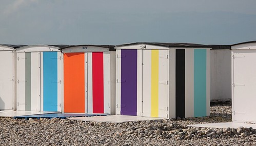
Top. Beach huts on Southwold Beach, UK. Photograph by Ben Wicks, 2020.

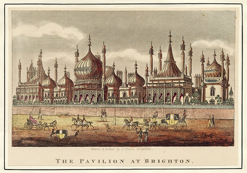
Joseph Henry Good, Brighton Pavilion, Brighton Museums, 1830.

Joseph Henry Good, Brighton Pavilion, Brighton Museums, 1830.
Holiday-makers contribute to the meaning of the seaside by engaging with the entertainment and retail on offer. In Practising Place: Creative and Critical Reflections on Place (Cornerhouse Publications, 2019) Dr David Jarratt (senior lecturer and researcher in Tourism at the University of Central Lancashire) and artist and writer Jenny Steele allude to the transitional resilience of the seaside and visitor reconnections with the built environment and seafront heritage forming the ‘seaside image’. Jarratt and Steele cite historian Fred Gray’s analysis of how eclectic, architectural splendour contributes to the ‘otherness’ of the seaside (Designing the Seaside, Reaktion Books, 2006). Our trips to the ‘edge of the land’ are informed by graphic language and patterns that are associative and expected within the resorts.
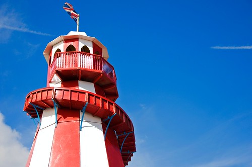
Oriental and avant-garde design has informed Art Nouveau and Art Deco forms of decoration on the façades of hotels, winter gardens and theatres, which are still evident in resorts today. For a limited time, holiday-makers are transported to a space designed for pleasure, where decorative design contributes to the creation of an ‘alternative reality’. Pattern and motif were integral to the original construct of many British resorts such as Brighton, where continental references are reflected in the cultural awareness and diversity in the designs of the pavilions and villas. The seaside has also been a place where Britain’s imperial past has been recognised and celebrated through monument and municipal building design through relief typography and iconography. In contrast, seafront shops are ablaze with illuminated colour and a clash of decorative, ornate pattern and symmetrical, stylised shapes. In particular, the striped pattern has become a key visual signifier of the seaside with sticks of rock, deck chairs, beach huts and carousels, all part of our experience of the seaside. Repeat pattern shapes that evoke the nautical heritage are deployed through a multitude of hues to sell candy floss, ice cream and picture postcards.
Cranch’s Sweet Shop, Salcombe, South Devon, 2020.

Helter Skelter, Llandudno, Wales, photograph by Richard Beatson, 2019.
In his book The Devil’s Cloth, A History of Stripes, Michel Pastoureau describes the impetuous ‘Stripe’, which ‘doesn’t wait, doesn’t stand still. It is in perpetual motion and animates all it touches, endlessly forges ahead, as though driven by the wind.’ In the Middle Ages, striped patterns had satanic associations along with negative connotations such as criminality and danger. Over the past two centuries, stripes, as a decorative device, have acquired positive associations through nautical representation and links to national identity. The pattern can signify a sense of freedom within an environmental stage set for entertainment and escapism. As with the liminality of the seaside and the undefined pleasure zones, in the stripe, writes Pastoureau, ‘there is something that resists enclosure within systems.’ Architects, artists, designers and filmmakers have used stripes and repeat patterns to exploit our sense of association and nostalgia, drawing upon our sensory experiences of the seaside, including carnivals, circuses, fairgrounds and Punch & Judy shows.
Hanningtons Lane, Brighton, photograph by Justin Burns, 2020.

Arcade, Great Yarmouth, photograph by Justin Burns, 2020.

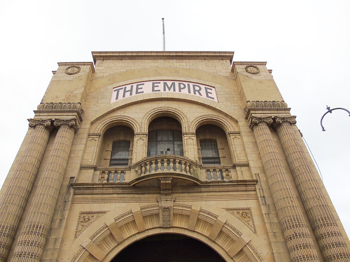
The Empire, Great Yarmouth, photograph by Justin Burns, 2020.
In investigating the socio-cultural significance and associated ‘sense of place’ of the traditional seaside resort, Jarratt* (2013) connects the carnivalesque with the liminality of the seaside through the communal aspect of the promenade and activities that are on the ‘edge of normal behaviour’. The seaside vista evolves from dawn to dusk with elaborate visual devices transitioning through the duration of our day-trip, accentuating the suspension of the everyday.
Lothar Götz, Dance Diagonal, Towner Gallery, Eastbourne, UK, 2019.
Lothar Götz, Dance Diagonal, Towner Gallery, 2019.
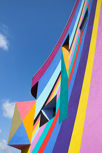
Recent contemporary forms of representation and communication have drawn upon redolent experiences, while engaging new visitors and audiences through multi-disciplinary media. Artist Lothar Götz’s recent mural for the Towner Gallery in Eastbourne reflects the seaside environment and carnival traditions through the temporary nature of the radiant painted stripes that cover the exterior of the gallery. Götz cites Modernism, the Bauhaus and The Triadic Ballet by Oskar Schlemmer as influences on his work.
Morag Myerscough’s touring Belonging Bandstand, 2018.
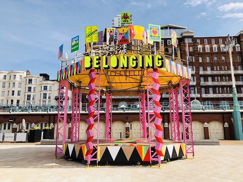
Morag Myerscough, Belonging Bandstand, 2018.

Similarly, Morag Myerscough’s recent mobile installation occupied boundaryless open spaces with a platform to encourage community voice and artistic expression. Exploring the theme of ‘belonging’, the design was informed by contributions from the communities within several touring destinations along the south coast of England. The ‘Belonging Bandstand’, adorned with graphic shapes and festival colour, enticed participants to engage with placards displaying messages of societal hope. The design combines the concept of the traditional bandstand, with the aesthetic of the painted, striped beach hut and the now-familiar pop-up event structures we see at festivals.
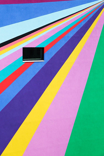
Spread and cover of Couleurs sur la plage [Colours on the Beach] by Karel Martens and Élodie Boyer, published by Éditions Non-Standard, 2017.

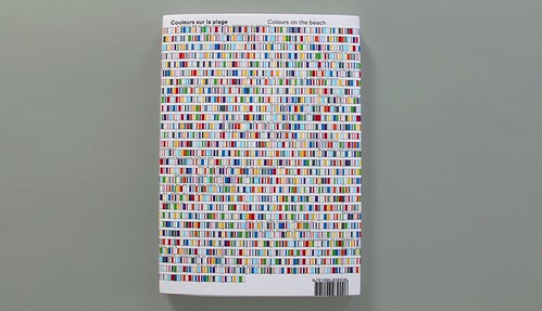
Colours on the Beach (Couleurs sur la plage) is a recent Karel Martens commission in Le Havre, Normandy, in which the celebrated Dutch designer / artist reimagines the white beach huts (cabins) through a coding system of painted coloured stripes. The designs across the architectural grid of cabins use ten colours and six widths of stripe, applied to the four walls of 700 beach huts along the beach. To mark the 500th anniversary of the city, the all-encompassing composition contains a concealed message within the colour system: the founding decree of Le Havre signed in 1517 by Francis I, deploying techniques derived from modern cryptography. The designs celebrate the port, the city, the seaside resort unified through diversity, through graphic and architectural systems reimagining the open and seemingly interminable public space.
The project transforms the landscape and continues to visually engage the local community and visitors alike since the 2017 celebratory festival, which was documented in a book published by Éditions Non-Standard. Overseen by publisher Élodie Boyer, Colours on the Beach meticulously articulates the process developed in conjunction with University of Le Havre’s Computing Laboratory of Information Processing and Systems (LITIS), demonstrating the possibilities of collaborative practice between graphic design, architecture and science. This panoramic seaside pattern communicates a singular message.
* Jarratt, D. (2013) A socio-cultural analysis of the traditional seaside resort and its contemporary meaning to tourists with specific reference to Morecambe, UK PhD Thesis. University of Central Lancashire.
Photograph of the Le Havre beach hut collaboration between Karel Martens and Élodie Boyer shown in Colours on the Beach, 2017.
Justin Burns, Head of Art & Design, Leeds School of Arts at Leeds Beckett University. Burns is exploring the graphic language of the seaside for a PhD.
Eye is the world’s most beautiful and collectable graphic design journal, published quarterly for professional designers, students and anyone interested in critical, informed writing about graphic design and visual culture. It is available from all good design bookshops and online at the Eye shop, where you can buy subscriptions and single issues.