Autumn 2009
One week in pictures
Tony Chambers
Mark Porter
Willy Fleckhaus
David King
Pearce Marchbank
Tibor Kalman
Jeremy Leslie
Now we are deluged with more images than ever, we have lost faith in the power of the photo to express anything other than our personal reality. We don’t take the production of meaning seriously and we use pictures with less fluency and purpose than earlier generations of photographers, designers and editors. We don’t know what we’re trying to say and we don’t know who we are saying it for. We don’t value expertise and commitment and we don’t believe in the photographer’s mission – nor do we think it is likely to have any effect. Rick Poynor looks at one week’s magazine journalism, and finds that this ocean of pictures tells uncomfortable truths about who we are now
If quantity alone is the decisive factor, we live in a great age of photography. It has never been easier to take a picture, and everyone is doing it. In the bygone days of film, a camera was still something to be brought out for special occasions. Processing pictures cost money, so cameras were used sparingly. Digital changed everything. With lightweight pocket cameras and camera phones, snapping pictures became a daily activity for many, particularly the young. The result is a peculiar new kind of photographic ‘literacy’: more people taking more pictures than ever, yet a feeling that the individual picture, particularly the well taken picture, counts for much less than it did. A ‘photo’ is now just an easily deletable particle in an infinite stream of images that will probably never materialise as a print and be invested with meaning as an object.
The devaluation of photography can be seen most clearly in the places where the medium once thrived: in newspapers and magazines. These developments have been incremental, so it is easy to take the situation for granted without realising how much has changed. It is equally easy to assume that what we see in papers and magazines now is all that photography is capable of doing. The changes were already under way in the 1970s, as printed publications increasingly lost out to the visual immediacy of television, long before digital photography became the norm for professionals as well as amateurs. By the 1990s, photography as we had known it was struggling to hold its place. The past fifteen years, if you care about photographic reportage, have been calamitous.
It is not just that the pictures are often mediocre and formulaic. The problem also lies in the way they are used. There is good reason now to doubt that many of the art directors who commission or select these pictures, and the designers who lay out the pages, have any deep understanding of, or commitment to, photography’s possibilities as a documentary or narrative medium. But how can this be? Isn’t the sensitive handling of photographs one of the fundamental tasks of a fully competent graphic designer? It certainly used to be regarded that way. ‘Of all the related visual disciplines, photography is probably the one of greatest importance to the graphic designer,’ wrote Allen Hurlburt in Layout: The Design of the Printed Page (1977). ‘Working with photographers is one of the most important aspects of the designer’s work.’ Those observations hold even truer for anyone engaged in editorial design.
If you doubt the situation could be as bad as I say, do what I did. Go to the newsstands and buy a big pile of papers and magazines and spend some time sifting through them all. To narrow down a potentially vast task, I followed a couple of rules. I chose to look only at British examples and I concentrated on publications where you would expect to find – and would once be certain to have found – high standards of photographic practice. This meant quality newspapers and supplements, and magazines with general subject matter, whose reputations depend on high-quality journalism. By comparing what was available from a particular publishing culture in a particular week (at the end of June), I hoped to produce a picture that amounted to more than a series of random impressions over time, and that could be fairly taken to represent the current condition of photography and its use.
So I ploughed through them all: The Times, The Sunday Times, The Guardian, The Observer, The Telegraph, The Sunday Telegraph, The Independent, The Independent on Sunday and the Financial Times, with a particular focus on their proliferating supplements. Magazines were a trickier task. I flipped through many with photography so perfunctory that they weren’t worth obtaining for this survey. I found material worthy of comment – whether to commend or criticise – in New Statesman, Intelligent Life (published by The Economist), Wired (UK), GQ (UK), Esquire (UK), Grazia and, slightly to my surprise, Jamie, celebrity chef Jamie Oliver’s new magazine about food.
I mostly avoided specialised publications (sport, music, computing etc.), which show endless pictures of essentially the same subject. A golf magazine art director could be performing wonders but it makes no difference to the more crucial standards of mainstream visual journalism. I also left out the independent subculture documented so effectively in We Make Magazines (2009) because, again, my purpose was to find out what was happening at the heart of our national publishing culture in ordinary newsagents. I broke my rule for The Drawbridge: its ambitious content makes it a natural in this company.
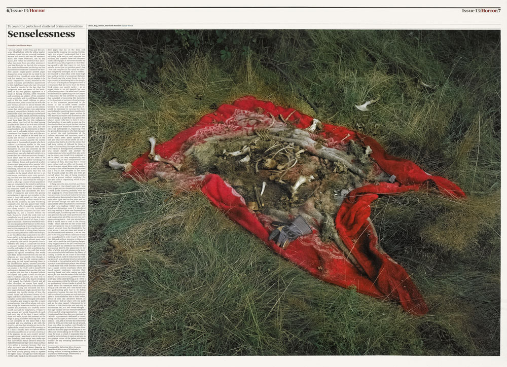
The simplest test I applied was the stun factor. I hoped to find pictures that stopped me in my tracks because the image was extraordinary, presenting something unexpected in an unfamiliar way. This only happened twice in all of these publications. The first, in New Statesman, was a picture showing a People’s Liberation Army ceremony in Taiyuan in 2008. The seated recruits, stretching away into the distance on both sides of the image, like a huge green human wedge, contrast powerfully with the hazy grey buildings behind them. This library photo from Rex Features is good rather than brilliant, and much of its impact comes from the confident way it fills the opening spread, forming an open window on the story that follows. The other photograph, in The Drawbridge, was a picture by Jason Orton of a glove, a rug and some bones in Dartford Marshes. This enormous image, centrepiece of an issue titled ‘Horror’, is extremely unsettling.
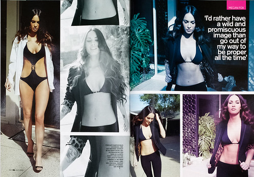
Spread from ‘All mouth and no trousers’, GQ, July 2009. Photographs: Simon Emmett. Styling: Jonas Hallberg. No single picture of Hollywood star Megan Fox dominates in a spread that suggests the casual layout of a scrapbook, or pictures taped to a fan’s bedroom wall. The fetishisic repetition of the actress’s image only serves to underline the lack of a real story.
In publications of this calibre, with thousands of pictures, there should have been many more images with this kind of power. But so many of these colour photos are dispiritingly bland. In an era when the public is supposedly fixated on celebrity, everything is about personalities and the portrait has become the mainstay of contemporary visual journalism. Yet these portraits, whether they show someone famous or an ordinary person, lack strong character as images. The figure will usually be presented in the middle-ground. The light tends to be even, flat, descriptive: it is given no role in defining form or suggesting the person’s depths or drama. There often seems to be only a minimal attempt to compose the picture, and visual surprises – unusual viewpoints, angles, shapes and details – are avoided. The surrounding environment, the subject’s work space or kitchen, is presented as ‘information’ in the same neutral, faux anthropological manner. The picture cannot escape being some kind of interpretation, but what these images mainly offer is their timidity in the face of the subject, their reluctance to make an authorial statement by risking a point of view.
The same blandness and lack of clear journalistic purpose also afflicts more obviously newsworthy subjects. A feature in the Telegraph Magazine about students facing an uncertain future in Swindon opens with a shot (by Mark Power) of the town centre. The image is static and uninteresting in content and drab in colour, its inexpressive flatness recalling the detached, ‘objective’ style of so much contemporary art photography. The picture certainly conveys a feeling of sterility, even hopelessness once you start to think about it, but it offers viewers no identification with the subject, no warmth. This un-enticing visual hook is followed by three more shots of the town – one shows five luckless students posing in microscopic long shot on an outdoor staircase – accompanied by pull-quotes working hard to provide a context for pictures that do little on their own to involve readers in the students’ plight, or to make them care.
This must, after all, be the reason for publishing such a story. As the French critic Christian Caujolle argues in Things as They Are (2005), a superb collection of photojournalism since 1955, it is only by creating a more incisive photojournalism that mass-market magazines will be able to offer a unique position that truly competes with TV and the internet. ‘If that is to happen,’ he writes, ‘greater attention and analysis must be devoted to every stage of the process that results in the production of meaning, including the choice of photographer, the selection of the images, the organisation of the sequence and its graphic development, always bearing in mind that typography, like layout, affects the way photographs are interpreted. It is absolutely essential that we continue to ask the fundamental questions: for whom am I publishing these images? What is the point of view I am seeking to express, to render intelligible?’
The essential principles that should guide any newspaper or magazine designer working with photographs are plainly stated in this quotation. The problem with many publications clearly starts from the failure to answer Caujolle’s final questions in any way other than ‘celebrity worship’, ‘fashion’ or ‘stuff to buy’. This can be seen in a lifestyle title such as GQ, which prides itself on being the home of intelligent writing for men without seeing the contradiction. GQ’s strongest visual statements in its July issue – the meaning it is really producing – are a set of pictures of the actress Megan Fox (its cover story) and a set of surfer swimwear pictures. Both come with the usual supplier and price lists for the models’ clothes.
The issue contains nothing remotely comparable in social awareness to the abrasive, compelling ‘Gun Nation’ photo-essay about American gun culture by photographer Zed Nelson, which GQ published in 1998 when Tony Chambers was art director. ‘It was genuinely fascinating, disturbing and thought-provoking,’ says Jeremy Leslie, who shows it in his book magCulture (2003).
‘The obsession with celebrity is a major factor generally in the positioning of magazines,’ Leslie continues, ‘and photographically who needs an expensive and complex shoot when a cheap paparazzi shot is all that’s required? The stories themselves are dictated by these images. A whole industry has built up around providing pap images for the celebrity weeklies and, increasingly, the monthlies use the same images, too.’
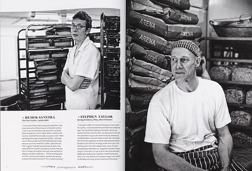
Spread from ‘Prepare to meet thy baker’, Jamie magazine, July / August 2009. Photographs: Chris Terry. A series of black and white pictures of contemporary bakers, in a new food magazine committed to wholesome eating, invokes the authenticity of the documentary tradition of worker portraits with deliberate nostalgia.
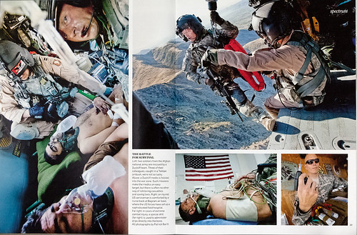
Only in The Guardian, and in the Spectrum section at the back of The Sunday Times Magazine, once home to some of the finest photo-journalism, are there occasional reminders of the intensively researched and costly to produce photographic essays that most British magazines long ago ceased to provide. The Spectrum section I looked at included six pictures by the photojournalist Patrick Barth, who spent three weeks flying with the US air-ambulance squad in Afghanistan. Barth’s shots are a poignant example of the kind of report that could often be seen in news magazines in the 1960s and 70s. Nevertheless, his pictures are second on the bill, after a tacky set of photos of burlesque artists posing at home, and they feel a little squeezed, their scaling against each other and placement on the page less certain than it could have been.
Elsewhere, though, my survey confirmed that papers that once knew how to identify a visual story, source excellent pictures and present them on the page in gripping visual narratives have completely forgotten how to do it. In the early 1990s, The Independent Magazine, where Colin Jacobson was picture editor, constructed superb photographic essays, usually in black and white, about subjects such as Ceausescu’s legacy in Romania, a Russian women’s prison, and an AIDS ward in Zimbabwe. The paper’s once sure instincts are nowhere to be found in a story about the twentieth anniversary of German reunification published in June. The opening spread pairs a black-and-white picture from 1961, showing a defecting East German solider leaping the barbed wire, with a present-day shot of the same street, where tourists are visiting a cold war memorial. The older picture, a remarkable news moment, is shown too small on the spread to transmit its full drama, while the over-scaled picture of a group of teenagers milling about has no more information, drama or interest than a casual snapshot. No meaningful relationship has been achieved between the two pictures.
While publishers and editors must take the blame for succumbing to the values and imperatives of an increasingly narrow and culturally damaging obsession with vacuous celebrity and consumer lifestyle, designers have also contributed to the decline in standards of photographic practice, if only through ignorance. Photography was pushed to the side, as an essential concern of the graphic designer, in the digital type revolution of the early 1990s, and, as image-making, too, went digital, it has never recovered its place. Few designers now see their primary task in terms of the ‘production of meaning’ by choice of photographer, selection of images and the organisation of sequence. Looking through contemporary manuals of graphic design, photography receives little attention. In Graphic Design: The New Basics (2008) by Ellen Lupton and Jennifer Cole Phillips, for instance, an otherwise thorough and popular guide, the authors allot the subject only a few brief entries. Pattern, on the other hand, a specifically graphic, largely decorative and mostly fashionable concern, has an entire chapter.
As software enables ever more intricate and rococo page designs, the graphic aspects of page construction increasingly preoccupy designers. ‘I think there is a perceived notion that good editorial design means lots of design,’ says Richard Turley, art director of The Guardian’s G2 section, ‘lots of intricate elements, lots of typefaces, and concept after concept. Often photography gets lost in that fiddle, with pictures getting a bit overwhelmed by it.’ GQ’s pages are cluttered with this kind of stylish but editorially redundant paraphernalia.
Turley dismisses his own design education, crediting Mark Porter, The Guardian’s creative director, with teaching him about the use of imagery, pacing a story and the importance of scale. He points to a tradition of editorial art direction (‘we’re still standing on their shoulders’) that includes Willy Fleckhaus, Michael Rand, David King, Pearce Marchbank, Fred Woodward and Tibor Kalman – also a crucial figure for Porter, who worked with Kalman on Colors. It comes as no great surprise that both Porter and Turley cite Pictures on a Page: Photojournalism, Graphics and Picture Editing (1978) by Harold Evans, editor of The Sunday Times for fourteen years, as a key influence on their approach to working with photographs. Evans’ book is a masterpiece, the best study of this subject ever written; it should be required reading for designers, yet, as Turley points out, it is a book that few designers seem to know about.
Porter encountered Pictures on a Page in the mid-1980s. ‘I think I had a vague instinct about this before, but reading Harry Evans taught me that the narrative is at the heart of every good picture decision,’ he says. ‘I still remember the examples he gave about how the meaning of a picture changes with the composition, use on the page and – especially – cropping, and I’ve been putting those lessons into practice for over twenty years. Pictures on a Page helped me understand that in the editorial environment the picture is not a finished artefact, but a raw material.’
Spread from the Spectrum section of The Sunday Times Magazine, 28 June 2009. Photographs: Patrick Barth. This kind of hard-hitting photo-reportage, once central to the editorial vision of the colour supplements, is now consigned to a special section, where it is just one of a variety of features in different photographic styles.
Cropping is a vital tool for refining images and constructing narratives, yet today it appears to be a declining art. Turley observes that the activity is ‘really overlooked now, considered to be a skill you just pick up, or maybe even not much of a skill at all’. Evans devotes 50 pages and many pictures to the possibilities of picture editing and creative cropping, and to cropping problems that might arise. Graphic Design: The New Basics assigns a single page, three photos and just 120 words to the subject.
The reasons for this neglect are as much technological as cultural and they impose awkward restrictions, even on publications as sensitive to the possibilities of photography as The Guardian. ‘Some of the digital images we now work with,’ says Porter, ‘particularly in newspapers, barely have the resolution to fill the space we need them to, so we simply don’t have the option of cropping them significantly, otherwise the resolution wouldn’t be up to it. The fact that so many are compressed JPEGs makes it worse. So digital technology has taken away one of the picture editor’s (or art director’s) most powerful tools for working with pictures.’
Magazine pages used to be constructed around photographs that were carefully selected, cropped and sized to tell the story. Too often now the pictures are relegated to a subordinate role. Images are dropped into predetermined boxes on InDesign templates and cropped to fit this frame (where cropping is possible) rather than cropped for narrative reasons.
‘I believe that every element on a page – writing, imagery, design – has to combine to tell the story of the piece,’ says Leslie, ‘but, sadly, too many times on the newsstand the magazines use imagery to fill a predefined space. This is the same as pouring text into text boxes without reading it. It’s just space-filling.’
The ‘space-filling’ problem is just as acute on the Web. The finely judged placement of one picture against another, and the dynamic visual and semantic relationships potentially achievable within the fixed frame of the page, are the first casualties online. On screen, the multiple diagonal axes of the asymmetrical page are replaced by the unvarying vertical axis of the single column, seen most typically in blogs where all the pictures within the main column are sized to fit the column width. As you scroll down, the photos ascend into view one at a time: each image has more or less the same visual weight and the narrative, where there is one at all, can be read in only two directions: down and up, forward and back. The photo galleries popular on newspaper websites are no better. Here, the images must conform to approximately the same size and position, irrespective of the nature of their content or degree of interest, and on this horizontal axis, which is closer to a constrained form of television than it is to the flexibility of the printed page, each new image wipes away the last.
I wish I could have found more in my survey of newsstand magazines to excite me. I hoped the exercise wouldn’t confirm what I felt to be the case before I began. At a time when we are deluged with more photographic images than ever, we seem to have lost faith in the power of the photograph to express anything other than our personal reality. We don’t take the production of meaning seriously and we use pictures with less fluency and purpose than earlier generations of editors, photographers, designers and readers. We don’t know what we are trying to say, and we don’t know who we are saying it for. We would rather not pay for the photographer’s expertise and commitment, we don’t believe in the photographer’s mission, and we don’t think it is likely to have any effect. Yet we take our pictures, regardless, and pour them into our boxes. Lacking a clearly defined purpose, rejecting the need to reveal and reform, our ocean of photos still tells us uncomfortable stories about who we are now.
Rick Poynor, writer, Eye founder, research fellow, Royal College of Art
First published in Eye no. 73 vol. 19 2009
Eye is the world’s most beautiful and collectable graphic design journal, published quarterly for professional designers, students and anyone interested in critical, informed writing about graphic design and visual culture. It is available from all good design bookshops and online at the Eye shop, where you can buy subscriptions and single issues.