
Spring 1999
Reputations: Adrian Frutiger

‘I was fortunate. Early in life, I understood that my world was a two-dimensional one. At sixteen I knew that my work would be in black and white.’
For more than 45 years the Swiss type designer Adrian Frutiger, born in 1928, has been a hugely influential figure in typography. After an apprenticeship as a compositor in Interlaken, he studied from 1949-51 at the Kunstgewerbeschule, Zurich. In 1952 he as hired by Charles Peignot, of the type foundry Deberny & Peignot, as a youthful artistic director. After initial acclaim for his font Méridien (1954) Frutiger soon established an international reputation by designing the Univers family of sans serif faces (1954-57). Other typefaces designed by Frutiger include Avenir, Centennial, Egyptienne, Glyphia, Iridium, Icone, OCR-B (the standard alphabet for optical character recognition) Seifa and Versailles, plus in-house typefaces for corporations such as BP and Shiseido.
In 1960, Frutiger established a design studio with Andre Gürtler and Bruno Pfäffli, His commissions have included logotypes, signage systems and maps, with clients such as Air France, IBM and the Swiss Post Office.
He has written several books about typography, signs and symbols, including Signs and Symbols (Ebury Press), Development of Western Type, Typografie and Geometry of Feelings (Syndor Press). He taught for ten years at the Ecole Estienne, Paris, and for eight years at the Ecole Nationale Supérieure des Arts Décoratifs, Paris. Significant honours include the Chevalier de l’Order des Arts et Lettres, the Gutenburg Prize of the city of Mainz and the 1986 Type Medal of the Type Directors Club of New York.
Frutiger has always embraced the technology of his time, from hot metal, through phototypesetting to digitisation. We wee his traces everywhere. In Paris for example. arriving at Charles de Gaulle airport, you are welcomed by signage in the sans serif face called Frutiger. You take the train to the centre: linear bands of rope-drawn signs of script in concrete at the railway station. And when you travel the city on the Metro, the station signage uses Frutiger’s Métro alphabet.
Throughout the modern world, from megastore to corner shop, text set in Frutiger’s Univers sings out from a thousand different magazine, books, posters and CD covers. Univers is proving to be one of the most important and enduring typefaces of the twentieth century, a masterpiece of structured diversity.
This relaxed and wide-ranging conversation took place during the 1998 ATypI conference, held last October in Lyons, France.
Yvonne Schwemer-Scheddin: You developed the first drawings for Univers during your studies at the Kunstgewerbeschule [Arts and Crafts School] in Zürich. Why a sans serif and not a roman face? Was this the influence of Bauhaus?
Adrian Frutiger: Typography in Switzerland was more oriented to the sans serif than to Roman type. At the school they worked with Akzidenz Grotesque and Neue Haas Grotesque and I lived for about ten years in this sans serif environment. But we didn’t like the Bauhaus much; the work was too constructed and rigid. We needed something more contemporary, nearer to the roman.
YS-S: Emil Ruder wrote that Univers, as Roman-Grotesque, ended the ideological struggle between Roman and sans serif.
AF: Ruder only said that this font links up again with the Roman. He wanted to emphasise the contrast with the Constructivist idea, where the ‘o’ is simply a circle and where there is no differentiation between the horizontal and the vertical. Univers is nearer to Roman than other sans serifs, since it displays a visual sensitivity between thick and thin in the up- and down-strokes, in the verticals and the horizontals.
YS-S: What was the main impulse for Univers? Was it the schools, Charles Peignot, phototypesetting technology, rational French thinking…?
AF: It was everything together. First of all, my studies with Walter Käch. He showed us, after making rubbings of Roman inscriptions, that an up-stroke is thinner than a down-stroke and that in the curves you can find beautiful variations between thick and thin. He always compared carved inscriptions with the sans serif, since these were not contrast-rich thick/thin Roman typefaces. He taught us to transfer these forms to Grotesque fonts. When I came to Deberny & Peignot in Paris, Futura (though it was called Europe there) was the most important font in lead typesetting. Then one day the question was raised of a grotesque for the Lumitype-Photon. Peignot felt that this has to be Europe [Futura], without question. It ran so well in lead typesetting, so why not in phototypesetting?
I asked him if I might offer an alternative. And within ten days I constructed an entire font system. When I was with Käch I had already designed a thin, normal, semi-bold and italic Grotesque with modulated stroke weights. This was the precursor of Univers.
At that time I could draw quickly, so I drew the letterforms on scrap card and stuck them together. I developed the font style by using the short word monde. Here I had an ascender, an ‘o’, an ‘m’. It came together quickly and I also had a good draughtswoman to help me. We made about sixteen variations of monde and I assembled them in the form of a star. When Peignot saw it he almost jumped in the air: ‘Good heavens, Adrian, that’s the future!’ He grasped at once that a multi-faceted tool was suddenly being placed in the hands of the advertising industry. I then appointed two Swiss draughtsmen, Bruno Pfäffli and André Gürtler. Within two months the entire system was in place.
Casting a font in lead was very expensive, which is why perhaps only one or two typefaces came out each year. Now suddenly I only needed to prepare drawings, and I could place sixteen alphabets photographically on one plate.
YS-S: Why the name Univers?
AF: Charles Peignot called it Univers. I proposed Le Monde, but it was too French, and also Galaxy, but he said ‘no, no, Univers!’
YS-S: Why did you develop the numerical code for Univers. Why was the number 55 chosen for the regular weight?
AF: If you want to do an international face, you don’t want confusion. In German semi bold italic is called halbfett kursiv; in France you don’t know if it is semi gras or gras and the terms bold and semi bold always get mixed up. So my idea was that the regular weight for text should be 55. It is the centre of a grid: below are the bold and above the light weights. I made a little decimal exercise.
YS-S: But why exactly 55?
AF: I wanted a two-digit number. So I thought, what is at the centre of the grid? There is 50 for the weight and 5 for the width, these being the two criteria for a font. So 55 becomes the version for copy text. The thicker brother above, the 60, was the semi-bold with a width of 6; it could no longer be 5. The bold version became 70 but had thinner strokes. Thus the three versions 55, 66, 75 came together as the starting point. Below there was a little brother with the number 45. The thickness did not change in the narrow ones, i.e. 50 remained as the normal thickness, but the width varies, it becomes narrower, then it becomes the 58. At first I took 57, but then I thought it would be cleverer to make the italics have uneven numbers and the remainder have even numbers. This is how the whole system came about.
I was completely immersed in this stage of inventing, the way only a young man can be. I thought round and round it incessantly, day and night. This was such an intensive time that sometimes I actually trembled. You must realise that in 1952 France was still exhausted, and suddenly there is a new technology, phototypesetting. Although book printers had already heard about it, nobody believed in it. And then someone else comes along and proposes a phototypeset font which no longer represents the old trinity – the roman, italic and semi-bold – but instead a system with 21 variations!
It happened to be the time when the big advertising agencies were being set up, they set their heart on having this diverse system. This is how the big bang occurred and Univers conquered the world. But I don’t want to claim the glory. It was simply the time, the surroundings, the country, the invention, the postwar period and my studies during the war. Everything led towards it. It could not have happened any other way.
YS-S: In Germany, Univers was thought of as a font for the cognoscenti – most people used Helvetica. Was it through design or the market route that Univers become more widely known?
AF: Helvetica was Linotype’s particular hobby-horse, and Univers was Monotype’s hobby-horse. Germany was Linotype country. Linotype was previously the ideal medium for very good Gothic scripts. On the Linotype matrix there were problems with the overhangs. The Gothic had no overhangs and there was no italic. Then Linotype took Excelsior round the world for the newspaper industry. The italic was a little distorted, but this didn’t matter. When Gothic scripts were discontinued things became harder. Then Hermann Zapf came and considerably improved the quality of line setting with Aldus and Palatino. But Univers was very poor on Linofilm. H. Berthold AG were the ones who mostly sold Univers in Germany and around the world. And this was also the best cut of Univers, since Günter Gerhard Lange stood behind it. Linotype’s hobby-horse was simply Helvetica. Helvetica is the ‘blue jeans’ typeface. It will probably be the font which expresses our century, since with Helvetica we can do anything. It is not bad, it is not wonderful, it is simply Helvetica.
YS-S: The typeface for mass culture.
AF: There’s no doubt about that. Compared to it, Univers is much more delicate and harmonious, and tends to be a little more stylish. That’s why I would prefer not to compare them. They are two completely different worlds.
YS-S: Last year Linotype presented the New Univers as a corporate typeface. What have you changed?
AF: I was delighted to learn that Univers would be re-designed. In 40 years Univers has had so many sisters and brothers around the world … in Japan I could hardly recognise my own font. When Linotype decided to re-do Univers, the first thing they did was to go back to the lead type Univers engraved in steel. From there we took the proportions and did the extensions. It was the greatest gift of my lifetime. I took great pleasure in doing sketches for the extreme weights, light and bold, because these were the poles for interpolation. All the italics were re-designed. First we slanted the romans, but the horizontal strokes stayed the same as in the uprights.
At the curves everything had to be corrected by hand. And you know how I do it? I take my scissors and cut off the excess. I prefer scissors to pencil. I sketched the corrections, marked them, drew them roughly and photocopied them, and cut them out with scissors. This works well, since the drawn capitals are about 15 cm in height. Everything was edited further on screen. Reinhard Haus did this well, he knows a lot about typefaces.
YS-S: You seem to regard serifs as superfluous. Why then did you design roman faces like Méridien and Didot?
AF: Oh, serifs are by no means superfluous and I like designing roman faces! Particularly for body text where serifs are a reading aid. There are two kinds of reading: text, and looking something up. Reading text is much easier with serifs. They are better at holding the words together.
But my main life’s work was designing sans serif typefaces. It is much more difficult to draw a grotesque than a roman face – much can be covered up with serifs in the latter. The grotesque is like the body of a fish, it is so smooth that no mistake can be allowed to happen!
Didot was my last typeface design, but as a text it is utterly impossible to use. I designed it mainly because Linotype became the owner of the complete library of the Deberny & Peignot foundry, but also as an homage to Firmin Didot. The original Didot had never been redesigned. It was a lovely end to my career as a type designer to make a true Didot.
YS-S: Your signage font Frutiger is much earthier, livelier.
AF: Nowadays it is much more than a signage face. It has already become to some extent a stylistic expression of the 1970s and 1980s. All media have adopted it spontaneously. It was simply a face which could be read comfortably. It was the ‘other one’, between Univers and Helvetica!
YS-S: Meta Design developed the signage face Transit for the Berlin Metro on the basis of Frutiger. Were you consulted?
AF: No, but in general I am pleased if new typefaces resemble Frutiger. If other designers copy my typeface it must be good.
YS-S: How did you create the Roman script Herculanum?
AF: Linotype formed a committee with calligraphers and decided to do some typefaces that went back to letterforms that preceded Gutenberg. Herculanum is one of them. It is based on a Roman manuscript from the first century AD – I drew it with a pencil.
YS-S: In 1973 your OCR-B design became the world standard for optical character recognition machines.
AF: OCR-B would have been better still, had I not used the Univers terminals. But at the time I was still completely faithful to Univers. Today I would prefer oblique terminals. But the criteria were very difficult to develop. We worked for five years to achieve sufficient visual difference between character-pairs that look quite similar to a machine. Like ‘0’ ‘O’ and, or ‘D’ and ‘O’ or ‘B’ and ‘8’. Today OCR-B is not used as much for automatic reading; only the numerals are used to any great extent. But it is interesting that young designers now use it a lot.
YS-S: Because it is a visual expression of digital technology. For example OCR-F by Albert Jan Pool, a re-design of OCR-B especially for advertising. Or the funny OCR-Alex Czyck by Alexander Branczyk. What do you of all these offspring?
AF: I find them amusing. OCR-B is a ‘public utility’.
YS-S: Can you imagine yourself creating font specifically for the screen?
AF: No. I believe there will always be difficulties in reading from the screen. I am amazed how people can stare at the screen day after day, hour after hour. I cannot do it. I have never sat down at the screen to design, only, for example to check a font’s digital outlines.
YS-S: You have said that verticals and horizontals form our perceptual framework. If that is true, we will always remain with two dimensions. Yet we are now breaking into three-dimensions, and into time.
AF: Why should we abandon two dimensions? Well, yes, in perspective of course. Until very recently we have worked in two dimensions on flat paper. Now we are drawn through the picture into a third dimension, into a virtual world. But three-dimensional fonts do not make sense. You can add shadows and provide depth, but there is no point. Reading means linear and black and white.
YS-S: But through data links, through hypertext, windows technology and so on, we read more simultaneously or branch out in different directions…
AF: Yes, yes, networks and so on, but if you want to read the text, you bring it to the surface. You don’t read it small from a distance, you enlarge it so that the text is legible, wherever it may come from. I have always lived in two dimensions. The third one belongs to the future. I enjoy the company of young people, particularly when questions crop up about the difference between fonts on the screen and material ones, as I have experienced them. Young people no longer see the type justification on the screen, and don’t know how close or how far letters should be placed from each other. And here I can set quite clear rules, I can share that with them as a tutor.
YS-S: You taught in Paris for a long time, at the École Estienne and at the ‘Arts Deco’. Is the three-volume book Der Mensch und seine Zeichen [Man and His Signs] based on your teaching programme?
AF: Yes. I taught more than typography. Symbols have pursued me from an early age, and that is why I spoke for an hour every day about their meaning. I had a large collection of symbolic marks and it was always in my mind that I would like to do something with it. So I wrote up the material more or less as I had taught it, e.g. fundamental things: what is a point, a line or a gesture etc.
YS-S: The symbols that interest you seem to be poetic counter-forms.
AF: The 26 letters of the alphabet kept me occupied all day long. But I always imagined that there is another script, as Hermann Hesse said in The Glass Bead Game. Thoughts can be recorded in ways other than in letters and words. In nature one can read a spider’s web, or leaves and trees etc. I do this symbolic to understand myself better, it’s a bit like a psychological analysis. As you see, the forms are still “letterforms” with insides and outsides, but only lines which do not cross and you can never see a beginning and an end of the line. Perhaps you can explain this – I don’t know.
YS-S: Symbols are psychological signs that come straight out of man’s psyche...
AF: Definitely, you can see that in all my personal work. It is a completely different world. Perhaps my spontaneous drawings are a kind of psychological analysis of whatever is inside me. I find no words for that which moves me inside, I simply draw it. This comes from deep inside, simply through the hand instead of through the mouth. It is a gift. I started this very young, only for my self quietly. I never showed these drawings publicly. Sometimes I sent something to friends at Christmas. I had never thought about a book. But Erich Alb has now published a book [Formen und Gegenformen, Syndor Press, 1998]. He simply pulled out all my drawers and declared that this must be made into a book. Now my psyche is exposed and accessible to all! But I don’t want to be an artist and it certainly shouldn’t be seen as an art book, since my symbolic marks have nothing to do with art.
YS-S: Although as a child you wanted to become an architect or sculptor…
AF: Yes, but I was fortunate in that very early in my life I understood that my world is a two-dimensional one. When I try to create a sculpture, it looks like a book that you open and close. I would have been a poor architect, because my thinking is not three-dimensional. And I don’t have good colour sense. This is a dimension that I lack and one which does not attract me. Of course I like it when a beautiful form is printed in beautiful red instead of only in black. I discovered this early on and this was my good fortune. At 16 I already knew that my work would be in black and white.
YS-S: You have designed symbols and images for the church – not genuine pictures, but pictorial signs of writing culture.
AF: I was born into Calvinism, but I always suffered from the nakedness of the word in our church. When I go to a Catholic church and see the many pictures – they can be good or kitsch, that is not the point – or when the priest stands there in a colourful robe (with different colours for different times of the calendar) then it makes sense to me. In our worship there are only words and some singing, while a lot happens visually during Catholic mass. This has always attracted me. For example, together with my wife I have had altar covers made in the various colours of the ecclesiastic year. And the black clothes with the white collars, which look like judges, that is too ascetic for me. I was always a little frustrated. Not that I would change my religion – that would raise quite different spiritual questions.
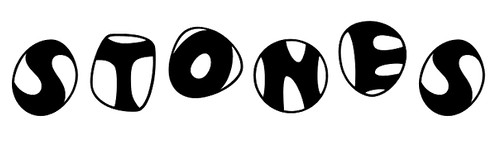
YS-S: You have created playful signs such as Frutiger’s Stones. Are these your metaphysical Dingbats?
AF: As you have seen, I like round stones. In central France some old stones were found in excavations from the tenth century BC. These are completely round pebbles. They show no figurative drawings, no script, only black spots whose significance is unknown. Perhaps these are marks of property or signatures – we don’t know. I sent a New Year’s Greeting to Otmar Hoefer of Linotype that showed similar round stones with alphabetical signs on them. Hoefer immediately asked me to do a whole alphabet of them. I never thought it would be realised, but why not. It’s fun.
Frutiger Stones, 1998. Linotype.
Top: Cover of Typographische Monatsblätter, 1961. Designed by Emil Ruder.
Yvonne Schwemer-Scheddin, design writer, Gauting, Germany
First published in Eye no. 31 vol. 8, 1999
Eye is the world’s most beautiful and collectable graphic design journal, published quarterly for professional designers, students and anyone interested in critical, informed writing about graphic design and visual culture. It is available from all good design bookshops and online at the Eye shop, where you can buy subscriptions and single issues.
