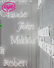
Winter 2011
Reputations: Commercial Type
‘There has been typography on the Web for its entire existence, because there are words, and where there are words there is typography … Some people believe that there is going to be a radical change in the process of reading because of webfonts. Actually, no.’
Commercial Type was born in 2007, to formalise a transatlantic partnership that began when type designers Paul Barnes and Christian Schwartz first worked together on Egyptian, their award-winning custom typeface for the Guardian.
Schwartz and Barnes have collaborated on most of their projects since 2004, including typefaces for the Empire State Building and Condé Nast’s Portfolio. As part of the team responsible for the redesign of the Guardian, Schwartz and Barnes were shortlisted for the Designer of the Year prize by the Design Museum in London; they won a D&AD ‘black pencil’; and they were named two of the 40 most influential designers under 40 by Wallpaper* (all in 2006). In 2007 Schwartz was awarded the Prix Charles Peignot (for a designer under 35 who has made ‘an outstanding contribution to the field of type design’).
In 2011 Barnes and Schwartz undertook an eight-date speaker tour of Australia for AGDA.
Commercial Type publishes retail fonts developed separately by Schwartz and Barnes, their staff, and outside collaborators such as Kai Bernau and Susana Carvalho. The company also undertakes custom typeface projects, including work for Fast Company; Ebony; Entertainment Weekly; the Wall Street Journal; and Wrigley.
Publico (2007-10), the typeface they designed for Portugal’s Público, has since been adopted by the London Evening Standard, the Atlanta Journal-Constitution in the United States, Dagens Nyheter in Stockholm, Diari de Balears in the Balearic Islands and Bloomberg Businessweek.
Forthcoming releases include Dala Moa (a sans companion to Dala Floda) and Chiswick (a typeface originally meant for a corporate client that was picked up by 41). Their latest release is the monoline family Marian.

Eye’s Simon Esterson and John L. Walters met Barnes (above) and Schwartz (below) at St Bride Library, London, in late 2011 during the ‘Critical Tensions’ conference.

EYE: What was your first project together?
Christian Schwartz: The Guardian typeface!
It was trial by fire on a large scale.
EYE: So when and where did you meet?
CS: Physically, at Heathrow, about six months into the Guardian project, but we first got to know each other via email about two years prior to this.
I had revived a German grotesk from the end of the nineteeth century as FF Bau, and Paul saw it in use on a blog called New Series started by Andy Crewdson after he ended [his celebrated type blog] Lines & Splines.
On his own, Paul had revived a later Swiss copy of this typeface, which had a completely different lowercase ‘g’, so he tracked me down via Andy to ask me about my ‘g’. This conversation led to others, and it wasn’t long before Paul was speccing Amplitude, which I was finishing at the time, for a redesign of Wallpaper* that he was consulting on.
EYE: Tell us about your Marian typeface.
Paul Barnes: We’ve just done this show in New York [‘Thieves Like Us’, a collaboration between Commercial Type and artist Dino Sanchez], which was about Marian. It’s our sort of concept album thing.
CS: With an extra track.
PB: It’s a concept to reduce forms to … the most basic, which is a kind of monoline Egyptian form. You’re taking a certain amount out of a serif [but] you’re not reducing it to the point where it becomes a sans serif.
I wanted people to look at historical forms, which we’re obsessed by … but without the baggage of thick and thin.
One of the reasons to do it was: Is there a contemporary wedding stationery that isn’t done in copperplate script, that isn’t done in serif typefaces?
It’s a concept album with cover versions, so it’s Bryan Ferry but it’s also…
CS: … Wendy Carlos
PB: Because it’s hard to remember how influential Carlos’s soundtrack for A Clockwork Orange was.
CS: The shock of something familiar represented in an unfamiliar way.
Letters in space
EYE: Is designing fonts on the computer still about new technology, or is it a more mature medium?
CS: The tools are always slowly evolving but the basic parts seem to be set for now. You’ve got a 1000-pixel grid, you work with Bezier curves, you set the spacing a certain way, the kerning a certain way.
There was a lot of excitement about OpenType when that was a new technology, but that wasn’t a fundamental change in the way things are designed … maybe a change in the way things are used.
Things that had been difficult became easy to do because the fonts are slightly intelligent and can do things for you.
So, in Marian, you can turn the swashes on and it will work the way we recommend these things combine. If you think of the basic thing of type design as being drawing letters within space and combining them into words, that hasn’t really changed since the advent of PostScript.
EYE: Do you assume you’re doing it for print? Not for typefaces that will only ever exist on a screen?
CS: Those products haven’t come along for us yet, but I’m sure at some point they will. That’s an expansion of territory, not a shift in focus.
PB: Marian would have never happened in the past, it would have cost too much. Whereas, as an individual, now you can do that.
What you see there could have been done in letterpress if someone had had the desire to do it.
CS: A very big if.
PB: Things like this have existed as letters. With digital type there hasn’t been this incredibly radical thing. The lines may be radical but you could cut them in metal if you wanted to. The forms may appear to be new but the technology has always existed. Even these blurred things. There’s little that is completely new.
There are very few typefaces that can exist only in a digital format. Beowolf, for example, where [the typeface] is new every time, is one of the few.
Former graphic designers
EYE: So why start a new foundry?
CS: The main thing we said before we started it was that we didn’t ever want to be bored.
PB: We do want to sell our typefaces and be successful. But like most people we want to do it on our terms. We want to be commercially successful so we can do interesting things.
CS: It’s that balancing act of doing projects that fund the other projects. Graphik is probably more saleable than Marian but Graphik still very much represents my taste as a former graphic designer. I like the kind of graphic design that’s done with it. [Graphik, designed by Schwartz, was used for Condé Nast Portfolio, Wallpaper* and later T, The New York Times Style Magazine.]
PB: The traditional foundries, the big monoliths … were from the printing trade.
CS: They were also machine companies, and what they were selling were typesetting machines, and the typefaces were the material to get people through the door.
PB: Pretentiously, we have these kind of other things going on that we like to bring in. Of course at the end of the day, we’re still selling a typeface. But somewhere at the heart of it there is that little bit of artistic something or other.
CS: There is a certain irony in being called Commercial Type and doing something like Marian, perhaps the least commercially viable typeface!
EYE: You say that, but it’s going to be everywhere, isn’t it?
CS: That would be hilarious, but I can’t picture that right now!
PB: We had a view at the beginning that, like a fashion house makes things that have very little profit in them – you have to do some things that will interest people enough that they’ll look at them and eventually buy the black trousers. You can’t hope to sell to everyone unless you become so large that you literally have every possible thing. We can’t ever do that.
We called ourselves Commercial Type because Schwartz & Barnes sounds like a law firm. And Commercial as in the Andy Warhol Factory thing, you know, and we are influenced by Factory Records.
EYE: How do you balance projects for clients with typefaces you initiate yourselves?
CS: You may have noticed that we haven’t released much this year – that’s because so much custom work came along this year.
EYE: One might think bespoke work was in decline: magazines don’t have those budgets any more …
CS: Well, they don’t have those sorts of budgets any more but we figure ways to make it work, because it’s a great place to get new ideas for the library. And you know it’s going to work for someone if it works for your client.
EYE: So it’s a kind of testbed.
CS: Exactly.
PB: A lot of projects, when we start, we think about it and we come up with a design, and we might end up with five or six things, of which three are probably crap, and two are pretty good but not right for this, and then maybe one is spot-on for the client. And those other five, even the three that are crap, a year later we go back and say, that was quite an interesting idea.
Of course you’re influenced by history. Either you’re working with history as an influence or you’re saying: ‘This is so good I almost don’t need to touch it, I just need to recreate it.’
EYE: When you’re going through that process of five or six ideas, do you sometimes realise you’re trying to recreate something that already exists?
CS: With every new client who wants us to draw something custom, the first part of our process is to try to talk them out of it. Just to make sure that they’re doing it for the right reason, that they need something and there isn’t something that exists already that could suit their needs perfectly. Because it’s a waste of somebody’s time and their money if we’re just recreating something for them that already exists. Life’s too short for that.
Screaming and jumping up and down
EYE: Can we talk for a minute about webtype?
CS: That’s the part we were dreading.
PB: It is obviously the elephant in the room.
CS: It’s not a shift in the market at all. Paper’s not going anywhere. As long as people ride the subway there will be papers and magazines.
We’re always interested in having a new medium to do work for. But in terms of inconsistencies between browsers, and the technical issues, and rendering in Windows, there’s a massive amount of stuff that we are still learning about and still coming up to speed on. So we haven’t wanted to rush into anything, because our reputation is based on a certain level of quality. You get these fonts from us and they just work. You can do your work with them and you don’t have to worry. So we don’t want to put out compromised versions of our library. I think that would do damage to our reputation as a whole.
EYE: Do you think a lot of the stuff that is out there is compromised?
CS: You’ve got a lot of typefaces that are designed for print and haven’t really been rethought for the screen in a way that they would need to be.
EYE: Are you waiting for the right custom client to come along?
CS: I suppose that would be a big motivator for us. So far, we’ve done some experiments and we haven’t been super-thrilled by them, so we’re working on building the methods that we’ll need to either adapt existing typefaces or draw new typefaces for the medium of the screen.
The iPad is a completely different situation. I had a conversation with some people on the tech side at the Guardian about nine months ago. And the existing [fonts] were absolutely fine. Nothing had to happen to the typefaces … so we loved the iPad for that. It feels like the Guardian without looking like the print newspaper.
The Bloomberg Businessweek app does a similar thing. It takes advantage of what the iPad can do that a print magazine can’t. If there’s a company mentioned in the middle of an article you can touch it, and their stock price from the last six months comes up, and you can see additional information that’s hidden on first reading.
We’re more excited about the world of tablets than the world of the Web. The constraints of the Web are a whole different can of worms.
EYE: That puts you in quite a different position to some of your contemporaries in type design, the other foundries.
CS: We’re very much in the publication world. If we see everyone screaming and jumping up and down about something, our first inclination is not to start screaming and jumping up and down, it’s to …
PB … run away?
CS What are people actually excited about here? What’s really going on?
‘Year zero’
EYE: When we first talked, ages ago, about webtype and TypeKit [the webfont library] in particular, you said you thought they were just making a company they could sell to Adobe.
CS: And they did! I wouldn’t have invested our typefaces in it, but I should have invested some money in it. I feel like the hosted webfont solutions are probably not where things should go. The spirit of the Web has always been: you’ve got things on a server, people come to your page, the server sends the stuff and there’s the page.
We have Stag all hinted and ready to go, but it’s still a display face and a print face that’s seen on the screen. It looks good but it will never be a dedicated screenfont.
EYE: There has been a lot of talk about 2011 being ‘year zero’ for webfonts…
CS: I was starting to become concerned about the whole thing until I was invited to participate in this round-table discussion about webfonts in NY a few months ago, with a guy from Webtype and some Typekit people and some other people …
The audience had a much different attitude than I expected. They were asking things like, ‘do we have to start using webfonts immediately, or is it ok for us to wait because this seems like a premature moment to be rushing into something, and Web design is difficult, and we have a lot of extra things to worry about, if that’s ok with you!’
PB: Tell me, how many websites have you been to where you’ve been stunned that they have the right typefaces – ‘Oh, it’s Garamond, as opposed to Georgia’ – and that has improved the whole experience so much? It hasn’t reached anything like that point, has it?
CS: I’ve seen a lot of Garamond that was the wrong point size with bad leading and so on … but it is Garamond!
EYE: There is an evangelical element …
CS: There is a very vocal minority and they’ve been driving the discussion to a large extent.
EYE: Isn’t it also about people who do branding who want to be able to say everything on their site is in the corporate typeface?
CS: There has been typography on the Web for the entire length of time that the Web has existed, because there are words, and where there are words there is typography.
PB: Some people believe that there is going to be some radical change in the process of reading because of this. Actually, no. Line lengths are going to remain the same.
People can be obsessed about small caps, old style figures. They’re wonderful things but they’re not essential.
Georgia does its job fantastically well. Maybe a hinted version of Bembo with small caps and old style figures and swash capitals is going to make some designers very happy, but…
EYE: Doesn’t it all come back to the nature of the content?
CS: Yes. What is the topic of this content and how can this be communicated best?
EYE: Is that why you’re drawn to magazine and newspaper work?
PB It’s the way the ‘cards have fallen’, as they say. I worked in magazines and did all that side, the art direction and design, so I’ve always enjoyed magazines.
And Christian and I have both worked for Roger Black. He cares about typography in editorial. And it’s a place where there’s a demand for typography and people care about typography. And with the Macintosh, typography has improved and you can do more things.
CS: One of the reasons it’s interesting to work in editorial is that you can work in a really wide variety of subjects: fashion, financial, news.
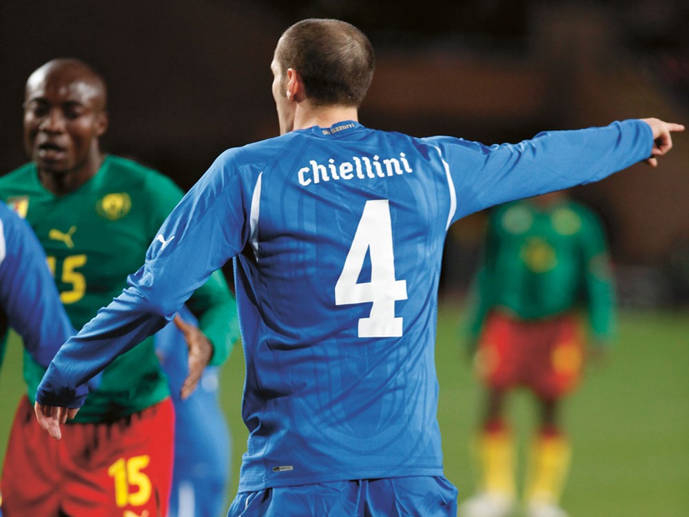
PB: Often as graphic designers you do get pigeonholed – ‘Oh, you do fashion.’ Luckily we’ve been allowed to move between quite diverse clients – from the numbers on football shirts to the Guardian, that’s a pretty big leap.
CS: We were doing the New York Times magazine and Bloomberg Businessweek at the same time. Berton [Hasebe, designer at Commercial Type] was working on one and I was working on the other. I think that variety is what helps us …
PB: … stay fresh. But don’t use the words ‘stay fresh’!
Whether we deliberately go ‘this typeface is going to be great for a magazine’ … Maybe there’s just something in our DNA that means that we produce things that work well in editorial situations.
We have done other typefaces that are non-editorial, haven’t we?
CS: There’s the typeface we did for Munich Re, that we did with Kai Bernau and Susana Carvalho.
PB: Or the National Trust.
CS: We maybe do one corporate typeface a year, if that. But that’s a very competitive market. Not that we’ve chosen not to compete in that area but we’re not so aggressive about going after work. In a lot of cases [corporate type design] is heavily driven by licensing requirements rather than design problems.
PB: There’s always that desire for a seamless thing because ‘we’re in 55 different countries in six continents and we need it in Cyrillic and we need it in Urdu and we need it in Gibberish,’ and there are people who can do all that. You have to become a big company, because big companies want to talk to the big corporate identity agency who want to talk to the big type company.
EYE: Just to go back to Roger Black, was Font Bureau the model for you as a foundry?
PB: We’ve never thought about this.
CS: We may have absorbed this without realising it from our time in the vicinity of the Berlows [Font Bureau co-founder David and his brother Sam].
I worked at Font Bureau for two years, but I was really just a production person. I was on the design staff, which meant I made a lot of fractions and italics and things, and I would condense things sometimes, or draw another weight.
It wasn’t a fantastically fulfilling job creatively, but it was where I learnt to do the process in the right way and work very efficiently.
PB: Unlike me. My typefaces tend to take fifteen or sixteen or twenty years to do.
CS: We should send Paul to some sort of boot camp …
PB: Roger is hugely influential because he is interested in history. When you look at old books – ‘that’s an interesting typeface, let’s have that!’
CS: Font Bureau were the first ones to realise that the Mac had this potential as a design tool.
PB: But I spent a huge part of my working life working with Peter [Saville], and that’s another experience that makes our foundry unusual.
EYE: What are the things you bring from working with Saville?
CS: [Laughs] Do you wear a dressing gown?
PB: [Laughs] Peter’s the most visually intelligent person I’ve ever met. How he talks about things, how he articulates things. Not just about typography.
The conversation will bring in things you generally you wouldn’t talk about in type design. You can go from talking about a Georgian vase to a piece of German Art Nouveau architecture, and then he’ll have some colour swatches on his desk. Curious mixes that are incredible.
CS: A more omnivorous approach to culture is definitely influential on us. We’re thinking of type not just as a part of graphic design or something on its own, but it’s a cultural artefact that combines with everything else that’s going on.
Typographic taste
EYE: How do you feel about Swiss type design in the postwar period?
PB: What’s interesting about Univers and Helvetica is the whole story of Zurich and Bern going for Neue Haas Grotesk while Basel went for Univers.
And in the end, Helvetica conquered the world and Univers … not exactly died a death but there’s not the powerful exponents in the way there are for Helvetica, [which] could be avant-garde and it could be a yogurt, it could be an airline.
EYE: Is that not true with Univers?
PB: Univers has a coldness… Univers is the 1940s and 50s, whereas Helvetica is something from the 1880s that’s been slightly cleaned up. It is Akzidenz Grotesk.
CS: With Helvetica there’s not so much of a learning curve. You can just put a word in it but with Univers you need to know a bit more to use it effectively.
PB You need typographic taste. You look at the best examples of Swiss typography in terms of book design and it’s all set in Univers.
Method design
EYE: You manage to mix new type designs with revivals.
PB: There are so many revivals and not many of them really get it right.
Dare we mention that sometimes you should just go back to the original metal? When they made it in metal, there were so many people involved they stopped it going overboard.
One of the problems with digital type is that you can go overboard with what you can do.
CS: When I worked solo I certainly had a tendency to either over-polish, or make families too big, or just get too deep into it and not realise how far down the rabbit-hole I was.
That has been one advantage of working with Paul and also with Berton. You each turn around several times a day and say: ‘Has this gone off the rails or is this all right?’
It’s harder to make a bad sculpture in marble than in clay. Just because of the effort and time involved, you naturally have to consider your ideas more.
EYE: In some of those metal versions isn’t it the quirkiness that gives them their character?
CS: The key thing I did with the Neue Haas Grotesk revival was not just to do the lightest and heaviest versions, but to digitise the ones in between as well. So it has that feeling of them being made individually.
PB: The original one is the best one. The thing about me and Christian is that we come from working in magazines and graphic design. We often look at old typefaces and say: ‘If we were doing a piece of graphic design, I’d want that typeface.’
EYE: Is it that you’re thinking like graphic designers, the consumers of the type?
CS: We don’t feel we need to put our stamp or our fingerprints all over it.
PB: You have to think: ‘How would the original designer have designed the euro?’ It’s a bit like acting, you have to get into the character.
CS: Don’t give them the impression that you’re dressing in Edwardian clothes, working by candlelight …
EYE: Method type design?
PB: Having spent so many hours in places like St Bride’s, and all those days and months and years I’ve spent in graveyards, you start to pick up on the way those designers worked.
CS: There’s still the idea that these are meant to be useful tools when we’re done with them. Not museum pieces. That is really the most interesting part. Because when we’re done with our work that’s not the end of it, it’s a beginning.
PB We get bizarre examples of what happens. With Dala Floda we’ve seen some great examples, there’s a magazine called Edelweiss that uses it well, and Frieze uses it very well, then there’s a glamour calendar …
CS: … and this gay porn mag with two guys dressed up as Mario and Luigi from Super Mario, using Dala Floda with all the swashes. Completely bizarre. From time to time we’ll look through who has bought the licences, and say: ‘Oh my, I wasn’t expecting that!’
PB: Going back to nineteenth-century typefaces – obviously they were dependent on letterpress technology. Litho freed type-design from these things. [With] Marian, for example, you can get much better quality control. Doing that in letterpress and trying to keep the quality up would be a nightmare.
EYE: And digital gives you a freedom over size, which no one who did letterpress ever had ...
PB: Yes. One thing we don’t want to appear to be saying is that metal was this glorious period. It’s about taking things from the past and … giving them a chance of a new life.
Finding the start of a story
EYE: What are your earliest memories of type and design?
PB: Well, my grandfather was involved in journalism, my grandmother had A. F. Johnson’s history of type and my family knew the editor of the Daily Telegraph so I remember seeing type books and a dummy of a newspaper with fake headlines. Very interesting to a child!
I remember when the National Trust used a lot of Albertus, maybe 1978 or 79. Albertus is one of the great, great, great typefaces, because it’s got such a distinct taste, and connotations of medieval knights and jousting …
EYE: What did you know about type then?
PB: I didn’t know anything about the process of making it. In the 1980s record covers were a big thing and what I found interesting were the ones that were more typographic. Peter Saville, Malcolm Garrett, especially Peter’s New Order covers.
My fascination has always been finding the beginning of the story. My father taught at Lanchester Poly, which had an art and design library, a fantastically well organised one. You’d go into that and see this is Bauhaus typography [and think:] ‘I’ve heard of the band, Bauhaus.’
I would sit down with my rough book and copy a New Order record sleeve with gouache and a brush. I read an interview with Malcolm Garrett in The Face and he said people were talking about Lissitzky and Rodchenko but the man you needed to go and find was Jan Tschichold … this book Die Neue Typografie. And then I found I could order Tschichold’s Asymmetric Typography from the British Library book depository in Yorkshire. Then someone showed me the German version!
I was lucky. I met a man called Roger Smith who taught at Reading University who said there was a course called Typography and Graphic Communication there.
I can’t express how fantastic it was.
We had James Mosley, and Paul Stiff, who was so critical but in such a good way.
Paul was one of the really great teachers, absolutely … I remember going there for the interview and he was asking really hard questions: How much do you want to do this? And telling you how to pronounce Tschichold.
And then there was Michael Twyman, whose book Printing 1770–1970 is one of the great books, and he could recognise all the specimens and all the typefaces.
So design school was this place where you have a letterpress workshop and you’ve got a fantastic library that had every issue of Neue Graphik, and every TM [Typografische Monatsblätter] as well.
EYE: What about you, Christian?
CS: My dad’s an animator and when I was a kid he would have lots of sheets of Letraset and dry transfer lettering around. And when he was done he would let me play with that.
And there were books around showing all the different styles of lettering. When the new Letraset book came for the year, I would get the old one and if it didn’t have the lettering I wanted I would copy it by drawing.
Then I started working at a sign shop in New Hampshire. This was at the very end of paste-up, typesetting on a 300dpi Mac lasersetter, doing galleys and pasting them up.
My dad worked on a show with a guy who had written The Macintosh Book, and he sold us our first Mac. That was my first exposure to the font menu. There were these different lettering styles on commercials and magazines, and the Mac was the thing that pulled that all together.
My big influence in high school was Rolling Stone magazine. That was when [art director] Fred Woodward was there. There was this whole culture, and growing up in very, very rural New Hampshire [Rolling Stone] was my window on to it. And Woodward was doing the most spectacular things with the opening spreads of the features. Such expressive typography. That’s when I decided I really wanted to design magazines, and make my own type, and graphic design was the thing I want to do with my life.
Flywheel
EYE: When did you design your first typeface?
CS: I drew a typeface when I was fourteen, on a copy of [type design program] Fontographer 3.2.
Flywheel was based on some lettering from a Louise Fili book cover. The whole idea is … rounded rectangles and so it’s very simple. I actually got it published [by FontHaus in Connecticut], which, looking back, I’m not sure was a good thing.
PB: I’m so jealous of the royalties Christian gets on this font.
CS: Three dollars a quarter.
EYE: Paul, what was the first typeface (or letters) you drew?
PB: Christian was talking about a manual process, but he didn’t go through hand-rendering, making layouts, doing something with a Rapidograph. I come from that tradition of Anthony Froshaug where there’s a perverse joy in making something look like Gill Sans with a pen.
The only reason I started designing typefaces was because, like many people who came from metal, you looked at the first digital typefaces and they weren’t as good as what you’d been used to.
When I first worked at Roger Black, they had a copy of Fontographer and I met this rather curious and incredibly enthusiastic guy called Jonathan Hoefler, who said you can do these things. I got this book on sixteenth-century typefaces and blew it up and redrew everything by hand and tried to digitise them. I didn’t know any of the rules.
CS: I didn’t learn until much later. I’d done these stupid terrible typefaces in high school and then when I went to Carnegie Mellon University in Pittsburgh … I called the Font Bureau in Boston and asked if they took interns (leaving out that I was a first-year student) and shockingly, yes, they did take interns, so I worked with Tobias Frere-Jones for half a summer.
He is a very quiet, shy guy, and I think I’m the quiet one in our partnership. So for the first week or so we didn’t talk to each other much. I would just draw stuff and he would make notes. Not in so many words, he let me know I needed to forget everything I’d ever learned and start from scratch. He showed me the right ways to go about things, which letters to start with, how to measure things.
Our very quiet lunches, by the end of my time there, had expanded to two- or three-hour sessions of getting out half the books in his incredible library, laying them out on the table, talking about the connections between things and how things evolved.
That was such an incredible education. That may have been the moment where I started to concentrate on type design. I did finish my graphic design course, but I didn’t ever end up working as a graphic designer.
As soon as I graduated I moved to Berlin to intern for Erik Spiekermann at Meta (see Eye 74). That was when he was just leaving. At the end of my internship they said: ‘You can stay if you want but Erik’s not going to be here and we’re not doing type design any more.’
Moving back to America and going to work at Font Bureau seemed like a better idea.
On the shoulders of giants
EYE: Paul, did you have the equivalent of Tobias sitting you down?
PB: I don’t really consider myself a type designer. I’m just a kind of amateur, who plays at it. Jonathan gave me some advice and Christian has given me some advice. I guess I’ve learned gradually. But there are books here that show how they did it in the nineteenth century, and a lot of things are very similar. And in terms of type design, letters go with letters. Your ‘a’ has to fit with your ‘n’ and your ‘o’.
You can look at the nineteenth century and find people doing exactly the same things.
CS: I don’t know if it’s reassuring or depressing that we’re making the same proofs you can find in the Caslon scrapbooks from 1870.
EYE: A lot of things don’t change …
PB: We’re standing on the shoulders of giants, as the cliché goes. And we’re dealing with something that hasn’t changed.
CS: But certain things do change and that’s what we’re keeping up with. Tastes change and methods of production change.
PB: Tastes do change and they don’t change.
CS: Yes, there’s a cyclical thing of taste.
PB: I like to think of it like an ocean, these very slow-moving currents. There is a long-term change, say, in the way we dress.
Christian’s got this great slide of people at a Renaissance fair, and he asks …
CS: Why isn’t Bembo like that? What makes a typeface unique [is] that using Garamond or Bembo now doesn’t look like someone dressed in medieval garb.
Stop. Print out. Examine
PB: One of the interesting things about type design is that you can work in the left field, and you can work in the conservative field as well.
One minute you’re doing a nice revival inspired by eighteenth-century English lettering and English vernacular, and then you can go off and do something peculiar …
Matthew Carter said to me once that type design is a process of editing, which is a really interesting thought. You’re going back and looking at things … and you’re constantly refining and thinking about it.
CS: But the trick there is not to over-refine and over-edit and over-polish things to the point where things become lifeless.
PB But good editing is a skill … which is partly artistic but also a curious series of tasks.
CS: I think our working relationship is one of editing each other … balancing out each other’s more negative instincts.
PB: I did a lot of logos. The Givenchy logo, the Kate Moss logo [both with Peter Saville]. These are things where the ‘G’ goes with the ‘i’ and the ‘v’ – it’s a typeface but it’s only those characters.
Whereas Christian has taught me that everything goes together. Maybe the problems I had with type design were that I hadn’t really thought that through.
With type design you need to continually stop, print out, examine.
EYE: With type design you’re involved in a process that leads to someone else using it. With a logo you have more control …
PB: With a logo, you can do something much quicker. Obviously, I do purely typographic logos, not jumping females and fishy things like that.
CS: Jumping females and fish! Is that how you sum up the world of logo design that’s not purely typographic?
PB You can make ideas and change ideas, so it’s an idea-based exercise that’s very inspirational.
We do have a very iterative way of working where we generate a lot of stuff and we throw half of it away. And Berton is getting used to this.
EYE: What’s Berton’s background?
CS: Not entirely dissimilar to ours. But he’s the only designer in our company who has a proper education in type design; he went to the programme at The Hague. He doesn’t have those four or five horrible typefaces that I have …
PB: I don’t want to airbrush our history …
CS: I put all my bad work from high school on my personal website because I don’t want be seen as running away from it.
And hopefully it shows some sort of evolution …
PB: That things are getting better.
CS: Have gotten better and hopefully will continue to do so.
John L. Walters, Eye editor, London
Simon Esterson, Eye art director, London
First published in Eye no. 82 vol. 20 2012
Eye is the world’s most beautiful and collectable graphic design journal, published quarterly for professional designers, students and anyone interested in critical, informed writing about graphic design and visual culture. It is available from all good design bookshops and online at the Eye shop, where you can buy subscriptions, back issues and single copies of the latest issue. You can also browse visual samples of recent issues at Eye before You Buy.