
Summer 2012
Rethinking Lubalin

As his book on Herb Lubalin – the first in almost 30 years – goes to press, Adrian Shaughnessy explains his change of heart about the US typographer
When I started out as an untrained, apprentice graphic designer in the 1970s, Herb Lubalin (1918-81) was held up to me as the designer I should study most closely. The American’s minor-deity status was mainly due to the ubiquity of U&lc, the newsprint house journal of the International Typeface Corporation (ITC), which Lubalin edited, designed and, as a director of the company, co-owned.
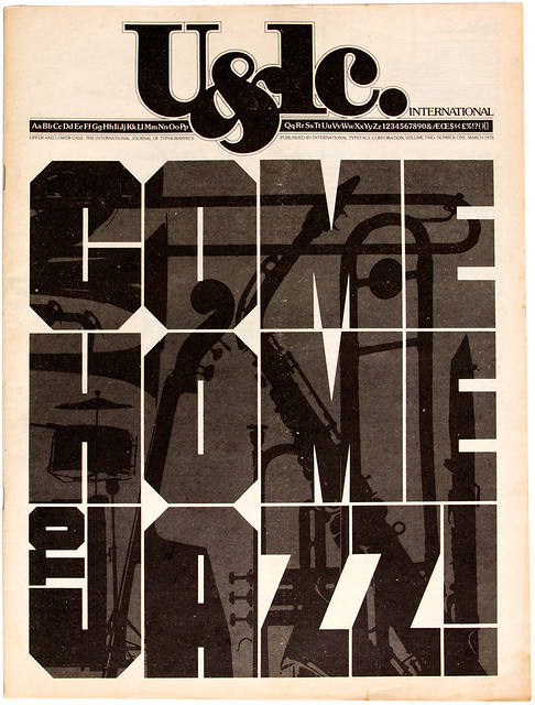
Lubalin was art director, editor and co-proprieter of U&lc magazine – a showcase for the work of the International Typeface Corporation (ITC). The publisher claimed controlled circulation of 250,000, and a readership of more than one million. A jazz-themed cover shows Lubalin’s use of the typeface ITC Machine Bold.
 Back then, U&lc’s fizzing mix of illustration, vernacular typography and the sleek ITC faces (mostly updates of classical fonts) made it a reference point for graphic modernity. But over time my tastes changed, shaped by younger, more radical voices: Neville Brody (see ‘Postmodern jam session’, about Fuse, pp.72-77), Emigre, Wolfgang Weingart, April Greiman, 8vo and other sources of graphic experimentation. Eventually, I threw away all my yellowing copies of U&lc, and with them my interest in Herb Lubalin: for the deconstructivist 1980s and 90s, he seemed too ‘smile in the mind’.
He recreates a piece of work that he had designed nearly twenty years earlier using metal typesetting, for the German graphic arts magazine Der Druckspiegel.
I hardly gave Herb Lubalin another thought until I set up Unit Editions with Tony Brook in 2009 with the intention of publishing books on neglected areas of graphic design. Lubalin’s name was on our first list of prospective subjects. But it wasn’t me who put him there – it was Tony. If I was to overcome my resistance to publishing and writing a book about Lubalin I would have to overcome that lingering prejudice.
As I began to research his life and work, it soon became clear that Lubalin was far from the epitome of mid-twentieth century design conventionality I believed him to be: he turned out to be more interesting and complex than a superficial glance at his best known work might indicate.
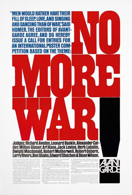
Lubalin deftly juggles Victorian playbill typography with a sly reference to the US flag. Yet the graphic formulation is late-1960s American Modern, as signalled by the use of the famous Avant Garde magazine logotype in the full point of the exclamation mark. The list of judges is an unusual mix of design and art world luminaries.
For one thing, he has a strong claim to be regarded as an early exemplar of the designer as author. In a long association with the radical editor and publisher Ralph Ginzburg, he worked on three significant publications: Eros (see Eye 25), Fact and Avant Garde (Eye 75 & 80). Many of the features in these magazines were pictorial, and relied on Lubalin’s flair for finding and commissioning era-defining photographers and illustrators, and laying out daring editorial spreads.
Further evidence that Ginzburg and Lubalin formed a seamless unit came up in conversation with Rhoda Lubalin, Herb’s widow. Ginzburg had been jailed in 1972 for ‘producing and distributing a magazine [Eros] that was judged to have abrogated the moral values and standards of society’. Years later Lubalin told her: ‘I should have gone to jail, too.’
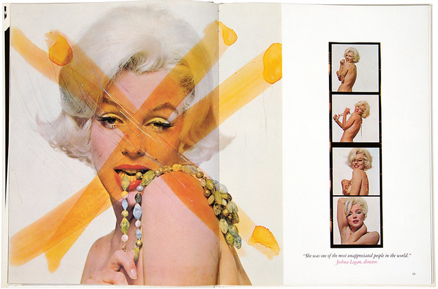
Spread from Eros (Vol. 1, No. 3, Autumn 1962). Photographer Bert Stern’s session with Marilyn Monroe, six weeks before her death in August 1962. Lubalin’s front cover and spread uses unedited strips of film, showing the original rejection crosses made by Monroe herself. Eros was Ralph Ginzburg and Herb Lubalin’s first collaboration, a magazine ‘entirely devoted to Love and Sex.’
Lubalin was also a political designer. He was never a radical, but a progressive liberal at a time when such sympathies were undoubtedly ‘bad for business’. When this is compounded with his work with Ginzburg, which put him at the forefront of the 1960s free speech and anti-censorship movements, we see he was unafraid to declare his political allegiances and sympathies.
For such a high-profile designer, he was not above working on small, no-budget liberal journals. And he was a supporter of Senator George McGovern, the ‘peace candidate’ who stood against Richard Nixon in the 1972 US presidential race. Along with Seymour Chwast and a handful of writers and illustrators, Lubalin produced McGraphic, an eight-page pro-McGovern / anti-Nixon / anti-Vietnam War newspaper.
After two years researching Lubalin’s life and work, I have found that his design was inclusive and humanistic: he pioneered a form of typographic design that required the participation of his audience, and never did anything that was authoritarian, bombastic or elitist. Today, as we foreground human-centred design, Lubalin seems remarkably contemporary.
Herb Lubalin: American Graphic Designer 1918-81 (Unit Editions). A limited-edition, numbered and boxed edition of this book can be ordered for the reduced price of £55 until 13 August 2012 from the Unit Editions website: www.uniteditions.com.
Article first published in Eye no. 83 vol. 21, 2012
Eye is the world’s most beautiful and collectable graphic design journal, published quarterly for professional designers, students and anyone interested in critical, informed writing about graphic design and visual culture. It is available from all good design bookshops and online at the Eye shop, where you can buy subscriptions, back issues and single copies of the latest issue. You can also browse visual samples of recent issues at Eye before You Buy.