
Summer 2012
Postmodern jam session
Erik Spiekermann
Erik van Blokland
Barry Deck
Cornel Windlin
Just van Rossum
Neville Brody
Jan Middendorp recalls Fuse, the type ‘magazine’ that opened up (and put the lid on) a transient era of adventurous type design from small digital foundries
Postmodernism came late to type design, but when it did, around 1990, designers embraced the postmodern strategies that had been developed elsewhere: sampling, appropriation, deconstruction, layering, mutilation, repetition, dehumanisation. The experimental spirit of the moment culminated in Fuse. In this adventurous quarterly, design could be taken a couple of steps further, because it didn’t matter whether the outcome was a usable typeface.
Published initially by FontShop, Fuse confirmed that company’s adventurous outlook. Joan and Erik Spiekermann had founded FontShop in 1989 to fill a niche – there was no European distribution channel for digital typefaces catering to the new market of DTP-savvy design and advertising agencies. They moved into publishing with the revolutionary ‘random font’ Beowolf, by the Dutch designers Just van Rossum and Erik van Blokland, which mutilated itself on its way to the printer.
Spiekermann was partners in the FontFont library with Neville Brody – star status had been confirmed by his 1988 V&A exhibition and its best-selling catalogue, The Graphic Language of Neville Brody, edited by Jon Wozencroft.
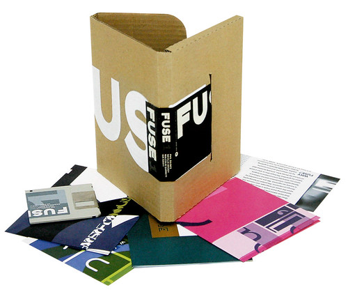
Fuse issue no. 1, 1991, complete with floppy disk and posters.
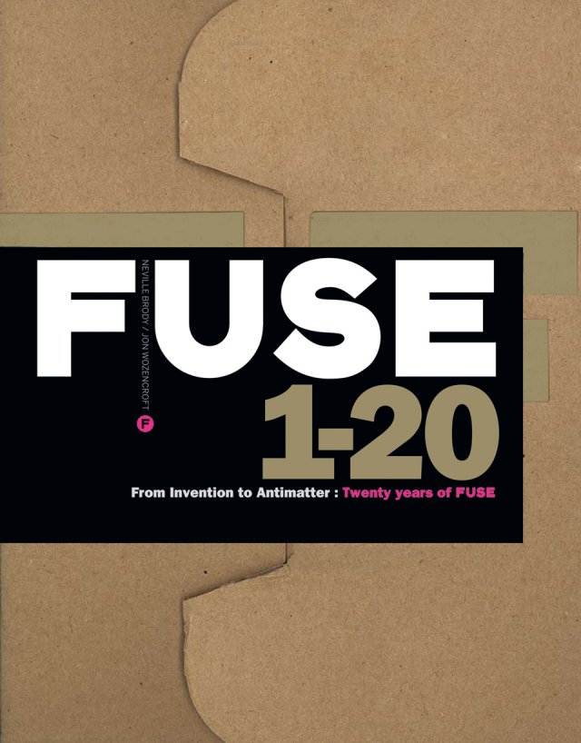
Top: box containing Fuse 1-20: From Invention to Antimatter: Twenty Years of Fuse (Taschen, £34.99) a new anthology designed by Neville Brody’s Research Studios in the style of the original editions.
The Brody fonts that Linotype was about to publish (Industria, Insignia and Arcadia) were hand-drawn alphabets from his days at The Face, digitised by others. But being inquisitive and more conceptually inclined than other type designers, when Brody did begin using a Mac, he became a pioneer right away. He realised digital type could be a vehicle for ideas, a self-referential medium evidencing and commenting on the manipulative power of digital tools and the way of the world. As the most far-reaching of these ideas could not easily be accommodated into a library of usable fonts, Brody created Fuse.
Edited by Brody and Wozencroft (with sparring partner John Critchley), Fuse became a platform where the digital font format could be explored beyond its functional role as a carrier of alphabets and icons. Each issue consisted of a smartly designed brown cardboard package containing a handful of experimental fonts, an editorial poster with texts by Wozencroft and guest authors, and four or five folded posters showcasing the typefaces. The editors came up with a broad theme (‘Virtual’, ‘Codes’, ‘Crash’, ‘Religion’, ‘Pornography’) that contributors often responded to by subverting or commenting on the theme itself. Contributors included people who, even then, were big names in type and / or graphic design: Spiekermann, Malcolm Garrett, Gerard Unger, Margaret Calvert, Jeffrey Keedy, Pierre di Sciullo, Peter Saville, Rick Vermeulen. It was like an open stage on a Tuesday night, where weathered players join newcomers in trying out new ideas, different instruments and unfamiliar rhythms.
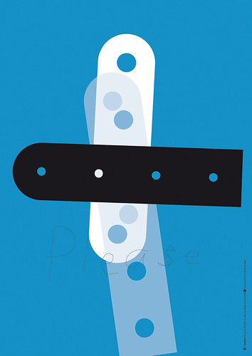
Poster from Fuse no. 10: Robotnik by Cornel Windlin, 1994.
Surprisingly (or perhaps not, because most designers remain functional thinkers even when given free space), several of the contributions turned out to be quite usable. Fonts such as Barry Deck’s Caustic Biomorph, Tobias Frere-Jones’ Reactor or Cornel Windlin’s Crouwel-like Moonbase Alpha became regulars of mid-1990s poster and flyer design. A small selection of Fuse fonts later became part of the FontFont type library. But the bulk of them (unless stored on hard disks) had become unavailable, as the diskettes on which they were stored became unreadable. As a result, one of the era-defining projects of early digital typography is known to many only from scattered mentions in books and the odd reproduced poster. So it is a very good idea indeed to collect it all in one place.
Fuse 1-20: From Invention to Antimatter: Twenty Years of Fuse (Taschen, £34.99) is a beautifully produced anthology, a boxed set designed by Brody’s Research Studios in the style of the original editions. On an editorial level it is extremely complete. Issues 1–18 (1991–2000) are documented in a sturdy paperback – all the texts and posters, preceded by short introductory essays by Wozencroft and Adrian Shaughnessy. The book closes with reports of the Fuse conferences of the mid-1990s, the Berlin edition of which gave birth to TypoBerlin, now one of the world’s major design conferences.
Issues 19 and 20, the two ‘final’ issues, which remained stuck in the pipeline until now, are part of the package, in the form of folded posters and a code that gives access to online fonts and other material.
The fonts that were part of issues 1-18 are, understandably, not included as digital files: a giveaway of close to 100 fonts would have been extremely generous at the current price, and probably difficult to organise. It is nonetheless a disappointment that they remain in limbo. I imagine many of the designers involved would have been happy to let their experiments be revived at no charge.
Poster from Fuse no. 18, 2000, set in FF Lies by Neville Brody. ‘Readability is a conditioned state,’ declared Brody. ‘I wanted to take the role of typography away from a purely subservient, practical role towards one that is potentially more expressive and visually dynamic.’

The posters in the book, reproduced at almost A5, are typographic time capsules as eloquent as specimens of foundry type from the 1920s, or copies of U&lc from the 1970s. Brody’s own posters announcing the themes have aged remarkably well; his series identity blends seamlessly into the current book’s design, and does not look dated. Some of the other posters do, but seldom embarrassingly so. As curators, Brody and Wozencroft rounded up quite an impressive array of collaborators.
With the visuals reproduced at reduced formats and the fonts only there to look at as printed alphabets, the emphasis of the book shifts to the writing, by Wozencroft and guest writers; all the pieces published on the ‘editorial posters’ are included – twice, actually, because beside the reset text are the reduced (and somewhat redundant) facsimiles of the original layout. The early issues feature short essays by the likes of Spiekermann, Phil Baines and Jeffery Keedy; but Wozencroft’s writing is the dominant editorial element throughout.
Although Fuse was referred to as a magazine, I wouldn’t be surprised if the texts often remained unread – people bought it for the fonts and the posters, and the poster format is not the most inviting carrier for text. The experience of being served up all these samples of Wozencroft’s 1990s writing here is, well, interesting.
Poster from Fuse no. 7, 1993, set in F Mogadischu by Cornel Windlin, which the designer described as an ‘absurd typeface … in its attemps to marry the random and the regular, the fuzzy and the formalised.’
Wozencroft is one of the few British design writers with a penchant for the speculative and associative language of the French post-structuralists, and opts for an approach to design that encompasses politics, social history, technology and mass media. The result is tense, ambitious writing that is by turns stimulating, visionary, self-indulgent, irritating, hermetic and witty. Reading these texts – pre-dotcom-bubble, pre-9/11, yet worldly wise and well informed – is a lot like browsing old issues of Wired. Sometimes we are reminded of the long way we’ve come in twenty years: ‘With over 4000 typefaces readily available for the computer we seem to be spoiled for choice,‘ wote Wozencroft in 1991. In all probability, it is twenty to forty times as many today.
Ten years ago, Fuse ground to a halt. Brody and Wozencroft had ideas and material for new editions, but the momentum had gone. The material in issues 19 (‘Revolution’) and 20 (‘Antimatter’) mostly dates back to 2003, and the font families and A2 posters that make up these two issues feel like a coda to the original series, not the start of something new. Designed by Brody, Jonathan Barnbrook, Erik van Blokland, Stefan Sagmeister and others, few of these fonts are representations of the alphabet; most are highly abstract and conceptual. I wish they had been included in the book; as it is, background notes must be downloaded from the Taschen website, and for several I have not found any information.
I was most fascinated by Barnbrook’s project, based on work by the British outsider artist, musician, civil servant and crackpot genius Alfred Rattera (1942-2003). Inspired by Rattera’s notes and his designs for a ‘philosophical alphabet’, a visualisation of a system ‘to organise the entirety of society for the ultimate advancement of mankind’, Barnbrook drew a set of pictograms that are as hermetic as they are visually attractive.
His extensive biographical essay on Rattera concludes with a sentence that seems to sum up the spirit of Fuse: ‘Rattera’s life and work are an example for all as to the complexity of thinking and intention needed every time we sit down to create a typeface.’
Jan Middendorp, designer, writer and author of Dutch Type, Berlin
First published in Eye no. 83 vol. 21, 2012

Eye is the world’s most beautiful and collectable graphic design journal, published for professional designers, students and anyone interested in critical, informed writing about graphic design and visual culture. It is available from all good design bookshops and online at the Eye shop, where you can buy subscriptions and single issues.