
Summer 2012
The line of beauty
Abby Goldstein
Alejandro Paul
Roger Excoffon
Matthew Carter
Hermann Zapf
Alex Steinweiss
Robert Slimbach
Script typefaces, currently enjoying an unprecedented popularity, bring a vital element of humanity to the digital age. By Paul Shaw and Abby Goldstein
Unruly scripts
Scripts, once the orphans of the type world, relegated to the back pages of type specimen books and ignored in typography manuals, now rival sans serifs as the fastest growing group of fonts, selling strongly to both amateurs and professional designers. This growth is being fuelled by a mix of high design (advertising and packaging) and low design (event collateral, especially wedding invitations).
Scripts are an unruly lot, one of the principal reasons that they have been shunned by typographers in the past and an explanation for the dearth of serious books on the subject. Defining them is difficult, especially since the word ‘script’ (like its German counterpart, ‘Schrift’) has so many meanings. Essentially, script typefaces derive their form from writing, whether formal or informal; whether done with a broad-edged or pointed pen, a brush, a ballpoint pen or an unconventional tool such as a ruling pen or spraycan.
At odds with metal
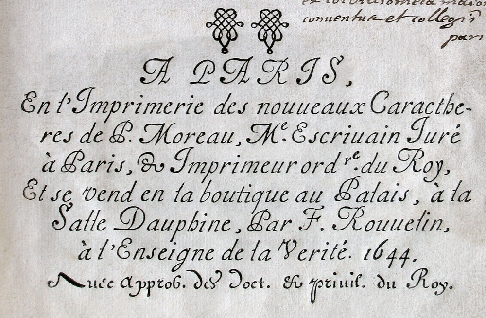
From the time of Pierre Moreau, credited with the first script typeface in 1643, punchcutters and type designers have been trying to imitate writing as closely as possible, a task at odds with the intrinsic nature of type. Written letters always vary, and sometimes they slope and join. Type is marked by uniformity and each letter is independent of the others. Furthermore, from Gutenberg’s day on, the trend in metal type was toward smaller and simpler character sets, which runs counter to the needs of script fonts for alternates and ligatures.
Photocomposition and digital type made it cheaper to include alternate characters and ligatures. Then, OpenType, with its palette of more than 65,000 glyphs, burst open the possibilities: type designers were no longer constrained to the 256-character ASCII set, nor were users stuck shuffling among multiple fonts to access a few extra characters. Now script fonts could have virtually unlimited alternates, ligatures and swash characters.
However, solving the size of the character set was not the biggest problem facing typefounders: contending with slope was. Because metal type has habitually been fitted to a rectangular space, sloped letters required innovative solutions – and typefounders, especially those in the nineteenth century, were up to the challenge. They cast scripts with kerned bodies, winged bodies, angled bodies and bodies that zigged and zagged – all to allow scripts to properly slope and join.
Strategies of slope
The first script to employ one of these strategies was Firmin Didot’s 1806 Anglaise, cast on an angled body. The remarkable series of Penman Scripts, cut by James West, August E. Woerner and Harrison T. Lounsbury in the 1870s and 1880s for George Bruce’s Son & Co in New York, were cast ‘so that the descending letters kern below the body and interlock with the ascenders’; a description that implies a ‘z-shape’ body.
American Type Founders used a winged body for Typo Script (1902) as did Benjamin Krebs for Idealschreibschrift (1903).
A further complication in joining script faces in metal was the need for each letter not only to meet up accurately with the following letter but to be able to do it with every letter of the alphabet – a virtually impossible feat without recourse to alternate characters, contortions or creating suites of related fonts. The Penman types included several alternate letters and some unusual ligatures.
Roger Excoffon mixed letters of varying slopes and informal shapes to create his groundbreaking masterpiece Mistral in 1953, while Aldo Novarese achieved perfect joins in Juliet (1956) by making the lowercase letters nearly upright and including detached joining strokes at the bottom right of most capitals.
Seamless joins
The advent of photocomposition eliminated the physical barriers to joining letters in scripts. Snell Roundhand (1966), created for Mergenthaler’s Linofilm machine, was the first script typeface that maintained a steep yet consistent slope. Matthew Carter, its designer, limited joins to the right side of each letter, thus negating the traditional difficulty of matching hairline strokes from adjacent letters. The execution of seamless joins was an important step towards the ‘holy grail’ of script typefaces that are indistinguishable from writing.
The next step was the significant increase in the number of alternate characters and ligatures that several 1990s PostScript fonts, most notably Poetica, Bickham Script and Zapfino, offered. But they achieved their expanded character sets by sleight of hand, as they were actually suites of related fonts: six in the case of Zapfino and 21 for Poetica (one of which consisted solely of 58 ampersands). Users were now faced with the new problem of having to juggle these fonts.
The advent of OpenType
The answer was OpenType, with its huge glyph palette (intended originally for non-Latin types but equally valuable for scripts), which reduced scripts such as Poetica back to single fonts. (However, in practice glyph palettes can be as aggravating to handle as multifonts.)
Another feature of OpenType that has been especially fruitful for scripts has been the innovation of contextual alternates, characters whose presence and frequency in a text is automatically determined by software programs such as InDesign.
When contextual alternates first appeared, with Adobe’s InDesign 1.5 in 2001, they seemed to be the perfect, pain-free way to insert proper f-ligatures in ordinary fonts and choose among alternate letters in script fonts. The proving ground was Caflisch Script Pro (2001) – released in conjunction with InDesign 2.0 – but soon other scripts (most notably Zapfino Extra in 2003 and Bickham Script Pro in 2004) were reconfigured to take advantage of this new technology.
The quest to look natural
Smaller foundries jumped into the game, beginning with Christian Robertson’s Dear Sarah Pro (Betatype) in 2004 but most notably Sudtipos (Burgues Script, 2007; Poem Script, 2011), House Industries (Studio Lettering suite, 2008) and Underware (Liza Pro, 2009) over the following five years. Each of these last three designs upped the ante in what contextual alternate programming could do to better simulate the vagaries of letters written by hand. Burgues Script reintroduced extravagant swash letters and flourishes; the Studio Lettering suite of Sable, Slant and Swing added language as a contextual feature driving the choice of alternate characters; and Liza Pro greatly expanded the range of options that a font could have in the quest to look natural. The floodgates for script fonts were now wide open.
Despite their great potential, contextual alternates have not been a panacea. In the case of script fonts, they sometimes hinder good typography, since the programming rules they operate under often fail to take into account anything more than a desire for a random frequency of letterforms and the creation of discretionary ligatures. The focus is on avoiding repetition as much as possible – ‘Liza makes your letters look different all the time,’ says the blurb for Liza Pro on the MyFonts website – even though all writing, from casual to careful, is marked by the repetition of similar, though not identical, letters. Obvious differences among alternate characters are more typical of formal scripts than informal ones. In calligraphy – as opposed to handwriting – they are design decisions, sometimes conscious and at other moments intuitive, made by scribes looking to shape letters into words and words into lines and lines into well balanced texts.
In contrast, the alternate characters found in informal scripts are the residue of physiological and emotional factors, such as the speed of writing and the writer’s mental state. This means that the variations in form tend to fall within a narrow range, one of the reasons that handwriting can be linked to an individual. The most natural of casual script fonts, such as Caflisch Script Pro or Toni Haaparanta’s Suomi Hand Script (2008), are those that recognise this and do not try to show off. The latter claims to eschew ‘OpenType magic’ in favour of ‘hundreds of ligatures, connecting pairs and trios of letters’. Contextual programming can act like magic – watching characters change as they are being typed can be mesmerising (or unsettling) – but designers are often better advised to turn off such features and rely on their own knowledge and skill in choosing the right letter or ligature for a given spot.
Handwriting scripts
Scripts can be separated into formal and informal (or casual) groups – with handwriting fonts being subsumed into the latter.
Because they are so intimately tied to the act of writing, they can be further subdivided into four subcategories based on tools:
• broad-edged pen (e.g. Veljovic Script),
• pointed pen (e.g. Tangier),
• brush, both flat and pointed (e.g. Stentor),
• other tools: pencil, pen, crayon, marker, ruling pen, spraycan, etc. (e.g. Twang).
Most of these tools leave distinctive traces that can be found in script typefaces. The exception is the group of script fonts based on lettering that itself is imitative of writing,but in an exaggerated or heavily stylised manner (e.g. LHF Ballpark Script by Tom Kennedy or Magneto by Leslie Cabarga).
To join or not to join?
Scripts have different characteristics and, hence, different terminology to that of romans and sans serifs. Continuous joining is an important feature, though not essential. Formal broad-edged pen scripts – such as chancery cursives (e.g. Poetica by Robert Slimbach) and rondes (e.g. ITC Redonda by Gerard Mariscalchi, 1998) – and brush scripts (e.g. Sunetta by Werner Schneider, 2005) often do not.
Formal pointed pen scripts (e.g. Libelle by Jovica Veljovic, 2009, or Compendium by Alejandro Paul, 2007) and most informal scripts (e.g. Liza by Underware, Zapfino by Hermann Zapf, and Caflisch Script by Robert Slimbach), regardless of the underlying tool being imitated, join up frequently.
Rhythm and sensibility
The new prominence of script typefaces means that designers need to expand their typographic knowledge. They need to learn new terminology, gain an understanding of the tools and mechanics involved in calligraphy and handlettering, and set aside classicist or Modernist notions of good typography. Using script fonts is not about hierarchy – there is no pairing of roman and italic, and no ranked combination of caps, small caps and lowercase – or contrast (scripts tend to be loners rather than members of families with multiple weights). It is not about kerning and tracking, either, since anything other than fine adjustments of letter and word spacing will destroy the rhythm and joining that is integral to scripts.
First and foremost, script typography is musical. Scripts – whether formal or informal, joining or discursive – have a rhythm. A formal script, such as Snell Roundhand or Michael Clark’s Pouty (2000), has a steady rhythm, while an informal script such as Stephen Rapp’s Memoir (2008) or Steinweiss Script (2010) has a syncopated rhythm.
A steady rhythm is created by consistency in letter height, branching, arch shape, joins and intervals (counterspaces and the spaces between letters). In contrast, these features are deliberately inconsistent, yet controlled, in a syncopated script. Furthermore, syncopation relies on the presence of alternate characters that vary in form, baseline position, slope and method of joining. Uncommon ligatures are essential. The difficulty in designing a good informal script – as attested to by the many failures littering the typographic landscape today – is controlling syncopation so that it appears to be natural and pleasing no matter what the combination of letters. The role of the typographer is to maintain or enhance the rhythm of the script, to let its personality flower.
The current embrace of scripts, especially those sporting a riot of swashed and flourished letters, on the part of designers is a continuation of the decades-old rebellion against the less-is-more philosophy of Modernism. But swashes and flourishes have been abused – both by graphic designers and type designers. Learning to use them well involves restraint, but most of all it involves the balance of white space and of text. This is something that goes beyond an understanding of calligraphy. It cannot be achieved through the use of contextual alternates. The only solution is to have a good design sense.
The popularity of scripts is not a fad, however fleeting the fame of many of them will be. They are here to stay because they fulfil the needs of the amateur designer as well as the professional. Scripts are malleable. Most importantly, they are personal. They encompass a variety of styles and they suggest a plethora of emotions. Scripts are human. As the digital world takes over more and more of our lives, they provide a link to the physical and tangible world we are leaving behind. When print is dead, scripts will remain.
First published in Eye no. 83 vol. 21, 2012
Eye is the world’s most beautiful and collectable graphic design journal, published quarterly for professional designers, students and anyone interested in critical, informed writing about graphic design and visual culture. It is available from all good design bookshops and online at the Eye shop, where you can buy subscriptions, back issues and single copies of the latest issue. You can also browse visual samples of recent issues at Eye before You Buy.