Summer 1997
Willem Sandberg: Warm printing
The Dutch pioneer’s catalogues for the Stedelijk show a tactile use of sensual materials and experimental typography
Torn paper shapes, images wholly or partially submerged behind what appears to be a screen of tracing paper, a fine art catalogue that does not reveal the name of its subject matter until page eight. For some observers these may appear to be the stylistic hallmarks of our age, but many will recognise the distinctive signature of an earlier figure, the Dutch designer Willem Sandberg. This is the man who introduced contemporary art to post-war Holland and who, as director of the Stedelijk Museum in Amsterdam, laid the foundations for one of the best collections of modern art in Europe. The seminal graphic designer and the inspired museum director meet in a body of work that is a monument of Dutch graphic design.
Sandberg, born 100 years ago in Amersfoort, lived his life by what would now be called alternative medicine and philosophy. He was conscripted after school, but his officer’s training came to an abrupt end when he refused to sign the oath of allegiance to the queen. He served the remainder of his military service as sergeant in the coast guards. He then enrolled at the Art Academy in Amsterdam, but left within his first year, horrified that professors scribbled on his work.
Sandberg travelled around Europe, experimenting with various lifestyle practices, including fasting, which he continued to use whenever he had difficult or important decisions to make. During his travels Sandberg met Johannes Itten, who had taught the basic course at the Bauhaus in Weimar (concentrating primarily on elements such as texture, tone, colour and movement) and who shared his interest in the oriental philosophy of Mazdaznan. Sandberg also studied Isotype, the system of pictorial statistics developed by Otto Neurath.
His first work for the Stedelijk Museum, where he later became director, was to design pictorial statistics for a 1928 exhibition entitled ‘Work for the Disabled’. The first catalogue he designed was for ‘Contemporary monumental art’, an exhibition to mark the fortieth anniversary of the museum in 1935. As well as designing the catalogue, he had to go to Germany to collect materials.
Sandberg became a curator at the Stedelijk in 1937. Although the designer disliked the notion of becoming a civil servant, he took the position on the condition that he would not have to give up designing the catalogues. Active in this new role, he mounted an exhibition of abstract art that included 70 works by 32 different artists. A retrospective of this sort was not only new to the Netherlands but unusual in Europe at that time.
He continued his curatorship with unrelenting energy, renovating the interior of the building. This included painting the red, yellow and green terracotta tiles of the entrance hall and staircase white, much to the indignation of burgomaster De Vlugt. Johannes Itten was commissioned to design a velum (later lost during the Second World War) to tone down the bright light from the new white-paned roof. Sandberg disliked the building intensely and resorted to growing ivy over the outside it in an effort to hide it. This was promptly ripped down when he retired as director.
Sandberg wrote a great deal throughout his life (the bibliography of his published writings comprises several hundred items) and some of his views changed radically over the years. One example of this is his attitude to the role of the museum, which he had described in 1929 as accommodating ‘the culture of the past’. After becoming involved in the Stedelijk, Sandberg considerably reviewed his thoughts, characterising the role of the museum of contemporary art as a meeting place for artists as well as for the public from all walks of life. He saw it as a place for experimentation and reflection of the culture of the present and his own role as the catalyst between artists and the general public. He considered all branches of the arts equally important in fostering this parallel between life and art: music, dance, poetry, industrial design, typography, architecture, photography and films, as well as the fine arts.
For Sandberg, the graphic devices usually associated with a museum – street signs, posters, museum journals and especially catalogues – were of central importance in expressing its image and making its activities visible to as large an audience as possible. He saw the catalogue as a ‘taster’ for an exhibition, a means of whetting the public’s appetite. For this reason they were made available, by subscription, some time before the exhibitions opened. This preview function is now largely performed by art programmes on television and radio, but at that time the subscription catalogues were an effective way of promoting the work of less well-known artists. Many internationally famous artists owe their present reputations to his inspired methods of communication. Sandberg designed 320 or so catalogues during his career, a staggering number considering that after 1945 (when he became the director of the Stedelijk), he did the work in the evenings after the day-to-day running of the museum had finished. There are reports that he sketched ideas and made designs during board meetings, in an effort to relieve the boredom of administrative tasks.
Sandberg’s cover for the magazine STYL shows an early use of the torn shape that was to become the hallmark. Red overprinting on blue produces the illusion of a third colour. The basic palette is that of the De Stijl artists, by whom he was clearly influenced, except that he would mix the primaries to achieve a third colour. The word STYL is in a bold Egyptian form. The use of blue and red is typical of Sandberg and the combination occurs in much of his work of this time – for example, on the cover of the Pays Bas book published in connection with the Paris International Exhibition of 1937, a calendar which he designed for Spin in 1938 and for the Stedelijk Museum ex libris (bookplate) of 1940. This shows Sandberg’s first use of the enlarged letters SM that he was to employ repeatedly as a symbol for the Stedelijk Museum. Although the typeface has changed, the device is still in use today.
Throughout the war Sandberg was active in the Dutch resistance movement, and in the spring of 1943 was associated with a daring raid. The Gestapo put a price on Sandberg’s head, forcing him to go into hiding for fifteen months under an assumed name. It was during this time that he made the first of his experimenta typographica, hand-made booklets in which he collected inspirational quotes from his wide reading, and to which he added his comments in writing and in typography. In giving each quote a definite typographic character, Sandberg transformed his seemingly loose collections into intensely coherent meditations on the great questions of life so disregarded outside his hiding place. Some of the booklets were later published using a mixture of type and hand-rendered elements. The first of these, ‘lectura sub aqua’ (reading under water), was published illegally in 1944. The experimenta typographica demonstrate the materials, styles and conventions he was later to adopt for a wider audience. The Stedelijk catalogues are in this sense a continuation of the experiments of Sandberg’s wartime seclusion, in which he was similarly prolific: he made twelve of the eighteen experimenta typographica in the period from December 1943 to December 1944.
It is interesting to speculate how Sandberg would have reacted to digital technology. His particular way of layering information and blurring elements through the use of tracing paper, his choice of incongruous script type styles contrasted with bold Egyptian and sans-serif text faces together with his use of ‘low technology’ appears to anticipate many of the devices of the postmodernist designers of the 1980s and beyond. The difference is that while a layered image created on a Macintosh and then printed on smooth white paper as one surface might well give a similar initial impression, one cannot turn the page and reveal the stronger image by lifting the tracing paper, or feel the textures that Sandberg achieved with blocks of text and large areas of unbroken colour on rough paper.
In one sense he sits uncomfortably in the age of Modernism though he certainly held some Modernist ideals. He abhorred symmetry: to him, the state of peaceful balance was a dead end. Yet he extended this dislike of symmetry to a rejection of obvious order. The trend in state museums in Northern Europe, on the other hand, was not to the rough but to follow the ideals originally set out by the Bauhaus, of clean, clear-cut designs, and certainly not to allow elements of randomness to creep in. Many of Sandberg’s catalogues were printed, at least in part, on recycled paper (re-used rather than reprocessed), so that each one was unique. In some cases, one can still make out the original printed matter. Yet although at first glance some of his work may appear to have postmodernist overtones, it is as difficult to place him under that label as it would be to place a figure such as Hendrik N. Werkman (the Dutch printer-painter whose work Sandberg promoted – and was greatly influenced by – throughout his life). Both were highly individualistic artists and designers, more concerned with finding new ways of communication than with challenging old ones.
One of the most important factors in Sandberg’s work is his choice of raw materials, the great care taken in selecting things such as tracing paper, Kraft paper, textile swatches and rough sugar paper for their feel, as well as for their visual peculiarities of texture and colour. His use of these sensual elements creates a sense of the accidental and makes each catalogue exquisitely individual and unique. Yet beneath their surface effects, Sandberg’s designs are disciplined and logical. He guides the reader through the process of revelation in a particular order and he never compromises the display of an individual artist’s work: the reproductions of paintings are usually printed on smooth, white paper and tipped-in. the mixture of materials that is so important in his work is one of the principal reasons why modern technology would have been an uncomfortable medium for him. He believed in real experiences.
Although Sandberg’s catalogue designs are highly personal creations, he managed, through layering and texture, to suggest the atmosphere of the individual exhibitions in each. The choice and permutations of his favoured devices appear to be a direct response to the content and ambience of the different shows. Through these techniques, Sandberg created each catalogue as an item to value and keep, making each exhibition an event to anticipate and remember.
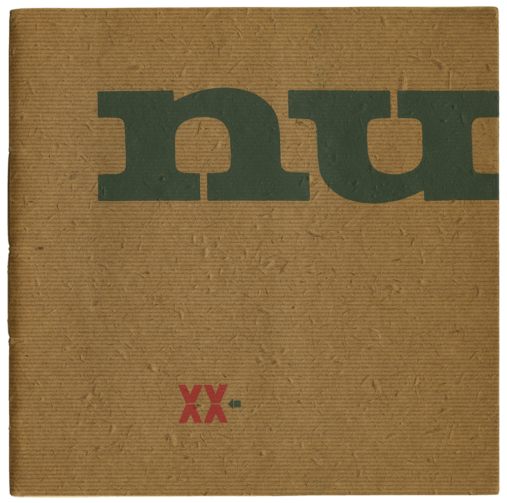
Top: Cover from nu, midden in de XXe eeuw (now, in the midle of the twentieth century), 1959.
Mafalda Spencer, lecturer in graphic communication at Falmouth College of Arts
First published in Eye no. 25 vol. 7, 1997
Eye is the world’s most beautiful and collectable graphic design journal, published quarterly for professional designers, students and anyone interested in critical, informed writing about graphic design and visual culture. It is available from all good design bookshops and online at the Eye shop, where you can buy subscriptions and single issues.