
Spring 2019
Easy reading

Typography, A Very Short Introduction
By Paul Luna. Oxford University Press, £7.99, $11.95
Paul Luna has written a very thorough explanation of typography as a subject and a practice. The book is not aimed at practitioners but at an intelligent general audience with no experience of typography beyond picking a font from their Fonts menu. There are plenty of good books on how to use type; this is not intended to be one of them. This book does not teach you how to do typography; it teaches you how to think about typography.
Although Typography: A Very Short Introduction follows the series design of the ‘Very Short Introductions’ – a page size of 11×17.5 cm, body type 8.5/12 pt Miller Text, flush left on a measure of 20.5 picas, with 36 lines per page, paragraphs indicated by a blank line with no first-line indent – Luna managed to persuade the publishers to let him lay out the pages himself, a logical thing in a book about typography, but well outside the usual parameters allowed to authors. Of course since Luna has been a book designer for Oxford University Press (he designed the last two editions of the Shorter Oxford English Dictionary), he was demonstrably capable of doing the job. His delight is designing complex texts; unsurprisingly, he does a good job of explaining just what makes them complex.
Spread from Typography: A Very Short Introduction, designed by Paul Luna.
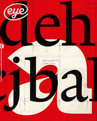
Top: The book’s cover.

‘Typography is design for reading.’ That is the first sentence of Chapter 1. As befits an introduction, Typography: A VSI presents a brief but knowledgeable survey of the history of writing and printing, and of the development of type, from pieces of metal to photographic images to pixels on a digital screen. Many of the earliest printed books were in fact quite complex, including of course the Bible and even more so the scholarly editions published during the explosion of printing in the Renaissance. How printers and publishers have dealt with that complexity has varied quite a lot with changing technology, but it always has the primary purpose of serving the reader.
The demands of a complex hierarchy of information, as in a textbook or cookbook or daily newspaper, call for careful typographic treatment. Luna demonstrates the various ways we use typography to sort this hierarchy, from the use of bold or italic type to indentation and vertical spacing. As he points out, the most important thing in preparing to produce any complex piece of printed or digital information is to assess just how complex it is: what kinds of differentiation need to be made between the parts, whether on the page or within a sentence. The most basic forms of typographic differentiation are punctuation. Even the spaces between words are a kind of differentiation – and one that wasn’t always a part of our written language.
Spread from Typography: A Very Short Introduction, designed by Paul Luna.
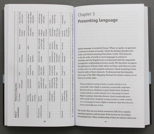
Luna gives us a dense but fascinating chapter called ‘Presenting language’, in which he breaks down the different ways that verbal information can be presented, and how it can be organised for typesetting to make that presentation both orderly and systematic. In the next chapter, he introduces the concept of ‘genres’: not in the sense of literary genres such as satire or romance, but as categories of books or documents and how their visual presentation tells us what kind of publications they are. The size and heft of a dictionary, along with its organisation into short entries with typographic variation in each entry, sets our expectations when we open the book. Similarly, the glitzy presentation of a fashion magazine tells us right away what it is and how to approach reading it.
Recognising these categories gives us a handle on how to design a text – even if the text is just an inter-office memo or a product sheet. Luna’s book does, after all, give some guidance to people who have potentially sophisticated typographic tools at their fingertips – on their computers – but have no training in how to use them.
In the last parts of the book, Luna delves into the current state of legibility research – what makes a particular passage of text easier or harder to read. There is no single answer, but the chapter ‘Making typography legible’ gives a good overview of both the questions and some possible answers being currently explored. Finally, the short appendices point us to a few useful rules of thumb and a lot of further resources.
Ever since I first encountered the ‘Very Short Introduction’ series, I have been waiting for a volume on typography. This is it. It was worth the wait.
John D. Berry, editor and typographer, Seattle, United States
First published in Eye no. 98 vol. 25, 2019
Eye is the world’s most beautiful and collectable graphic design journal, published quarterly for professional designers, students and anyone interested in critical, informed writing about graphic design and visual culture. It is available from all good design bookshops and online at the Eye shop, where you can buy subscriptions and single issues. You can see what Eye 98 looks like at Eye Before You Buy on Vimeo.