
Autumn 2012
On being well read
Typography, Referenced: A Comprehensive Visual Guide to the Language, History, and Practice of Typography
By Allan Haley, Richard Poulin, Jason Tselentis, Tony Seddon, Gerry Leonidas, Ina Saltz, Kathryn Henderson with Tyler Altermann; Rockport Pubishers, $50, £35Shaping Text
Written and designed by Jan Middendorp; BIS Publishers, €29.90, £18.99Reading Letters
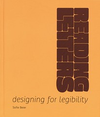
Written and designed by Sofie Beier; BIS Publishers, €39, £34Inside Paragraphs: Typographic Fundamentals
By Cyrus Highsmith; The Font Bureau, $15Cómo crear tipografías: Del boceto a la pantalla
By Cristóbal Henestrosa, Laura Meseguer, José Scaglione. Designed by Elena Veguillas; cover design by Laura Meseguer; Tipo e (tipo-e.com), €18 plus p&pThe Anatomy of Type: A Graphic Guide to 100 Typefaces
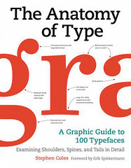
By Stephen Coles. Designed by Tony Seddon; Harper Design, $25.99, £16.24
In this shifting digital world, countless websites, blogs and social networks provide instant information on typography and type design.
Yet printed books and magazines seem more prominent than ever. For some time, a small number of acclaimed reference works, such as Robert Bringhurst’s The Elements of Typographic Style, has dominated a field in need of serious rejuvenation. These six books represent a significant update, taking in the globalisation of design and the evolution of Web typography. They also put the work of forgotten designers such as W. A. Dwiggins back on the map and spotlight such relative newcomers as Marian Bantjes and Henrik Kubel. But do typographic books and manuals have a future? Isn’t the internet a better platform nowadays for renewing and sharing the endless expansion of type culture?
Typography, Referenced boldly attempts to cover a range of topics: history, classification, designers, foundries, technology and education. The book is profusely illustrated and contains inspiring material, such as Gerry Leonidas’ essay on type design. Sadly, it is marred by typos and some confusing mistakes (the Albertus example on p.57 is actually set in another typeface; the Joos typeface on p.138, credited to Jean François Porchez’s Typofonderie, was designed by Laurent Bourcellier and released by typographies.fr). It looks outdated, like a late-twentieth-century schoolbook; maybe the last of its kind.
By comparison, Jan Middendorp’s Shaping Text is a refreshing and humbler crack at the genre. This handy book started life as a desktop publication for text designers. Its six sections are divided into thematic spreads, making it a pleasure to browse. One example of its dynamic editorial and design qualities is the cross-referencing at the bottom right-hand corner of the page, which aids efficient navigation through topics (‘Grid Systems’, ‘Choosing Fonts’). With its many contemporary practical cases, analysed when necessary in considerable detail, Shaping Text has all the qualities needed to become a classic.
Reading Letters comes from the same publisher. Derived from a PhD thesis at the Royal College of Art, it tackles a well-worn but still sensitive subject: legibility, from the letter to the text, in printed matter, on screen and in public spaces. Sofie Beier aims to help designers create high-legibility typefaces and ‘determine the optimal typeface for a given project’. Rather than infallible recipes, the book offers a series of considerations and assessments, helped by academic resources and practical examples, all carefully illustrated. Big names (Gerard Unger, Matthew Carter) sit alongside little-known studies such as Frank E. Blokland’s research on ‘patternisation’ of type design. Despite minor historical errors and occasional difficulty shaking off its dense scientific foundations, Beier’s book is a solid starting-point, offering lots of food for thought.
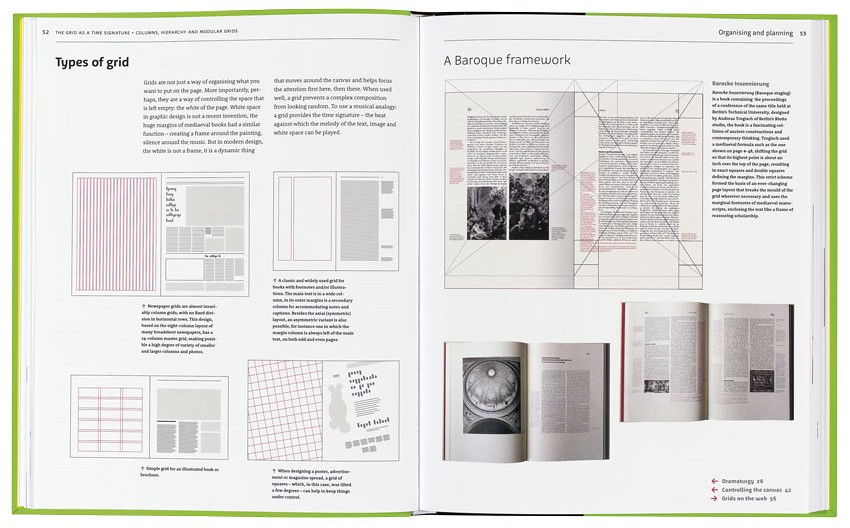
Top: spread from Jan Middendorp’s Shaping Text on controlling space with different grids, using Andreas Trogisch’s Barocke Inszenierung as one example.
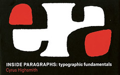
Legibility and the mechanics of typography are also addressed in Inside Paragraphs: Typographic Fundamentals, a small, cleverly designed manual by the American type designer Cyrus Highsmith. It deals with the most essential aspect of typography: how to correctly ‘shape text’. Letters are like a bunch of instruments with their own features: each is eager to play solos, but when gathered together they have to build a harmonious piece of music. Typography is about spacing: letter, word, line, paragraph. Highsmith explains it very well, helped by his unique ability to combine text and image through duotone illustration. He manages to create a rapport with the reader and achieves a rarely seen outcome in typographic literature. The book can also be considered a tribute to American illustration of the 1960s, with Saul Bass and Paul Rand as godfathers.
Cómo crear tipografías is a singular and audacious venture by a small Madrid-based publisher. Informed by the different educations and careers of Cristóbal Henestrosa, Laura Meseguer and José Scaglione, it is a well structured guide to typeface design for students and beginners. Over nine chapters, each author narrates the lengthy, cautious process of creating a font, describing method, mistakes and tricks ‘From sketch to screen’. Personal accounts are underpinned by necessary basics and meaningful duotone illustrations. Let’s hope an English edition appears soon: this may be the most fruitful publication so far available in the discipline.
Lastly, Stephen Coles’ The Anatomy of Type (available on paper or digitally [and now published in the UK as The Geometry of Type]) should get a mention. Classic and contemporary fonts are organised into fifteen new categories (for example: ‘Humanist Serif’, ‘Geometric Sans’, ‘Grotesque Slab’), each displayed on a spread and put under a magnifying glass with basic but essential historic information. It is a down-to-earth but playful and helpful tool for users in search of a distinctive typographic tone – a cautiously plotted but worthwhile attempt to shake type classifications to the core.
Sébastien Morlighem, researcher, writer, lecturer, Barcelona and Amiens
First published in Eye no. 84 vol. 21 2012
Eye is the world’s most beautiful and collectable graphic design journal, published quarterly for professional designers, students and anyone interested in critical, informed writing about graphic design and visual culture. It is available from all good design bookshops and online at the Eye shop, where you can buy subscriptions, back issues and single copies of the latest issue. You can see what Eye 84 looks like at Eye before You Buy on Vimeo.