
Thursday, 10:00am
18 September 2014
AK and A23D on press
Alan Kitching
A2 / SW / HK
Paul Rand
Tom Eckersley
Josef Müller-Brockmann
Abram Games
F. H. K. Henrion
Henrik Kubel
Scott Williams
Design history
Graphic design
Posters
Technology
Typography
Two 21st-century letterpress projects breathe new life into this arcane, antiquated but much-loved method of mark-making
The LDF’s opening graphic weekend featured plenty of stimulating events and fascinating displays, with workshops, movies (Lost Highway), demonstrations, talks (Paula Scher, Irma Boom), David David’s Carousel Wall in the tunnel entrance, and Barber & Osgerby’s vertiginous Double Space – huge rotating mirrors – in the Raphael Gallery, writes John L Walters.
Type enthusiasts, however, would have been particularly fascinated by two (superficially) unconnected presentations on Saturday – by Alan Kitching in the lecture theatre and by New North Press in the Learning Centre.
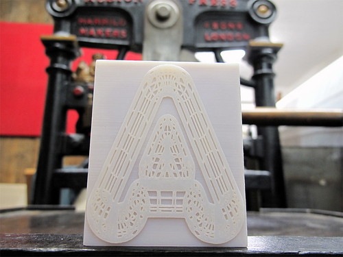
The letter ‘A’ from the A23D font designed by A2-Type.
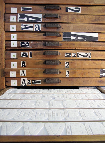
Type case at New North Press for the new 3D-printed, all-caps typeface A23D.
Both events focused on new ways of approaching letterpress printing. Both presentations featured specially commissioned short films. New North Press partner Richard Ardagh has commissioned a new font called A23D from designers Henrik Kubel and Scott Williams of A2-Type. [Disclosure – I’ve written about this project for the forthcoming issue of Pulp magazine.]
Another personal link is that both Kubel and Williams attended Kitching’s letterpress workshops at the Royal College of Art.
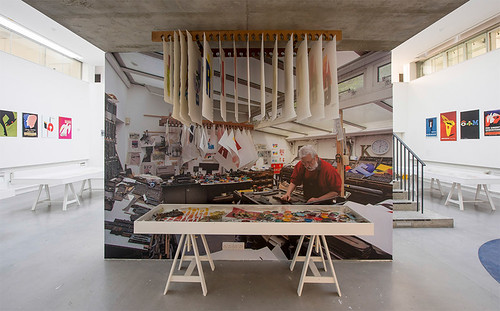
Installation image from the exhibition ‘Alan Kitching and Monotype: Celebrating the Centenary of Five Pioneers of Posters’ at London College of Communication.
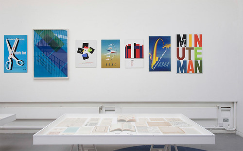
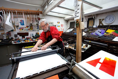
Installation image from ‘Alan Kitching and Monotype: Celebrating the Centenary of Five Pioneers of Posters’ showing a photograph of Alan Kitching printing in his Kennington Studio.
Alan Kitching gave a comprehensive talk about his 50-year career in design and typography, ending with a description of his new project for Monotype, a set of five posters featuring monograms of designers whose centenaries fall in 2014: Tom Eckersley, Abram Games, FHK Henrion, Josef Müller-Brockmann and Paul Rand. [Disclosure – I wrote the short biographies printed litho on the reverse of each poster.]
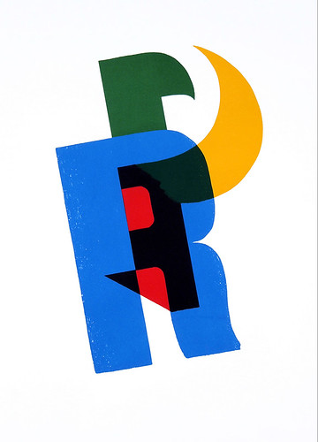
Alan Kitching’s poster for Paul Rand, which uses Monotype’s Gill Shadow for the ‘P’ and a woodletter ‘R’.
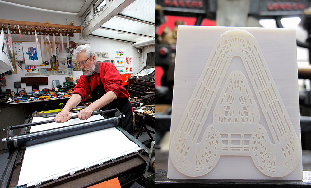
Anyone who has studied with Kitching will know that he’s long advocated the ‘use what you have’ philosophy of making the most of the materials in your own studio. He admitted in questions at the end of Saturday’s talk, that he never thought he would use type that wasn’t in his own, vast collection of wood and metal tpe.
However Kitching’s premise for this new project was that one letter of each monogram would be made from a Monotype typeface while the other would be a letter from his wood type collection. To realise the idea, he cut giant version of the letters – a Gill Shadow ‘P’ for Paul, a Futura Black ‘A’ for Abram – out of thick card. The artwork for these colourful posters was made in Kitching’s Kennington studio using letterpress, but the final edition was printed by silkscreen at Advanced Graphics in London.
Alan Kitching and Monotype directed by Kenzo Ejiri.
The A23D project also breaks with the convention that letterpress fonts should be either wood or metal. The eighteen-line, capitals-only font, whose printing surface was fabricated by Chalk Studios using a polyjet 3D printer, stands at the same height as conventional wood type, and can be locked into a forme on the type bed alongside other characters and furniture such as rules and spaces.
A23D: A 3D-Printed Letterpress Font filmed by Adrian Harrison and featuring Richard Ardagh of New North Press and Henrik Kubel and Scott Williams of A2-Type. The project was supported by ACE, the Arts Council of England.
Alan Kitching often says that he was ‘liberated by letterpress’ – that this supposedly obsolete method of printing enabled him to find new forms of expression. A23D and Kitching’s Monotype project – in their separate, but similarly experimental methods – may point a few new ways in which letterpress itself can be liberated from the previous millennium.
Alan Kitching printing in his Kennington studio. The Futura Black ‘A’ for Abram Games can be seen far right.
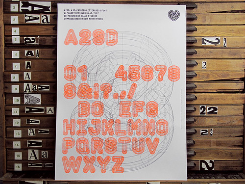
A23D specimen poster, printed on Sirio 200gsm donated by Fedrigoni. See the forthcoming edition of Pulp magazine.
John L Walters, Eye editor, London
Eye is the world’s most beautiful and collectable graphic design journal, published quarterly for professional designers, students and anyone interested in critical, informed writing about graphic design and visual culture. It is available from all good design bookshops and online at the Eye shop, where you can buy subscriptions and single issues.