
Wednesday, 2:00pm
17 September 2025
As good as it gets
Otl Aicher: The Legacy Archive
Wiedemann Lampe, 41 Hoxton Square, London N1 6PB. Noon-6pm daily, 13-21 September 2025Rush to see this London exhibition of superlative posters by Otl Aicher, urges Quentin Newark
To say that Otl Aicher’s work is the best you can see anywhere is an understatement, writes Quentin Newark. I studied every poster up close and could not see any flaws … not one bad kerning pair, no misregistration or ghosting, no hickeys, no plucking, no uneven tints.
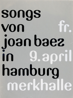
For decades I have been lied to by British printers – it is possible for print to be flawless! If you go, look closely at the bicycle poster (there is a great book-catalogue, too) for the exhibition ‘Design & Sport’. I swooned at a meticulously, coolly, mechanically drawn, silver bike – a production masterclass of metallic inks, foiling, thin lines and overprinting.
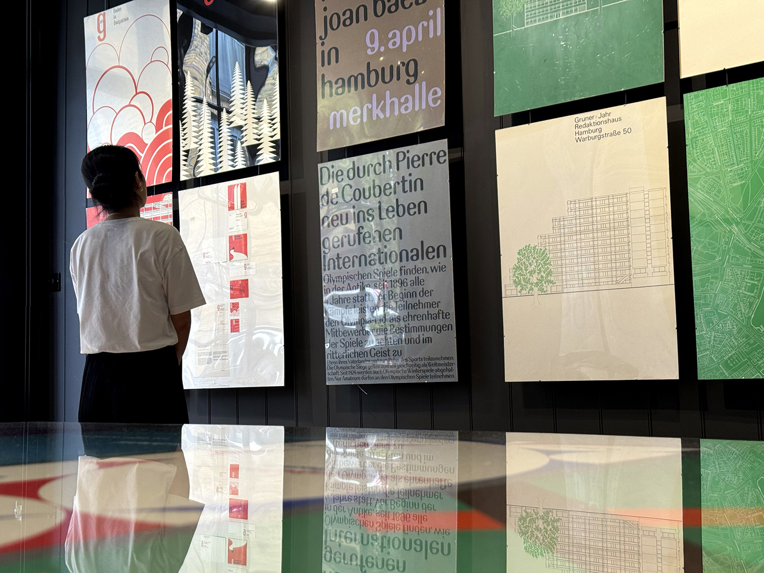
Right and above. Otl Aicher posters on display at the Wiedemann Lampe gallery in London, 13-21 September 2025. The exhibition is on two floors, with about 30 posters on the ground floor. Every poster is a zinger. Flawless composition, typography, and visual oomph. And the printing is to die for
Nothing to criticise about the design either. Strong branding, great colours, amazing switches in scale, authoritative information design, grids to die for, incredible drop-dead drawing. Some of it geometric, some of it painterly. All of it masterly.
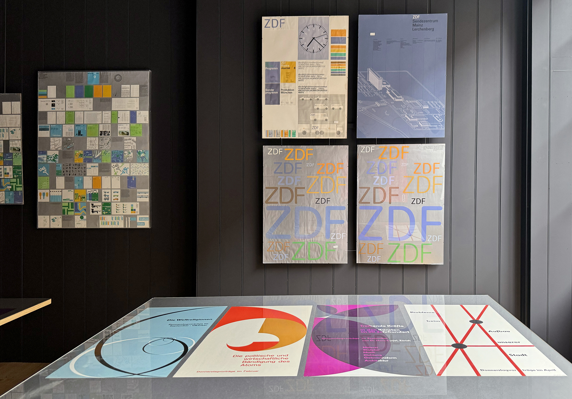
Otl Aicher (b. 1922) died in an accident in 1991. His family have lived in the residential portion of his vast Rotis farm-housing-studio estate since then, but recently decided to move. As a consequence, Wiedemann Lampe and gallerist Bernhard Brandt now have the Aicher family archive. The gallery space, in East London, enables the curators to show about 30 posters on the ground floor, and another 60 or so downstairs, plus Olympic matchbooks and books. Some posters are for sale.
Aicher worked for a fantastic array of clients, both profit-driven and social: he branded many towns and little cities to boost their tourism. His commercial clients were not rapacious corporations, but companies that cared about excellence: FSB, Lufthansa, lighting company Erco.
This is the way to present brand guidelines, forget PDFs or those awful manuals.
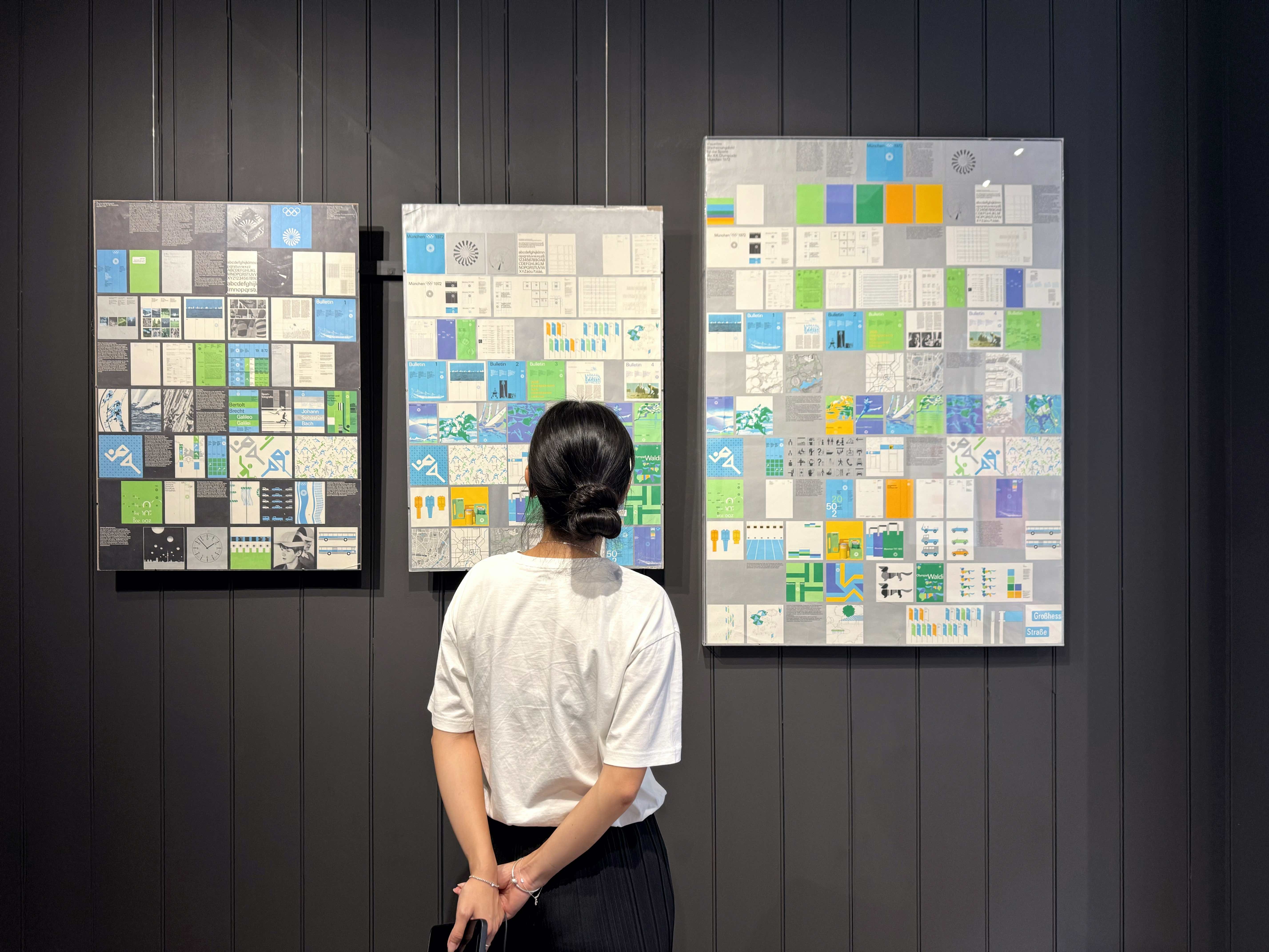
Of course there is the 1972 Olympic work on show (see Eye 101). Apparently the client asked for a design and colour scheme for a ‘new Germany’, to distinguish it from the red-white-black of the disastrous 1930s and 40s, hence Aicher’s strange (to my eyes, until now) Olympic palette: yellow, orange, fresh green, pale and dark blue. Now I understand it was to get as far away as possible from you know who.
There is a pair of posters of an experimental typeface I can best describe as ‘Verner Panton Sans’ – curvy and blobby, but strictly a sans serif. A sans made friendly. Karl Gerstner designed a similar typeface, trying to reconcile the curves in serif forms with the mechanistic edges of sans. Germans have always worried about the historical mess that is the Latin alphabet, with its capital letters, a whole different set of little letters, and then serif (tradition?) and sans (modern?). What should the future look like? If architects can speculate with ever wilder forms, why cannot graphic designers do the same?
I suggest you do anything you can to see this show, take whatever train, bus, plane, bicycle, donkey or canal boat you need. It is as if a spacecraft landed on the grass of Hoxton Square, and the design of a vastly superior lifeform has been offloaded for our inspection … after which it will be loaded up and zoomed back to their galaxy. You have until Sunday. For a moment I thought I had died and gone to design heaven.
Quentin Newark, designer, writer, co-founder of Atelier Works, London
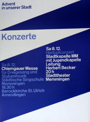
Concert poster, 1972. Aicher proposed this very 1970s-looking-curvy typeface for the 1972 Olympics. It would have made that scheme even more unique and complete than it already is.
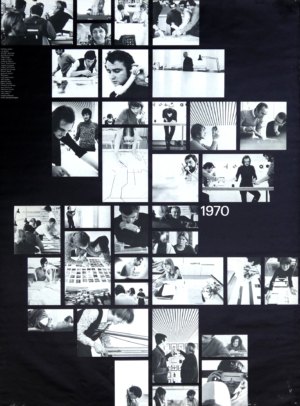
Photographs of ‘Design heaven’: Aicher leading the 80-strong team that designed the Regenbogen–Spiele (Rainbow Games, referring to its exuberant colour scheme) in 1972.
One of the many civic promotion systems Aicher designed, this is for the town of Memmingen in 1975. The whole scheme riffs off the angles of an ‘M’.
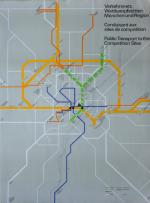
Public transport map, Olympic Games, 1972. The exhibition shows that (combined with superlative quality) what makes Aicher great is his excellence in every field of design. Here he gives a lesson for the ages in information design.
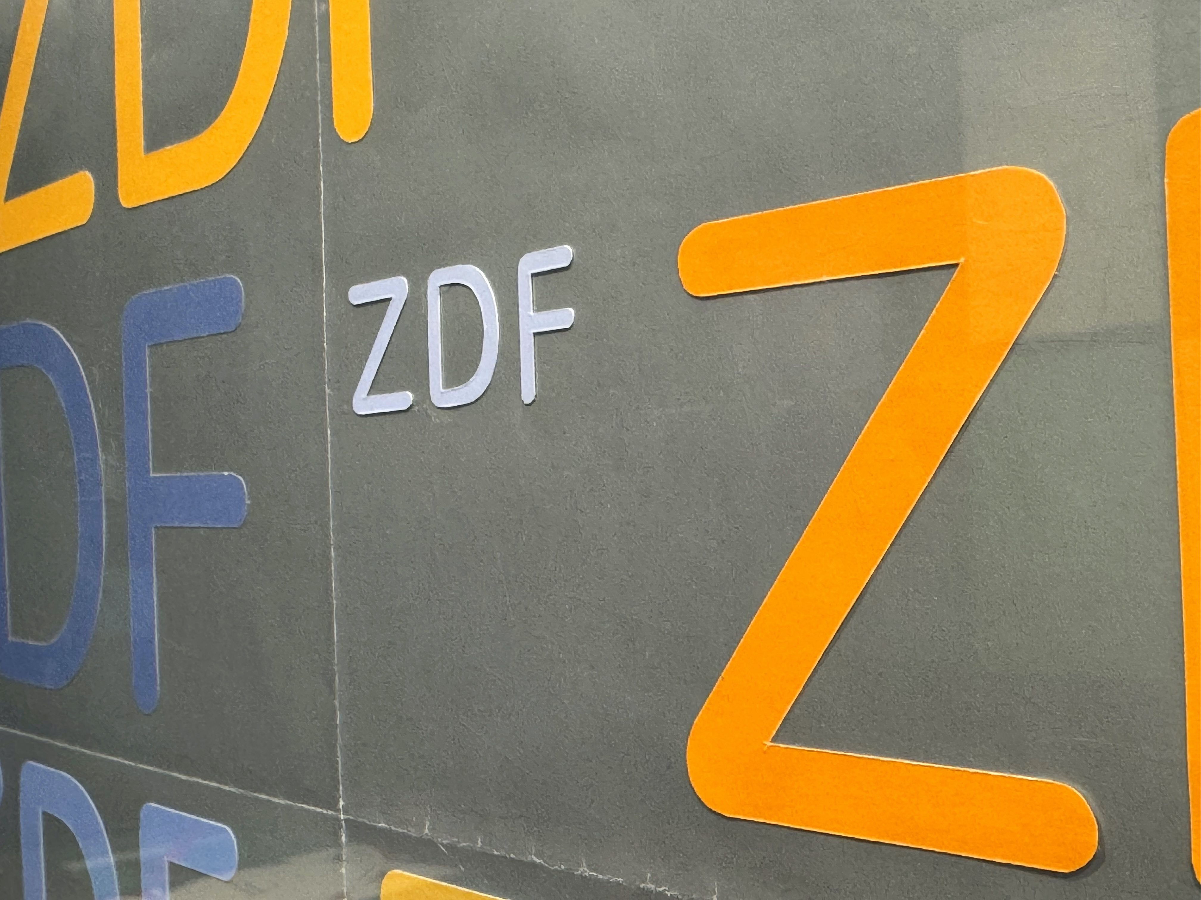
Logo for Zweites Deutsches Fernsehen (ZDF, Germany’s version of BBC2), 1973. Aicher found in testing that the tips of the Univers letters would blur, so he redrew them with round terminals. The exhibition features several original mock-ups, although they are so immaculate you could easily mistake them for printed posters.
Eye is the world’s most beautiful and collectable graphic design journal, published for professional designers, students and anyone interested in critical, informed writing about graphic design and visual culture. It is available from all good design bookshops and online at the Eye shop, where you can buy subscriptions, back issues and single copies of the latest issue.