
Tuesday, 3:44pm
17 July 2012
Best in show
Design through a typographic lens – a report from last night’s TDC Awards in New York by Doug Clouse
Best in show
http://farm4.staticflickr.com/3199/2924253970_b60afdf869_o.jpg
Design through a typographic lens – a report from last night’s TDC Awards in New York by Doug Clouse
The Type Directors Club annual competition captures a portrait of design in our time, through the lens of typography, writes Doug Clouse.
While the profession that gave the Club its name 67 years ago has virtually disappeared, typeface design and appreciation have boomed worldwide in recent decades, bringing more attention to this highly selective competition.
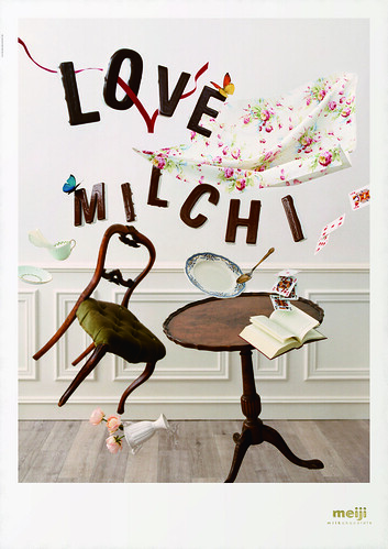
Poster by Ren Takaya, Tokyo, one of seven ‘judges choices’ from the 215 winners. Producer: Asuka Takizawa. Photography: Megumi Oyama. Designers: AD&D. Client: Meiji Co.
Type: Universe 67 Bold Condensed.
Judge Andrew Byrom commented: ‘To steal a line from Bootsy Collins, this design is a “naughty nothing that will wet your eyeballs.” I didn’t feel the need to go out and buy the chocolate … I wanted to eat the poster.’
On Tuesday 16 July 2013, the TDC presented awards and opened an exhibition of winners of the latest competition. This competition is the TDC’s 59th for the use of type in communication design and its sixteenth for typeface design. Out of 2040 entries in the communication design competition, from 33 countries, the judges selected 215 works from nineteen countries, including England, France, Germany, Canada, Japan, Korea, Portugal, and Turkey. Out of 197 entries in the typeface competition, only fourteen were selected.
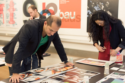
TDC judges Tarek Atrissi and Irina Lee.
The judges – respected designers and educators including Abbott Miller, Rietje Becker and Stephen Coles and James Montalbano – came to New York for a day last winter and evaluated room after room of anonymous entries. If judges had designed works under consideration, they excused themselves from judging and a proxy stepped in. Judging is taken seriously and is governed by traditions, including the use of a set of vintage Dixie brand paper cups that have held the judges’ chits (voting slips) since 1983.
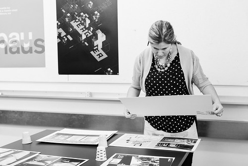
TDC judge Rietje Becker with inverted Dixie cups in foreground.
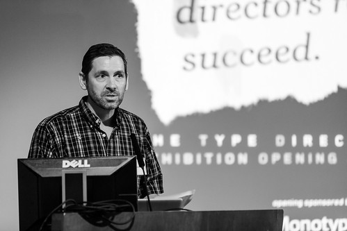
The TDC reception on 16 July [last night] was a combination of awards ceremony (with TDC President Graham Clifford acting as master of ceremonies) and gallery opening. TDC officers announced seven recipients of TDC student scholarships. Competition chairs spoke about the high quality of the entries and the difficulty in selecting winners, familiar comments at TDC competition openings in the past few years.
Graham Clifford, TDC President. Photograph by Catalina Kulczar.
A judge involved in the beginning of the typeface competition confided that typefaces that would have once won the typeface competition are now seen as ‘ordinary’. The bar has been raised, as typeface design education and practice have spread into languages, cultures, and media where they did not exist before. Technological developments have made it easier to develop large typeface families of multiple weights and styles that include many special characters. Also, the study of history and quick transmission of information have spread appreciation of past styles and revivals, as well as current trends.
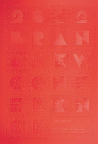
Armin Vit’s poster for the 2012 Brand New Conference won the overall ‘Best in Show’.
Unable to attend, ‘Best in Show’ winner Armin Vit sent an acceptance video in his place wearing his poster. Photograph by Catalina Kulczar.
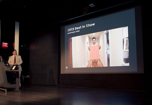
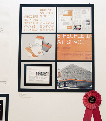
Highlights of the awards ceremony were the announcement of the overall ‘Best in Show’, which went to Armin Vit for his poster for the 2012 Brand New Conference, and the First Place award for student work, which went to Stanley Xing Chen’s rebrand and identity system for the Architecture and Design Museum of Los Angeles, (designed at the Art Center College of Design).
Stanley Xing Chen of the Art Center College of Design won first place in the student category. Photograph by Catalina Kulczar.
The multiplicity of typographic and design styles now in favour are evident in the exhibition. On display are revivals of mid-twentieth-century Modernism, such as Mike Joyce’s Swissted posters, as well as historical revivals like a complex nineteenth-century-style identity for a lawyer, by the office of Kevin Cantrell.
Identity design by Kevin Cantrell, Ario Vance, and Ben Webster.

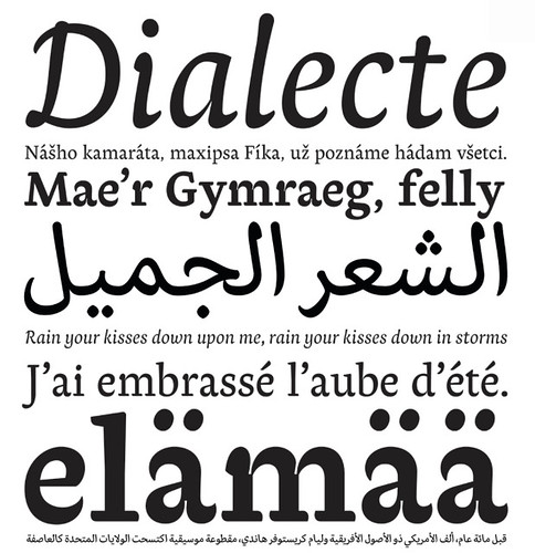
Much of the ‘type design’ isn’t type at all, but lettering, examples of which range from calligraphy to the barely legible drawn letters in a poster by New York design firm Collins. Among the typeface design winners is the typeface Baldufa [LINK], by Ferran Milan Oliveras, which provides both Roman and Arabic characters, along with countless diacriticals, ligatures, and special Farsi and Urdu characters.
Baldufa, by Ferran Milan Oliveras, also won gold at the European Design Awards
The sheer variety of styles attests to the number of skilled designers and good design schools in the world. The TDC, which began as a small New York City-centric group of mostly men has evolved into an international community of over 1000 members, men and women, working in a wide variety of styles.
The TDC will now pack seven exhibitions that will travel the globe, from Minneapolis to Taiwan, during the coming year. The eagerness of schools, galleries, and even calligraphy societies to display these travelling exhibitions is evidence of continuing reverence for the good design of language, whatever the dialect. It also attests to respect for ink on paper, since most of the entries are printed objects. The TDC will, in fact, bring forth, later this year, a new printed object, a catalogue of the competition designed by Chip Kidd.
The exhibition, which is sponsored by Monotype and The Cooper Union, will be on view at The Cooper Union from 16 July to 8 August 2013.
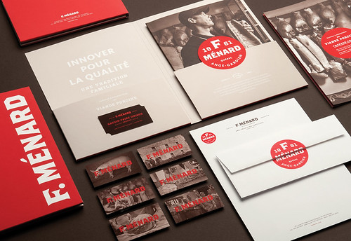
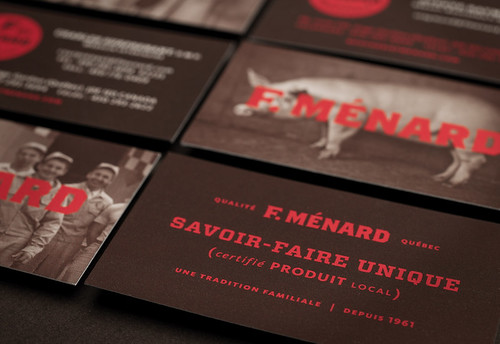
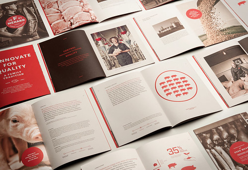
F. Ménard identity designed by Serge Côté and Andrée Rouette, Montréal for Luc Ménard. Judge Rietje Becker’s comments on the identity: ‘This design … places importance on both the company’s 50-year history, as well as its product innovations, a combination … perfectly captured in the brand’s new visual expression. … Often, too many typefaces in one logo present a problem. In this case they go a long way toward telling the … story … All collateral and stationery reflect the same typographic look, complimented by the bold use of red, photography and simple infographics. … They manage to make a meat producing company look seductive and rich in history.’
Doug Clouse, graphic designer, Type Directors Club board member and president of the New York chapter of the American Printing History Association, New York
Eye is the world’s most beautiful and collectable graphic design journal, published quarterly for professional designers, students and anyone interested in critical, informed writing about graphic design and visual culture. It is available from all good design bookshops and online at the Eye shop, where you can buy subscriptions and single issues.