
Friday, 11:20am
7 October 2011
Design for drugs in NYC
Exhibition will explore the graphic world of pharmaceutical products
A new exhibition at The Herb Lubalin Study Center at The Cooper Union will explore the graphic world of pharmaceutical design. Work by Andy Warhol, Lester Beall, Will Burtin and Herb Lubalin features in the show, which charts design for drugs from the 1940s to the present day. Here, curator Alexander Tochilovsky shares his thoughts about what he sees as a ‘golden age’ in US pharmaceutical design, the 1940s and 50s.
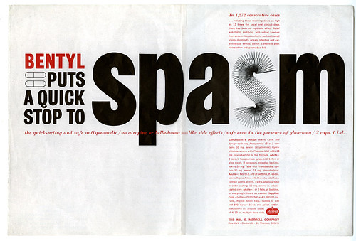
Top: Ad designed for Wm. S. Merrell Company by Herb Lubalin, photo by Carl Fischer (1954).
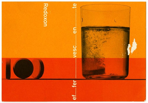
Below: Ad for Roche by Aldo Calabresi for Studio Boggeri, photo by Sergio Libis (1959).
Tochilovsky: ‘The discovery of “miracle drugs” in the mid-1930s (mainly sulfonamides), capable of controlling bacterial infections, led to the formation and rapid expansion of the pharmaceutical industry. The Second World War helped stimulate that growth immensely, due to the need for such drugs in the war effort, while simultaneously forcing many of the leading European artists and designers to emigrate to the United States. The artists found a home in the new climate of American commercial arts, and in the art schools. Their teachings inspired generations of talented American designers, many of whom found a steady stream of work in the rapidly growing pharmaceutical industry.’
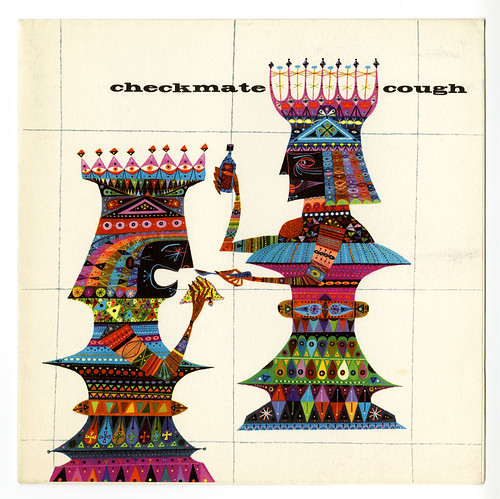
Above: Promotional mailer for Ciba, designed and illustrated by Jerome Snyder (1950s).
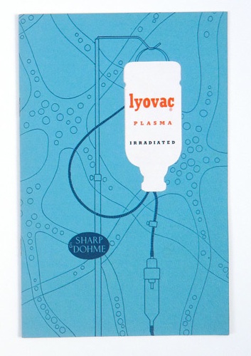
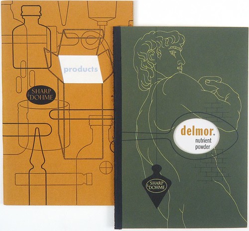
Below: Promotional booklets for Sharp & Dohme, designed by Alexander Ross (1940s).
Tochilovsky: ‘The relatively young industry was receptive of new visual ideas and able to afford these young designers a platform to showcase their talents. I can also speculate that because the majority of the promotional material was aimed directly at the physicians, rather than the general public, it tended to be more visually sophisticated, and more influenced by the modern art movements. Similar things occurred in Europe, especially in Switzerland, as the pharmaceutical industry was being born.’
For more pharmaceutical design, see ‘The romance of chemicals’, a portrait of Swiss designer Max Schmid, father of the ‘Geigy style’ while working at J. R. Geigy Pharmaceutical Corporation (now Novartis) in the 1950s and 60s.
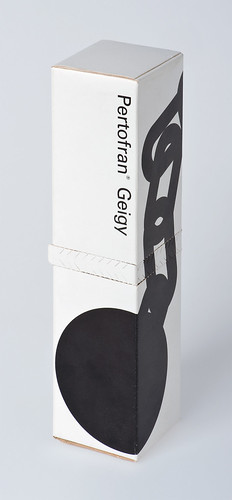
Below: Package design by Max Schmid for the antidepressant Pertofran (1962). When the perforated strip in the middle of the box is torn open, the links in the ball and chain illustration are broken, symbolising liberation from the patient’s depressive state.
1 November > 3 December 2011
PHARMA
Herb Lubalin Study Center
41 Cooper Gallery at The Cooper Union
41 Cooper Square, New York, NY 10003
cooper.edu
Eye is the world’s most beautiful and collectable graphic design journal, published quarterly for professional designers, students and anyone interested in critical, informed writing about graphic design and visual culture. It’s available from all good design bookshops and online at the Eye shop. For a taste of the new issue, see Eye before you buy on Issuu. Eye 80, Summer 2011, is out now. Eye 81 will be on press soon.