
Tuesday, 7:59am
15 July 2014
Design for eating: Milton Glaser
Milton Glaser recalls working with an inspirational client – the great New York restaurateur Joe Baum (1920-98). Interview by John L. Walters
New York designer Milton Glaser has long been associated with design for food and drink, from his restaurant identities (Rainbow Room, Aurora) to his label and logo designs for Brooklyn Beer.
In this telephone interview with John L. Walters, he recalls an early interest in food, his time as an ‘Underground Gourmet’ for New York magazine, and his long, creative collaboration with friend and client Baum.
John L. Walters: Food has always been an interest of yours … In another life could you imagine being more involved in food and less in design?
Milton Glaser: It’s a great subject. People ask me why I was interested in it, and I very often say it’s because my mother was such a terrible cook it inevitably led me to an interest in the subject.
The other thing that really generated an interest was my time in Bologna, where early (or relatively early in my life) I got a Fullbright [scholarship], and Bologna of course is the capital of gastronomy in Italy.
It was such a contrast to everything I had eaten up until then in my life, particularly my mother’s spaghetti recipe, which I’ll give you briefly.
Take a pound of Mueller’s spaghetti. (Mueller’s sounded unthreatening to my mother, being of Jewish heritage. It didn’t sound as alien as Ronzoni.)
Boil it for an hour until most of the water has evaporated. Demould it from the pot and allow it to dry. Cut it into slices and fry it in chicken fat.
That was spaghetti in my house.
It wasn’t until some years later in Bologna that I understood what spaghetti was. That was the beginning of (as it was with many things) what my understanding of Italian food was, and food in general.
After I came back to the United States, my viewpoints had changed and I became more selective in what I would eat.
For six or seven years, Jerome Snyder and Glaser wrote ‘The Underground Gourmet’, a guide to cheap restaurants for New York magazine.
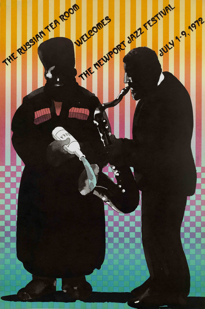
Top: Milton Glaser and Seymour Chwast, The Russian Tea Room Welcomes The Newport Jazz Festival, 1972.

Then, at a certain point, before we had started New York magazine, I began to write a column for the old [New York] Herald Tribune with Jerome Snyder [1916-76] … a wonderful illustrator, and also a designer.
And we wrote a column that we thought was startling at the time, which was a column on cheap food in the city. No-one was writing about cheap food, because the restaurants were not ones that advertised in magazines. (Basically you would only review restaurants you could get an ad out of.)
So all the cheap restaurants went unnoticed by newspapers. But we started writing about cheap restaurants and discovered there was an enormous interest and appetite for cheap restaurants. We carried it over into New York magazine, that Clay Felker [1925-2008] and I started, and it was an enormously popular column because everybody was looking for good cheap restaurants.
I mean cheap is okay but cheap and good is really something.
JLW: And did you do this under cover?
MG: We just walked the streets … When friends of ours knew we were doing it we got recommendations.
There were parts of the city where we knew we could find good places … particularly in the ethnic parts. We knew if we went to Chinatown we would find something if we looked long enough, or Korea Town, or sections of Little Italy.
More then than now, the city was more locally ethnic before the millionaires came in and bought up every inch of space. So you could find local ethnic places all over the city. And people were dying to discover that. And it was terrific to be able to find a place where you could have lunch for four dollars.
We enjoyed doing that. We always were surprised at how responsive people were. We wrote about a little restaurant in the jewellery district that had six seats and a counter. And we wrote a review of it and so many people turned up that they had to close down. So there are consequences.
But it got me started in the food business. I began to do other books … I did something with James Beard, a cook’s catalogue and a book selling kitchen appliances. Then I started restaurant design with Joe Baum, the great restaurant developer and entrepreneur.
The Rainbow Room logo, 1987.

Service plate for the Rainbow Room, 1987.

Interior of the Rainbow Room, 1987.

I did the Rainbow Room and the Aurora. I designed a number of restaurants and they were great fun to do. I found myself in some curious way in the food and food criticism business, that was a great run. I always loved food and enjoyed either doing cookbooks and writing about food and doing things related to food. Still do on occasion … it’s just that other things have occupied my life.
JLW: Do you think the identity design of restaurants and food companies has gone too far? Or do you still enjoy it when it’s done well? Do you have a critical eye on things that are happening in NYC and elsewhere?
MG: Well … there’s this knotty ‘branding’ thing that is going on in the design field, where some kind of funny illustration and peculiar lettering is supposed to be a solution to your identity problems. And that becomes more significant than the food you’re serving. That kind of infantile or juvenile idea of what it takes to create an image or a ‘brand’.
If I hear that word ‘brand’ again I’m gonna jump out of a window. It’s become a superficial term that means nothing. Except that somebody learned another word that sounds professionalised, as though it means something.
Well there’s too much of that kind of superficial and largely useless identity search to distinguish one institution from another. Most of it is just poorly done and not very thoughtful, but … I suppose one could say that about most activities in this town – or any town.
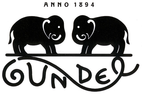
Logo for Café des Artistes restaurant in New York, 1991. A partner to Hungary’s Art Nouveau restaurant in Gundel, Budapest. The image of elephants relates to the zoo nearby.
JLW: You talk very warmly about Joe Baum [1920-98] as a perfect client.
MG: Well Joe was an interesting man. He did a lot of restaurants, I mean hundreds.
What he did every time was imagine that there was no such thing as a restaurant before you started working. He would go to the table and say we have a knife and a folk and two spoons – where shall we put them?
It was that kind of …
JLW: First principles?
MG: Yes. It’s like you’re starting from nowhere. And there are no precedents. And of course, in design, you have to deal with precedents and what the customer has experienced, but with Joe it was all like: ‘suppose there were no history, and there were no expectations – what would you do?’ And I learnt a lot from Joe about the nature of design, just by this kind of openness to the idea that all things are possible. It was a great learning experience. I worked with him for many years and I have to say that inherently, he was not a restaurateur, he really was a designer and the restaurant was his instrument. He viewed the restaurant as a kind of laboratory to try all kinds of things that had not been tried before. So when you look at all the things he did – and there were many examples – every one was really very different and took advantage of different assumptions.
In Art is Work, Glaser writes: ‘Usually logos are simple and reductive. In this case we wanted the logo for Windows on the World [1995] to be expansive to convey a sense of generosity.

The Rainbow Room was totally different from Windows on the World, even though to a large extent they may have shared a similar audience. Joe had a very enquiring mind. He was always interested in seeing if there was an alternative to the existing solution.
JLW: How long did you work together?
MG: Close to 25 years. The other thing about it that was essential (and I’ve said this often, but I don’t think I can say it enough) is that it was an affectionate relationship, not a professional one, and it wasn’t dependent on the idea that you were getting paid for doing a certain body of work, and that you had professional standards to meet.
It was really based on the fact that we liked each other, and we were trying to solve a problem, and we were willing to totally commit to that act – that it had very little to do with keeping track of your hours.
I mean, any time he wanted to work on something I would run downtown, or he’d come uptown and he’d say ‘I have another idea, can we spend another hour on it ?’ And I’d say ‘of course’.
It was really based on the sense that we had a common purpose and that we enjoyed doing it and that there is no more exciting thing than working with somebody – feeling that you have the same intention and the same purpose, and that together you can really do something novel and exciting. And he created that sense, the sense that you’re maybe doing something you’ve never done before and never will again. There’s also the willingness to accept the possibility that you can discover something together.
All of that sort of ‘environmental stuff’ that happens in good collaborations doesn’t happen that often in professional life.
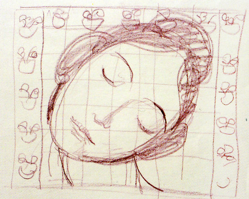
An early sketch of the goddess used for the Aurora Identity. Aurora was ‘The Rosy Fingered Goddess of Dawn’.
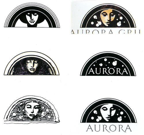
Some steps in the process of developing the Aurora logo. The final design is bottom right.
‘Aurora was a wonderful restaurant,’ says Glaser. ‘It was Joe’s, it was his own. It really had some beautiful aspects to it, but a rather undependable chef.’
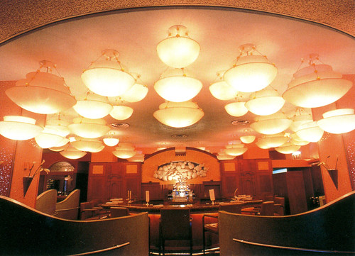
The Aurora interior featured lighting that changed colour with the time of day. Each chandelier contained three different bulb colours on dimmer switches, which when mixed created hues from bright white to pale pinks and deep purples. The overall aim was to create a ‘cosmology of light’.
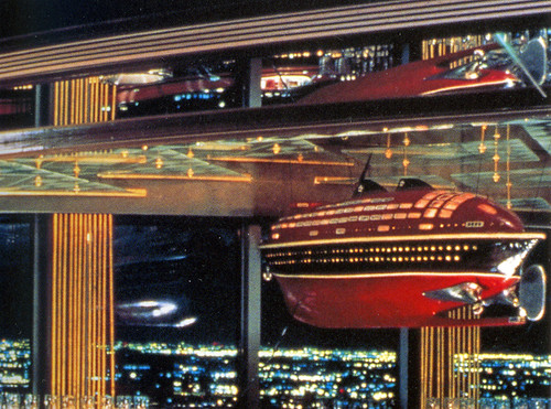
Rainbow Room interior, with floating ocean liner model discovered in California, originally designed by Norman Bel Geddes.
John L. Walters, editor of Eye, London
Eye is the world’s most beautiful and collectable graphic design journal, published quarterly for professional designers, students and anyone interested in critical, informed writing about graphic design and visual culture. It is available from all good design bookshops and online at the Eye shop, where you can buy subscriptions and single issues.