
Thursday, 8:10am
22 March 2012
Evidence of health
Part two of Bowman & Edgar’s report from Dublin conference Offset 2012
Pam Bowman and Matt Edgar report from the Offset 2012 conference in Dublin. See part one, ‘Bigger, brighter, better’.
Saturday (continued)
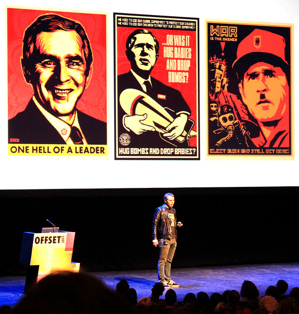
Headlining on Saturday night was Shepard Fairey, the all-American son of the captain of the football team and the cheerleader, street artist and skateboard enthusiast who claimed to be ‘perpetually motivated by dissatisfaction.’ The problem with so much hype is that it’s hard to live up to. The weekend produced an enormous amount of Twitter traffic but very little of it critical in any way until this talk. People were commenting about the lack of discussion about working process and rather too much about politics.
His skill in appropriating John Carpenter’s ‘Obey’ motif from his film They Live and transforming it into a skater brand demonstrates great entrepreneurship. Dissent it is not. ‘I have two kids and I want the world to be okay for them. Plus, I need a future generation to post stickers for me.’ He needn’t worry; there were plenty of disciples already out sticking ‘Obey’ and ‘Andre’ to lampposts all over Dublin. A talk not to be missed, but not an enduring memory.
See the review of Supply and Demand: The Art of Shepard Fairey in Eye 62, and ‘Sticks in the mind’ in Eye 69.
Sunday
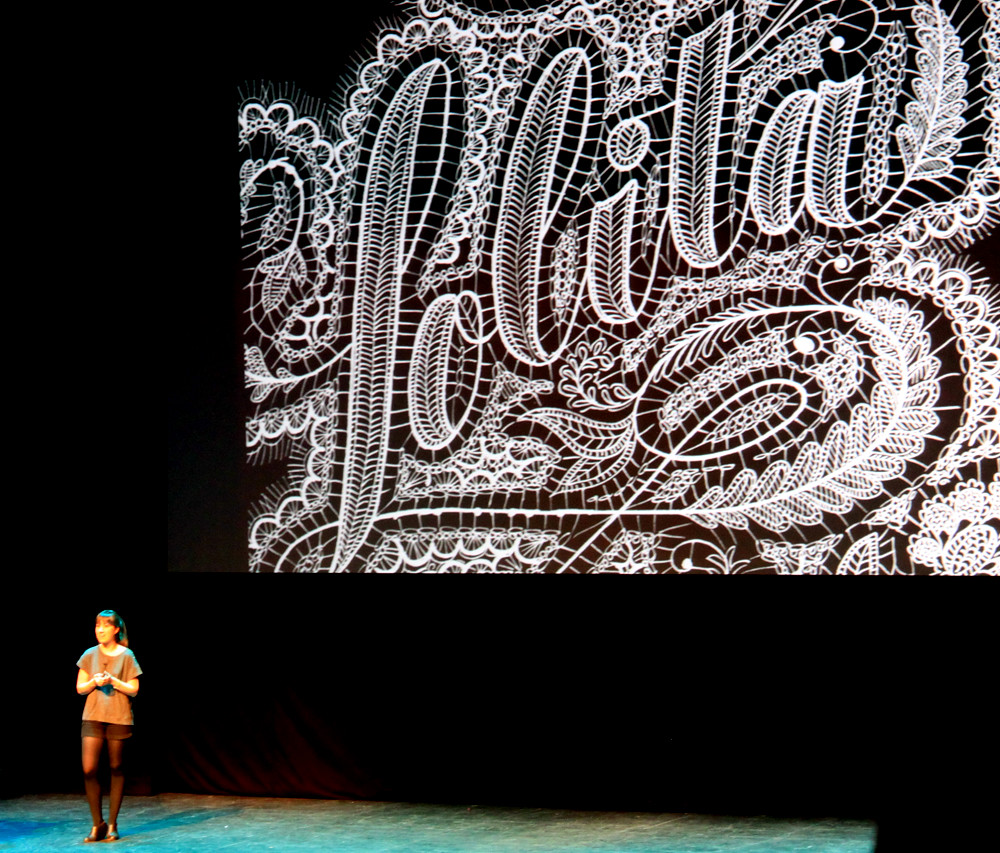
The 10am slot on Sunday – following two consecutive nights out in Dublin and two solid days of back-to-back talks – is a tough one. Jessica Hische was absolutely the right choice: the theatre was packed, she was energetic and having fun on stage. She spoke at frantic pace, was light, funny and bright – the antidote to Shepard Fairey. Jessica spoke about the joy in doing what you love and admitted that for a woman in illustration it’s difficult to produce pretty things because of the assumption that that’s exactly what you will do. ‘I like making pretty things and it took a long time to forgive myself for it.’
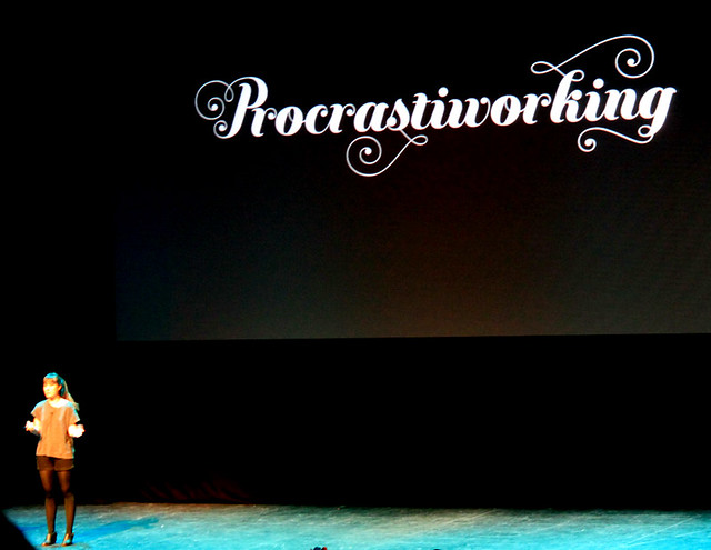
Jessica showed work for clients and self-initiated work, much of which was extremely involved and so has gained the title ‘Procrastiworking’. It’s great, beautiful and often very useful and some of it produced purely with CSS and HTML, like Should I Work For Free? and Don’t Fear the Internet.
She offered advice like ‘make things you wish existed’ and ‘to be a successful illustrator, draw dogs doing human things’. She clearly defined the relationship between lettering, calligraphy, typography and type design and made the audience understand why it’s important to buy fonts and to pay a reasonable price for them. She created a typeface ‘Buttermilk’ and with a deeper understanding of the technical aspects of type design, has gone on to develop it into ‘Buttercream’. She is on the board of directors of the Type Directors Club and pointed the audience to all the resources they make available for students and people wanting to learn more about typography.
Jessica’s talk was a great start to the last morning and a difficult act to follow, but Sunday was essentially motion day and Johnny Kelly was a real highlight.
Currently based in London at Nexus Productions, Johnny gave an overview of his career so far. The talk was interspersed with a number of short stop-frame GIF animations (shown below) commissioned for the Barcelona-based design college Elisava.
These short films go to the heart of the way Johnny works. Stop-frame is a slow, painstaking process and often very technical. He talked of how he has always tried to bring an ‘immediacy over technical know-how’ into that process in the way that an illustrator might work when sketching ideas. His RCA graduation film ‘Procrastination’ achieves this economy brilliantly. He describes his process as ‘ambition born out of naivety.’ The humour and timing is exquisite throughout and not just in motion. His reworking of a Nike trainer into a clog is delicious. He emphasised the importance of having a graphic design education in being able to develop strong concepts and articulate them in an appropriate language.
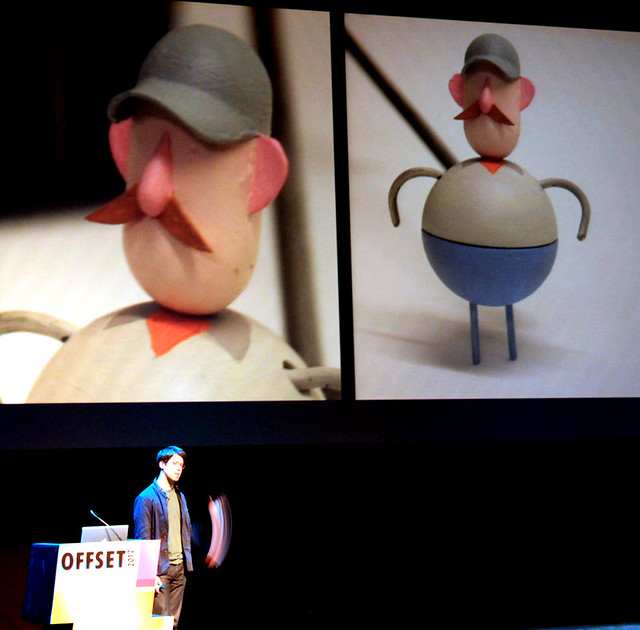
The final project he showed was preceded by the slogan ‘how to make commercial animation without losing your soul (or die tryin’)’. The animation (video below), commissioned by Chipotle, is a short film about sustainable farming methods. In two minutes and one long tracking shot, we are told the story of a farmer who employs intensive farming techniques and then over the course of a generation comes to reject that way of life.
The character design, modelling and direction bring together what Kelly has previously done but with a moving emotional depth. It’s a hugely affecting piece of graphic communication. He tells us that shortly after it was shown during a commercial break during the recent Grammy awards, McDonald’s announced that it was rethinking its practices around pork gestation crates. He was not claiming credit at all but having watched the film I think I would be rethinking my practices too. Particularly useful was showing how the film was made, the level of forward planning, how storyboards were used to organise different aspects and how the story changed through the making.
United Visual Artists (UVA) produce sculptural, interactive forms, projections, set, light and sound design for a range of clients including Massive Attack, Battles, the V&A and Opera North. Some of the work is permanent architectural installation, other pieces temporary or for one performance only. From the ones shown by UVA's Ash Nehru, Origin 2011 and Chorus 2009 really stood out as beautiful examples of their craft. Origin is a ten by ten metre gridded cube that can be stood in and responds to its audience. Chorus is a series of pendulum lights that swing in and out of sync and work with a sound track composed by Maria Calix.

Ash talked about the kind of investment that pieces like these require to develop and build and showed the working process. For this kind of work the tools have to be created and designed for each project, which is a great opportunity for learning and innovation.
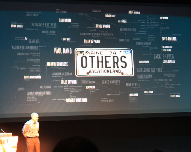
Kyle Cooper (below) treated the audience to an impressive rendition of the prologue from Henry V, from which he sourced the names for his former production company Imaginary Forces and his current company Prologue. Cooper was educated by Paul Rand who was bemused when his student said that title design was the work he wanted to do. ‘Why? No one’s doing any interesting work in that area?’ But Cooper saw the potential of motion in Rand’s work and showed examples of what he called ‘the suggestion of sequence.’ Cooper emphasised the importance of both ‘the hand in the work’ and the edit, ‘animation in an editorial sense’. The editorial, whether in camera or in post-production, runs through a great deal of the work presented. As with Johnny Kelly, Cooper clearly feels he is a graphic designer first and foremost with the application in sequence.
On this evidence graphic design is in a healthy condition. Although this is an industry in flux it appears to be opening up opportunities for graphic designers as never before.
We’re looking forward to next year’s line-up.
Pam Bowman is Typographer at du.st and Principal Lecturer at Sheffield Hallam University. Matt Edgar is Course Leader for Graphic Design at Sheffield Hallam University.
Eye is the world’s most beautiful and collectable graphic design journal, published quarterly for professional designers, students and anyone interested in critical, informed writing about graphic design and visual culture. It’s available from all good design bookshops and online at the Eye shop, where you can buy subscriptions and single issues. Eye 81 has the theme of ‘Designers and clients’. Eye 82 is on its way to subscribers worldwide.