
Friday, 12:00pm
29 April 2016
Offset 2016: day three
Matt Edgar
various designers
Gert Dumbar
Studio Dumbar
Liza Enebeis
Russell Mills
Jonathan Barnbrook
Seb Lester
Niall McInnery
Úna Burke
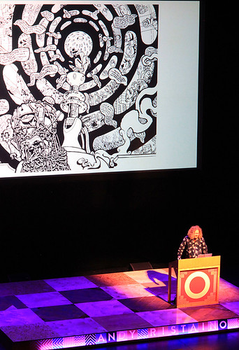
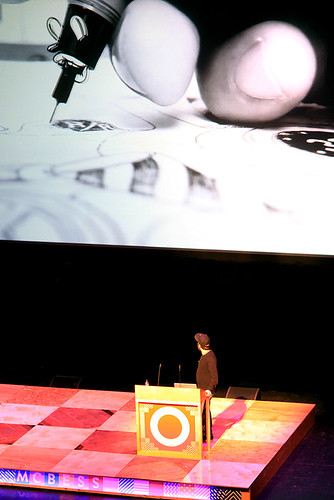
Andy Ristaino
McBess
Stephen Averill
Shaughn McGrath
Graphic design
Illustration
Music design
Visual culture
Studio Dumbar, Niall McInnery, Andy Ristaino, Úna Burke, McBess, Stephen Averill and Shaughn McGrath … and Seb Lester. Pam Bowman and Matt Edgar conclude their coverage of the Dublin Offset conference
By the Sunday morning at Offset 2016, more coffee is required, with several extra shots, but there is still a lot to look forward to, write Pam Bowman and Matt Edgar.
Day three began with Limerick-born fashion photographer Niall McInnery.
Studio Dumbar.
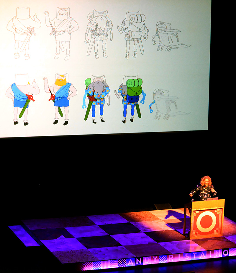
Top: Andy Ristaino.
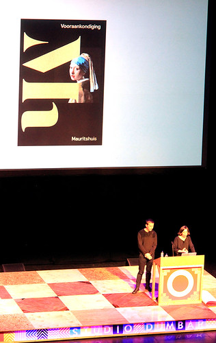
Studio Dumbar followed with process and posters, visual identity systems and their application. Creative director Liza Enebeis talked about the legacy of Studio Dumbar, the importance of graphic design in the Netherlands and showed recent projects including the visual identity for Mauritshuis, Alzheimer Nederland alongside work from the early 1990s for the Dutch Police.
Mauritshuis stationery designed by Studio Dumbar.
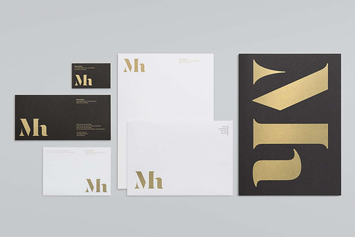
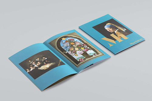
Visual identity for Mauritshuis.
For graphic designers who graduated in the late 1980s, the work of Studio Dumbar was a hugely influential part of their graphic design education. Graphic surprise and narrative through photo / typographic spatial play and a reworking of De Stijl diagonals found their way into many student projects. Founder Gert Dumbar was a central figure in what Michael Rock once described as the ‘Dutchification’ of graphic design.
Dumbar’s role as visiting professor at the RCA in the mid-1980s influenced a generation of designers who went on to set up their own studios straight from the college. It was interesting Enebeis chose to show the visual identity developed for the Dutch Police developed in 1993. The visual language evokes the pilled-up club poster aesthetic of Manchester’s Haçienda – applied to a law enforcement agency. Gert Dumbar’s angular shadow is still cast across all the work that emerges from the studio. In his essay on Dutch design in 2013’s Multiple Signatures Rock asks, ‘Are young graphic designers living with the corpse of their parents’ Dutch design? Did Dumbar finish it off with terminal, nationwide overdesign? If not, what is left? Is there any room left for the Dutch design imagination?
Printed material as part of the visual identity for Alzheimer Nederland designed by Studio Dumbar.
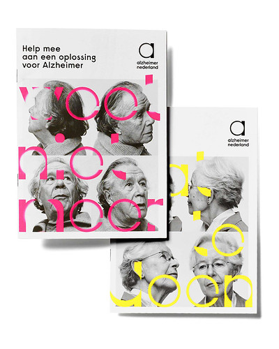
Enebeis (who is also one of the founders of Type Radio) showed images from the identity system Studio Dumbar designed for Alzheimer Nederland. The solution works best in motion where the typographic treatment dissolves into white. Maybe it is in these new digital spaces where the imagination can find new forms?
Andy Ristaino, The Babysitter, 2008 (SLG Publishing, $29.95).
Andy Ristaino.
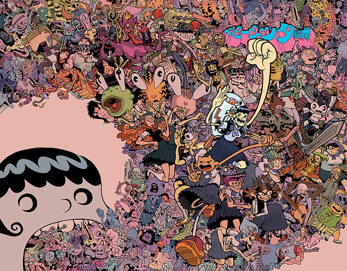
Andy Ristaino is an illustrator, animator, graphic novelist, storyboard artist and character designer, best known for his work on the popular animated series, Adventure Time. Like Mr Bingo, he mentioned a successful Kickstarter funded, self-published project, this one entitled ‘Night of the Living Vidiots’. He shows very many weird and wonderful drawings and ideas for characters – his influences come in part from the natural sciences, and fantastical images of trees, fungi and bizarre sea creatures referenced from Ernst Haeckel’s majestic Art forms in Nature. Drawing aligned with a graphic comic sensibility are at the heart of his practice. It seems like a very fun way to spend a career.
Úna Burke took to the main stage with her wonderful leather creations, while on the Accenture Stage, Jon Barnbrook, Russell Mills and Stephen Averill discussed ‘The Future of Music Design’.
The break-out stages provided a more intimate setting for attendees to discuss aspects of contemporary practice and engage into dialogue with the speakers. With a resurgence of interest in vinyl, alongside the growth of paying subscribers to Spotify (30 million as of March 2016) and the emergence of Apple Music, the nature of future design for music is always an interesting subject.
Barnbrook’s recent design work for David Bowie’s The Next Day and Blackstar explore new ways of responding. The Next Day played with iconic sleeve images and reinterpreted them anew. ★ (Blackstar) strips the image of Bowie away completely and uses a pared-back aesthetic and unicode glyphs that have cross platform application. Barnbrook opened up his designs for fans to download under a creative commons license and responses were rich and varied. An interesting part of the conversation focused on music curation, playlists and influence. Where John Peel once opened up new routes into music, the computer algorithm may now hold more sway. Barnbrook half joked that it was frightening how insightful algorithms, like Spotify’s ‘Discover’, could be. This hybrid of user-centred playlist curation and smart algorithm suggests a possible model for graphic design’s role in shaping the future of music’s visual language.
McBess.
McBess.
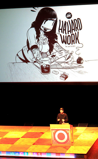
McBess is a French Illustrator living in London. A black-inked comic tattooed aesthetic dominates. His subject matter includes semi-clad women, guns, tattoos and fairytale clearings in woods. He works predominately in black & white, with hand drawn dots rather than greyscale. Tools are Rotring pens and the occasional lithographic stone. When working digitally he uses Photoshop and drawing tablet rather than vector based software. More recently he has translated his illustrative style into hand-drawn animations. He showed several films of work in progress and talked about his approach to perspective and isometric drawing.
He featured a project for Jack Daniel’s Whiskey and finally the beginnings of an animation for his band, Dead Pirates, animated in 2D which clearly shows the influence of Max Fleischer and Betty Boop on his work.
McBess, Birthday 2014 – The Roadtrip for Jack Daniel’s Whiskey, 2014.
Penultimate speakers Stephen Averill and Shaughn McGrath, Irish graphic designers, best known for overseeing every U2 album, were followed by the final speaker of the weekend, Seb Lester.
Seb Lester.
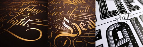
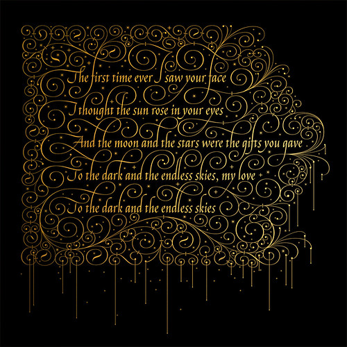
Seb Lester, First Time Ever.
Having seen Seb Lester talk at Offset in London in November 2015 I know it can be an emotional rollercoaster but this time the audience reaction was astonishing. Seb talked through his career from type designer, with fonts released by T26 and Monotype, to calligrapher, from an ‘unknown’ to someone with more than 19K Twitter followers and a million-plus Instagram followers. He’s been featured on news programmes in the US and received a commission from NASA. The conversation he has with a friend about how to charge for usage rights for outer space is hilarious. Seb is likable, humble and seems shocked by his popularity. This, alongside the absolute beauty of his work is what gets grown men weeping (and emotionally Tweeting), and earned him a standing ovation.
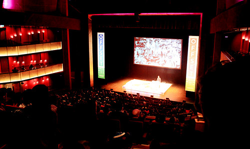
This brought a conclusion to an impeccably curated three days. Exhausting but inspiring, the conference once again captured the energy and restless nature of contemporary design as well as celebrating the work of established practitioners, and it sold out three days in a 2500-seat venue. Ready for another dose in Dublin in 2017.
Bord Gáis Energy Theatre, Dublin.
Pam Bowman, Subject Group Leader, Visual Communication, Sheffield Hallam University
Matt Edgar, Course Leader, BA (Hons) Graphic Design, Sheffield Hallam University
Eye is the world’s most beautiful and collectable graphic design journal, published quarterly for professional designers, students and anyone interested in critical, informed writing about graphic design and visual culture. It is available from all good design bookshops and online at the Eye shop, where you can buy subscriptions and single issues.