
Tuesday, 7:07pm
9 November 2010
Sound and vision #1
Time to find some new, meaningful associations between music + design.
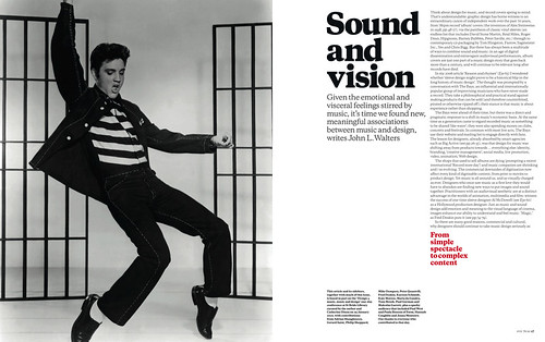
Think about design for music, and record covers spring to mind, writes John Walters. (See ‘Sound and vision’ in Eye 76, the music design special issue, opening spread below.) That’s understandable: graphic design has borne witness to an extraordinary canon of independent work over the past 70 years.
But there has always been a multitude of ways to combine sound and music: in an age of digital dissemination and extravagant audiovisual performances, album covers are just one part of a music design story that goes back more than a century, and will continue to be relevant long after records have died.
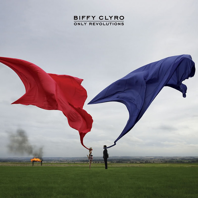
Top: Storm Thorgerson’s unforgettable images for Biffy Clyro are not so much album covers as graphic signifiers that can be recognised within a fraction of a second during a Google image search. See ‘Never mind the music’ on the Eye blog.
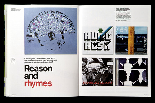
In my 2006 article ‘Reason and rhymes’ (Eye 63, opening spread, below) I wondered whether ‘sleeve design might prove to be a historical blip in the long history of music design’. The thought was prompted by a conversation with The Bays, an influential and internationally popular group of improvising musicians who have never made a record. They take a philosophical and practical stand against making products that can be sold (and therefore counterfeited, pirated or otherwise ripped off); their stance is that music is about experience rather than shopping.
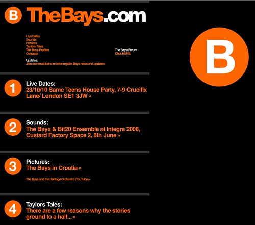
The Bays were ahead of their time, but theirs was a direct and pragmatic response to a shift in music’s economic basis. At the same time as a generation came to regard recorded music as something to be shared ‘like water’, they were also spending money on clubs, concerts and festivals. In common with most live acts, The Bays use their website (below) and mailing list to engage directly with fans. The lesson for designers was that design for music was shifting away from products towards … everything else: identity, branding, ‘creative management’, social media, live promotion, video, animation, Web design.
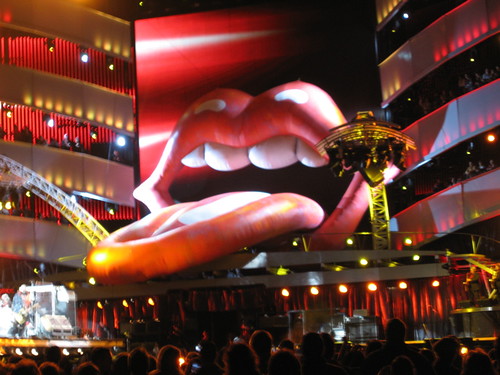
Late in the twentieth century, the kind of spectacle customary in opera and film became the norm for touring bands such as Pink Floyd, Earth Wind & Fire, Pet Shop Boys and the Rolling Stones, for whom John Pasche’s original ‘tongue and lips’ logo has grown to epic, inflated proportions (above, see ‘Two degrees of (colour) separation’). In the 2000s, practices such as Yeast, The Light Surgeons and UVA (below) have emerged to apply digital, graphic methods to create spectacle in live performance. In the rock, pop and indie arena, every other band feels obliged to provide some sort of visual experience.

Above: Costume for a Mandarin in Le Chant du Rossignol, Henri Matisse (1920). Some of the most revolutionary and significant works of the early twentieth century had their origins in ballet, in particular Sergei Diaghilev’s astonishing period as artistic director of the Ballets Russes, early in the twentieth century. Diaghilev had the flair and wit to put radical designers and image-makers together with revolutionary composers to create ‘total theatre’. See ‘Design for music and dance’.
Some of the most effective concert presentations are relatively lo-tech, even when they employ a visual language that started on screen. Norwegian band Jaga Jazzist’s work with designers Yokoland for their recent One Armed Bandit album and tour used the simple resource of slot-machine icons (see the ‘making of’ video above). And the collaboration between Danish band Efterklang and design duo Hvass&Hannibal that began with their popular YouTube animations (below) now covers designs, stage sets and costumes (for their orchestral collaboration Parades) that echo the stylised design of the Diaghilev era.

Visualisation programs can provide some acts with low-budget spectacle, but these work better in short form. One of the most lauded recent examples is the interactive calligraphic microsite (soytuaire.labuat.com) for Labuat’s ‘Soy Tu Aire’ (above, see also ‘Musical paintbrush’). ‘We imagined a conductor moving the baton with her hands,’ says Rafa Soto of Herriaz Soto Co, who devised the site with fellow art director Roman Rodriguez and programmer Jordi Ministral of Badabing!. ‘We wanted to create a tool that allowed us to represent the different intensities of the song,’ adds Soto, ‘similar to that of a Chinese paintbrush.’ Intimate experiences like this, which can be enjoyed on a laptop or iPad using headphones, are perhaps the natural successor to the involvement fans used to feel with twelve-inch sleeves, as something to dote on.
Below: In the present time, record companies are less keen to fund the artfully directed, cinematic videos of MTV’s heydays, by directors such as Chris Cunningham (Björk) and Michel Gondry (Kylie), notwithstanding outrageous exceptions such as Lady Gaga’s extended promo for ‘Telephone’.
This is an extract from ‘Sound and vision’ in Eye 76, our music design special issue.
Eye is the world’s most beautiful and collectable graphic design journal, published quarterly for professional designers, students and anyone interested in critical, informed writing about graphic design and visual culture. It’s available from all good design bookshops and online at the Eye shop. For a sample of the music special issue, see Eye before you buy on Issuu. Eye 77, Autumn 2010, is out now.