
Tuesday, 8:00am
6 March 2012
Type Tuesday
A facelift for Italian daily Corriere della Sera – from Brera and Solferino

In late 2004 Gianluigi Colin, design director at Italian daily newspaper Corriere della Sera – one of the oldest newspapers in Italy – led a comprehensive redesign as the daily migrated to full colour presses for the first time in its 135-year history, writes Alexander Ecob.
Central to the new look was the commissioning of two new typefaces, from studios LeftLoft and Molotro, to be used throughout the paper which, earlier this year (a full seven years since the process started), were finally fully implemented.
Speaking to Eye, LeftLoft said ‘Being asked to design a custom type family is a rather rare opportunity in Italy. The call from Corriere della Sera was exceptional, and we were extremely pleased when the paper’s art director, Gianluigi Colin, requested our hand in the project.’
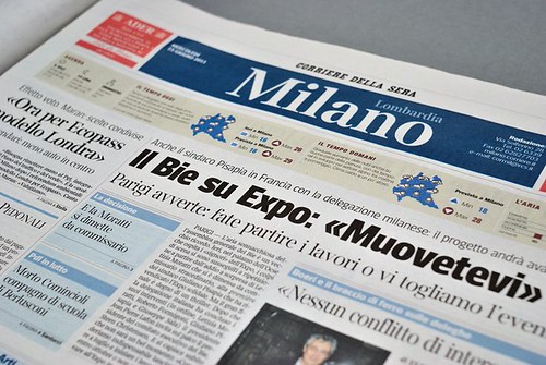
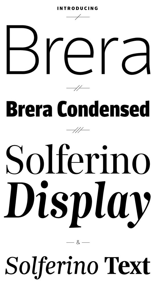
The type created for Corriere includes 41 weights split into four families: Brera, Brera Condensed, Solferino Display and Solferino Text.
The concept behind the system of typefaces is aimed at meeting both technical and formal requirements. Brera and Brera Condensed are contemporary sans serif fonts. Their open structure has been designed to reduce any horizontal stretching of the text.
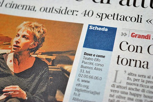
‘Solferino Display is a serif font for big type size and titles. It’s a sort of “Scotch-Italian” alphabet whose purpose is to give the newspaper a strong personality and elegance. Solferino Text has been specially designed to allow a greater number of characters while ensuring and improving legibility. Compared to the alphabets previously in use, it has been possible to save twelve out of 100 lines of copy text.’
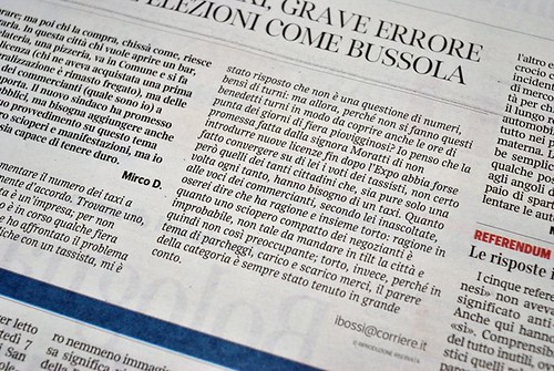
For a paper that was previously using Helvetica and Times New Roman, it is a strong and positive change, and the fact that a newspaper is willing to commission a wide family of type over a multi-year process is a powerful vote of confidence in a supposedly dying industry.
Eye is the world’s most beautiful and collectable graphic design journal, published quarterly for professional designers, students and anyone interested in critical, informed writing about graphic design and visual culture. It’s available from all good design bookshops and online at the Eye shop, where you can buy subscriptions, back issues and single copies of the latest issue. Eye 81 has the theme of ‘Designers and clients’. Eye 82 has just been printed.