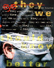
Autumn 1994
A sense of rupture
ReVerb is a four woman, one-man design team in the heart of polyglot Los Angeles. In their conceptually based work, artificial distinctions between ‘high’ and ‘low’ melt into an alternately grating and blended concoction that reflects the discord and simultaneity of life in the city
Ruben, one of the last elevator operators in Los Angeles, cranks the handle and, with a heave, slides back the door to ReVerb’s ninth floor studio in the ageing Zigzag Moderne Wilshire Tower. I am taken aback by the almost 360-degree view of the ‘out there’ that prescribes the inner world of ReVerb. ‘We’re sitting here surrounded by the image of the city,’ says Lorraine Wild, one of ReVerb’s five partners, apparently referring to the streets and neighbourhoods rather than the view itself. Somi Kim, another partner, agrees: ‘We all have an interest in Los Angeles; it’s the ultimate polyglot city.’ ‘I live in a fake Spanish house next to a fake Tudor one,’ says Wild. ‘That’s the visual environment of this city. It’s not a phoney construct.’
In the conceptually based work of ReVerb, distinctions between ‘high’ and ‘low’ melt into a sometimes layered, sometimes blended concoction that reflects the discord and simultaneity of Los Angeles life. Their work poses the question: whose vernacular? For Somi Kim, Whitney Lowe, Lisa Nugent, Susan Parr and Lorraine Wild, the fire escape sign on the wall is as notable a part of the visual environment as the worn Bertoia chairs that flank the conference table, however different their histories. Their bricolage takes everyday material, demystifies it, acknowledges it as a reference point, then uses it in an unconventional way to produce new meaning.
ReVerb’s portfolio opens with an affable ‘hi’ on its corrugated cardboard cover. The large ‘5’ on the inside front cover is sometimes overlooked – a simple clue to the rewards that await the viewer who delves beneath the surface. The book is infused with intelligence, wit and innovative form that is at times deceptively quiet, at others a hyper-eclecticism gone into overdrive. ‘We use styles like maniacs but we never use them lock, stock and barrel,’ Wild explains. ‘We would usually manipulate them to create some kind of tension. No style is either good or bad, it’s just another style – whether you use it wholesale or not.’ One of the outstanding features of ReVerb’s work is the way it ruptures the surface. Wild responds, ‘Rupture – yes, it’s a rupture – but we think it reflects the real world.’
While the polyglot formal vocabulary of much of ReVerb’s work may reflect the diversity outside, it is also a result of the different interests within the studio. ‘While some overlap, others don’t,’ says Kim. ‘It’s what I’d call a hybrid vigour.’ Kim worked as an editor at Random House, between studies at Harvard and CalArts; Lowe studied architecture then graphic design at Art Center College of Design and has worked for Massimo Vignelli and Anthon Beeke; Nugent, the only native Californian, studied illustration then switched to graphic design in the graduate programme at CalArts; Parr received her BFA from Parsons School of Design and has worked in Portland and New York; Wild – designer, writer, and historian – attended Cranbrook and Yale and was the director of the design programme at CalArts, where she taught Nugent and Kim.
The distribution of work varies accordingly to the workload, initial client contact and the parameters of the project. Sometimes members work individually, sometimes in various groupings with one designer spearheading each project to give the client a consistent contact. But the five-headed monster can be difficult to contain. At times ReVerb have had to temper the way they present their collaboration to clients, and they worked consciously to produce a cohesive portfolio from the mix.
The five members were brought together by their need for studio space. Starting off in a tiny room on the eighth floor of the Wilshire Tower, they moved in 1991 to the more spacious ninth floor and officially became ReVerb. Their influences, besides the clamour of the city, are their combined book collections and historic typographers, especially more marginal characters such as W.A. Dwiggins, Imre Reiner, Dick Elffers. ‘One kind of new typography is to use new fonts; another is to re-use or resituate existing fonts,’ Wild says. ‘There have always been eclectic typographers, but now there’s a new technical capacity that further opens up the possibilities.’
The unusual typographic combinations that infuse much of the studio’s work mirror the collaborative spirit by which it is produced. ‘With five people, you can’t have a preconceived notion of what the outcome is going to be,’ says Wild. With no clear-cut hierarchy, ReVerb strive for an openness in which everyone involved – whether design assistants, student interns, designer / collaborators such as Barbara Glauber, Caryn Aono or Rick Vermeulen, or the clients themselves – feels comfortable about throwing in ideas. As a result, it has become increasingly difficult to say that any one person authors any one piece of work. ‘For the initial LAX 92 logo there were four or five of us in front of the computer with three letters and two numbers,’ says Lowe. ‘We’d take turns operating the mouse. We must have generated 50 logos in two sessions.’
ReVerb’s collaborative strategy includes a close-knit relationship with the client. ‘I feel we’ve been joined at the hip forever,’ says Ed Leffingwell, project director for LAX 92, an ongoing multi-institutional biennial exhibition project for which ReVerb designed the catalogue. Rather than just a self-promotional tactic, this acceptance of the client as a collaborator is part of the conscious effort to relinquish control – to allow the outcome to develop from the specific needs of the project and from the process itself. ReVerb’s way of tackling a project includes a close reading of the clients’ needs and the texts themselves – which shouldn’t be, but is exceptional. ‘What’s really notable about ReVerb is that they’re smart, they read the text and they listen to what the project is about,’ says Cathy Gudis, catalogue editor for LAX 92. Gudis commended the team for their ability to negotiate with a cumbersome client and to articulate their ideas ‘so well it’s scary.’
ReVerb begin many of their larger projects by making extensive and inclusive searches for whatever seems appropriate, interesting, humorous. They gather separately and when the results of their researches are laid out, the clashes of, say, Parr’s selections side-by-side with Nugent’s or Lowe’s, create unusual associations and tell new stories. Then comes the editing, pinpointing the communication. ‘It’s not about consensus,’ says Kim, ‘it’s not about everyone being happy, necessarily. It’s about the work.’
For Nike, ReVerb filled a binder with ephemera that their clients could sift through, what Kim describes as ‘the clutter of our lives.’ Rave flyers, baseball trading cards, 3D postcards, aluminium erasing templates, Dutch postage stamps, library cards, clothing tags – it’s all open for consideration, all valid reference. The surfaces are rich, tactile, seductive; there is pleasure to be gained from the mythologies, humour, materials. And these same qualities come through in ReVerb’s work: they use whatever materials and forms speak appropriately, whether a rainbow foil stamp or Bodoni.
But while the initial process may be open, the resulting designs – whether signage for a railway station or an alumni newsletter – are precisely articulated. Now Time, a quarterly journal published by ART Press, is perhaps the group’s most visible visual experiment. Overtly expressive and erratically paced, it ranges from sophisticated subtleties to amateurish typographic experimentation. It revels in ‘artiness,’ an accurate reflection of the content, which runs from interviews with semioticians to manifestos by architects. Now Time is probably seen by other designers as one of those ideal projects in which the designer is ‘allowed the freedom’ to experiment and pursue his or her personal interests, though ReVerb claim that the journal’s formal expression is derived from a close reading of individual essays and the magazine’s attitude as a whole. As in much of the group’s work, the conceptual approach denies any separation between form and content.
Some of ReVerb’s strategies, particularly in their book and catalogue design, rely on structure and typographic subtlety that are apparent only to the viewer who takes the time to read. Such multi-level meanings cannot be grasped from magazine reproductions, nor do they jump off the table at design competitions. On the other hand, when a message needs to be delivered quickly and concisely – for posters, logos or book covers – ReVerb adeptly handle visual clichés many would try to avoid, with only a trace of irony. Frequently typographic, such work is direct, a second cousin to the ‘big idea’ approach of the late 1960s and early 1970s, but with a twist – as in their use of the typeface Uncial on the Mike Kelley Catholic Tastes catalogue, or the light bulb on the CalArts’ Art Department recruitment poster, or the retro-futuristic, fake digital type on the ‘Future Projections’ poster for Sci-Arc, or the simulated typewriter fonts in the LAX 92 catalogue. The twist is derived from the context, the aggregation of fonts or the off-bat compositions, which hint that there is more than just one big idea brewing.
The visual and conceptual tension gives some of ReVerb’s work as uncategorisable quality that may make less adventurous designers uncomfortable. Innovative form, by its very definition, contains an element of the unknown: a characteristic that fits in with conventional graphic design goals (original solutions derived from the clients' problem). But in the case of ReVerb, the outcome is a formal vocabulary that is at times so different that difference itself becomes the primary signifier.
At its most effective, the difference produces richness and depth, arousing the reader to decipher the codes held in the details, much like finding your way through a city where you understand only fragments of the language. But might this disruptive strategy throw connotations into the mix that the designers have missed? The collisions sometimes create unpalatable combinations; at their worst they can be off-putting.
The ‘Four Winds’ recruitment poster and general prospectus for the Otis College of Art and Design are the visual equivalent of a multilingual yelling match. They combine a plethora of disparate elements in crowded juxtapositions, effectively conveying the school’s desired message: ‘work is being done.’ At the four corners of the poster are student faces, lips pursed as if blowing, inviting because they appear friendly and unintimidating. ‘They’re willing to be dorks,” Kim admits. But when combined with ‘whooshes’ and spinning type, are they cool? Does this visual vocabulary speak the language of aspiring artists in high school? While the various elements convey distinct meanings when looked at individually, the cumulative effect, visual difficulty, density and quirkiness might leave the viewer overwhelmed, shut out. At a glance, some might just call it ugly.
The graduate prospectus, by contrast, is an elegant visual metaphor: experience unfolds. While it uses typefaces and materials considered outside the realm of good taste – holographic foil samplings and Souvenir Italic – it is beautiful in that constrained way many designers love. Questions arise: is it too controlled, too refined? Does it simply look too nice? Part of the value of this work is that it makes you question your reactions, makes you stop and think – why do I consider this good? What is good, in general? And from there everything breaks down.
ReVerb’s inclusive attitude shuns the role of the designer as taste manufacturer. They make few decisions based on ideas of personal taste or on the culturally contrived distinctions between good and bad, preferring to evaluate form in terms of meaning: what something says rather than how it looks. The Otis recruitment pieces push one’s tolerance for aesthetic discord to the limit, with photography, composition, colour and typographic choices so unconventional that the foothold of familiarity slips away. Yet ReVerb find it difficult to imagine that others may not understand. ‘Anything that stands out is perceived as some kind of gratuitous personal stylistic expression and is not seen as a valid, conceptually enhancing attribute of a product,’ laments Kim. Nugent adds, ‘I don’t understand that – if you look at work that is neutral, it has no essence. That’s confusing. If you’re paying money for an identity, you want to stand out. Our clients are happy with what we give them. When I was at CalArts, Barry Deck’s Template Gothic was perceived as odd and now it’s everywhere.’
So like all taste, an appreciation of new work is acquired through repetition and association. Wild continues, ‘Everyone at CalArts thought Barry’s fonts looked odd and interesting, but none of us could have predicted the extent to which they would be accepted. I guess I’m missing that program, that piece of software that makes you want to kill new ideas, which is why I like to teach. I see all sorts of weird work every day and I think it’s fascinating. One graphic designer I know told me that she thought the Mike Kelley book looked ‘scary.’ She was responding to it as a professional and found the deliberate incompetencies disturbing. But it’s only scary if you look at it from the viewpoint of meta-correctness. It’s not odd if you open up a wider idea of what graphic images work in the world.’
Anne Burdick, graphic designer, Los Angeles
First published in Eye no. 14 vol. 4 1994
Eye is the world’s most beautiful and collectable graphic design journal, published quarterly for professional designers, students and anyone interested in critical, informed writing about graphic design and visual culture. It is available from all good design bookshops and online at the Eye shop, where you can buy subscriptions, back issues and single copies of the latest issue. You can also browse visual samples of recent issues at Eye before You Buy.