Summer 2010
Classical crossroads
Design meets serious music: long programme notes, small budgets and ‘de-averaging’
The St Bride ‘Design 4 music’ conference on 29 January included a panel discussion on the role of design in classical music, chaired by cellist and composer Philip Sheppard with designer Mike Dempsey and Peter Quantrill, an editorial manager for classical production company White Label and a writer. Here we publish highlights from their presentations, plus some comments and exchanges with members of the audience.
Philip Sheppard
‘I’m a cellist. I have absolutely no knowledge of design or typography, apart from being a victim of some extremely bad examples of it.
‘I do work closely with image, though, both static and moving – I’m a film composer, particularly for documentary – and I feel very moved by music inspired by image. There was a time in 1980s and early 90s when classical music thought, “Oh gosh we’ve got to get cool.”
‘We started to get photographs with lighting design! Lots of design – low-budget Mondrian meeting Microsoft Paintbox, and an awful lot of lowercase typography used and abused. Classical musicians became confused and worried.’
Mike Dempsey
‘My musical taste is very eclectic, but I have been involved in classical and opera … in particular English National Opera (ENO) and the London Chamber Orchestra (LCO).
‘I met Christopher Warren Green (LCO’s principal conductor) in the 1980s, working with a session orchestra, doing things for film.
They “resurrected” the orchestra to appeal to a younger audience. They felt classical music performance was housed in a dusty museum case – penguin suits, everyone reverential, frightened to clap between movements. I got involved, created their identity, onstage presentation, got the stylist in to make them look good, brought in lighting design.
‘Each season I create a visual theme. The only constant is the LCO logo. I designed a series of twelve-inch album covers (along with CDs) that were more akin to the world of pop. At the time, most classical sleeves would show a detail from a Constable painting or something.
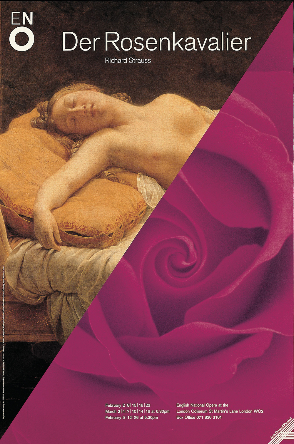
‘General director Peter Jonas was brilliant when he was running ENO. My logo – three letters of different weight – represents a singer with an open mouth. I said to him the only way we are going to get this to work is to dispense with the current process of approval. Which was actually everybody, right down to the box office. When ENO had two operas on at the Coliseum, they had to break down the sets, but couldn’t afford to store them. So they put it all back in the trucks and parked them in the street. I thought this was a missed opportunity, like a massive billboard that we could use very cheaply.’
Peter Quantrill
‘I’m not a designer, I do the words. I started off selling classical music in shops. Some people would say, “That’s got Bryn Terfel on the front, I want that.” And some would come in knowing exactly what they wanted. And there were some for whom the design would make a lot more difference to them when they got the package home.
‘Now I’m editorial manager for a production company for the classical industry. I spend a bit of time liaising between the marketing director and freelance designers. Classical music is different in that the label has a lot more say in what goes on the packaging. They might discuss it for days on end before going to designers with a vastly complicated brief. And then being surprised when it takes them 50 or even 150 returns to get something that they want.
‘At the opposite end, you get the client who says: “Oh yes … flute concerto … the usual picture.” Which is shorthand for: “I want you to find an agreeable Renaissance painting of roughly the same vintage as the piece, brief a designer with that and get him to put together with some inoffensive serif font”.
‘Re-issues have a great importance in classical music, and recordings can be 80 years old. Maria Callas singing Puccini – do you go for the original cover? Do you simply use her face? Or do you try to re-market this recording for a new age?
‘We’re a bit behind the times when it comes to thinking about how we make design and music interact.’
Sheppard
‘With regard to programme notes [concert or recording], there’s a huge amount of copy to fit in, whether it’s historical context or because the artist has written a 3000-word essay about their viola da gamba. Looking at the LCO programme, I know Peter writes a lot of text and Mike has to set it!’
Dempsey
‘Peter’s notes are incredibly comprehensive. I go to see the LCO perform and I realise just how useful the notes are. But you can’t set it in 6pt News Gothic Light. It has to be big enough to be read, often in half light, so sometimes it has to be cut, but we all have to compromise – it’s not just about a pleasing effect for the designer.’
Further discussion
Sheppard
‘In the rock world, if you become an uber-fan you buy the coffee-table version, with facsimiles and extended notes.’
(See also ‘Pack shots’, pp.58-63.)
Quantrill
‘There’s a nasty new word for this – “de-averaged”. A current example of this is a recording by Leif Ove Andsnes playing Mussorgsky’s Pictures at an Exhibition – for something not far shy of £50 you get a book with the CD. Or you buy the CD for £15. But that’s still a bit fancy, still associating the recording with that fancy artwork we’ve commissioned – how about we just issue the recording with some Russian coins and sell that for a fiver? That’s “de-averaging”.’
Sheppard
‘The classical music world is niche. If you’re a new artist you’re having to do a bedroom version of what in the old days a record company would have done. The industry has lost what little budget it had. People have to look at a holistic approach to design: a blog is probably the first way to tell someone what you sound like and look like.’
John L. Walters
‘In pop music, the album is the work. In classical, the work is the piece of music, and it’s not necessarily married to a particular recording. There are exceptions. The original album of Terry Riley’s In C has great object value, it’s part of that wonderful series of Columbia designs from the 1960s and it also has the score inside, so you can open it up and understand how the music’s made. Classical music design is closer to editorial design. Perhaps the challenge is to find ways of incorporating an editorial approach in the way music is sold, disseminated, understood and ultimately enjoyed.’
Dempsey
‘You can’t find a new way if you’re dealing with people who are blinkered. The moment you deal with the classical industry there are no budgets. And they want to see what they know.’
Quantrill
‘Conservatism is endemic. On the other hand – let’s face it – how many of you are regular classical music listeners? Right. About five per cent. Many of you are going to design covers for classical music …’
Hannah Caughlin
‘I think there’s an interesting connection between classical music and electronic music. The artwork tends to be more abstract and that may be because of the designer not relating to the content. In pop and rock you’ve got lyrics, and you’ve got personality …’
Paul West
‘I run a design agency [Form] that does a lot of pop music, but 95 per cent of the time we don’t hear the tracks when we start!’
Quantrill
‘Some of the most successful classical covers at the moment have absolutely no relationship between the character
of the music and the artwork. They’re on the conductor John Eliot Gardiner’s own label, Soli Deo Gloria. For his 60 releases of Bach cantatas all they say is Bach Cantatas, Gardiner, with various National Geographic faces peering out (see “No two dreams are the same …” in Eye 62). But the majority of artist-led releases make the artists look as though they want to be stepping out of the pages of Vogue but know they don’t really belong there.’
First published in Eye no. 76 vol. 19.