
Summer 2008
Design’s wayward cousins
Humble and often vulgar, chapbooks offer an illuminating window into the medieval world.
If one scans through the familiar attempts to frame a ‘favoured lineage’ of graphic design, the absence of the humble chapbook comes as little surprise. As a rule of thumb, semi-reliable content accompanied often by irrelevant illustrations and knocked out by apprentice printers rarely wins any awards.
The term chapbook – probably derived from an Anglo-Saxon term for ‘cheap’ or ‘trade’ – covers a range of small booklets that succeeded the popular, single-sheet ‘broadsides’ in the early 1600s and continued to circulate until the mid-nineteenth century. Written to meet the demands of an increasingly literate society, they offered up celebratory tales of folk heroes, such as Robin Hood, and popular fables gathered from across Europe and translated. To accompany the lengthier texts, the chapbooks were often spiced with a bawdy blend of ballads, riddles and advice for cuckolds and courting couples.
British chapbooks were distributed from publishers in London and strong provincial print centres such as York and Glasgow. They were sold by travelling peddlers known as ‘chapmen’ who would return with the unsold copies and requests for more of the popular titles, ensuring that we now enjoy an insight into the tastes of the late-medieval, pre-industrial communities. Diarist Samuel Pepys was one who anticipated their value to future generations and he collected heavily in the 1680s, binding his collections and taking care to separate the religious ‘Penny Godlinesses’ from the secular, which he termed ‘Vulgaria’ or ‘Penny Merriments’.
The printed quality of the chapbook was often poor, partly due to the choice of paper but also to the length of print run, which greatly exceeded that of the works of fine literature more familiar to design students. Text was usually accompanied by simple woodcuts, although their choice was often dictated by availability rather than any particular relevance. Even at their time of greatest popularity chapbooks were referred to as ‘bum fodder’ or toilet roll: a swipe, no doubt, at the content as well as the production values. And yet they make for an engaging read.
In chapbooks in the Pepys collection we are advised on how to remove freckles: ‘Steep a piece of Copper in the juice of Lemon till it be dissolved, and anointing the place with a feather morning and evening, washing it off with white wine.’ Sports and Pastimes offers schoolboys vital tips on ‘how to make a disagreeable maid-servant fart uncontrollably’, while The English Fortune Teller reliably informs us that ‘a mole on the forehead of a man denotes him of great possessions’ while ‘a man or woman having a mole on the left side of the nose shall wander from place to place in an unsettled condition’.
Bequeathed to Magdalene College, Cambridge, the Pepys collection has a sheer breadth that provides the reader with a candid, Pasolini-esque pan across a society emerging from the Puritan Ascendancy and beginning to enjoy the benefits of literacy. But what of the chapbooks’ place in design history? The canon anoints, retrospectively, a consensual recognition of certain family values or a sharing of DNA. It is a process that fits neatly with our idea of ‘progress’, ensuring that ‘greatness’ is passed on like an Olympic torch. And so – in comparison with the blue blood of Baskerville, Bodoni and the boys – the chapbooks, with bawdy songs, jokes and scandal, represent the wayward cousins and a source of shame. Yet this ignores their true significance: their role in shaping patterns of mass consumption while bridging oral and text-based cultures to ensure that we now share an invaluable window into a world so often denied by those within the ‘favoured lineage’ of design history.
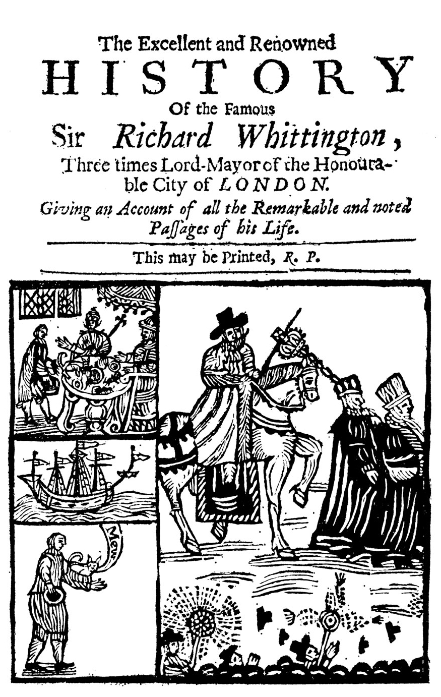
Top: cover for a chapbook published by J. Conyers, based on 1605 narrative: ‘How Whittington by rason of his hard usage, attempting to run away, was brought back by the ringing of the Bow bells: and of great Riches he received for the adventure of his cat, and how it came to pass.’ By permission of Pepys Library, Magdalene College, Cambridge.
First published in Eye no. 68 vol. 17 2008
Eye is the world’s most beautiful and collectable graphic design journal, published quarterly for professional designers, students and anyone interested in critical, informed writing about graphic design and visual culture. It is available from all good design bookshops and online at the Eye shop, where you can buy subscriptions and single issues.